|
design awards
 gold award
Category: Island Exhibit
Exhibitor: Shure Europe GmbH Design/Fabrication: Wenger.One GmbH, Munich, 49-89-462-304-0, www.wenger.one Show: Integrated Systems Europe, 2022 Budget: $750,000 – $999,000 Size: 66-by-85 feet PHOTOS: Shure Europe GmbH
Shure Thing
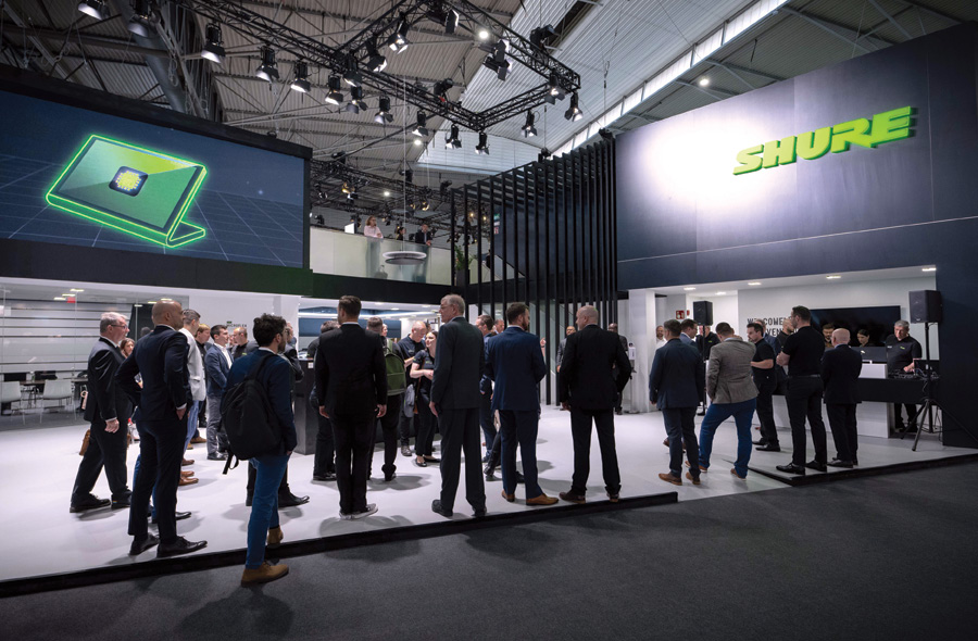
Illinois-based Shure Inc. has been making top-of-the-line audio and recording equipment for nearly 100 years and is renowned for its commitment to precision. So it makes sense that the European segment of the company wanted its exhibit at Integrated Systems Europe to be laid out with the meticulousness of a Swiss timepiece. But on top of that, Shure marketers asked the designers at Wenger.One GmbH to create a double-deck stand that offered more than a conventional product showcase. Shure wanted to give ISE attendees an experience aligned with its "Sound Extraordinary" tagline.
Angling for Engagement
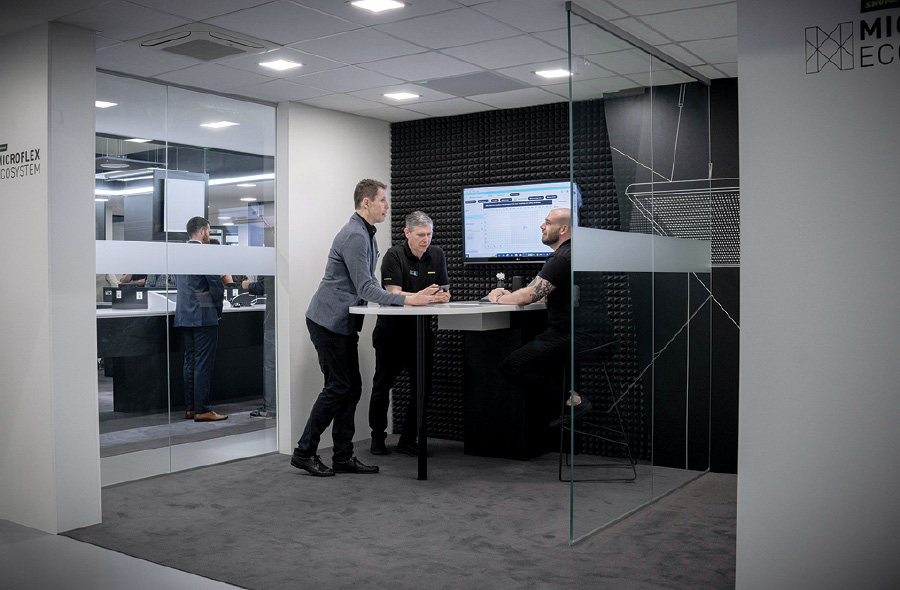
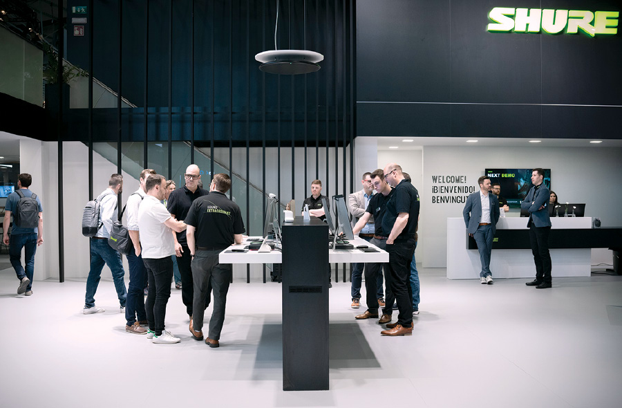
The design team came at this straightforward directive with a literal twist: "The solution was a diagonal stand design so that the visitor is pulled into the exhibit," said Andr é Wackenhut, project manager at Wenger.One. By placing the architectural elements at a clear angle, designers created a pair of tapering "plazas" on opposite sides of the footprint that subtly drove visitors toward a central experience zone where they could get a hands-on overview of Shure's newest offerings. Adjacent enclosed and semi-enclosed rooms on the main floor and upper deck provided more in-depth demos of the company's featured products. And due to the auditory nature of company, all of these spaces had to be carefully designed and constructed to meet numerous acoustic requirements.To subtly but effectively encourage passersby to enter Shure Europe GmbH's stand, designers placed the exhibit's main structures at an angle, thereby creating a pair of tapering plazas that funneled traffic to a central experience zone. While the interior of the stand skewed toward wood tones, white walls, and pops of greenery, the exterior was dominated by panels of black laminate that incorporated horizontal and diagonal shadow gaps to impart a degree of lightness and visual interest. "Everything feels consistent," said one Exhibit Design Awards judge. "It's very slick but with a lot of depth. They really have every piece of this space figured out." Precisely right. E 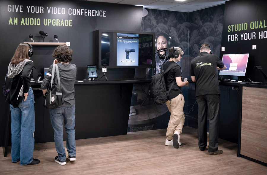
|
|
|
||||||||||||||||||||||||||||
|
|
||||||||||||||||||||||||||||
|
TOPICS Measurement & Budgeting Planning & Execution Marketing & Promotion Events & Venues Personal & Career Exhibits & Experiences International Exhibiting Resources for Rookies Research & Resources |
MAGAZINE Subscribe Today! Renew Subscription Update Address Digital Downloads Newsletters Advertise |
FIND IT Exhibit & Display Producers Products & Services All Companies Get Listed |
EXHIBITORLIVE Sessions Certification Exhibit Hall Exhibit at the Show Registration |
ETRAK Sessions Certification F.A.Q. Registration |
EDUCATION WEEK Overview Sessions Hotel Registration |
CERTIFICATION The Program Steps to Certification Faculty and Staff Enroll in CTSM Submit Quiz Answers My CTSM |
AWARDS Sizzle Awards Exhibit Design Awards Portable/Modular Awards Corporate Event Awards Centers of Excellence |
NEWS Associations/Press Awards Company News International New Products People Shows & Events Venues & Destinations EXHIBITOR News |
||||||||||||||||||||
|
||||||||||||||||||||||||||||


