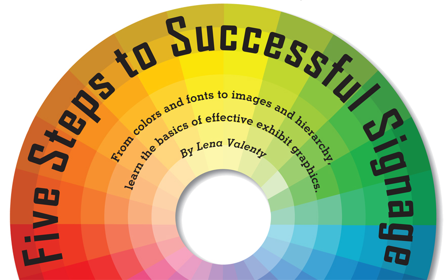
exhibit graphics |
 |
 ccording to graphic-design guru Milton Glaser, "To design is to communicate clearly by whatever means you can control or master." Simple enough. So why, then, are so
many exhibit graphics unappealing, cluttered, and ineffective? Turns out, the key to successful graphics isn't just pretty pictures. You also need a basic understanding of hierarchy, color theory, fonts, and density. After all, a picture may be worth a thousand words, but that means nothing unless those words communicate your key message. With that in mind, here are five steps that will lead to exhibit graphics that work. ccording to graphic-design guru Milton Glaser, "To design is to communicate clearly by whatever means you can control or master." Simple enough. So why, then, are so
many exhibit graphics unappealing, cluttered, and ineffective? Turns out, the key to successful graphics isn't just pretty pictures. You also need a basic understanding of hierarchy, color theory, fonts, and density. After all, a picture may be worth a thousand words, but that means nothing unless those words communicate your key message. With that in mind, here are five steps that will lead to exhibit graphics that work.
1. Establish Messaging Hierarchy
Hierarchy is just a fancy way of saying "order of importance." It can be found nearly everywhere, from your own numbered to-do list to the old
U. S. of Agriculture's food pyramid. It's an organizational tool that tells your brain how to prioritize informa-tion - a tool that when used correctly, can increase the effectiveness of your exhibit graphics. It directs your eye where to go, giving your brain mental cues on the amount of time to spend ingesting each bit of info. And when it comes to exhibit graphics, that direction is imperative as you have only a limited time to capture your audience's attention.
"Hierarchy dictates what the primary, secondary, and tertiary messaging will be, and as part of the exhibit-design process, it determines where each of those elements are located within the space," says Mark Pearlman, design
director at Alameda, CA-based exhibit-design firm Group Delphi. It's the reason you see large banners overhead featuring a company name instead of, say, its mission statement. Exhibit graphics are the physical embodiment of making small talk with an attendee - there's a beginning, a middle, and an end to that conversation. First, you introduce yourself.
Then, you briefly discuss a new product or service, and finally, if the attendee is interested, you enter into a deeper conversation about that product. According to Pearlman, the formula for crafting the nonverbal version of that conversation through your exhibit graphics goes like this:
. Primary Level - Visible from 50 to 100 feet away, this level is the intro and contains company identification (such as a logo) and main messaging (such as a tagline). It attracts people to the space and hopefully hooks them within five to seven seconds as they walk by before something else catches their eye.
. Secondary Level - Visible from 10 to 50 feet away, this level enables people to determine what they want to explore in the space. It usually comprises large static graphics and/or dynamic video associated with a company's products and services to keep people interested and in the exhibit.
. Tertiary Level - Visible from one foot to 10 feet away, this level is for qualified attendees who are genuinely interested in the company and its offerings. It should include graphics identifying demonstration areas, defining product displays, and promoting in-booth presentations.
2. Identify Effective
Color Combinations
Once you have determined
your messaging hierarchy, turn your attention to color. Your palette is likely dictated by corporate identity or an internal style guide. If that's the case, your color options may be limited, but there are still guidelines for usage that you should follow, regardless of the hues you choose. "Contrast is key when it comes to color, especially if you're placing text on a colored background," says Brendan Dooley, senior graphic designer at the San Francisco office of exhibit house MC². Obviously, you want to pair light-colored text with a dark-colored background, and vice versa. But beyond that, there are certain color combinations that are more pleasing to the eye than others.
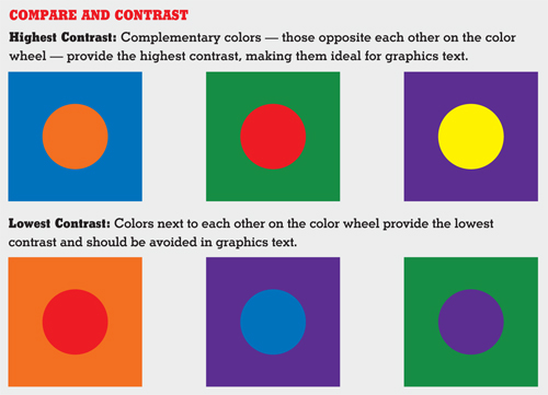 To identify optimal pairings, consult a color wheel divided into primary (red, yellow, blue) and secondary (green, orange, purple) color wedges. The color wedges opposite each other - called complementary colors - have the highest contrast, while the colors next to each other have the least contrast. For example, if your back wall is a shade of blue, and you want to overlay copy, choose a shade of orange to ensure your text is legible and your message pops. To identify optimal pairings, consult a color wheel divided into primary (red, yellow, blue) and secondary (green, orange, purple) color wedges. The color wedges opposite each other - called complementary colors - have the highest contrast, while the colors next to each other have the least contrast. For example, if your back wall is a shade of blue, and you want to overlay copy, choose a shade of orange to ensure your text is legible and your message pops.
If you don't have an internal style guide, Dooley recommends using other marketing pieces as inspiration. "Stay consistent with the colors used in your marketing collateral, print ads, product packages, websites, business cards, brochures, and so on," he says. "This will help clients and potential customers recognize you on and off the show floor and across multiple marketing platforms."
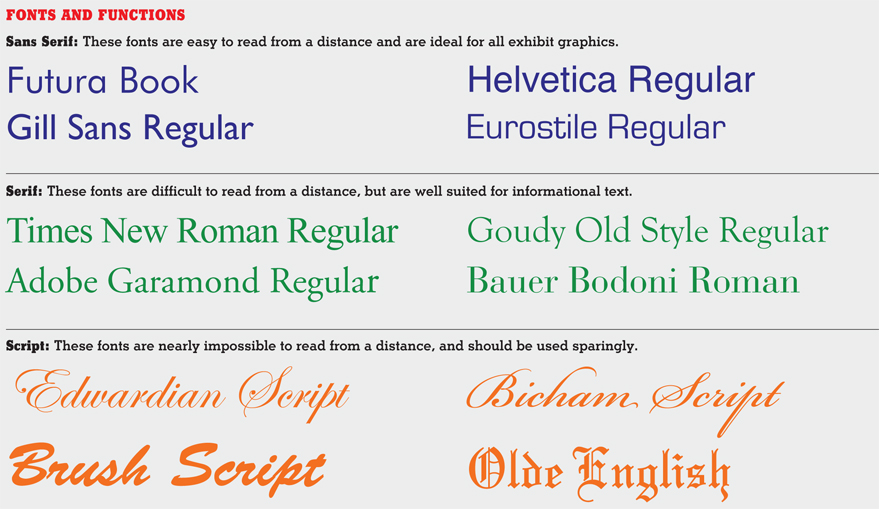
3. Select a Functional Font
With thousands of fonts at your disposal, it's easy to get lost in a sea of Comic Sans and Papyrus. Think of fonts as a tone of voice - they have the power to change your message, just as a person's inflection can mean the difference between sincerity and sarcasm.
So how do you choose the right font for your exhibit graphics? Start by deciding if you want to use a serif or sans serif font. "Serif fonts are great when reading the newspaper or a book, but unless they are an integral part of your brand identity, stay away from them in your exhibit graphics,"
Dooley says. "They are harder to read in a trade show environment and may be lost altogether from a distance." The legibility issue is mostly attributed to the fonts' serifs, which are like tiny tails that punctuate the letters. Examples of popular serif fonts include Times New Roman, Adobe Garamond, and Goudy.
On the other hand, sans serif fonts, such as Helvetica, Arial, and Futura, are much more legible in larger graphics because of their streamlined appearance. Sans serifs are a great choice for wayfinding signage and any directional info, and are easier to decipher from a distance, making them the perfect choice for exhibit graphics. "Futura, Helvetica, and Univers are very clean, simple, and easy to read," Pearlman says. "But they're also an obvious choice for many companies. I like to find a font that differentiates the booth from the other exhibitors."
In addition to serif and sans serif, there are also script and ornamental fonts, both of which are best suited for use as graphic elements versus informational text. Script fonts often feature exaggerated flourishes and sometimes resemble handwriting, making them hard to read on a small scale. Examples include Edwardian Script and Brush Script. Ornamental
fonts are, as the name suggests, ornamental and should generally be avoided in exhibit graphics. "These fonts are often filled with a unique personality that can be very helpful when designing logos or a themed event," says Eli B'sheart, vice president of creative and innovations at EWI Worldwide, a live communications company based in Livonia, MI. "But remember that legibility is key for any communication. If attendees can't read your message, they are unlikely to comprehend it."
4. Determine Appropriate Density
Think of how many times you've walked the aisles of a show and spotted a back wall laden with paragraphs of text detailing everything from product specs, testimonials, and company history to info about the exhibitor's in-booth giveaways. Now consider how many times you stopped to read it all. Chances are, that number is around zero. "Exhibit graphics, like the space itself, need to support the brand experience and not overwhelm attendees with competing messages," B'sheart says. "Thus, the most important rule of thumb is 'less is more.'" That rule, as B'sheart explains it, comprises three tenets:
. Size - Break down text into bite-size chunks. A wall of text is useless (unless it's being used as a design element), and does a disservice to the importance of the information that needs to be conveyed. If you can't shorten the text, use bullet points to differentiate longer lines of copy.
. Position - Keep text at eye level, between 3 and 6 feet from the floor.
. Format - The clearest way to communicate large amounts of copy may be to develop print or digital pieces that attendees can explore in greater depth. The booth staffer can also help disseminate detailed information,
negating the need for copious amounts of copy on your graphics.
|
|
5. Integrate Imagery
When it comes time to select
photos, images, and supporting visual elements for exhibit graphics, balance is key. "Imagery, like messaging, should be used to support your overall brand and enhance the experience," Dooley says. "When used together, images and text should complement each other and tell a much more engaging story." But image selection should not be done independent of the hierarchy, color, and font decisions you've made.
A good example of text that supports imagery and vice versa is the iconic Absolut Vodka print campaign created by New York-based ad agency TBWA Worldwide. The campaign, which boasted more than 1,500 iterations, featured an Absolut bottle (or outline thereof) somewhere on the page, accompanied by a short phrase across the bottom of the image that always started with "Absolut" and ended with a noun that pertained to the graphic. The font chosen matched the libation's logo, and the phrase - typically two words - paralleled the construction of the product name.
Granted, that example is the stuff of Don Draper's dreams, but the traits that made the ads successful can be applied to exhibit graphics. The ad was easy to read and comprehend, and the brand identity was so strong that it became recognizable as an Absolut ad even in installments that didn't feature the company's logo.
|
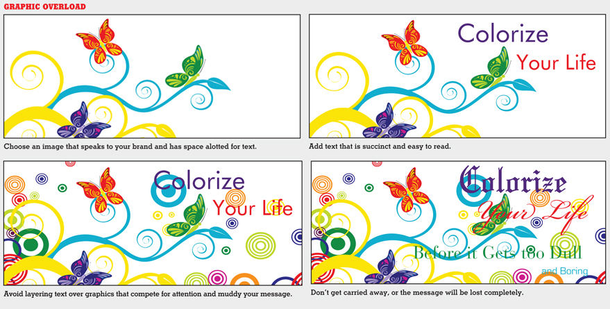 |
In addition to choosing imagery that supports your message and brand identity, think about copy placement, a consideration that comes into play long before graphics are designed and produced. "Consider how your image will work with copy in it," Dooley says. "If custom photography is out of your budget, many of the online stock-photo websites allow you to search for imagery with 'copy space' as a criterion. These images will have empty or clean areas to accommodate text and logos."
However, if text has to be placed on top of the image, follow these three dos and don'ts: First, ensure text is legible and doesn't compete with the image for attention. Second, don't overlay text on top of a busy image. If the image lacks an open area, use transparencies or color, such as a tinted text box, to separate the text from the image. Finally, don't use
special effects or additional artwork that conflicts with the image, your brand, or your message.
Regardless of the imagery, font, and colors you select, your graphics still need to serve one primary function: communication. Think of exhibit graphics as your first impression, and make it a good one. E
|
|
|