t's a big, big world – at least when it comes to large-format graphics. Given the recent advancements in everything from printer technology and image-capture devices to substrates and ink, large-format graphics are becoming de rigueur for marketing efforts in general and trade show exhibits in particular.
But trading in your traditional graphics for glorious, billboard-size prints isn't as simple as telling your supplier to "biggie size" your order. At least to some degree, XL graphics (which are known by various terms, including large format, super wide, grand format, etc. depending on their size and the supplier) have their own set of hiccups and challenges. However, when many exhibitors make the move to large-format prints, they fail to upsize their knowledge base in conjunction with their graphics' measurements – and they often end up with big-time problems to match their big-format displays.
So to help expand your expertise right along with your display's dimensions, EXHIBITOR enlisted the help of seven graphics professionals. Providing everything from a text-size tutorial to color-matching considerations, their suggestions and advice are organized into the following eight-point primer. Follow their recommendations, and you'll be able to create big-league graphics minus the small-minded mistakes.
TIP #1
Substrate

While fabric is the large-format substrate of choice for most exhibitors, there are countless other options, including everything from outdoor-friendly mesh to adhesive-backed vinyl. So our experts offer two suggestions when it comes to substrate selection: 1) Consider all options, and 2) carefully discuss the intended environment with your supplier.
"Fabrics are popular for trade shows because they're lightweight and relatively easy to work with," says Regan Dickinson, marketing communications specialist at LexJet Corp., a provider of wide-format inkjet-printing equipment and supplies. "But before you favor fabric, examine the alternatives. For example, if you want a giant background graphic applied to an exhibit wall, and you intend to use this wall at multiple shows for several years to come, a durable, adhesive-backed vinyl – or even printable wallpaper – might be a more practical option than fabric, which is comparably more fragile. Or, if you'd like to use a graphics panel on different surfaces (and not just in a customized frame in your exhibit), consider adhesive-backed fabrics that can be easily removed and reapplied in various locations and on numerous surfaces."
In addition to mulling over multiple substrates, exhibitors should discuss their application environments with their print providers, according to Dickinson. "When you order your graphics, discuss where and how often they will be used," he says. "Are you talking about an overhead element for three shows per year, or a wall-mounted panel within reach of attendees' fingers that you'll trot out 20 times annually? These situations demand different substrates. Also talk about whether the graphics will be exposed to sunlight, weather, extreme temperature fluctuations, bright interior lighting, etc. – all of which could damage the substrate, fade the ink, or create issues with lighting and/or glare."
And don't forget to discuss sizing straight out of the gate. "Before it can recommend a material, your producer needs to determine whether your exhibit graphics will need to be paneled together (that is, somehow seamed or stitched), and it must know how you want your graphics displayed," says Dan Hirt, president of Primary Color, a provider of print-media products and displays in Costa Mesa, CA. "Switching to a fabric from a rigid board, for instance, could allow you to create a seamless graphics presence."
TIP #2
Imagery

"When dealing with large-format graphics, one problem consistently rears its ugly head: People can't visualize enormous graphics by staring at a computer screen," says Ben Lawless, designer at Penciled In Designs, a graphic-design firm in San Luis Obispo, CA. "While you can stand across the room and squint at your monitor to try to get a feel for how it might look, there's no way you can truly understand the sense of scale that will result when it's blown up to real size. And without a perception of size, creating effective graphics is a crapshoot."
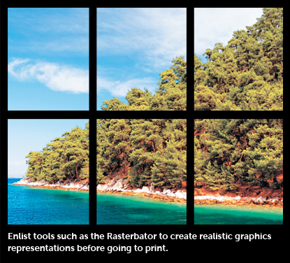 To remedy the situation, Lawless says you should actually create a true-to-size visual mockup using an application such as the Rasterbator, a free online tool at www.rasterbator.net. Once you upload an image to the site, the application enlarges it according to your specs and slices it and dices it into a multiple-page PDF. You can then download the PDF, print it using 8.5-by-11-inch sheets of paper, and tape the pages together to create the full-sized graphics you have in mind. This might be a bit difficult with colossal graphics that are larger than the walls in your office. But even printing out versions that are one-quarter or one-eighth of the size will help you visualize them better than simply looking at them on a computer screen.
"Granted, it's a bit of a craft project," Lawless says. "But it will absolutely help you determine if your text sizes are readable, if the scale of your images is on target, and whether your mix of text and images communicates your intended message. This is the best way to prevent a major marketing misstep."
To remedy the situation, Lawless says you should actually create a true-to-size visual mockup using an application such as the Rasterbator, a free online tool at www.rasterbator.net. Once you upload an image to the site, the application enlarges it according to your specs and slices it and dices it into a multiple-page PDF. You can then download the PDF, print it using 8.5-by-11-inch sheets of paper, and tape the pages together to create the full-sized graphics you have in mind. This might be a bit difficult with colossal graphics that are larger than the walls in your office. But even printing out versions that are one-quarter or one-eighth of the size will help you visualize them better than simply looking at them on a computer screen.
"Granted, it's a bit of a craft project," Lawless says. "But it will absolutely help you determine if your text sizes are readable, if the scale of your images is on target, and whether your mix of text and images communicates your intended message. This is the best way to prevent a major marketing misstep."
TIP #3
Format and Resolution

Regarding file type, size, and resolution, it seems that each supplier wants something slightly different. So your first step is to obtain your supplier's spec sheet.
However, despite spec-sheet variations, Geoffrey Kilmer, president of PhotoWorksGroup, an exhibits, graphics, and photography provider in Charlottesville, VA, offers some general information about what you might need. "Adobe InDesign has become the standard in page-layout software, and it enables you to combine various graphics elements to create your layout," he says.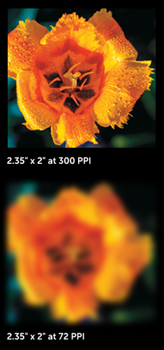 "You still need Photoshop to color balance and massage your images, and Illustrator is the software of choice to create or manipulate logos. But if an experienced designer had these three programs, high-resolution images, and a spec sheet from your graphics supplier, he or she should be able to create a file suitable for large-format graphics."
Kilmer also offers an explanation of pixels per inch (PPI). "Let's say you have an 8-by-10-inch image at 100 PPI. If you change the canvas size to 16-by-20 inches and make no other changes, your PPI value will be cut to 50 PPI. If you double the canvas again, your PPI is 25. As you increase the output size, the PPI value drops. If it falls below the minimum requirement, quality will suffer."
While there are ways to fix PPI-related issues to some degree, you'll need an experienced designer to manipulate the images without causing them to degrade or soften. As a side note, Kilmer also asserts that asking for images using dots per inch (DPI) is actually an incorrect use of the terminology. "DPI refers only to the resolution of the output device, not the digital image resolution," he says.
Despite these disparities, experts stressed the importance of vector art for logos and custom text and fonts. "Vector art is a mathematically engrained art file – one that's actually drawn using points, lines, and curves – that will allow you to enlarge your logo to practically any size without it becoming pixilated," says Mark Yurik, director of online markets for Big Printing Las Vegas. "A raster graphic, on the other hand, is made of thousands of tiny squares of color (pixels or dots), and it's difficult to blow up without significant pixilation. If you have a rastered logo, Google 'vectorize my art.' You'll find countless websites that will turn your logo into a vector file in less than 24 hours and for only about $45 to $65."
TIP #4
Lighting

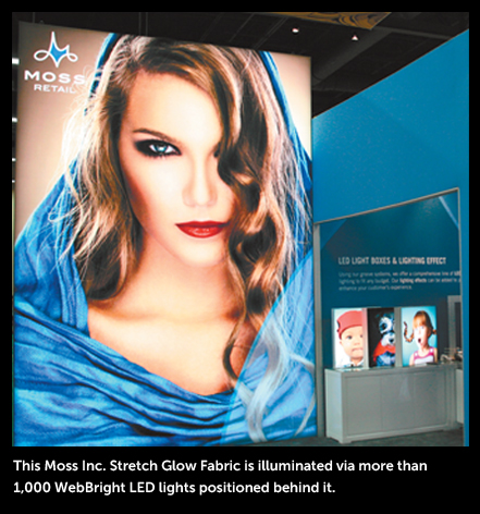
Some exhibitors assume that going big means they can go dark as well. "But just because your graphics are big doesn't mean they don't still need an effective lighting strategy," Hirt says. "Effective lighting is often the difference between graphics that disappear and those that truly make an impact. So a good lighting plan must be developed side by side with your graphics strategy."
 Myriad lighting options are available, including everything from truss- and ceiling-suspended fixtures to lights that attach directly to your large-format framing system. But according to
Dickinson, "LED lighting has revolutionized the use of backlighting on all types of graphics panels. LEDs can now fit into a super-slim panel along the graphics' edge and provide dramatic backlighting or edge lighting. So even if your panel is 20 feet long, a strip of LEDs along the side can make it come alive."
Myriad lighting options are available, including everything from truss- and ceiling-suspended fixtures to lights that attach directly to your large-format framing system. But according to
Dickinson, "LED lighting has revolutionized the use of backlighting on all types of graphics panels. LEDs can now fit into a super-slim panel along the graphics' edge and provide dramatic backlighting or edge lighting. So even if your panel is 20 feet long, a strip of LEDs along the side can make it come alive."
Denise Rodriguez, a junior marketing professional at Super Color Digital, a graphics-printing firm headquartered in Irvine, CA, cautions that your print and lighting suppliers should be equal partners in your planning process. "The majority of graphics can withstand harsh, direct lighting without fading," she says. "However, different lighting conditions will affect the longevity of ink, so it's worth your time to talk to your graphics provider about ink types and materials and how they should respond to the type of lighting you intend to subject them to over time."
Kilmer concurs. "Depending on your lighting, materials, and colors, your print producer might want to view the graphics with your selected light source to optimize the color balance and avoid a shift from your color specifications."
TIP #5
Color Matching

"I'd say that only 50 percent of people that send my company artwork fully understand that CMYK colors look different on a light-emitting computer screen versus an actual printed graphic," Yurik says. "CMYK colors are light-absorbing hues, but they're enhanced when you see them on a screen. When you print them out, CMYK colors
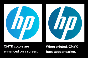
usually shift toward darker hues."
So what? Sometimes, nobody cares – or notices. But if you have well-known brand colors, and you create a 40-foot company logo on a fabric graphic, your suppliers must understand color matching. Otherwise, a blue HP logo could morph into Ford blue. Bottom line, if color is critical to your brand, inquire about color-matching capabilities before you hand over your hues. "Allow enough time in your production process to view a hard-copy proof to make sure printed colors meet your expectations," Kilmer says.
TIP #6
Provider Choices

With all of the aforementioned information, it's time to fire up the printers, right? Not so fast. You need to select a quality provider.
In some cases, you might be able to print your own graphics. "A wide-format printer allows you to print on the fly and have greater control over the process, and would be perfect for banners, header graphics, posters, and backlit designs," Dickinson says.
But if your needs are more complex, Hirt leans heavily toward graphics-production firms. "Some exhibit houses have huge graphics departments with capable technicians and endless equipment," he says. "And if your exhibit house fits this mold, by all means keep everything under that one roof. However, many exhibit providers specialize in exhibitry, not graphics. A good-quality print provider knows graphics inside and out and is G7 certified [which essentially means the provider offers visual similarity across all print processes], and it has all the substrates, printers, and finishing services you'll likely need. So given this availability of equipment and expertise, you can usually expect a faster turnaround time – and perhaps a
lower cost."
Kilmer agrees. "User- friendly printers and software have enabled exhibit houses to get into the graphics-production market," he says. "While some of them have invested the time and resources to do it right, many operate under a one-size-fits-all mindset, and they can't offer the best solution for each unique application." Hirt also suggests that you have all of your graphics – or at minimum all graphics for the same booth – made by the same firm. "If everything is produced under one roof, you can easily check for color and quality consistency across all mediums."
TIP #7
Text Size and Contrast

Most exhibitors understand that brevity is key when it comes to graphics text. And for the most part, they have a good sense of how big their text needs to be to maintain readability for small-format graphics. But when you're talking about a 20-foot-long fabric wall, for instance, how big (or small) should your letters be?
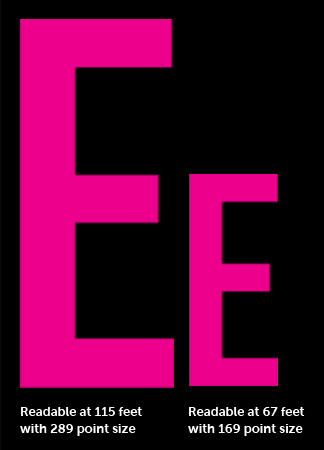 Lawless offers this calculation to determine text size: Multiply the distance at which you want people to be able to read your text (in feet) by 0.035; your answer is the required height of your text (in inches). Then multiply the required text height by 72 to determine the required point size.
Using these calculations, if you want your text to be readable at 15 feet, it should be 0.53 inches tall and have a point size of 37.8. To extend the visibility distance to 30 feet, the text height must increase to 1.05 inches, and the point size should jump to 75.6.
But in order for any text to be readable, regardless of size, you need a fair amount of contrast as well. "When all graphics images, text, and colors have the same level of intensity, they fight for attention, creating a visual war that massacres readability," Hirt says. "When you find a balance where these elements work well together with varying levels of intensity, your graphics become far more impactful."
Lawless expands on this idea a bit more. "Wherever you have text, you should use contrast to make it completely distinguishable from its background," he says. "That means if you have a dark background, place white text on it (or a similar color), and vice versa for a lighter background. Be mindful to use colored text and drop shadows sparingly, as they have a nasty habit of obscuring your text, even though all you wanted to do was to distinguish it from its background. White or black text with no shadow is usually the most readable of all color options."
TIP #8
Finishing

You can create towering graphics with brilliant colors and the perfect blend of text and images. But if those graphics are finished incorrectly – perhaps with a lackluster laminating job – your pristine graphics have a blemish that will draw the eye almost more than your beautiful images. "In fact, the bigger a project is, the more you need to pay attention to finishing details," says Tara Lamb, president of Louisville, CO-based Global Imaging Inc., a provider of digital print systems.
 "Finishing includes everything from stitching pillow graphics to fit snuggly across framing to adding magnet connectors and assembly clips so rollable PVC graphics adhere smoothly to a frame," Yurik says.
Sources suggest that you talk with your graphics firm about the types of finishing required for your project, and that you then ask to see samples of similar finishing steps that it has performed for other clients. Not every graphics-production facility has mastered each one of these, and some might not have the services you need.
Yurik also suggests that you talk with your graphics producer about its design templates. "Most large-format graphics are designed around a template – including the substrate, frame, connectors, etc." he says. "Whenever you have a custom design that doesn't follow the original template, you need top-notch finishers, since measurements and placements for everything from silicon-edge seams to zipper location will require customization."
So as you can see, adding large-format graphics to your exhibit arsenal isn't really that big of a deal. You just need to create the proper artwork, maintain a bare-bones understanding of the processes involved, and ask your providers some key questions. Armed with the aforementioned advice, then, you're well on your way to creating the next big thing for your exhibit.
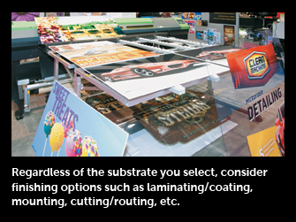
The Finish Line
While graphics-finishing processes vary among suppliers, Geoffrey Kilmer, president of PhotoWorksGroup, an exhibits, graphics, and photography provider in Charlottesville, VA, explains three finishing services your large-format graphics will likely require.
 Laminating/Coating Laminating/Coating
Most exhibit graphics should be laminated for protection from scratches and abrasions, and textured laminate can also decrease reflections and glare. One of the more popular approaches today is to use a heat-activated vinyl laminate, which is applied to the front and back of the print.
 Mounting Mounting
Various mounting techniques can be used to enhance your graphics' appearance. It can be as simple as mounting to Gatorfoam, expanded PVC (aka Sintra), or acrylic plastic. Or producers can enlist mounting techniques to create visual effects. For example, if you mount to an acrylic sheet, the print will appear to have an enhanced depth perception because people will view it through plastic.
 Cutting/Routing Cutting/Routing
Many graphics-production houses have a CNC router and/or a digital cutter. This equipment enables them to easily produce intricate contour cuts to create graphics that can literally stand out in the crowd. Meanwhile, laser cutters are used to fashion dimensional letters from acrylic plastic. There are also many substrates that can be laser etched, creating sharp, tactile text or images that can draw attention.
|