graphics |
 mall-exhibit graphics are like opening lines. In the three- to five-second glance typically afforded you by passing attendees on the show floor, the graphics in your 10-by-10 exhibit space must clearly communicate who you are, what you're selling, and what benefits your company's product or service can offer them. mall-exhibit graphics are like opening lines. In the three- to five-second glance typically afforded you by passing attendees on the show floor, the graphics in your 10-by-10 exhibit space must clearly communicate who you are, what you're selling, and what benefits your company's product or service can offer them.
If your booth graphics are effective, a conversation ensues. But if your graphics bomb, they repel trade show attendees faster than a smarmy barfly armed with halitosis and cheesy pick-up lines.
So how do you make sure your 10-by-10 graphics attract attention, communicate your company's key message, and lay the groundwork for a long-term relationship? You start by studying the smelly barfly. That is, you understand what not to do - so you can avoid it.
Here are 10 of the most common 10-by-10 graphics mistakes, along with clear rules to help you understand what you should do instead. If you avoid the mistakes and obey the rules, your graphics are sure to score every time.
|
 |
|
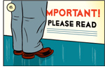
Mistake 1: Too Many Words
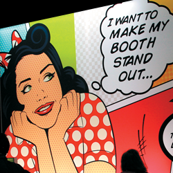
Rule: Use a maximum of six to 10 words.
 "If your text takes more than three seconds to read, you've got too much text," says Chuck Michel, manager of business development at St. Louis graphics firm Group 360 Communications. That means your graphics can feature maximum of roughly six to 10 words and maybe an eye-catching company name or logo. Paired with an interesting image that also communicates your message or offerings, the text should complement the accompanying image to create a powerful, cohesive, can't-miss message that stops people in their tracks and draws them into a conversation with booth staff.
|
Mistake 2: The Wrong Words
Rule: If you talk benefits, attendees will listen.
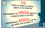 With only a handful of words in your arsenal, message selection is critical - and benefit statements are key. "Attendees only want to know what's in it for them," says Susan Shuttleworth, marketing manager at Hummelstown, PA-based TransCore. "For example, tell attendees your product 'Cuts transportation costs by 20 percent!' or that it can 'Double your ROI.' But don't waste your word allotment to tell them how cool your company is or to list product numbers and specs. Attendees just don't care."
|
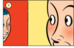
Mistake 3:
Competing Colors
Rule: Use light over dark
or dark over light text combinations.
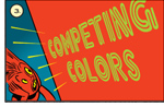 "When it comes to color selection, text color must provide a sharp contrast with the background in order to have full effect," says Gwen Parsons, senior vice president of Nomadic Display, a portable- and modular-exhibit provider in Springfield, VA. "One must place text on a case-by-case basis, simplify the overall amount of text, and avoid using busy backgrounds."
Effective color combinations typically include dark colors (e.g. black, navy, forest green) on light backgrounds
|
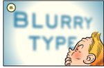
Mistake 4:
Artsy Fonts
Rule: Use serif or sans-serif styles and no more than two fonts per graphic.
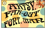 "Graphics text should be clear and easy to read, not artsy," Michel says. "Your images, not your text, are your art, which means artsy fonts are unnecessary." Artsy fonts are difficult to read, as they fight for the readers' attention by competing with the image and distracting the reader by pulling the eye back and forth.
Out of the three primary font styles - serif, sans serif, and decorative - serif and sans serif styles are the easiest to distinguish and read.
Note: For more information on font types, sizes, and colors, see "But Can They Read It?" in EXHIBITOR's March 2003 issue, available online at www.ExhibitorOnline.com.
|
Mistake 5: Tiny Type
Rule: Text must be a minimum of 4-inches tall.
 Type should be a minimum of 1-inch tall for every 3 feet you step away from it, Michel says. Since most attendees are at least 12 feet from your exhibit as they pass it in the aisle, text should be at least 4-inches tall, i.e. roughly the size of a standard envelope. If you want attendees to read your text from 20 feet away, for example, it should be a minimum of approximately 6.5-inches tall.
|
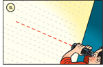
Mistake 6: Text Below Eye Level
Rule: Position text in the 2-foot zone.
 The 2-foot zone across the top of the exhibit is the ideal location for text, says Adam Brodsley, principal of San Francisco exhibit-design firm Volume Inc. "It's really the only unobstructed area on your exhibit's back wall that people can see clearly in an aisle full of people."
If you absolutely can't position all of your text within the 2-foot zone across the top of the back wall of your exhibit, make sure it doesn't go lower than eye level, which is roughly 5 feet up from the floor.
|
Mistake 7: Too Many Images
Rule: Use one large, well-cropped image.
 Less is more. Rather than a smattering of small images, use one large main image to fill the majority of your graphic display, says Randy Harju, principal at exhibit house 3DL Design Inc. in Mundelein, IL.
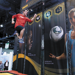
Parsons also suggests cropping the image to concentrate its effectiveness. "For example, let's say you want to use a shot of a person sitting in front of a computer in an office," she says. "All of the other information in the image - the window in the background, the files on the corner of the desk, the wastebasket overflowing at the bottom right - distract from the person at the desk. However, if you crop the image so you only see the person's face bathed in the glow of the computer monitor, you dramatically increase the impact of the message - and you create an eye-catching image attendees can't help but notice."
|
Mistake 8: Poor Image Quality
Rule: Use high-resolution images, and consult your graphics designer.
 "Garbage in, garbage out," Michel says. "Never use a low-quality image, such as one with a resolution too low for your final graphic's size, to try to make a high-quality impression. Make sure you and/or your graphics designers have a good understanding of the resolution of the image and its enlargement limitations before you purchase it."
Not all images can be "rez'd up," or enlarged, and still retain their quality or appearance. Often, low-res images can become blurry or grainy when enlarged. Pay special attention to low-cost stock photography and company logos, which often have image-enlargement issues. Since situations, photos, and uses vary, consult your graphics designer before making a purchase.
|
Mistake 9: Bad Lighting
Rule: Position lights every 2 to 3 feet.
 "The decision whether or not to light your exhibit is simple: Do you want people to see your graphics, or don't you?" says Paul Fine, president of Fine Design Associates Inc. in Doylestown, PA.
Without lighting, your graphics, your message and your program simply fade away. Fine recommends using two 100- or 200-watt halogen lights spaced 2 to 3 feet apart. For optimum coverage and to avoid glare, position the lights 2 feet out from the graphics and light the entire back wall, not just the header.
|
Mistake 10: Nicks and Dings
Rule: Clean and maintain graphics properly.
 Accidents and hung-over forklift drivers happen. But most graphics damage can be avoided with careful handling and cleaning. Experts suggest the following techniques.
 Hire a professional laminator. Delamination is a common graphics problem, as graphics experience extreme temperature fluctuations - from more than 100 degrees inside tractor-trailers to freezing temperatures in airplane bellies. Professional laminators understand the expansion and contraction rates of different materials; plus, they often provide a lifetime delamination guarantee. Hire a professional laminator. Delamination is a common graphics problem, as graphics experience extreme temperature fluctuations - from more than 100 degrees inside tractor-trailers to freezing temperatures in airplane bellies. Professional laminators understand the expansion and contraction rates of different materials; plus, they often provide a lifetime delamination guarantee.
Get a helper. Graphics are often damaged when one person tries to unpack, hang, and repack them alone - rather than asking, or paying, for help.
Pack properly. Don't just roll up your graphics and toss them in a case. Place a sheet of plastic or brown, butcher-type paper between the panels to prevent scratches.
Clean them. You can wipe down most graphics with Windex and a paper towel. But don't get the liquid near the edge of the graphic, as it may seep under the laminate and cause a bubble. Most black marks and sticky sub-stances can be removed with a cotton ball and Goof Off, a multipurpose cleaner. And don't forget to run a bit of rubbing alcohol across any magnets, which lose their powers of attraction when they get dirty. e
|
|
|
|