|
ammunition
Ideas That Work
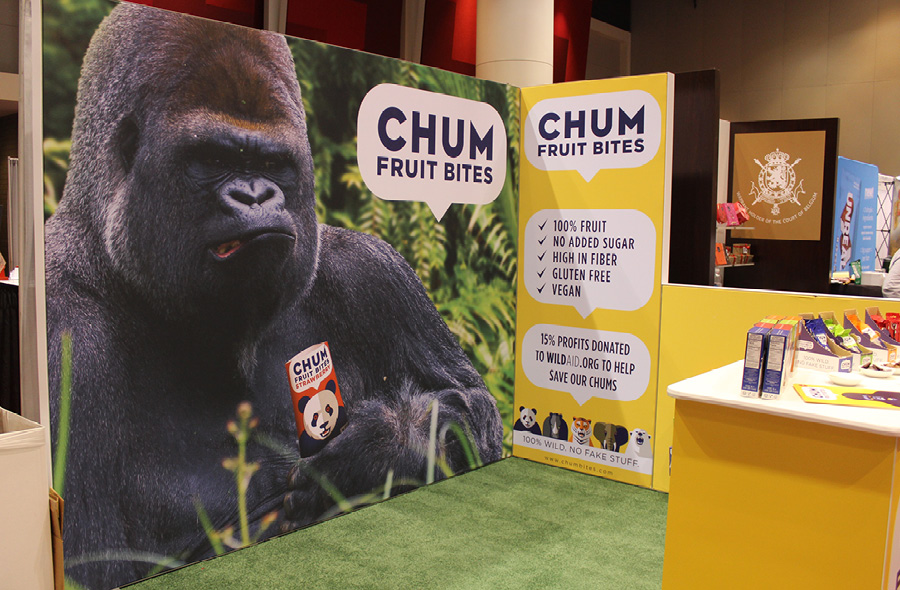 Cute and cuddly animals are mainstays in exhibit imagery. However, the grumpy silverback covering the back wall of Chum Bite's 10-by-10 at the Sweets and Snacks Expo was not of that ilk. That deviant approach may just be why so many visitors cocked their heads and stopped to ask the maker of all-natural fruit chews what was up with the menacing primate. The wild graphic gave staffers the perfect opening to explain how the firm donates 15 percent of its profits to WildAid, a nonprofit working to protect endangered – and sometimes intimidating – wildlife around the globe. The messaging certainly appealed to the eco-minded Millennials the company was targeting. 
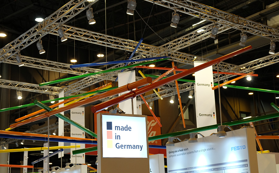 It's always an aesthetic challenge to create a visual link between pavilion participants – or even between various brands or product groupings within a massive stand. At the Offshore Technology Conference, Germany hurdled this hiccup with Lolo Jones ease. To unite all exhibiting entities as part of its sprawling pavilion, the German coalition used a series of various-length tubes coated in a rainbow of colors. Suspended from silver truss and dangling from ceiling points, the tubes branded each German exhibitor as part of the whole while also adding a soaring point of interest. You might just say that Germany performed a fast and effective tube job. 
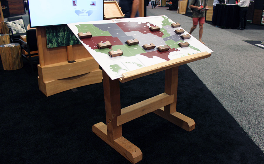 Too often exhibitors struggle with delivering visitors the right business card for their regional sales rep, wasting time by sifting through piles of alphabetized – or, worse yet, random – cards. Think Wood, an association promoting the use of softwood lumber in building applications, solved that problem at the American Institute of Architects' Conference on Architecture in Las Vegas by enabling attendees to find their unique rep's card themselves. Near its welcome desk, Think Wood set up an approximately 4-by-3-foot color-coded wooden map of the United States on an angled stand not unlike an architect's drafting table. A card holder was affixed to each region containing the area rep's business cards. At a mere glance, attendees could locate and grab their reps' cards, avoiding the usual frustration and delays. 
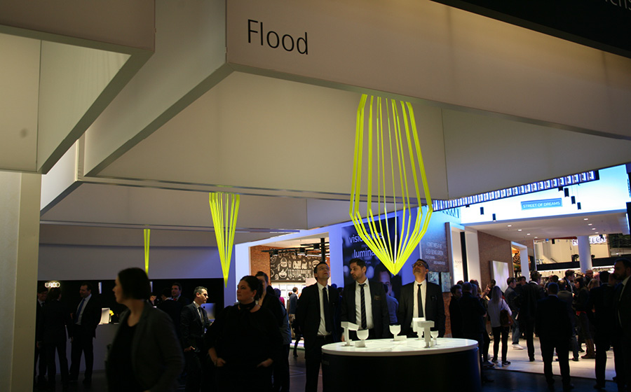 Seeing the Light Getting attendees to clearly understand the difference between lighting terms such as flood versus wide flood can be a massive challenge amid an exhibit hall's ambient lighting. But at EuroShop, Erco GmbH devised a clever way to explain these terms as they applied to the firm's wide range of lighting products. The entire stand was divided into various product groupings. In each area, visitors discovered a circular table with light fixtures displayed atop. Above each table, however, they found a square box frame with text denoting a term such as "flood" or "narrow spot." Suspended from the center of each frame was a neon-yellow Plexiglas form crafted in the same shape as the light for that particular term. That is, the narrow spot looked like a long cylinder, while the broad flood was more of a cone shape. The strategy helped attendees understand the various terms and quickly find the product grouping that best suited their needs. 
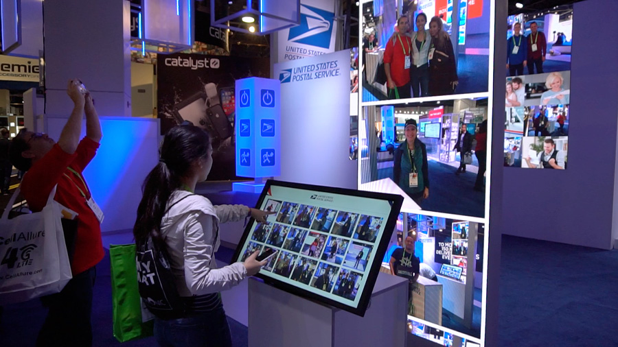 Most in-booth photo activations seem more like afterthoughts than strategic engagements. For example, how do photos of attendees in your exhibit help you sell, say, postal offerings? Well, the United States Postal Service effectively answered that question at the 2019 International Consumer Electronics Show. Staffers offered to snap pics of booth visitors, and those images were added to an evolving mosaic shown on a video wall inside the exhibit. But in a genius move that made the ubiquitous photo op immediately relevant to the brand, USPS staffers printed each image on a mailable postcard before segueing into discussions on the postal service's cutting-edge offerings. 
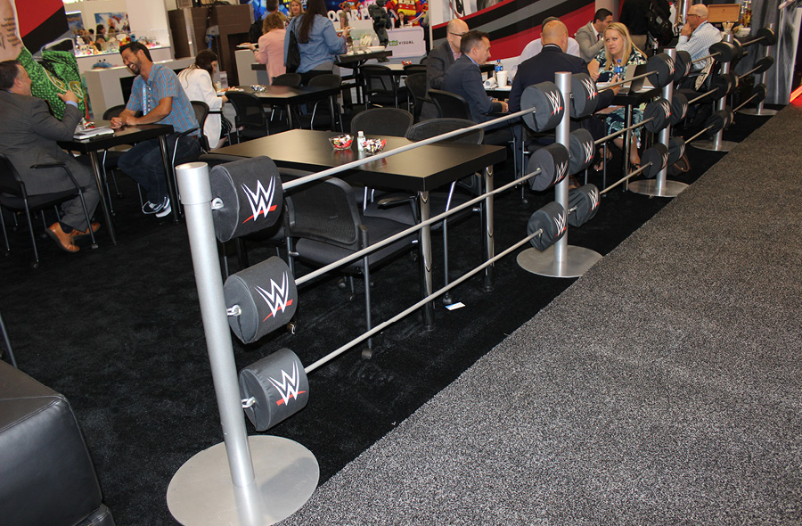 Stanchions are usually as memorable as rice pudding, but World Wrestling Entertainment Inc. (dba WWE) turned them into an on-brand attraction at the Licensing Expo. Each stanchion in WWE's exhibit had three rigid bars coming out of each side, creating the illusion of a roped-off wrestling ring. Where each rod joined the stanchion, a branded turnbuckle pad transformed the simple divider into a creative, eye-catching element. 
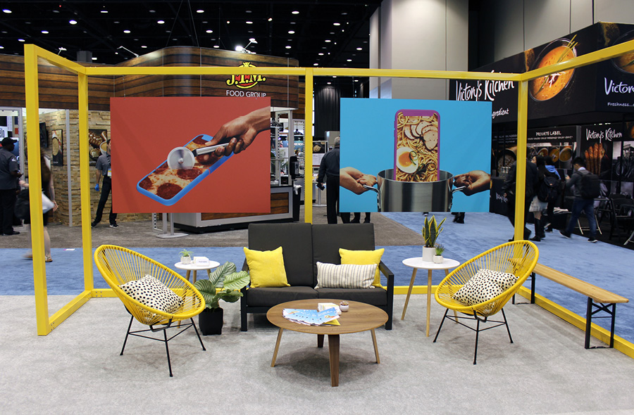 Exhibit walls clearly stake out one's territory on the show floor, but they can have the adverse effect of seeming exclusionary, which is problematic if your goal is to encourage foot traffic. Postmates Inc., a goods- and food-delivery service, overcame this obstacle at the National Restaurant Association Show in Chicago by using a modular system of square yellow beams minus the walls to outline the perimeter of the space. Several poster-sized graphics suspended by nearly invisible wires from the 8-foot-high top beams further defined the space while retaining its open atmosphere. The minimalist exterior design allowed an easy view of several comfortable seating areas in booth, clearly communicating that all attendees were welcome to enter the space.
|
|
|
||||||||||||||||||||||||||||
|
|
||||||||||||||||||||||||||||
|
TOPICS Measurement & Budgeting Planning & Execution Marketing & Promotion Events & Venues Personal & Career Exhibits & Experiences International Exhibiting Resources for Rookies Research & Resources |
MAGAZINE Subscribe Today! Renew Subscription Update Address Digital Downloads Newsletters Advertise |
FIND IT Exhibit & Display Producers Products & Services All Companies Get Listed |
EXHIBITORLIVE Sessions Certification Exhibit Hall Exhibit at the Show Registration |
ETRAK Sessions Certification F.A.Q. Registration |
EDUCATION WEEK Overview Sessions Hotel Registration |
CERTIFICATION The Program Steps to Certification Faculty and Staff Enroll in CTSM Submit Quiz Answers My CTSM |
AWARDS Sizzle Awards Exhibit Design Awards Portable/Modular Awards Corporate Event Awards Centers of Excellence |
NEWS Associations/Press Awards Company News International New Products People Shows & Events Venues & Destinations EXHIBITOR News |
||||||||||||||||||||
|
||||||||||||||||||||||||||||


