|
ammunition
Ideas That Work
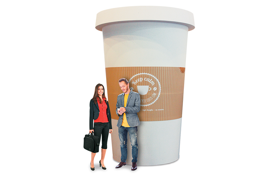 Bigger isn't always better, but once in a while an extra-large display can truly set you apart on the trade show floor. Daikin Europe N.V., a provider of heating and refrigeration products, did just that at EuroShop 2017. But rather than doubling up on the size of its footprint, Daikin multiplied the size of its exhibitry. It devised an exhibit theme loosely based around the heating and cooling products it provides to retailers, and as such, it filled its roughly 30-by-30-foot space with giant-sized elements. An enormous milk carton and shopping bag towered more than 14 feet tall; meanwhile, an insulated cup and a product catalog with pull-out tabs offering info on the company's products reached a height of more than 10 feet. Combined, the oversized objects surprised and delighted attendees, who immediately understood what Daikin delivers. 
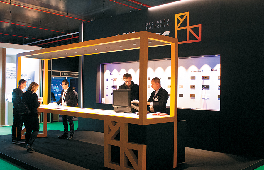 Furniture is a necessity in most exhibits, but it typically does little in terms of helping a company brand its space. Not so for Lithoss nv/sa, a maker of switches for lighting and electronics, at Integrated Systems Europe. Rather than displaying its offerings atop a blasé base, Lithoss had a custom table fabricated to resemble a 3-D representation of its yellow, geometric logo. As the sole freestanding element within the company's stand, this eye-catching table not only branded the booth and provided a suitable context for the products on display, but also featured integrated lighting that illuminated the offerings below. 
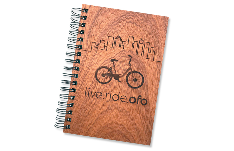 Let's be honest: Too many cheap tchotchkes are dumped in nearby trash cans or abandoned in hotel rooms. While that's a concern for every exhibitor, it's especially problematic if sustainability and environmental stewardship are core principals of your brand, which they are for Ofo Inc., a Beijing-based bike-share company. That's why Imprint Engine sourced customized Woodchuck wood-covered journals for its bike client to distribute to decision-makers during a breakout event at the United States Conference of Mayors. The notebooks were an ideal solution because of Woodchuck's "buy one, plant one" program, which more than offsets its environmental impact by planting a tree for every notebook it produces. The bike company upped the ante by including a packet of cherry-tree seeds in each notebook to encourage attendees to plant trees in their own communities and join Ofo's environmental sustainability mission. No disrespect to Kermit the Frog, but sometimes it's easy being Green. 
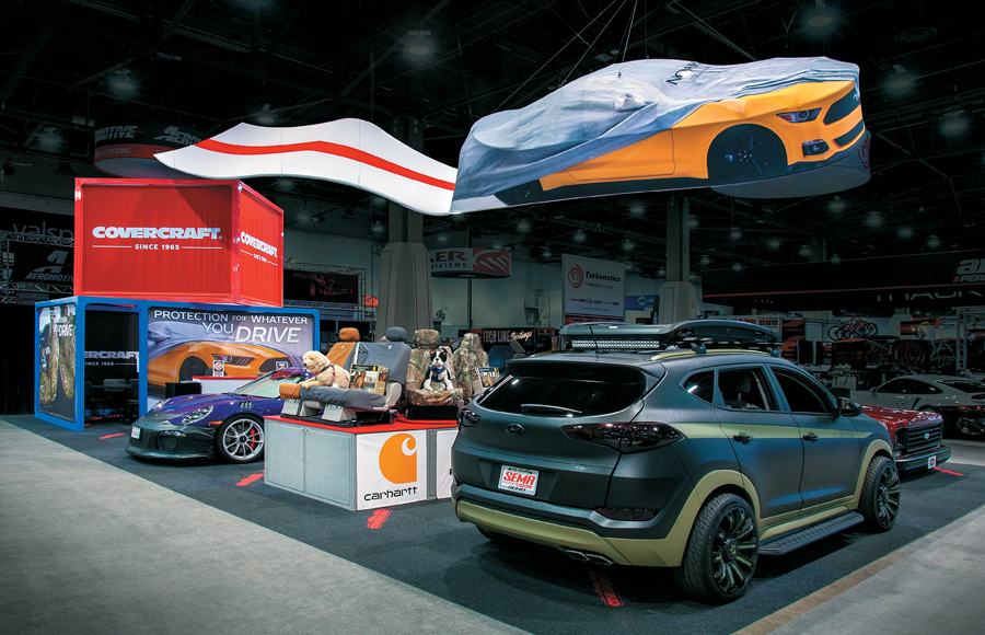 Overhead elements are great at branding a booth but too often fail to convey the exhibitor's offerings. At the Specialty Equipment Market Association Show, however, Covercraft Direct LLC, which manufactures protective automotive coverings, utilized Moss Inc. to develop an overhead design that accomplished both goals. A 6-foot-wide, 16-foot-long aluminum skeleton cloaked in tensioned fabric looked like a canary yellow Ford Mustang peeking out from beneath a car cover. A long tensioned-fabric ribbon of road flowed behind the car, adding the illusion that the Mustang was cruising down the highway with the rippling silver cover about to blow off. The vehicle's undercarriage bore the brand's name, helping rubbernecking showgoers easily identify the company and its wares. 
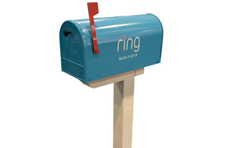 Yard Party Home-inspired exhibits are nothing new, but they are usually employed to welcome attendees inside. Ring Inc., on the other hand, put its products – the Video Doorbell and Floodlight Cam – in the proper context via a space resembling a home's front yard. A house-like structure, complemented by a water feature and faux cobblestone path, displayed the products (which were mounted to the front door and above the windows) in their natural habitat. To top it all off, the company added its booth number and corporate logo to a sky-blue mailbox positioned near the aisle. Now that's a fresh take on creating a little curb appeal. 
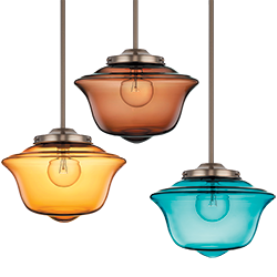
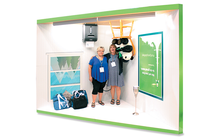 BambooHR LLC put a twist on the traditional photo op that had passersby doing double takes before queuing up to take part. One corner of the exhibit featured a freestanding triangular structure with a ceiling, floor, and two side walls. Designers outfitted the space to look like a simple room, complete with a window looking out onto a mountain scene, a pendant light fixture, a paper shredder, and, naturally, a plush toy panda sitting on a chair and holding a bamboo shoot. The interest-piquing twist was that the entire scene was upside down, with the panda/chair combo suspended from the ceiling and the light fixture standing straight up from the floor. Staffers snapped photos with attendees' own smartphones and afterward encouraged participants to post the pics on social media, tag the company, and include the hashtag #setpeoplefree. Reps then printed the hashtagged photos, allowing attendees to leave with permanent reminders of their flipped- out photo ops. 
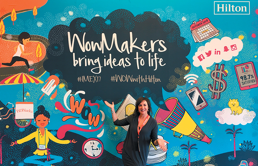 Effective graphics turn heads and slow feet. The most effective, however, actually stop passersby and start conversations. That's just what Hilton Worldwide Holdings Inc. managed to do with its graphics at IMEX America. Inspired by Kon Wee and Jay Crum's urban artwork in and around Memphis, TN, Hilton commissioned the artistic duo to create whimsical and colorful murals for its booth's walls to celebrate the "WowMakers," a moniker the company uses for those event planners who juggle innumerable daily tasks. The brand-colored artwork was mesmerizing enough to pause traffic, but the delightful details – a calendar showing next year's IMEX dates, a cup of coffee representing the lifeblood of event planners, the ever-present trade show lanyard – stopped feet and kickstarted conversations. The original designs, which playfully captured the complications of planners' jobs, drew attention while communicating Hilton's respect for its clients.
|
|
|
||||||||||||||||||||||||||||
|
|
||||||||||||||||||||||||||||
|
TOPICS Measurement & Budgeting Planning & Execution Marketing & Promotion Events & Venues Personal & Career Exhibits & Experiences International Exhibiting Resources for Rookies Research & Resources |
MAGAZINE Subscribe Today! Renew Subscription Update Address Digital Downloads Newsletters Advertise |
FIND IT Exhibit & Display Producers Products & Services All Companies Get Listed |
EXHIBITORLIVE Sessions Certification Exhibit Hall Exhibit at the Show Registration |
ETRAK Sessions Certification F.A.Q. Registration |
EDUCATION WEEK Overview Sessions Hotel Registration |
CERTIFICATION The Program Steps to Certification Faculty and Staff Enroll in CTSM Submit Quiz Answers My CTSM |
AWARDS Sizzle Awards Exhibit Design Awards Portable/Modular Awards Corporate Event Awards Centers of Excellence |
NEWS Associations/Press Awards Company News International New Products People Shows & Events Venues & Destinations EXHIBITOR News |
||||||||||||||||||||
|
||||||||||||||||||||||||||||


