

|
graphics
Successful Signage
Exhibit graphics can be powerful tools in the fight for showgoers' attention, especially given recent advancements in projection mapping, digital signage, and holographic technology. But these newfangled options aren't cheap, putting them out of reach for marketers with small booths and even smaller budgets. While a banner stand may seem boring next to a kinetic video wall, flatscreens don't grow on trees – but creativity comes free. With that in mind, here are 11 examples of exhibitors who made the most out of substrates as basic as Sintra, vinyl, and tension fabric. By Travis Stanton
 Back-wall graphics should both command attention and give passersby a good idea of what your company has to offer. AudioPressBox (a division of MediaTech Central Europe a.s.) checked both of these boxes at Integrated Systems Europe. A simple image depicted a run-of-the-mill press conference with five different microphones aimed at the presenter. But red X's atop all but the central mic clued in ISE attendees to the fact that AudioPressBox's audio distribution amplifiers negate the need for multiple microphones, streamlining press-conference setups and increasing efficiency. Takeaway: Seek to tell your product's story without a single word. Doing so not only helps you to convey your company's offerings, but also enables attendees who aren't fluent in English to more easily understand what you're trying to say. 
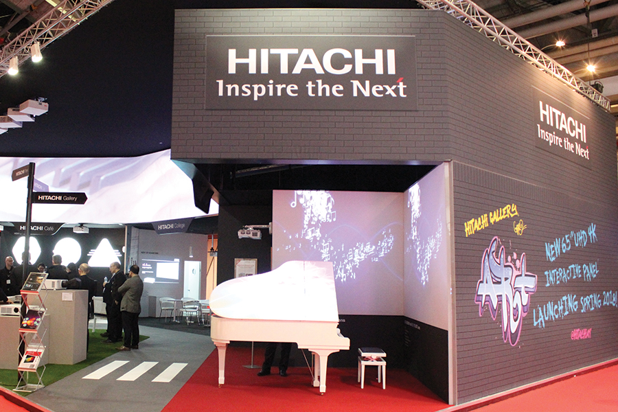 Most corporate exhibits have about as much personality as dry toast. That's one reason Hitachi Europe Ltd. decided to add a little edge to its exhibit by eschewing generic graphics and covering the back and side walls of its booth with tension fabric printed to look like a black brick wall. Text introducing the company's 3LCD Laser Ultra Short Throw Projector and other new models appeared to have been spray-painted onto the wall by graffiti artists alongside words such as "art" and "music" rendered in the same street-art style. The bright colors, dynamic fonts, and urban aesthetic attracted attendees to the Hitachi stand and helped the company differentiate itself amid the vast sea of comparably pressed-suit-like spaces. Takeaway: Consider fonts outside your established corporate style. Sure, Helvetica and Times New Roman are easy to read, but typography that's a little more dynamic and attention-getting might stand a better chance of actually being read.
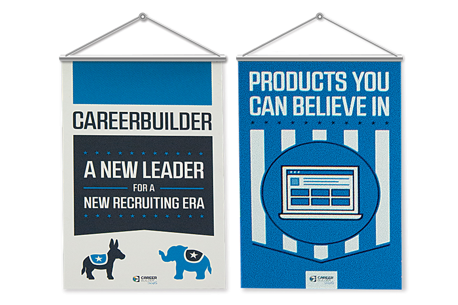 To coincide with an election occurring within a few months of the Society for Human Resource Management show, CareerBuilder LLC created election-themed graphics that resembled campaign posters. Pithy slogans such as "Everyone has potential candidates. We have candidates with potential" and "A new leader for a new recruitment era" helped position the firm as a solid front-runner on the trade show floor. After scanning attendees' badges, staffers invited them to have their pictures taken, choose a human-resource-related slogan ("The right choice for recruitment," "Putting the human in human resources," "This is the face of great recruiting," or "The future of HR starts here"), and wait while another staffer created customized campaign-themed buttons bearing their likenesses and selected sayings. Takeaway: Capitalize on pop culture or current events. Using such elements as a springboard for your booth's theme and messaging can help your exhibit instantly appear more relevant.
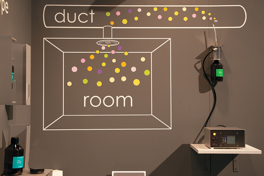 Sometimes the simplest solution is also the smartest one. At HX: The Hotel Experience, At-Aroma GmbH wanted to communicate how its customized scent-diffusing system works. But rather than verbally explaining the concept or devising a looping video to demonstrate it, At-Aroma created a back-wall display comprising little more than the product and some vinyl graphics. The diffuser system was mounted to the wall with the nozzle from its scent bottle positioned over graphics representing a room's ceiling-enclosed ductwork. Colorful dots suggesting the aroma seemed to waft up from the bottle, through a line drawing representing an air duct, and past a ceiling-mounted vent into a room below. The simple strategy piqued attendees' interest and communicated the product's intended purpose in a single glance. Takeaway: Consider an infographic approach to your in-booth imagery, and use your back wall to visually diagram how your product or service works.
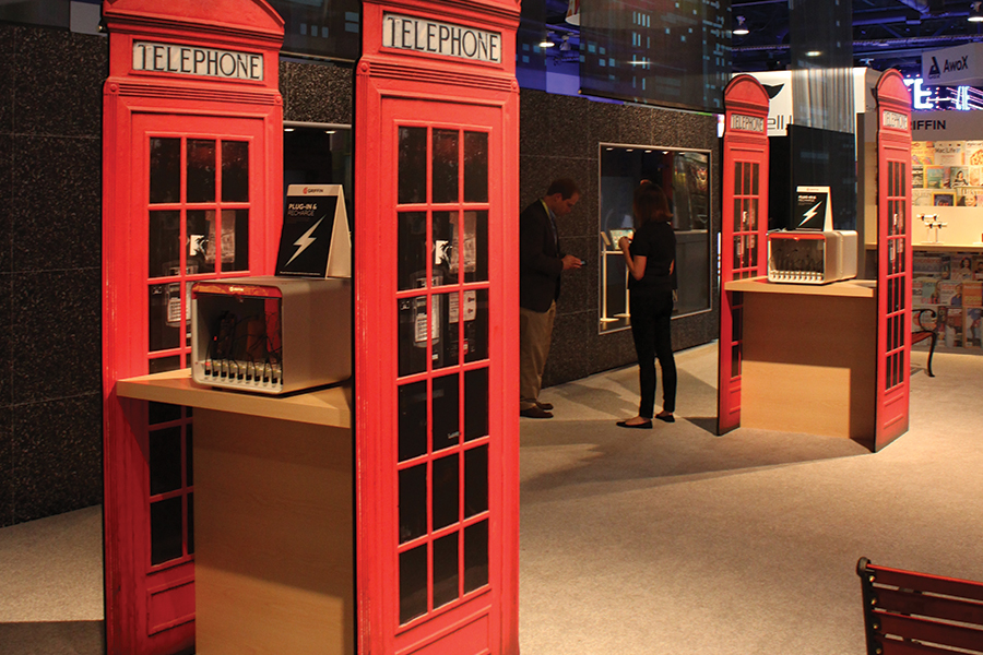 Griffin Technology, which manufactures and sells a barrage of different cases for smartphones and mobile devices, constructed an unusual and arguably outdated icon inside its exhibit at the International Consumer Electronics Show. A series of bright-red British phone booths lined the back of Griffin's space, attracting attention from droves of curious passersby. While the booths themselves, which actually comprised two flat graphic panels attached to opposite ends of waist-high tables, reinforced the company's phone-related wares, they also housed double-sided charging stations, allowing up to 20 different users to "plug in and recharge" their devices at a time. Takeaway: Fabricate 3-D structures with 2-D graphic panels and use that space to stage in-booth engagements, host small lounges, or even offer makeshift meeting rooms.
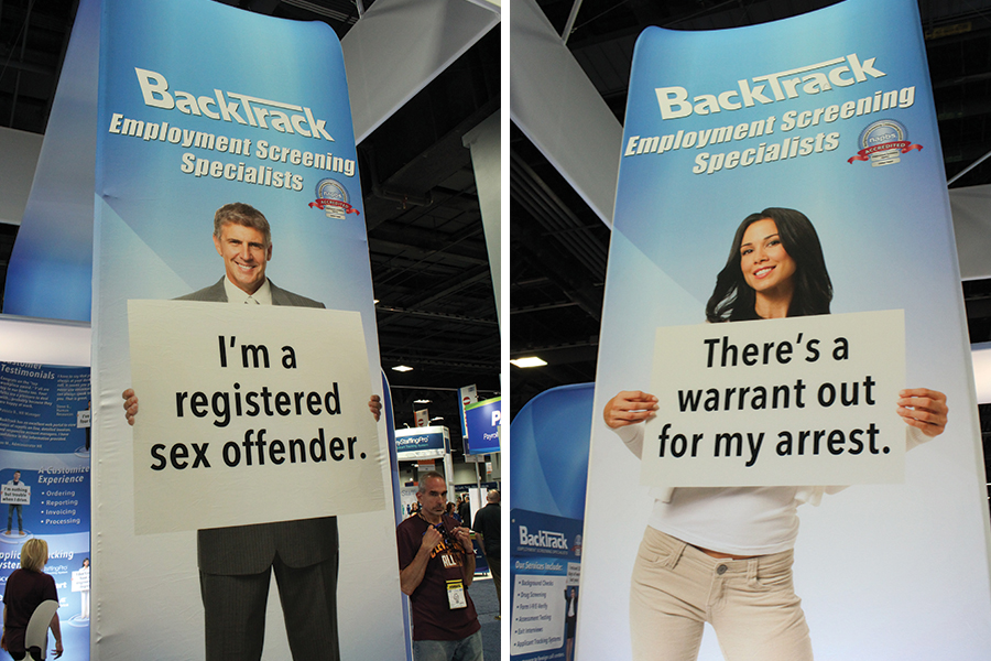 BackTrack Inc., which provides background checks and employment screening services, used its graphics to stop traffic and reinforce the need for its offerings. Large backlit panels bookending the company's island exhibit featured stock images of what appeared to be smiling, ordinary people. Each individual held his or her own sign bearing a surprising admission such as "I'm a registered sex offender" and "There's a warrant out for my arrest." The juxtaposition of troublesome messages with the individuals' wholesome appearances underscored the fact that you can't judge a book by its cover. Takeaway: Use unexpected text or images to pique curiosity and add personality to your company's exhibit.
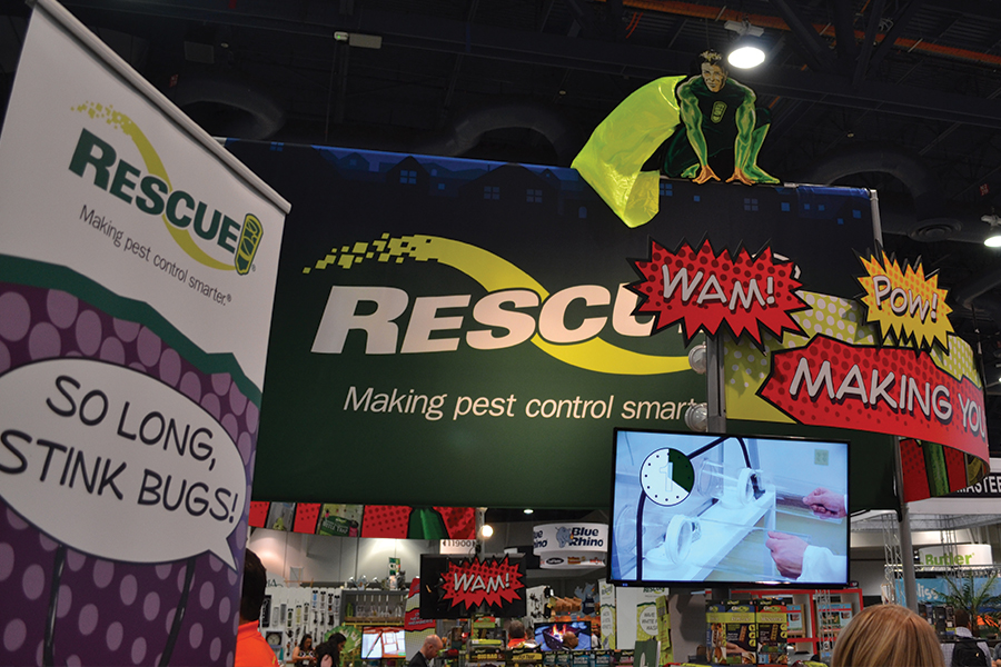 Defeating backyard bugs is tricky business. So to show hardware store owners how its products are capable of turning their customers into outdoor-entertaining superheroes, Sterling International Inc., the maker of Rescue insect traps, employed a series of creative comic-themed graphics in its exhibit at the National Hardware Show in Las Vegas. A dozen banner stands sprinkled around the booth echoed that theme and bore witty sayings such as "Biting flies, be gone!" and "Buzz off, beetles!" Takeaway: Trade shows are serious business, but your graphics don't have to be. A whimsical, stylized approach will no doubt stand out among the show's more demure displays.
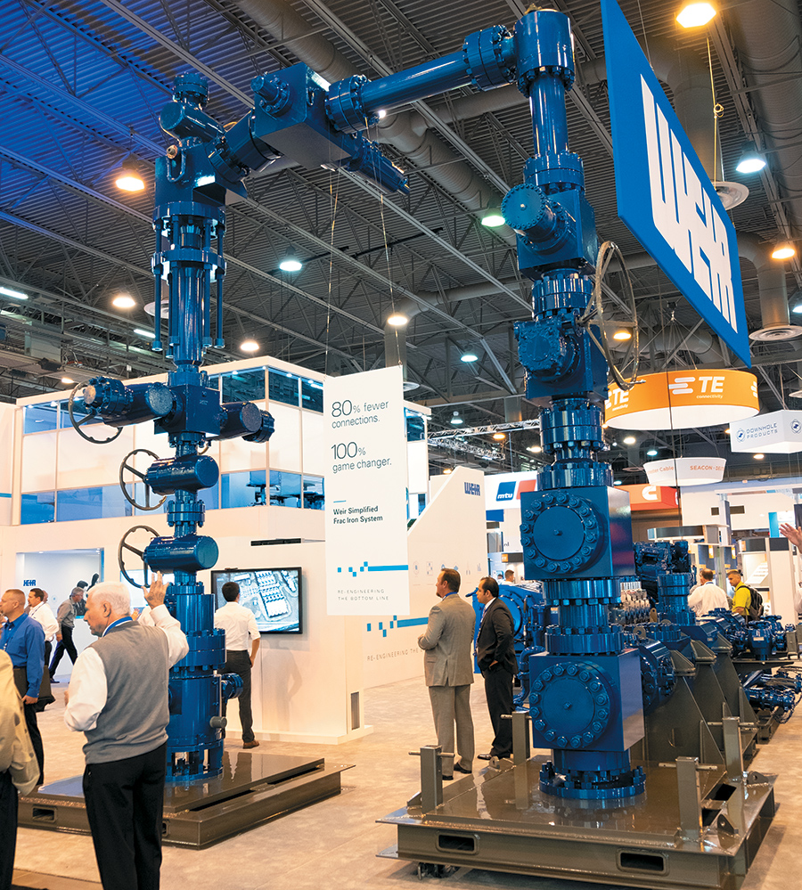 When you're a massive provider of product engineering for the oil, gas, and power industries, it's easy to be a little full of yourself – a situation that usually equates to an exhibit filled with products and text-heavy graphics that do more to toot your own horn than to address attendees' pain points. At the Offshore Technology Conference, however, The Weir Group PLC sidestepped this big-player blunder with a corporate-blue arch comprising various oil-industry pipes and valves. Then, from the center of the arch, it draped a simple white poster board that bore a highly succinct but utterly communicative message: "80% fewer connections. 100% game changer." The self-restrained tactic lured in curious attendees and conveyed the core benefit of Weir's system. Takeaway: When in doubt, keep it simple. Limit signage to a single piece of information or benefit statement tailored to address attendees' "What's in it for me?" internal query. Your newly streamlined signage will help express that key message without it being muddied up by other marketing copy.
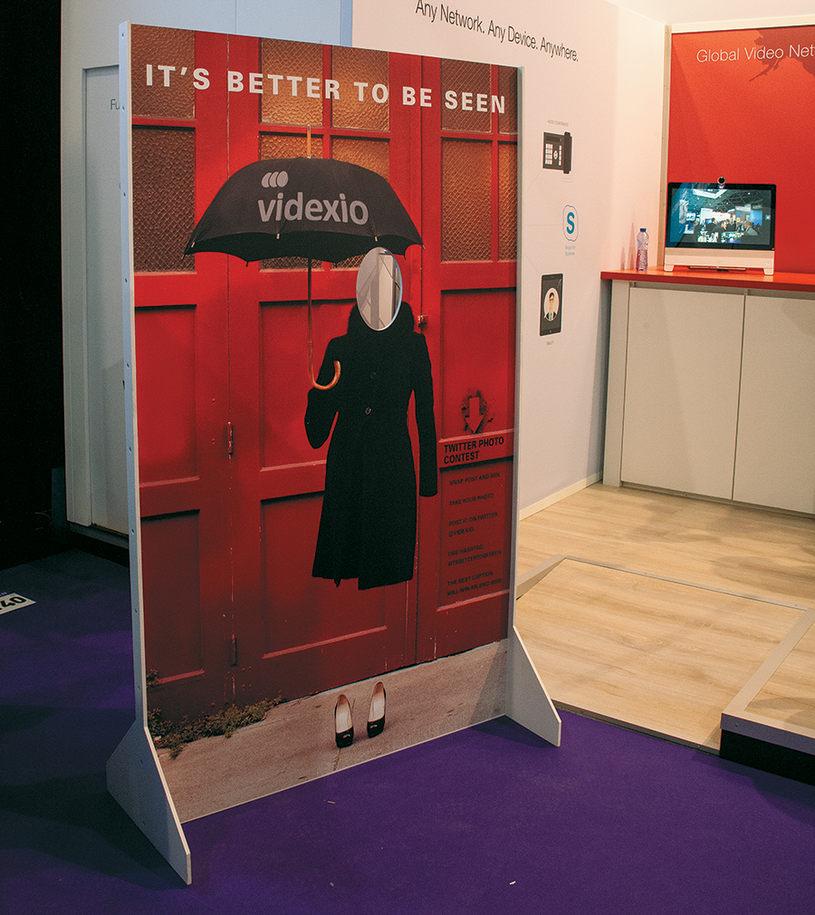 Videxio AS wanted to generate on- and off-floor awareness for its video-conferencing products and services, so it deployed a memorable social-media tactic to tempt attendees to spread the word. Videxio crafted a roughly 3-by-7-foot freestanding graphic panel featuring an image of what appeared to be an invisible woman wearing heels and a trench coat while standing under text reading "It's better to be seen." A cutout meant for attendees' heads to peek through appeared atop the "body," and nearby verbiage instructed attendees to pose for a pic, caption the image, and tweet it with the hashtag #ItsBetterToBeSeen. The best caption as judged by Videxio's marketing personnel won an iPad Mini. Takeaway: Turn simple substrates into engaging photo ops that capitalize on today's selfie culture and encourage social-media sharing.
 When you're selling a line of high-tech skivvies that claim to protect wearers' "family jewels" from the radiation emanating from cellphones and Wi-Fi, a sense of humor is absolutely essential. To convey its lighthearted ethos – and elicit double takes from passing attendees – men's underwear brand Spartan choose an unusual word cloud for its back-wall graphic. The 10-foot-wide panel listed dozens of pseudonyms and slang terms for a certain part of the male anatomy printed in black letters against a white background. The tongue-in-cheek touch caught the attention of passersby, many of whom grinned, blushed, and/or chuckled before stopping to learn more about how the antibacterial silver fibers in Spartan's unmentionable offerings block 99 percent of wireless radiation. While the strategy might prove too risqué for some exhibitors, Spartan had both the proper product and the gooseberries to pull it off. Takeaway: Don't be afraid to push the envelope a bit. Humor can be a great way to break the ice and establish a more laid-back rapport with booth visitors. Just be prepared to handle any attendees who may be put off by your borderline-bawdy tone.
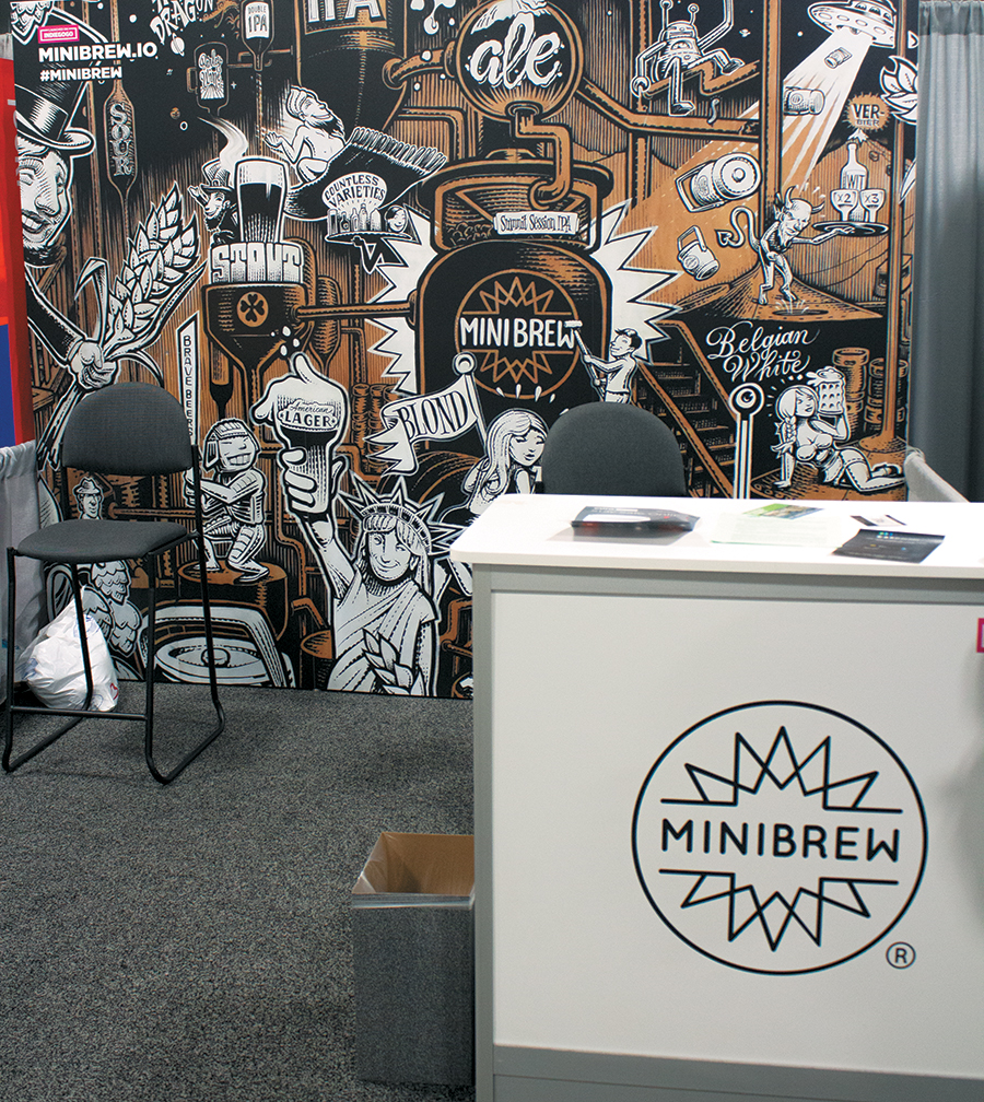 Sometimes all it takes to stand out on a busy trade show floor is a strong graphic that speaks to your target audience. MiniBrew BV, which helps clients brew their own craft beer, made a statement at the International Consumer Electronics Show with a bare-bones booth featuring little more than a reception desk and an impactful back-wall graphic. The mural, created by The Amsterdam Signpainters and dubbed "The Map of Beer," was originally commissioned for use on the company's traveling beer trailer. So to imbue the 10-by-10-foot booth with a taste of its corporate culture, the company repurposed the pen-and-ink, cartoon-style artwork. Takeaway: Have a dynamic website or ad campaign? Rather than reinvent the wheel, reuse existing imagery to save a little on creative costs and keep your booth tightly aligned with your company's visual identity and other marketing efforts.
|
|


|
||||||||||||||||||||||||||||
|
|
||||||||||||||||||||||||||||
|
TOPICS Measurement & Budgeting Planning & Execution Marketing & Promotion Events & Venues Personal & Career Exhibits & Experiences International Exhibiting Resources for Rookies Research & Resources |
MAGAZINE Subscribe Today! Renew Subscription Update Address Digital Downloads Newsletters Advertise |
FIND-IT Exhibit & Display Producers Products & Services Supplier to Supplier All Companies Compare Get Listed |
EXHIBITORLIVE Sessions Certification Exhibit Hall Exhibit at the Show Registration |
ETRAK Sessions Certification F.A.Q. Registration |
EDUCATION WEEK Overview Sessions Hotel Registration |
CERTIFICATION The Program Steps to Certification Faculty and Staff Enroll in CTSM Submit Quiz Answers My CTSM |
AWARDS Sizzle Awards Exhibit Design Awards Portable/Modular Awards Corporate Event Awards Centers of Excellence |
NEWS Associations/Press Awards Company News International New Products People Shows & Events Venues & Destinations EXHIBITOR News |
||||||||||||||||||||
|
||||||||||||||||||||||||||||