exhibit design |
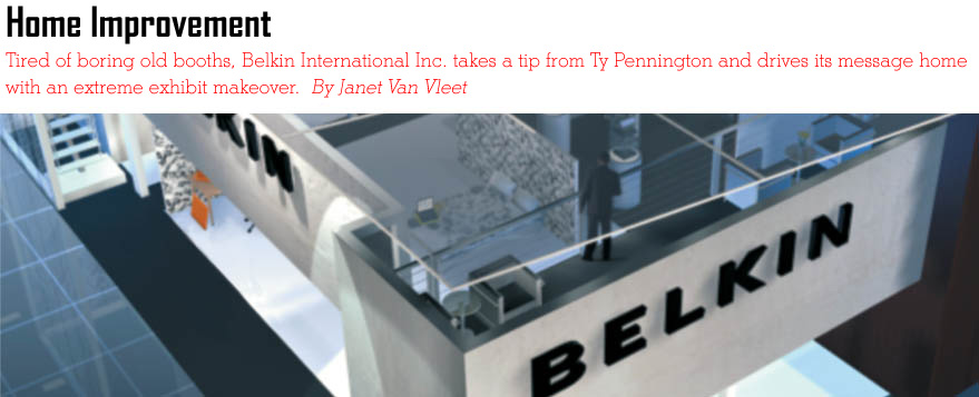 |
 he International Consumer Electronics Show abounds with flashing lights, giant screens, and high-tech talk. But when Belkin International Inc. decided to scrap its old booth and start over from scratch, it took a 180-degree turn from the CES norm. he International Consumer Electronics Show abounds with flashing lights, giant screens, and high-tech talk. But when Belkin International Inc. decided to scrap its old booth and start over from scratch, it took a 180-degree turn from the CES norm.
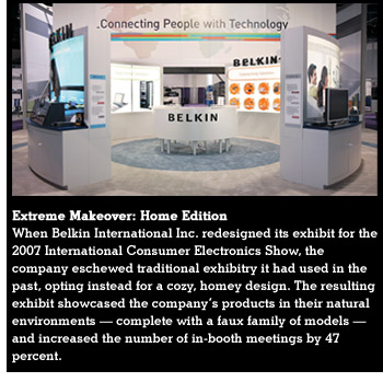 Belkin, which makes connectivity solutions such as cables for computers, hands-free phone headsets, and iPod accessories, has exhibited at CES for more than 15 years. Though the company typically used large photographs and displayed plenty of products, its past booths teetered on the edge of ordinary.
Cindy Anderson, senior marketing and communications manager, says not much thought or strategy had gone into previous booths, other than selecting which products to display. Because most of Belkin's offerings are used with other companies' products - its n52te Speed Pad, for example, is used with computer games - it wasn't always easy to tell what the booth was promoting. Consequently, the Belkin products faded into the background. "You looked at a desk full of stuff, but you couldn't tell what was Belkin's," Anderson says. "In past years, we didn't carry through the idea of how our products work in the home thoroughly or completely enough. We would throw a desk in this corner and a home theater in that corner, but they felt forced and out of context."
The 2006 booth, for example, featured lots of bright-white outside walls with large photographs of models and products, but the models weren't using the products. It looked generic, with nothing shouting "Belkin" except the company name emblazoned on the wall. Inside the booth, many of Belkin's offerings were encased in hard plastic bubbles, making them completely inaccessible. As a result, Belkin didn't give attendees a memorable impression of the brand - or much of a reason to visit its booth, since they could only look at the products, but couldn't give them a hands-on test run.
But for the 2007 CES show, Belkin wanted to not only make the products accessible, but to show attendees exactly how the products integrate with other companies' offerings, and more importantly, how they're used in a real-life setting.
Furthermore, Belkin wanted to increase in-booth meetings with its established large retail partners, while attracting an increased number of attendees to its exhibit. Previously, meetings with the company's large retailers took place off site, usually at hotels. This meant the retailers rarely visited the booth at the show, a practice Belkin wanted to abolish. After all, one purpose of investing in an attractive exhibit design is to appeal to customers, on the show floor. If some of the company's biggest retailers never see it, what's the point?
In an optimistic attempt to solve all its problems in one fell swoop, Belkin decided to scrap its old exhibit and design a new space that showed its products being used in the home, contained conference rooms for its retailer meetings, and appealed to women (research conducted by the Consumer Electronics Association indicated women make at least 60 percent of electronic purchases), all the while standing out from the CES crowd.
|
|
|
Interior Exhibit Design
"At a technical trade show, the environment is much more sterile, with all the big screens and lights," says Teresa Tong, Belkin's trade show and events manager. "What we wanted to provide for the attendees was a different feeling, a coziness."
The five-member Belkin trade show team began bouncing ideas off each other for the exhibit's redesign. If a main objective was to show Belkin products in use at home, why not do exactly that and turn the exhibit into a home? The creative team also hoped a home concept would speak specifically to the women in the crowd.
"Belkin wanted the booth to make a lifestyle statement, not just be another product display," says Margo Chase, of Chase Design Group, the company that designed Belkin's CES exhibit. So Chase set out to craft a two-story 55-by-60-foot home-inspired booth to address the company's objectives.
Because Belkin wanted the exhibit to convey the forward-thinking attitude of the company, Chase researched cutting-edge interior-design trends in an effort to incorporate uber-modern elements into the exhibit.
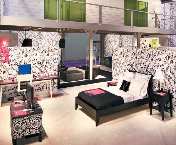
On the first floor, she created a cozy, comfortable house area, complete with a bedroom, dining room, living room, music room/den, garage, and more, each furnished with all the comforts of home such as crisp linens and working exercise equipment. According to Tong, the hominess of the space appealed to the female attendees, as it provided a unique oasis amid other exhibits' flashing lights and giant plasma screens.
For the second floor of the exhibit, Chase designed private rooms to hold all meetings with Belkin's retailers and prospects - no more off-site appointments. Adjacent to the conference space, a lush lounge with high-tech hook-ups offered a downtime respite for VIPs.
But a house is not a home without appropriate décor. Chase's research showed the interior-design industry forecasting the use of black and white in home design, giving her a color scheme for the in-booth abode.
The black-and-white color palette bloomed into a series of custom-made wallpapers with repeated patterns of natural images, creating an unusual, nature-evoking backdrop. Repeated silhouettes of bare trees, leaves, and birds became a pattern that caught the eye and provided a lacy, airy feel.
To keep the space from looking stark or monochromatic, Chase infused bright colors into the design in a deliberate and calculated manner. Vivid orange, green, pink, and blue laminated-vinyl pads, chosen to match the colors of Belkin's products, were scattered about the exhibit and placed under different Belkin products, not only lending splashes of color to the design, but also drawing attention to the products themselves.
"By using the neutral background of black and white, the color spots under our products really stood out and visually identified Belkin's products," Anderson says, solving previous exhibits' problem of Belkin's products fading into the background.
|
|
|
Home Sweet Home
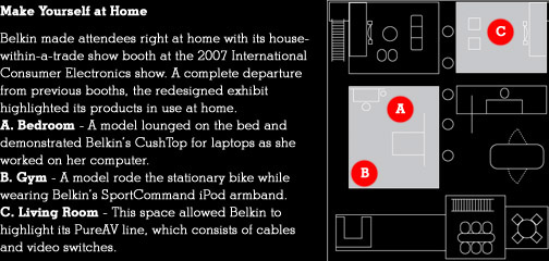
Belkin used a black-and-white color scheme in its booth, from the wallpaper to the Mini Cooper parked in the garage. Bright splashes of color were used throughout the exhibit to highlight Belkin products.
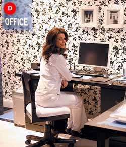
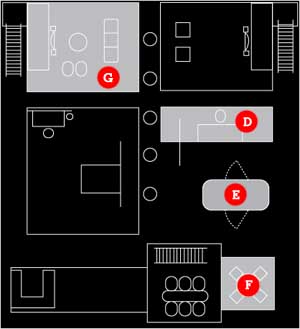
D. Office - The exhibit showed off a wealth of Belkin products in use, such as wireless USB and its N1 router.
E. Garage - A model sat in the Mini and listened to music on an iPod via Belkin's FM transmitters.
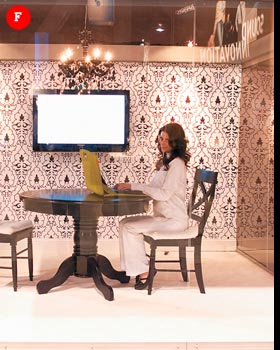
F. Dining Room - The models took turns in this glass-enclosed room and worked on a laptop and a variety of Belkin products.
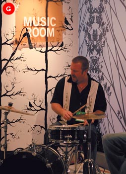
G. Music Room/Den - Musicians rocked out as technicians used Belkin's TuneStudio mixer/recorder.
|
Model Behavior
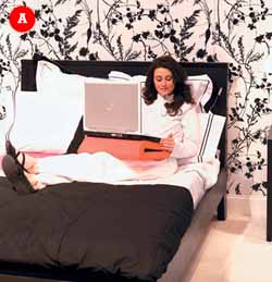
Each room of Belkin's booth/house hybrid contained different Belkin products that would logically be used in that part of the house. For example, the music room featured a TuneStudio, the bedroom showcased Belkin's CushTop laptop support, and the garage space displayed an iPod FM transmitter.
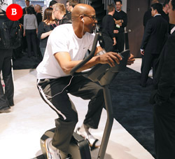
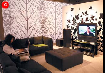
To further demonstrate the products and their applications within an actual home, Belkin decided against traditional product demonstrations in favor of something that more accurately reflected reality. So, the company hired models to act as the exhibit's in-booth family. The models moved throughout the exhibit as if it truly were their home, working out in the home gym, watching television in the living room, and checking e-mails on a laptop in the dining room. They happily answered questions from visitors and even invited attendees to try out the products themselves, but never broke character otherwise.
The innovative approach flavored the entire exhibit with an intriguing sense of authenticity, as attendees could see Belkin's products being used by real people in real applications inside a "real" house.
Women at the show felt the exhibit was particularly warm and welcoming, says Melody Chalaban, Belkin's public relations manager. One woman, who had worked at exhibit houses for years, called it "absolutely gorgeous" and said she'd never seen anything like it.
Real-Life Results
Seeing was believing when it came to Belkin's revamped conference rooms and on-site meeting policy, a combination so successful that in-booth meetings jumped 47 percent over the previous year. Plus, a number of existing and prospective clients returned time and again, often bringing other representatives of their companies to see the sleek Belkin booth, Anderson says.
"It was really overwhelming how many more of our retail partners came to see the exhibit," Anderson says. "One major mass retailer was there four times with different people. That doesn't happen very often. Word of mouth just traveled, and they all wanted to see the booth."
The buzz about the unusual exhibit spread through the show, nearly doubling the number of booth visitors compared to the previous year. With positive feedback and corporate objectives accomplished, Belkin's extreme makeover proved to be a home-sweet-home run. e
|
|
|
|
|


 he International Consumer Electronics Show abounds with flashing lights, giant screens, and high-tech talk. But when Belkin International Inc. decided to scrap its old booth and start over from scratch, it took a 180-degree turn from the CES norm.
 Belkin, which makes connectivity solutions such as cables for computers, hands-free phone headsets, and iPod accessories, has exhibited at CES for more than 15 years. Though the company typically used large photographs and displayed plenty of products, its past booths teetered on the edge of ordinary.