xhibit managers are the ultimate jacks-of-all-trades. They need a commanding knowledge of marketing, sales, and promotions, and they also need to master the basic knowledge and terminology involved in multiple logistics areas, including transportation, audiovisual, and electrical, to name a few.
Among this growing list of "trades to master," graphics producer/designer often tops the list of exhibitor's least-favorite hats. And it's no wonder, as graphics production not only involves endless variables, including everything from dots-per-inch sizes to file types (JPG, TIF, and EPS, oh my), but each exhibit house or graphics producer does things a little bit differently. So when it comes to graphics production, some jacks-of-all-trades struggle to master the intricacies, and others well, they simply don't know jack.
Granted, to fully explain all the technical aspects of graphics design and production, it would take a book - or maybe even a college course. And who has the time or the mental storage capacity for all of that when you've got 14 other hats to wear before lunch? However, a bit of basic, easy-to-digest information about some of the most common color and image-clarity issues is all you need to seize control of your entire graphics-production process.
Here are several guidelines to help you hold competent conversations with your suppliers, whiz through some of the trickiest parts of the process, and add "graphics-production artist" to your hat rack.
Suppliers
Before you start production, make sure your graphics designers, whether in-house or external, are fully capable of producing what you need.
To test their capabilities, ask to see samples of what they have done in the past, from the concept stage all the way to the end product. Are the projects high quality? Are the image resolutions appropriate? Have the designers created graphics similar in size, materials, and difficulty to your project? Also check the colors of the end products to see if they match the specifications from the client.
If anything seems "off" in terms of quality, color, or difficulty, shop around. No matter how carefully you monitor your graphics production, it can still go awry if you're working with a designer or producer with insufficient experience.
 Dots Per Inch Dots Per Inch
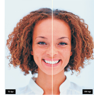
With talented designers and producers in place, it's time to consider your images. Generally speaking, any photo or graphic you copy from a Web site will be 72 dpi, which is almost never good enough for exhibit graphics. To assure the quality you need, purchase images through a photography-related company or Web site, and make sure your image is a minimum of 100 dpi - 300 dpi is even better - at the final size of the finished product.
Generally speaking, the higher the image's dpi, the better quality your finished product will be. If you have an image that is 300 dpi, for example, it can be blown up to three times its size, making it 100 dpi, before losing quality. The same isn't true of images 72 dpi, for example, which lose resolution and quality when enlarged at all.
Final printed images that will be viewed within 10 feet also look better at 300 dpi, because at a lower dpi, you may actually be able to see the dot pattern in the image. Consequently, images viewed at a greater distance can be printed at a lower resolution, starting at approximately 100 dpi, because the farther away you are, the more your eye will "blend" the dots, creating a clearer overall image.
Color Fidelity
Color, be it in an image, logo, or background, is tricky, and any one of the many steps involved in the graphics-production process can easily skew your hue. If you've had problems in the past, don't immediately fire your graphics producer or designer. Rather, try to discover why the problems occurred and rectify the situation in the future.
Start by analyzing the color fidelity
of your past graphics. Compare the color of your company logo, for example, against the published samples. For those that don't match up, ask your designer to retrace the process to determine where things went wrong and how to avoid such missteps in the future.
Whether you're retracing a problematic process, or even if you've never had a color problem in the past, investigate the following typical problem spots to maintain your graphics' color consistency.
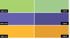
 PMS vs. CMYK. Many logos or graphics are developed with Pantone Matching System (PMS) colors, and traditional ink printers use the exact PMS color ink to print the color. Digital printers, however, use a four-color (CMYK) printing process, using cyan, magenta, yellow, and black ink to mix a color closest to the PMS color. Thus, graphics files produced with digital printers often must be color-corrected to get the closest PMS color match - a time-consuming, tedious process that can go bad in a hurry. PMS vs. CMYK. Many logos or graphics are developed with Pantone Matching System (PMS) colors, and traditional ink printers use the exact PMS color ink to print the color. Digital printers, however, use a four-color (CMYK) printing process, using cyan, magenta, yellow, and black ink to mix a color closest to the PMS color. Thus, graphics files produced with digital printers often must be color-corrected to get the closest PMS color match - a time-consuming, tedious process that can go bad in a hurry.
Multiple Digital Printers. Different digital printers print colors differently - which means you may end up with inconsistent colors if you use different printers for different jobs. If a printed proof is provided, however, the digital printer can be calibrated to match the printed colors.
Finishes. The finish of a printed graphic can also alter the final color. Printing on coated (glossy) or uncoated (matte) materials can make a color look bright or dull, respectively. Supplying a printed, finished proof enables the graphic artist to consider the finish when calibrating the printer for your graphics.
Formats and File Types
With your images and colors under control, your next step is to consider your file format and type. The most generally acceptable software file formats for both PCs and Macs are Adobe products (including Illustrator, InDesign, and Photoshop), Corel Draw, Macromedia Freehand, and Quark Xpress. Files should always be saved in their native, or original, format so they can easily be edited for color correction. If your files are transferred into another format, it's difficult to adjust individual elements of the file without sacrificing quality.
 With the various software file formats mentioned above, you can save your artwork in compatible file types, which are used across the board in the graphics industry. Since they are primarily created from Adobe products, the most acceptable - and most common - file types are EPS and AI, especially when working with logos or line art. With the various software file formats mentioned above, you can save your artwork in compatible file types, which are used across the board in the graphics industry. Since they are primarily created from Adobe products, the most acceptable - and most common - file types are EPS and AI, especially when working with logos or line art.
TIF files are large, uncompressed files that provide excellent quality, while JPGs are compressed files with smaller file sizes. TIF files are typically
your best option for photos, and JPGs work fine for photos as well, but only if the resolution is high enough - roughly 100 to 300 dpi - for acceptable quality.
File types that make it difficult or impossible to produce graphics are Word (.doc), and PowerPoint (.ppt). Self-extracting files, such as EXE or SEA, can often become corrupt and are also not advisable.
So when you're selecting or purchasing artwork, make sure both your file formats and file types match your graphics-producer's software formats as well as the end product you intend to produce.
Whatever the file format or type, your image provider will also need to submit several additional pieces of information such as color codes, including CMYK and/or PMS codes, along with an accurate, printed, color proof of artwork. If you are submitting a vector-type file, include all fonts or convert fonts to outlines or paths. And of course, submit the name, phone number, and e-mail address of your company contact or art creator so the producer can contact him or her to answer any additional questions.
Submitting Art
Finally, you also need to select the proper vehicle for submitting files to your graphics producer. Normally files of acceptable quality are too large to submit by e-mail. Your best vehicles, then, are CDs or DVDs. Of course, always include a printed proof with digital files to allow for proper color printing.
Floppy disks and zip disks are not usually a good option, as floppies lack enough memory to hold a suitable graphics file, and zip disks are outdated to the point that few people use them any more.
 Also, if your graphics producer has an FTP site - an Internet-based "holding tank" used to transfer large files - you may be able to post your artwork there so graphic artists can download it directly. Also, if your graphics producer has an FTP site - an Internet-based "holding tank" used to transfer large files - you may be able to post your artwork there so graphic artists can download it directly.
Attention to these details on the front end of your graphics process will help assure that your graphics are truly compelling, that they maintain your brand's integrity, and that you're fully confident wearing your new graphics-production artist hat. e
|