| INTEGRATED PROGRAM |
Exhibitor: Deckel & Moneypenny Exhibits
Creative/Production: Deckel & Moneypenny Exhibits, Louisville, KY, 888-501-7469, www.deckelmoneypenny.com
Show: EXHIBITOR2014
Budget Range: $10,000 – $24,000
Goals:
 Create 82,800 brand impressions. Create 82,800 brand impressions.
 Engage with 190 attendees. Engage with 190 attendees.
 Identify 20 qualified leads. Identify 20 qualified leads.
Results:
 Achieved 134,003 brand impressions. Achieved 134,003 brand impressions.
 Generated 291 attendee engagements. Generated 291 attendee engagements.
 Netted 132 qualified leads. Netted 132 qualified leads. |

t trade shows, there's an expectation among some attendees that giveaways are handed out indiscriminately. Called many names – trick-or-treaters, tire-kickers, freeloaders, etc. – these attendees roam the aisles, looking for tchotchkes and the like. And most exhibitors happily oblige. After all, handing out premiums is a great way to break the ice and engage potential prospects in top-level conversations about their needs, assuming they stick around long enough to chat. But what if you want more meaningful results than a freebie free-for-all can generate? Well, if you're Deckel & Moneypenny Exhibits, you get stingy with the goods – baked goods, to be exact.
The exhibit house was making its debut at EXHIBITOR Show in 2014, and although the Louisville, KY-based company has been around for 50 years – and counts divisions of companies such as General Electric Co. and Chevron USA Inc. as its clients – it didn't quite have the brand recognition to go along with its tenure. "To be blunt, we just didn't advertise," says Steve Deckel, the firm's design director. "The company was founded before the Internet, and back then everything was regional. We basically took a map, drew a circle that included Louisville, St. Louis, and Indianapolis, and that's where we focused our marketing efforts."

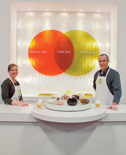
Deckel & Moneypenny Exhibits kept its 10-by-10-foot booth simple to showcase the cupcake-decorating
activity and subsequent attendee engagement.
In fact, prior to 2014, the company had only exhibited twice at industry shows – once in 1984 at the TS² show in Louisville, and again at the same show in 2009 at McCormick Place in Chicago. By then, the housing market had crashed, some of D&M's clients had closed shop, and the U.S. economy had deflated faster than a chocolate soufflé. "When the financial Armageddon hit, we figured it was probably a good idea to start telling people outside the region that we were in business," Deckel says. "We knew that everyone was cutting back, and fewer exhibitors would be at TS² in 2009. So it was a good idea to show up. When I see other people zigging, I have to zag."
Thus, the company devised a "smaller is better" campaign comprising a Shrinky Dinks booth activity and a white, 10-by-10-foot exhibit, all with a budget of $10,000. Staffers engaged attendees that approached the booth, guided them through the Shrinky Dinks creation process, and shared a bit about the company. In addition to a handful of awards it received at the show, the program generated 20 qualified leads – including one from a company that became D&M's second largest client. "I knew after the success of that campaign that we couldn't exhibit again unless we brought our A game," Deckel says. "I didn't want to do another show until we could do it right." It would take five years and one speaker-training session before Deckel felt he had an idea that warranted a return to the show floor.

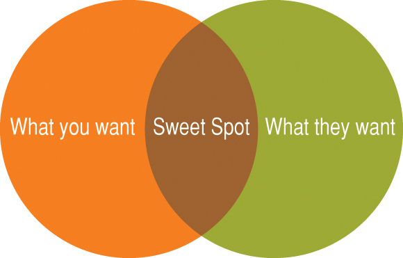
A Venn diagram depicting the sweet spot of exhibiting – the point at which attendees' needs and suppliers' needs overlap — served as the campaign's creative inspiration.
Sweet Inspiration
In the months before EXHIBITOR2014, Deckel and his team had thrown half-baked ideas around, but nothing stuck. "I figured we'd have to wait another year," he says. While D&M didn't have plans to exhibit, it was sending Deckel and Leslie Word, the firm's marketing coordinator, to the show as conference speakers. As such, they had to attend speaker training just six months before the show.
Taught by Dan Lumpkin, an organizational psychologist and president of management-consulting company Lumpkin & Associates, the session challenged speakers to rethink their approach to presenting. "He brought up this concept of the queen of hearts," Deckel says. "He explained that when a magician tells you to 'pick a card, any card,' he is using sleight of hand to get you to pick the card he wants you to pick, while making you believe it's your choice. The same concept can be applied to public speaking – as a presenter, you need to ensure the audience is receiving the message you want, but in a way that affords them an 'ah-ha moment.'"

Paired with an image of a frosted cupcake baked by one of D&M's own employees, text on the ad used in pre-, at-, and post-show marketing read, "We're Sorry... We didn't bring enough for everybody."
With his creative wheels spinning, Deckel thought about the message he wanted to convey in his session on small, successful exhibits. He drew a Venn diagram in his notebook, writing "them" (attendees) in one circle and "you" (exhibitors) in the other. Deckel then labeled the intersection as the "sweet spot." "The Venn diagram illustrates that suppliers have things they want to share with attendees, and attendees have things they want to share with suppliers," he says. "At a trade show, you should only talk about the things that live in the area where those interests – or circles – overlap, no matter who you are." That revelation prompted Deckel to revise his key messages for the session, but more importantly, it sparked an idea for a booth at EXHIBITOR2014.
Back at D&M headquarters, Deckel rallied the troops, excited to share his Venn diagram and exhibit idea centered on the sweet spot concept. Despite having limited experience at exhibit-industry shows, D&M believed that engagement and interaction were keys to success at shows in general, and EXHIBITOR2014 in particular. "We needed a highly engaging activity that would not only draw in attendees, but also exemplify the sweet spot message," Deckel says.
There are few in-booth activities that combine smallness and sweetness, but D&M whipped up a clever one: cupcake decorating. In addition to being a metaphor for the sweet spot in Deckel's Venn diagram, the scent and sight of the cute confections would lure in passersby long enough for staffers to engage them in conversations about D&M, ultimately increasing brand awareness and hopefully netting some qualified leads in the process.

Booth visitors decorated cupcakes with a variety of toppings. In addition to being a tasty treat, the confections served as a metaphor for D&M's sweet spot concept.
Considering his Venn diagram and fine-tuned sweet spot strategy, it's no surprise that Deckel didn't want to cast a wide net and play free and loose with the jimmies and candy toppings. He also didn't want D&M to get lost in the shuffle amid all the well-known exhibitors that would be on the show floor. So to promote the cupcake-decorating activity in a way that would garner attention, D&M came up with a somewhat controversial approach to pre-show marketing content: It got selective – and depending on who you ask, a little snobby.
The "In" Crowd
In the weeks leading up to the show, Deckel's team sifted through creative ideas in an effort to come up with the perfect ad campaign. Inspiration ultimately came from a company that shared D&M's "smaller can be better" design ethos: Volkswagen AG. "I've always liked curiosity-gap headlines, and the best example of that is the iconic Volkswagen lemon ad from 1960," Deckel says. The ad featured a black VW Beetle and the word "Lemon" in the middle of the page. Body copy below the image explained that the pictured vehicle didn't pass inspection due to blemished chrome on the glove compartment. "The headline piques your curiosity and pulls you in to read the rest of the ad, and that's what I wanted to do," he says.
Instead of a German-made car, Deckel used an image of a vanilla cupcake topped with white frosting. The headline above the cupcake read, "We're Sorry," while a small sign sticking out of the petite treat featured the words, "We didn't bring enough for everybody." Additional copy below the cupcake image read, "Everybody? No. Anybody who values a committed partner who helps deliver results." The ad, which would run in industry publications, also had the company's booth number and an invitation to stop by and pick up a cupcake. It didn't, however, include any info about the company's offerings or abilities. Deckel wanted people to visit the booth for that.

Staffers packaged the finished cupcakes in white boxes too large to fit inside show bags. Couldn't-miss stickers featuring the text "They had one for me" were then affixed to the boxes.
The ad was also distributed via email blast to current clients and pre-registered attendees about a week and a half before the show, and it served as the landing page for the campaign's microsite. To further promote D&M's presence and the sweet spot campaign, employees added an invitation to visit the booth to their email signatures and included the microsite URL. "Since our brand recognition was nonexistent among potential EXHIBITOR2014 attendees, we needed to maintain a consistent message across all touchpoints," Deckel says. So the same imagery was repeated as a full-page ad in the show directory, which attendees received inside their show bags.
Whether they liked the ad or not, attendees would certainly see a lot of it prior to setting foot on the show floor and making their way to the booth. D&M could only hope the cupcake activity would be just enough sugar to cancel out the ad's spice.
Let Them Eat Cake
When the show opened at Mandalay Bay in Las Vegas, and attendees arrived at D&M's 10-by-10-foot booth, they encountered a sweet oasis inside a bustling exhibit hall. A funnel-cake aroma wafted from a scent machine, enveloping the sugar-white exhibit while a lime green and persimmon Venn diagram featuring the words "What you want," "What they want," and "Sweet Spot" decorated the back wall. Inset and mounted to a textured panel and illuminated by white lights, the diagram reinforced the sweet spot idea introduced by the pre- and at-show ads. Positioned in front of the back wall, a reception counter featured a tray on top of which frosted cupcakes and bowls of toppings were displayed. Naturally, even the cupcake decorations had a double meaning in this esoteric exhibit. "The toppings represented the real choices and options available to trade show managers," Deckel says. "Try to pile on all the toppings, and like an exhibit cluttered with way too many messages, it becomes a hot mess."

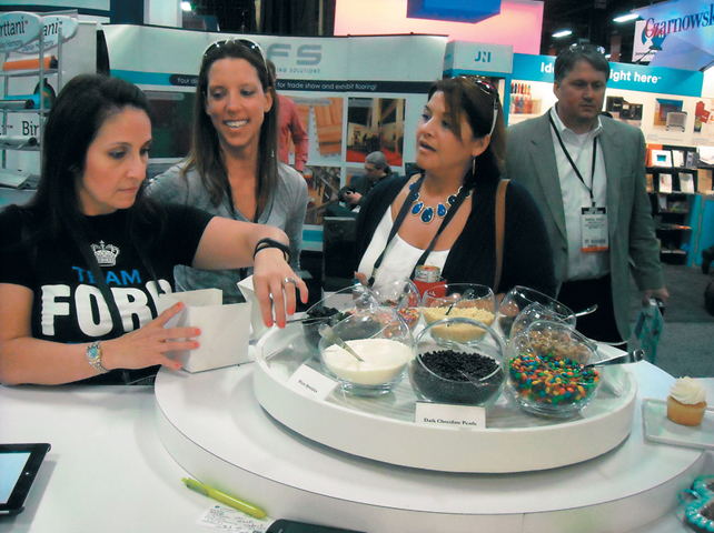
The cupcake-decorating activity facilitated attendee engagements that lasted an average of 10 to 15 minutes.
As attendees decorated their confections, booth staffers chatted with them about their creative needs and answered the inevitable question faced by an exhibitor with zero brand recognition: "What is it you guys do?" But Deckel wasn't complaining – the confusion led to an average engagement time of 10 to 15 minutes, and Sizzle Awards judges took note. "Some exhibitors would have just handed out cupcakes," said one judge. "By creating an experience around them and integrating the visual element into all aspects of the program, D&M created an experience, not just a giveaway."
When attendees had finished getting their cupcakes just right, staffers packaged them in white branded bakery boxes that were too big to be shoved into show bags. Thus, the boxes became awareness builders as attendees carried them in their hands as they roamed the aisles.
"We needed a highly engaging activity that would not only draw
in attendees, but also exemplify the sweet spot message."
In addition to impressions, which topped out at 134,003 by the show's end, the campaign yielded 291 engagements, besting D&M's goal by 53 percent. It also resulted in 132 qualified leads and more than 20 hot prospects, with some planning to issue requests for proposals in the next six months. Plus, the booth won Best New Exhibitor at EXHIBITOR2014.
By zeroing in on a single message (no matter how snarky) and pairing it with an engaging activity, D&M proved that taking a chance can lead to great results – you just need the, ahem, cake balls to pull it off.



 t trade shows, there's an expectation among some attendees that giveaways are handed out indiscriminately. Called many names – trick-or-treaters, tire-kickers, freeloaders, etc. – these attendees roam the aisles, looking for tchotchkes and the like. And most exhibitors happily oblige. After all, handing out premiums is a great way to break the ice and engage potential prospects in top-level conversations about their needs, assuming they stick around long enough to chat. But what if you want more meaningful results than a freebie free-for-all can generate? Well, if you're Deckel & Moneypenny Exhibits, you get stingy with the goods – baked goods, to be exact.