PHOTO: EXPOSURES LTD.

agnification devices, such as microscopes, telescopes, binoculars, and the like, are magical tools. Without them, bacteria would be little more than mysterious gunk, we'd still think stars were tiny orbs of light instead of giant balls of gas, and cruel children would have one less ant-torturing device in their arsenals. What's more, viewing an object — and perhaps the world — from a new perspective is fascinating, and the mere chance to do so causes many of us to pause, peer, and ponder.
That change in perspective, then, is exactly what MG Design Associates Inc. wanted to foster among attendees at EXHIBITOR2014 (now known as EXHIBITORLIVE), an educational conference and exhibition for exhibit and event marketers. Based in Pleasant Prairie, WI, MG Design hoped to alter attendees' perception of the company, tweaking it ever so slightly from that of a traditional exhibit house to more of a full-service engagement-marketing firm. Plus, it wanted attendees to examine their own tactics, and to consider new tools to improve effectiveness — courtesy of MG Design, of course.
So how did the company conjure that change of perspective, and meet various lead- and awareness-related goals, all within the confines of a 20-by-30-foot exhibit? It harnessed the power of the aforementioned magnification devices and developed a spot-on integrated program that not only exceeded lead goals but also forced attendees to stop, stare, and rethink MG Design.
"The fascination they had with the magnifying glasses and their curiosity to discover the items and images displayed under them lured countless visitors to interact with them."
Oversized Obstacles
The company's perspective-bending experience was born of some rather unyielding challenges. In addition to introducing its engagement-marketing group, aptly named Magnify, which provides everything from technology and staff-training solutions to digital content and creative concepts, MG Design also wanted to cut costs, generate media attention, and focus on personal engagement as opposed to high-tech wizardry.
At the previous year's show, the booth had a serious whiz-bang factor, courtesy of an eye-catching projection-mapping experience. But for the 2014 iteration, MG Design felt a lower tech, back-to-basics strategy would better highlight its creative capabilities and foster more intimate conversations. "We wanted to create face-to-face interactions during which booth staffers could help attendees look closely at their exhibit programs and assess ways in which our new offerings could address their needs," says Ben Olson, MG Design's vice president of marketing.
Plus, the company's management had thrown down the budgetary gauntlet. "They challenged us to cut our budget by 50 percent compared to the previous year, as a means to save company cash and to demonstrate that we, too, can stretch a dollar and streamline effectiveness," Olson says. "This way we could show attendees what we could accomplish on a minimal budget and thus what we can do for them if they face a similar situation."
And as if that wasn't enough, MG Design also hoped to increase leads compared to the 2013 show and to cultivate media attention, thereby extending that effectiveness (and the investment) beyond the

MG Design Associates Inc. tweeted and posted photos of mystery items that were hidden within the Magnify Gardens scattered throughout its exhibit. Booth visitors that located the objects received $5 Starbucks gift cards.
show floor. "Generating awareness is always a goal, but this year we wanted the world to know about Magnify, and we needed the press to help spread the word," Olson says.
With that list of objectives, Olson and his team turned a discerning eye upon their program and brainstormed for a unifying concept to not only meet their goals but also attract attendees. Ultimately, they settled on an apropos theme, Experience Magnified, that would use various magnification devices and personal staff interactions to help alter attendees' perspectives. The concept would also incorporate a trio of tenets — See Further, Look Deeper, Think Bigger — as the basis of a three-part experience that MG Design hoped would draw attendees to the exhibit like astronomers to a Lenoid meteor shower.
Magnified Messaging
MG Design launched its Experience Magnified theme with a pair of pre-show emails, various social-media posts, and a theme-specific microsite, which went live roughly six weeks before EXHIBITOR2014, held March 16 – 20 in Las Vegas. Sent to preregistered attendees, clients, and

At the first station, Look Deeper, booth visitors peered through a microscope and tried to identify images of four mystery items. The activity subtly suggested that
attendees look at their own exhibit programs with analytical eyes.
|
prospects, the first e-blast introduced the Experience Magnified concept, encouraged recipients to visit the booth, and offered them a free show-floor pass (for those that hadn't already registered for the event). In addition, the email directed attendees to a microsite (
www.MGDesign.com/EX14) to learn more about the firm and schedule an in-booth meeting.
The microsite, then, introduced the theme, and site-navigation buttons led visitors to individual pages devoted to the tenets Look Deeper, See Further, and Think Bigger. Each page featured a magnification device along with theme-related messages. For example, the Look Deeper section offered an image of a telescope and the text: "Don't drown in detail, revel in it. The clarity to dig deeply into details, analyze data, and demand more are critical to driving your exhibit program and your career forward."
An appointment-scheduling tool and photo portfolio of MG Design's work also appeared on the microsite's home page. Text here explained that the company would be giving away a Brookstone pocket projector (a 4-by-4-inch projector that connects to smartphones, tablets, laptops, etc.) in its exhibit via a drawing. However, those attendees that scheduled an in-booth meeting prior to the show would receive an additional entry.
A second, similarly themed email promoted the drawing while text reiterated the firm's three-pronged message: "Focus is essential. MG Design challenges you to dig deeper into the details and demand more, to see further to meet the experiential challenges of tomorrow today, and to think bigger to drive your exhibit program and your career forward." In addition, various tweets along with Facebook and LinkedIn posts promoted the exhibit, projector drawing, and Experience Magnified theme — and rounded out the pre-show strategy.
Amplified Engagement
Once the show opened, MG Design used these same social-media avenues to post and tweet new mysterious missives each morning. Each post featured a unique photo along with text urging attendees to come to the booth and locate the image in exchange for a $5 Starbucks gift card. For example, on the first day of the show, the company tweeted a photo of NaYoung Kang — the winner of its second annual design competition and the recipient of a scholarship courtesy of MG Design — and instructed attendees to find that photo in the exhibit.
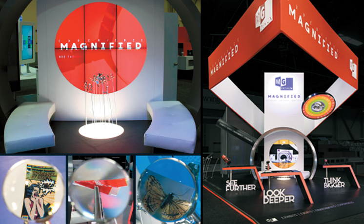
Arriving at the booth, attendees discovered not a high-tech custom exhibit but rather a 600-square-foot rental property clearly organized into three stations. Each one featured a red counter, some sort of magnification device, a built-in monitor displaying an offline version of MG Design's website (which had been wrapped in an Experience Magnified thematic overlay), and a 3-D cutout of the words See Further, Look Deeper, or Think Bigger resting on the floor under the counter.
"In an effort to cut costs, demonstrate our abilities to work within a lean budget, and show off our rental inventory, we used rental components to design what looked like a custom exhibit," Olson says. "It was so well crafted, however, that most attendees didn't immediately discern that it was a rental. So staffers worked this point into their in-booth conversations."
White-leather furniture positioned beneath a silver arch at the back of the space formed a casual conversation area. Here, a 20-foot-tall ID tower acted as a backdrop, and an embedded set of monitors offered a video of MG Design's latest projects. A square red-fabric header bearing the MG Design logo and Experience Magnified tagline clearly branded the space while three Magnify Gardens lured in attendees for a closer look.

Tempting attendees to be more strategic and look beyond the everyday rat race, the See Further station featured a red telescope. When visitors gazed into it, they discovered an animated video of an exhibit manager running on a hamster wheel.
|
Each garden comprised roughly five to 10 small poles sprouting from the floor at various angles. Attached to the top of each 0.25-inch-diameter pole was a magnifying glass positioned in front of a small dimensional object, such as a penny, nugget of fool's gold, or a teeny image. While three of the images were the mystery photos MG Design promoted through social media, other images comprised everything from photos of the firm's work to a miniature typewriter.
"Even if they weren't on a quest for the mystery photos, attendees were nonetheless drawn to the Magnify Gardens," Olson says. "The fascination they had with the magnifying glasses and their curiosity to discover the items and images displayed under them lured countless visitors to interact with them."
After the magnifying glasses hooked attendees in the aisles, staffers quickly reeled them in and rewarded those who'd found the mystery image with a $5 Starbucks card. Next, they directed visitors toward the first of the three stations, Look Deeper. Here, staffers urged attendees to look at four different magnified images and to guess what they were seeing. (The colorful yet mostly unrecognizable images were of a fly, drop of blood, grain of sand, and snowflake.) Staffers then explained that exhibit managers always need to look closely at their programs, and to come at them with fresh, analytical eyes to ensure that each element, from massive structures to tiny details, is effective.
Staffers then moved the conversation to station two, See Further, where designers had attached a large red telescope to the counter. However, they'd rigged the device so that rather than displaying a close-up of the convention-center ceiling, it actually showed attendees an animated video of what appeared to be an exhibit manager running on a hamster wheel. Staffers explained how exhibitors need to get off this wheel and see past the everyday rat race. "In essence, this was a message about how attendees should look beyond mundane exhibit-marketing tasks, and approach their programs with a more strategic outlook," Olson says. "And of course, it was about not only how MG Design could handle some of those mundane tasks, but also how we now had tools to help them think more strategically."
Finally, the conversation shifted to the Think Bigger station, where the Brookstone pocket projector for the drawing was attached to the counter and directed at a round, 60-inch-diameter, tensioned-fabric surface suspended overhead. "The projector wasn't even powered up, but as a sort of eye-catching conversation point, we made it look like this tiny device was showing amazing images on the overhead disk," Olson says. "In reality a projector attached to truss was doing the work."
At the Think Bigger station, then, staffers explained that visitors needed to think bigger and to consider new ways to improve effectiveness. Staffers also launched a presentation that was projected onto the overhead disk. Featuring photos of MG Design's work, the presentation also included stats from the Center for Exhibition Industry Research that supported the need for the aforementioned products and services. For example, one statistic explained that 43 percent of exhibitors are so remiss in fulfilling product-info requests that by the time attendees receive the info, they've already purchased the product from another firm. And of course in this instance, MG Design staff went on to explain that with Magnify's services, follow-up communication always arrives in a timely manner.
"This was a message about how attendees should look beyond mundane exhibit-marketing tasks, and approach their programs with a more strategic outlook."
After attendees visited each station in the booth, staffers offered them a red lanyard pin featuring the MG Design logo and the phrase "I've been magnified." They also scanned attendees' badges for entry into the drawing, and offered them a refreshing beverage and a sweet reward. "Each day of the three-day show we distributed a different type of food and beverage pairing, each one of which was purchased from one of our clients," Olson says.
With booth visitors satiated — and hopefully fascinated — the experience came to a close. And while some attendees moved to the furniture grouping to talk shop with staffers, all attendees left the exhibit with a new perspective of what MG Design offered, and perhaps what might need tweaking in their own programs.

At the Think Bigger station, visitors viewed a stat-filled presentation projected onto overhead scrim that urged them to consider new ways of establishing exhibit effectiveness.
|
Enhanced Outreach
While the booth played host to exhibit- and event-marketing professionals on the trade show floor, MG Design also had a little something special waiting in the pressroom for media representatives. The company's press kit contained the customary accoutrements, including news releases about Magnify and case studies of some of the firm's recent projects.
But a one-sheet handout in the kit also instructed recipients to read through the rest of the documents in search of a special message that would lead them to a unique reward. In essence, text embedded in one of the case studies directed press reps to visit the MG Design exhibit and talk with a staffer to obtain a customized gift.
Twelve of the 15 targeted media representatives did just that. After briefing each member of the press on Magnify's offerings, booth staffers gave him or her a swag bag full of nuts and cookies along with a customized gift, ranging from a spa service to an indoor skydiving experience. "We wanted the press to experience the same sense of discovery that attendees did on the show floor; plus, the press kit forced them to familiarize themselves with our offerings before claiming their reward," Olson says. "It was a great way to educate writers and editors in hopes that they'd help spread our message to the masses."
In addition to wooing the press, and generating awareness and leads, MG Design also used the show to gather more general information. "MG Design always enlists multiple sources of intelligence to help guide decision making and company direction," Olson says. So the firm hired a third-party survey team to conduct off-floor attendee surveys. All told, the team talked with 75 exhibit and event managers — a figure that surpassed MG Design's goal by 50 percent. "The survey asked attendees about hot-button issues, and what they wanted from an exhibit house," Olson says. "We then used the information gathered to validate our messages and set the stage for 2015."
Augmented Reality
Looking ahead to a new year is all well and good, but what did the Experience Magnified program do for 2014 objectives? Simply put, it obliterated them. The integrated campaign netted 28 percent more leads than the previous year — all at half the cost. Plus, by the end of 2014, MG Design had exceeded its request-for-proposal goal by 10 percent.
Press interviews and post-show mentions also exceeded projections. During the show, the company gave seven in-depth press interviews, two more than anticipated. And in the weeks following the event, MG Design was featured or mentioned in seven publications, including the Las Vegas Review-Journal and Exhibit City News.
In the end, MG Design's Experience Magnified theme proved what a little creativity and a few magnification tools can do. And with its spot-on execution, it not only changed attendees' perspectives but also amplified its program's effectiveness. 


 agnification devices, such as microscopes, telescopes, binoculars, and the like, are magical tools. Without them, bacteria would be little more than mysterious gunk, we'd still think stars were tiny orbs of light instead of giant balls of gas, and cruel children would have one less ant-torturing device in their arsenals. What's more, viewing an object — and perhaps the world — from a new perspective is fascinating, and the mere chance to do so causes many of us to pause, peer, and ponder.


