Here are seven basics every exhibit manager should know when it comes to designing booth graphics. By Candy Adams

here's an industry rule of thumb that states exhibitors have about three seconds to catch the attention of passersby and communicate key messages. With this condensed time frame, an exhibit's graphics must offer appealing visuals to back up those messages. And if you want
people to really get your message, your graphics need to contain more than just pretty photos. They need colorful, relevant images, legible fonts, and concise copy that provides the answer to the question on most attendees' minds: What's in it for me? Here, then, are seven pointers to help you create exhibit graphics that work.
 Dimensions
The optimal size of exhibit graphics is contingent on the overall size of your exhibit, intended purpose of the graphics, type of graphics, distance from which the graphics will be read, and of course, your budget.
I've seen intriguing collages of relatively small, framed images illustrating multiple applications of a particular product, and I've seen breathtaking, seamless wall murals that measured 16-by-24 feet. Both formats got my attention and delivered their respective messages loud and clear. But, as a general rule, I think it's more important to focus on one large, well-cropped image rather than a number of smaller ones.
 Placement
The graphics' purpose, size, and legibility will dictate their placement within an exhibit. For example, signage that facilitates locating exhibitors on the show floor — and often features the company's logo — are called long-range graphics. Such graphics are generally found on large hanging signs suspended above island and peninsula exhibits, and on towers or columns within the booth, typically displayed at the maximum height allowed by show management to increase visibility.
To further differentiate themselves from other exhibitors, companies sometimes use internal or external lighting and kinetic elements on these types of graphics, such as turntables for rotation or fans to make hanging banners wave in the wind. The downside to long-range graphics is that you can't predict visibility until every hanging sign and element is erected for every exhibit throughout the venue. So even if you have a sign hanging from the ceiling and facing the entrance, the exhibit one aisle over might have an even larger sign that obscures your message.
That's where mid-range graphics come in. These are the signs and images used to further identify your company and its products/services. Placed approximately 10 to 50 feet from the aisle, the graphics' intent is to lure attendees from neighboring exhibits and aisles into your exhibit. If your booth space is not an island or peninsula that can have hanging signs readable from a distance of 50 feet, these graphics should have your company name, logo, tagline, and product names. Mid-range graphics are often positioned at or just above eye level, i.e., between 5 and 8 feet from the ground.
To communicate your message once attendees are in your exhibit space, short-range graphics are used. These graphics include signage and text legible only from close distances. Content is heavy on information, and can include product benefits, features, specifications, applications, pricing, and even complex charts and graphs. These signs are usually smaller than mid- and long-range graphics, and are read from 1 foot to 10 feet away. They should be mounted at eye level, between 5 and 6 feet from the ground. This height helps prevent blockage from anyone that may be standing in front of the graphics.
That said, some graphic designers swear by the "2-foot rule," which states short-range graphics should only be placed in the top 2 feet of an 8-foot-tall exhibit property.
 Messaging
Exhibitors have a tendency to put too much content on their graphics. If you're going by one of the basic rules of billboard readability, six words or less is ideal. Statements containing
more than six words are less likely to be read. And graphics that can't be read in three seconds (the time it takes to walk about 10 feet past your booth) have too much text. You need to communicate your key message(s) in as few words as possible and keep it simple and clear.
Graphics messaging should focus on your target audience's needs by concisely conveying product benefits (not features). Opt for brief benefit statements that answer the infamous "What's in it for me?" question, over copy-heavy diatribes extolling every product specification. Test your graphics messages by asking, "What problem do attendees have that they're trying to solve?" "Why should attendees want our product?" and "What makes our product different or better than our competitors' products?"
The answers to those three important questions should inspire and direct your exhibit-graphics copy.
Fonts are like voices
that
can express an
entire
range of emotions. They
can yell or whisper
your key messages.
 Colors and Contrast
For effective exhibit graphics, select text colors that provide a sharp contrast to the background color. This can be achieved by simply using light hues over dark, or dark over light colors. When in doubt about color combinations, check a color wheel and select colors opposite each other, such as yellow and purple or orange and blue. These pairings provide a high level of contrast when the proper hues are used. And if possible, avoid overlaying text directly on a busy background, textured surfaces, or images, all of which can create visual noise and decrease the legibility of your message.
Furthermore, don't mix too many colors in your exhibit. Use a maximum of three to maintain a cohesive look. And stay consistent with the colors used on other corporate marketing pieces to ensure an integrated look. This will ultimately help potential clients and current customers easily recognize you on the sometimes hectic trade show floor.
When working with your graphic designer, specify if your colors are being matched using CMYK (a mix of cyan, magenta, yellow, and black) or PMS (Pantone Matching System).
 Imagery
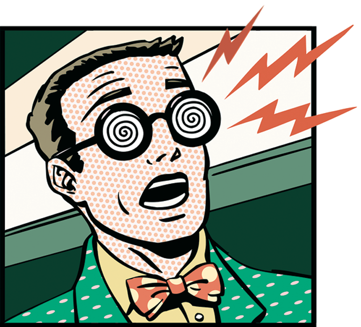
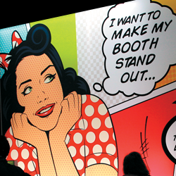
What's on your graphics? Are they hanging signs with text and logos? Is your logo so well known that there's no need to pair it with the company name or tagline? Or will a photo with a strong benefit statement be the ultimate bearer of your message? If you're using images, what type of image best conveys your message? It's been my experience that images of attractive, diverse people using your product(s) will attract more attention than product "glamour shots."
The quality of the image used and its subsequent output speaks volumes when paired with your corporate message. Using a low-res image will result in pixelated, grainy, or blurry output. Consult with your graphic designer on specific requirements to make sure you have usable, high-res images in standard file formats such as .jpg or .eps. When purchasing stock images, buy the biggest, highest resolution file available.
 Typefaces
My graphic designer always tells me fonts are like voices that can express an entire range of emotions. They can yell or whisper your key messages. And there's even a font called "Sarcastic," which is in reverse italics. The selection of fonts is seemingly endless and ever growing, but most of them are organized into one of three major font families: serif fonts such as Times Roman or Garamond, sans serif fonts like Helvetica or Arial, and decorative fonts such as Comic Sans or any of the script fonts that resemble handwriting. Serif and sans serif fonts are generally the most readable.
With all these options, you need to select the most appropriate voice to convey messages to your audience. The type on your graphics should be easy to read based on its location in the exhibit and distance from the viewer.
If your company has a corporate style guide, it likely has a list of fonts you can use, along with colors, images, white-space requirements, etc. to maintain brand consistency. Share this guide with your graphic designer and producer so they're aware of the rules before creating your graphics.
Much like color choice, there are also rules of thumb for font use: Avoid using more than two fonts on the same graphics, and select font sizes so that your type will be 1 inch tall for every 3 feet attendees will stand from it. For instance, if a graphics panel is 6 feet from where you anticipate attendees might be standing to read it, the letters should be 2 inches tall.
 Durability
What's more important to you when it comes to exhibit graphics: cost or durability? Based on the many types of graphics-production techniques and materials available, you'll need to decide whether your booth graphics are intended for one-time use or if they'll be displayed for multiple trade shows. Depending on the purpose of your exhibit graphics and durability required, various flexible (such as fabric, Duraflex, and adhesive vinyl) and rigid (such as Sintra, plastic, paper, and foam) materials can be used, many of which are produced with shipping considerations in mind.
Whichever material you choose, pack your graphics with care. Since graphics panels are often stacked for shipping, I use protective corners and foam, bubble wrap, or butcher paper to keep each panel from getting scratched by any hook-and-loop fastener or magnets mounted on the back of the panels. Sturdy external packaging — such as graphics cases, crates, cartons, or tubes — is also critical as it protects graphics and can tolerate the abuse they'll take during shipping and storing between shows.
There's nothing worse than getting to a show and discovering damaged graphics. The solution to this problem is to always have access to the current graphics files (ideally on a USB drive or CD) in case you need to reproduce them at the last minute.
Even with everything that can go wrong, designing and producing effective exhibit graphics certainly isn't rocket science. Yet I'm amazed by how many exhibitors completely miss the mark. By paying attention to color, placement, and messaging, you'll be well ahead of the graphics game.