ammunition |

|
 
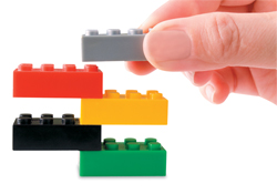
To highlight its antibody-conjugate (ADC) therapy (an approach intended to spare nontargeted cells and thus reduce many of the toxic effects of traditional chemotherapy) at the 2011 American Society of Clinical Oncology show, Seattle Genetics Inc. turned to an unlikely medium - Legos. The pharmaceutical company brought in two Lego artists to build an 8-foot-tall model of an ADC, and enlisted booth visitors to help. Intrigued by the giant aisle-side structure taking shape, attendees were invited to build roughly 2.5-by-5-by-2-inch bricks and affix them to the model via a rubber mallet. The unusual tactic not only communicated the company's product offering, but it also served as a traffic builder and interactive experience to boot.

 
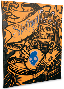
When your product's primary differentiator is its edgy, artistic design aesthetic, then it makes perfect sense to add a little urban-art flair to your exhibit space. So Skullcandy Inc., a manufacturer of high-end headphones that bear graffiti-inspired graphics, hired a pair of graffiti artists to paint murals on two wall panels inside its exhibit during the 2010 International Consumer Electronics Show in Las Vegas. The evolving art not only kept interested attendees coming back to see the murals' progress throughout the four-day show; it also allowed staffers - as well as the artists themselves - to engage booth visitors in conversations about Skullcandy's unique designs. Now that's art with a competitive edge.


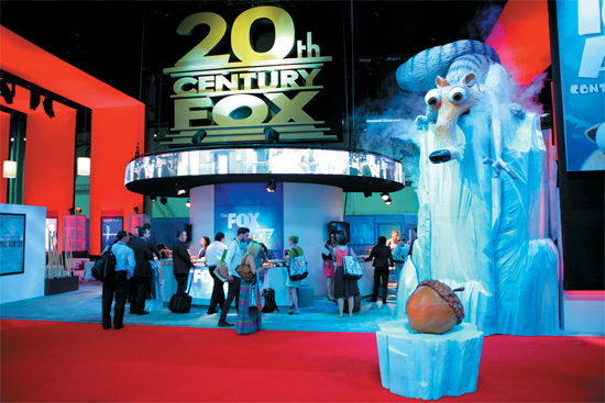
To promote its popular Ice Age films at the 2011 Licensing International Expo, 20th Century Fox erected an iceberg big enough to sink the Titanic. Standing roughly 20 feet tall, and steaming thanks to an embedded smoke machine, the berg featured Ice Age's iconic "saber-toothed squirrel," Scrat, perched precariously atop it, reaching to snag a 3-foot-diameter acorn on a patch of ice below. More than a simple sculptural element, the iceberg became a landmark on the show floor and a favorite photo opportunity for Licensing attendees.


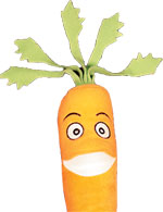
 Carrot Culture, the intellectual property division of O.C. Tanner Co., provides clients with training on how to properly recognize and reward employees. But since most of its prospects think they already know how to pat their co-workers on the back, Carrot Culture has to first educate them on research that indicates otherwise - so starting the conversation is an important first step to convincing prospects to become clients. To jumpstart that dialogue, Carrot Culture employs an adorable little lure: stuffed
carrots. Designed to resemble Garret, the company's mascot, the plush giveaways are an attendee magnet. In addition to the fuzzy veggies, Carrot Culture offers free demos of its online learning. "We really believe that if we can get people to start talking with us, they generally stick around a while," says manager Pat Poyfair, who staffed the Carrot Culture booth at the American Society for Training and Development's TechKnowledge show. "We use our giveaways to get people out of the aisle and into our booth. And we've been busy all day as a testament to that strategy." As it turns out, at least for Carrot Culture, giving really is better than receiving. Carrot Culture, the intellectual property division of O.C. Tanner Co., provides clients with training on how to properly recognize and reward employees. But since most of its prospects think they already know how to pat their co-workers on the back, Carrot Culture has to first educate them on research that indicates otherwise - so starting the conversation is an important first step to convincing prospects to become clients. To jumpstart that dialogue, Carrot Culture employs an adorable little lure: stuffed
carrots. Designed to resemble Garret, the company's mascot, the plush giveaways are an attendee magnet. In addition to the fuzzy veggies, Carrot Culture offers free demos of its online learning. "We really believe that if we can get people to start talking with us, they generally stick around a while," says manager Pat Poyfair, who staffed the Carrot Culture booth at the American Society for Training and Development's TechKnowledge show. "We use our giveaways to get people out of the aisle and into our booth. And we've been busy all day as a testament to that strategy." As it turns out, at least for Carrot Culture, giving really is better than receiving. |
|

 Hospitality is an important
part of most European trade shows,
so it's no
surprise
that Ansorg
GmbH opted
to give booth visitors
a snack inside its space
at EuroShop 2011 in
Dusseldorf, Germany.
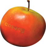
But instead of offering same-old sandwiches or cavity-inducing hard candies, Ansorg offered apples that were laser engraved with the company's logo
(a process that doesn't damage the fruit). The unique and healthy offering not only hit the spot, but it also left a good taste in attendees' mouths. Hospitality is an important
part of most European trade shows,
so it's no
surprise
that Ansorg
GmbH opted
to give booth visitors
a snack inside its space
at EuroShop 2011 in
Dusseldorf, Germany.
But instead of offering same-old sandwiches or cavity-inducing hard candies, Ansorg offered apples that were laser engraved with the company's logo
(a process that doesn't damage the fruit). The unique and healthy offering not only hit the spot, but it also left a good taste in attendees' mouths.


Getting the media to stop by your booth is about as easy as convincing a teen that "mother knows best." At the World of Concrete Show, Topcon Positioning Systems Inc. came up with a nifty strategy that made that pesky problem a little bit easier. Each press kit featured a sticky note that read: "Note to self - visit Topcon at WOC Booth #C4613 to see: 1. World's Fastest 3D Dozer system, 2. Great deals on Construction Lasers, 3. New construction layout products, 4. Latest in Asset Management equipment." The sticky notes, which were also on a table near the press-room entrance, not only invited journalists to see the booth; they also provided four reasons why a visit would be worthwhile.


 How do you take an ugly convention-center column smack dab in the middle of your space, and make it work for you instead of against you? At the International Contemporary Furniture Fair in New York, wood-furniture maker Shimna took the cement column inside its exhibit
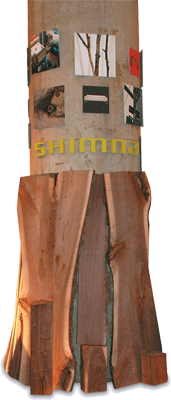
at the Jacob K. Javits Convention Center and turned it into a branding element and product display. The company simply placed several unfinished wood boards (the raw material it uses to create its furniture) against the base of the column, and then positioned cut-out letters around the column to create the company's logo. Above the logo, Shimna attached several photos of the company's products, materials, etc., and - voila! - the eyesore of a concrete support column quickly became a functional exhibit element. How do you take an ugly convention-center column smack dab in the middle of your space, and make it work for you instead of against you? At the International Contemporary Furniture Fair in New York, wood-furniture maker Shimna took the cement column inside its exhibit
at the Jacob K. Javits Convention Center and turned it into a branding element and product display. The company simply placed several unfinished wood boards (the raw material it uses to create its furniture) against the base of the column, and then positioned cut-out letters around the column to create the company's logo. Above the logo, Shimna attached several photos of the company's products, materials, etc., and - voila! - the eyesore of a concrete support column quickly became a functional exhibit element.
|
What's The Big Idea?
Do you have a clever exhibit-related tip? Did your last exhibit have an über-cool traffic builder?
Contact Travis Stanton at tstanton@exhibitormagazine.com. |
you might also like |
 |
 |
 |
Ideas That Work
Ideas That Work
Table Talk, Hanging Out, Band Aid, The Pot Pit, and more. |
Ideas That Work
November 2016
Giveaway Gamble, Table of Trends, Submerged Sales, and more. |
Ideas That Work
Ideas That Work
Bottoms Up, Quid Pro Quote, Animal Magnetism, and more. |
|
|
|


