What do metal cake pans, a rented television stand, and an array of store-bought anti-fatigue mats have in common? They're all central elements in this 10-by-10-foot exhibit created by San Francisco exhibit-design firm, Mauk Design. Crafted for the Healthcare Convention & Exhibitors Association show, the exhibit featured back and side walls comprising Lexan sheets, which were rolled into tube form and secured via magnets. Forty-two cake pans fitted with low-energy LED lights from Ikea provided dramatic lighting within the Lexan tubes. Meanwhile, a 3-D TV (which was purchased in the show city and shipped back to San Francisco for use in the designer's home) offered images of Mauk's various design projects. With a price tag of less than $1,000 for the materials, the totally tubular booth design was cost conscious to boot.

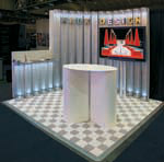
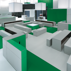
 When you're a brand- and marketing-management firm, your booth had better scream "This is who we are and what we do!" At the American Association of Pharmaceutical Scientists show, New York-based That's Nice LLC hurdled this tall challenge with relative ease. Hoping to effectively demonstrate its marketing prowess to attending pharmaceutical-company marketers, That's Nice turned its modest 10-by-10-foot booth space into a brand-focused environment that still retained an open feel. Simple aluminum frames and fabric formed the primary structure, while the back-wall graphic - void of any market-specific connotations - evoked a sense of energy. A flatscreen monitor played a custom animation promoting the company's services, while emerald green, turf-like flooring and transparent plastic chairs added a touch of whimsy to the brand-appropriate booth. When you're a brand- and marketing-management firm, your booth had better scream "This is who we are and what we do!" At the American Association of Pharmaceutical Scientists show, New York-based That's Nice LLC hurdled this tall challenge with relative ease. Hoping to effectively demonstrate its marketing prowess to attending pharmaceutical-company marketers, That's Nice turned its modest 10-by-10-foot booth space into a brand-focused environment that still retained an open feel. Simple aluminum frames and fabric formed the primary structure, while the back-wall graphic - void of any market-specific connotations - evoked a sense of energy. A flatscreen monitor played a custom animation promoting the company's services, while emerald green, turf-like flooring and transparent plastic chairs added a touch of whimsy to the brand-appropriate booth.
 
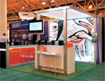
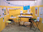
Nothing says "Relax, and let's chat" quite like an outdoor patio. Seen at the National Stationery Show in New York, this quaint exhibit for Katney B., a New Haven, CT-based contemporary stationery designer, provided the essence of a garden patio in the tiniest of spaces. Including a soothing-yellow picket fence (which provided a charming visual and auditory barrier that separated the space from the bustling show floor), a gardening bench, a bistro table and chairs, and the company's cards displayed via clothesline, this serene scene served as the perfect backdrop for Katney B.'s creations and a couldn't-resist respite on the harried trade show floor.
 
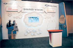
Plenty of exhibit houses claim they can brainstorm creative solutions to their clients' problems. But at the Healthcare Convention & Exhibitors Association show, U.K.-based exhibit house Medex-Media actually turned this claim into a 3-D display. The company's 10-by-20-foot booth depicted a brainstorming session, featuring a "thought cloud" in the middle of the back wall. Meant to represent how the company works with clients to create a shared vision, the booth featured a flatscreen monitor that displayed various images of the company's work.

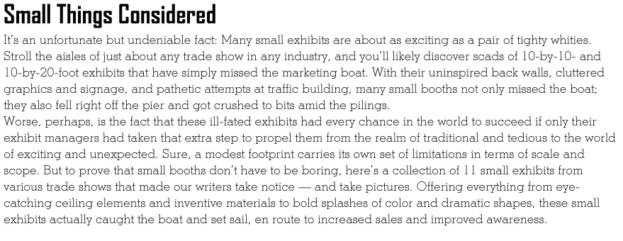
 Sometimes, all you need is a single color to make a bold statement. This striking exhibit for Tangram, a Pleasantville, NY-based exhibit house, featured a stark-white palette. However, to make sure it caught the attention of EXHIBITOR2011 attendees, its designers used form, line, and texture to create a stellar aesthetic. While the glossy-white desk acted as the central conversation area, words representing Tangram's corporate culture popped off the back wall with a sort of bas-relief effect. The 10-by-20-foot wasn't an elephant in terms of size, but it was certainly elephantine in terms of its powerful presence. Sometimes, all you need is a single color to make a bold statement. This striking exhibit for Tangram, a Pleasantville, NY-based exhibit house, featured a stark-white palette. However, to make sure it caught the attention of EXHIBITOR2011 attendees, its designers used form, line, and texture to create a stellar aesthetic. While the glossy-white desk acted as the central conversation area, words representing Tangram's corporate culture popped off the back wall with a sort of bas-relief effect. The 10-by-20-foot wasn't an elephant in terms of size, but it was certainly elephantine in terms of its powerful presence.
 
This booth for Sunrise Systems Inc., a Pembroke, MA-based manufacturer of custom LED signage, attracted attendees at the Society for Environmental Graphic Design show with a mixture of clean lines and sleek, on-trend materials. The 10-by-20-foot display integrated the company's signage into the back wall, where five LED bands offered scrolling creativity- and design-focused messages. A large etched logo, which was ghosted onto the back wall's aluminum panels, reinforced the client's brand.
Yellow flowers and a single red panel displayed the
company's corporate colors.
 
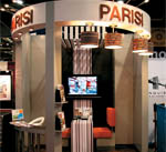
Who says you can't have it all in one 10-by-10-foot booth? Discovered at GlobalShop in Las Vegas, this gorgeous exhibit for Parisi Inc., a Newtown, PA-based architectural design and manufacturing company, included everything from an aisle-side bar with streamlined white stools and a restaurant-style booth, to contemporary suspended light fixtures and a couldn't-miss overhead identifier. But this booth didn't just include myriad components; it also boasted class and style.

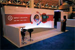
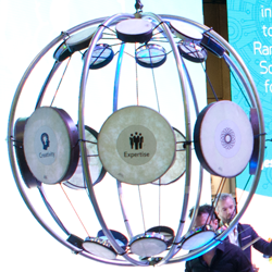
 At the Healthcare Convention & Exhibitors Association show, Impact Unlimited got creative with its creative-capabilities presentation. It placed a 2-foot diameter, interactive globe in the center of its exhibit's back wall. Meanwhile, a small metal arm with a magnifying glass on the end was attached to the wall, with the glass end positioned over the globe. As attendees moved the globe, placing various countries under the magnifying glass, two monitors displayed the company's work in that specific country. At the Healthcare Convention & Exhibitors Association show, Impact Unlimited got creative with its creative-capabilities presentation. It placed a 2-foot diameter, interactive globe in the center of its exhibit's back wall. Meanwhile, a small metal arm with a magnifying glass on the end was attached to the wall, with the glass end positioned over the globe. As attendees moved the globe, placing various countries under the magnifying glass, two monitors displayed the company's work in that specific country.
 
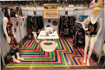
What do you get when you mix a wooden identification sign, a pair of mannequins, and myriad rolls of colorful electrical tape? The answer is this can't-walk-by-without-stopping booth for Animated Closet. The clothing firm, which claims to favor cozy fabrics and edgy graphics, handcrafted this booth for its presence at Magic Marketplace. While the central table and chairs offered an in-booth meeting space, the undeniable made-you-look element was the electrical-tape flooring, which gave this booth a wow factor all its own.
 
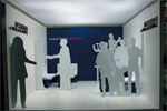
How do you create separate conversation spaces within a modest 10-by-10-foot exhibit - and not concoct an ugly bunch of barriers in the process? If you're German exhibit house Messebau Blazejewicz Produktion & Realisation GmbH, you delineate your space via white, wooden cutouts of human forms. Scattered throughout the company's space at EuroShop 2011, the silhouettes acted as dividing walls - both partially shielding seated attendees from passing gawkers while also maintaining an open, inviting, and interesting space.
 
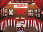
With a company name like Two Trick Pony, your booth
better offer more whimsy than a typical pop-up. This
10-by-10-foot booth at the National Stationery Show
certainly delivered. While examples of the company's
greeting cards and invitations hung like artwork from
fabric-lined back and side walls, red-and-white-striped
fabric acted as unexpected wainscoting - and gave the
booth a circus-tent-like effect. A small table and chairs
in the center of the in-booth display offered a place to
congregate without reducing accessibility to the product
displays. With design chutzpah like this, Two Trick Pony
wasn't horsing around.
|


