product displays |
 |
 utting together the perfect product display for your exhibit is like creating a show-stopping gown for the red carpet. You need to accentuate the positives while camouflaging
any imperfections that get in the
way of a flawless ensemble. And in this case, those imperfections can be anything from wayward wires to poor lighting. utting together the perfect product display for your exhibit is like creating a show-stopping gown for the red carpet. You need to accentuate the positives while camouflaging
any imperfections that get in the
way of a flawless ensemble. And in this case, those imperfections can be anything from wayward wires to poor lighting.
Sure, you can select an off-the-rack display system, arrange your offerings on the shelves, and call it a day. But to elicit a truly jaw-dropping reaction (and steer clear of attendees' worst-dressed lists), you need to create a custom look that puts your products in the spotlight.
So to help get your creative juices flowing, we've compiled 17 examples of exhibitors that gave their product displays the star treatment.
|
 Legs to Stand On Legs to Stand On
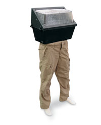
If your product display doesn't have a leg to stand on, perhaps you should give it one. That's what FHJ Lighting NA Inc. did at the Lightfair International show. To make its ballasts, fixtures, and lighting equipment stand out amid aisles of other displays, FHJ made its products stand, literally, by mounting its wares to the bottom halves of clothed mannequins. The resulting displays looked like pieces from a modern-art installation. Not only did the unexpected approach grab attendees' attention, but the leggy, low-cost pedestals also positioned the company's offerings at the perfect height for prospect perusal.
|
 Hung out to Dry Hung out to Dry
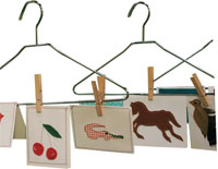
When is a greeting card more than a greeting card? If you ask the folks at Winston Salem, NC-based Bobbin Designs, they'd likely say it's when the card is made by hand using fabric and thread to give it a textural appeal. So to promote its handmade cards at the 2011 National Stationery Show, the company treated them more like clothing than cards. Clipping the cards to metal hangers and suspending them from rusted pipes created an eye-catching scene that quickly communicated the company's offerings - and stood bolts and bobbins above other exhibitors' two-dimensional displays.
|
 A Cut Above A Cut Above
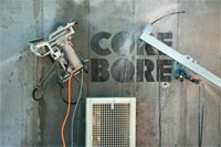
Want to draw attention to your diamond saw blades, which are perfect for cutting concrete? Then don't just plop 'em on any old pedestal. Instead, build a concrete wall and embed your products - machines, blades, and all - in it. That's what Diamond Chain International did at the World of Concrete show. Prior to the event, staffers powered up some concrete-cutting tools bearing their blades, and started cutting into a concrete back wall. Shortly into their linear and curved cuts, they killed the motors, leaving the machines embedded in the concrete at eye level for easy viewing. You saw it here, folks.
|
Digital Dose of Reality
 Rather than just showing off small samples of its products at the Surfaces show, flooring manufacturer Tarkett SA used three of its products as the actual exhibit flooring. What's more, each roughly 10-by-10-foot sample butted up to a wall with text that stated, "Welcome to everyday. The place where real life happens. And it happens to floors." Three monitors positioned against the bottom-most portion of each wall displayed images of children, pets, and people's legs. Creating an optical illusion of sorts, the people and pets appeared to
walk across the floors in the exhibit, and across all three screens. Rather than just showing off small samples of its products at the Surfaces show, flooring manufacturer Tarkett SA used three of its products as the actual exhibit flooring. What's more, each roughly 10-by-10-foot sample butted up to a wall with text that stated, "Welcome to everyday. The place where real life happens. And it happens to floors." Three monitors positioned against the bottom-most portion of each wall displayed images of children, pets, and people's legs. Creating an optical illusion of sorts, the people and pets appeared to
walk across the floors in the exhibit, and across all three screens.
|
 Light-Bright Displays Light-Bright Displays
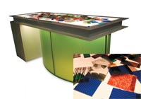
Schneller LLC created a hands-on display that promoted its Veritas ResinArt Panels at the GlobalShop show. The company cut its resin panels into various sizes, ranging from book-mark-size samples to 4-by-6-inch pieces. Labeled with the product's name, each sample was placed atop an internally lit table measuring roughly 2-by-8 feet. Thus, product samples resting atop the table appeared almost as if they were individually lit from within. Attendees shuffled through the samples like a deck of cards; examining each one and comparing it to others that might have caught their eye.
|
 Wreck Center Wreck Center
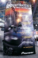
When it comes to product displays, elegant is usually the aesthetic of choice for most exhibitors. But when your product tagline is "Speakers of Mass Destruction," you're probably going to want something a little more rugged. That's why Pioneer USA hung four of its speakers from an overhead truss by metal chains inside its exhibit at the International Consumer Electronics Show in Las Vegas. Perfectly suited to its mass-destruction message, the ominous overhead audio equipment made the products look like high-tech wrecking balls, and took traditional displays to new heights.
|
 Happy Feet Happy Feet
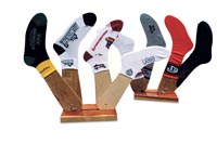
Flagpin Products wanted to get off on the right foot at the 2011 Promotional Products Association International Expo. But in a 10-by-10-foot exhibit, it's almost impossible to showcase more than a handful of products without it looking like a clearance rack. So to keep the clutter out of its space while showcasing dozens of its customizable socks, Flagpin enlisted the help of some faux feet. The company built wooden displays that held four foot-shaped cutouts apiece, then dressed each appendage in one of its socks. The resulting display featured more than 40 products without cramping the exhibit's style.
|
 Stripped-Down Seating Stripped-Down Seating
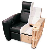
Beauty may be skin deep, but inner strength is found beneath the surface. To illustrate that point and highlight the superior construction of its furniture, Salamander Designs Ltd. created a revealing display in its exhibit at the International Consumer Electronics Show. The Bloomfield, CT-based furniture manufacturer stripped off half of the exterior from one of its chairs, displaying the wooden skeletal structure of the recliner. Staffers used the chair to discuss its internal construction and point out the materials and details that make the Salamander name
synonymous with sturdy furniture.
|
 Water Works Water Works
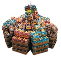
To display its Crayola-brand Color Coolerz beverages at the Food Marketing Institute show, Advanced H2O LLC constructed a water feature that, well, featured the flavored water. The company stacked more than 40 cases of the individually bottled drinks into a circular arrangement topped with a neon-Plexiglas shelf that held roughly a dozen additional bottles. A pump concealed inside the circular structure propelled water up a tube that ran through the center of the Plexiglas and out over the bottles. The movement and unmistakable sounds of trickling water drew additional attention to this already eye-catching display.
|
 Table Stakes Table Stakes
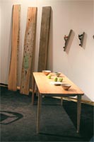
Studio Moe produces beautiful, handmade furniture from reclaimed wood. But telling that story in a 10-by-20-foot booth can be a little tricky. So the company decided to convey its key message via a trio of elements. Three planks of reclaimed wood rested against the exhibit's back wall, next to wall-mounted wood planers, which Studio Moe uses during its manufacturing process. Finally, next to the planks and planers sat one of the company's elegant wooden tables. The three simple elements told Studio Moe's story from start to finish, highlighting the handcrafted process that makes its products unique.
|
 Between the Lines Between the Lines
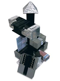
How do you effectively display a membrane system that allows concrete to expand and contract without breaking? You assemble a series of sculptural exhibit elements that look more like high-end art installations, which is exactly what MM Systems did in its exhibit at the International Parking Institute Conference and Expo. The displays incorporated the company's various membranes sandwiched between different colors and sizes of concrete blocks. Each membrane was labeled with the product name, allowing staffers to effortlessly walk attendees through the company's entire portfolio.
|
 An Image in Glass An Image in Glass
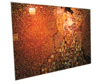
Don't just tell people your product is a work of art, prove it. Providers of tile and surfacing solutions, G&G Home Supplies Inc. used myriad colorful glass tiles to recreate a famous portrait by artist Gustav Klimt for the Surfaces show. Positioned on an exterior wall and lit by two overhead spotlights
attached to the wall, the roughly 2-by-3-foot portrait featured a young woman dressed in a brilliant gown comprising various shades of yellow, orange, and brown tiles. The aisle-side artwork stopped attendees in their tracks, and no doubt propelled them into the booth to see what other types of product art G&G had to offer.
|
 Back Wall and Beyond Back Wall and Beyond
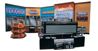
Infiniti Décor manufactures everything
from display stands to check-out counters. But plopping a counter here and a counter there would be mere clutter compared to the eye-catching display Infiniti created at the Food Marketing Institute show. Using realistic back-wall graphics featuring images of soda machines and coolers
full of beverages, Infiniti turned its booth into a convenience store. The store-like setting created a suitable context for the company's offerings, while the perspective of the back-wall graphics created a sense of depth that made the booth appear much larger than it actually was.
|
 Expect the Unexpected Expect the Unexpected
At the 2011 Promotional Products
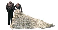
Association International Expo, clothing manufacturer Cutter & Buck Inc. didn't simply hang a pair of its polos atop some pipe and drape and call it a day. Rather, the company added a little extra oomph to its exhibit by creating a series of interesting, eye-catching displays. In one vignette, for example, the skirt of a woman's outfit was made of hundreds of crumpled pieces of paper, positioned to resemble a flowing train. Each of the vignettes surprised and delighted attendees with unusual elements, drawing them in for a closer look at Cutter & Buck's main attractions: the apparel on display.
|
 This Sucks This Sucks
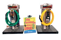
Sometimes a little humor can go a long way. To help its product display stand out from countless similar displays at the Car Care World Expo, J.E. Adams Industries Ltd. used some simple tongue-in-cheek signage. Positioned between two of its new high-powered car-wash vacuums, the company placed a brightly colored sign that read, "Our vacuums really suck!" Most exhibitors probably wouldn't want to admit their products suck, but J.E. Adams' clever suction-inspired signage grabbed attendees' attention, put a smile on their face, and gave staffers a lighthearted opening line to boot.
|
 Wonderful Whirligig Wonderful Whirligig
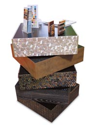
Why settle for a typical product swatch when you can create a little bit of product-swathed art instead? For the Design Boutique show, Architectural Systems Inc. didn't just display its wares, it created a pair of waist-high tables and covered them with its various wood panels, flooring, and decorative surfaces. What made these tables truly unique, however, was that each roughly 4-inch-tall-by-1.5-square-foot box rotated on a concealed axis. So aside from the table bases, which remained stationary, each structure's five sections spun around, creating an appealing, ever-changing look.
|
 A Room With a View A Room With a View
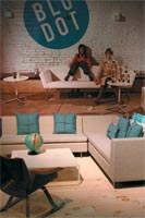
A product display out of context is like a cherry without a sundae. But in a cramped space in the middle of an exhibit hall, it can be difficult to create a suitable context that's both realistic and relevant. So at the International Contemporary Furniture Fair, Blue Dot Design and Manufacturing Inc. set up various furniture displays in front of large-format graphics that matched the color scheme and aesthetic of the displays. Designed to look as if the real-life displays were breaking out of the two-dimensional graphics, the simple strategy created an immersive context for the furniture, and helped the modest booth feel a bit roomier.
|
|
|


 utting together the perfect product display for your exhibit is like creating a show-stopping gown for the red carpet. You need to accentuate the positives while camouflaging
any imperfections that get in the
way of a flawless ensemble. And in this case, those imperfections can be anything from wayward wires to poor lighting.