


|
exhibiting 101
 Graphic Gaffes
Make sure your exhibit's graphics send the right message by avoiding these common mistakes. By Betsy Earle
An effective exhibit has a lot of components. The physical exhibitry, floor plan, and in-booth activations and displays all play a vital role. But when it comes to immediately grabbing the attention of showgoers walking the aisles and conveying to them what your company offers and why they should care, there's no denying the supreme importance of impactful, well-designed graphics. This is a fundamental element of face-to-face marketing, but I bet all of us can think of more examples of graphics we've seen on show floors that have disappointed rather than delighted.
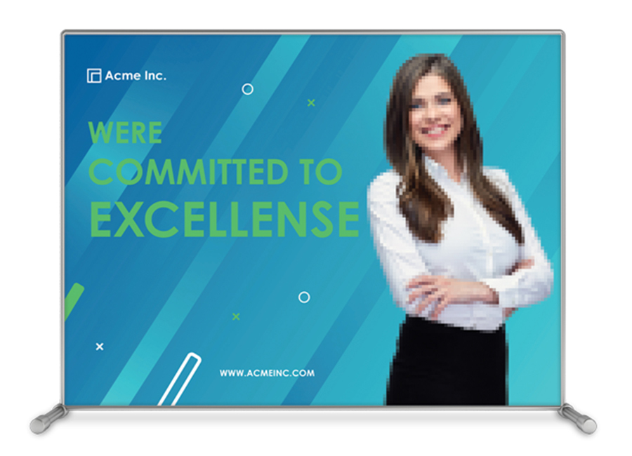
While there's certainly a degree of subjectivity at work here, just as with anything in the creative realm, there are some pretty reliable best practices to consider when working on your exhibit's graphics. So let's reverse engineer the problem and go through some of the things you don't want to do. If a picture is worth a thousand words, here are nine graphic gaffes that will prevent your exhibit from saying the right ones. 1. Believing that a large-format graphic and a print ad are the same thing. When creating back-wall graphics, a lot of exhibit managers tend to just blow print ads up to a larger format, thinking this will have the same impact. While you absolutely want to ensure that corporate branding and communication styles match across the board, from brochures and social media to your exhibit's graphics, a back wall should not be designed the same as an ad in a magazine. The purpose of graphics is to draw the attention of passerby and let them know what you do and how your offerings benefit them. Once you've intrigued their eyeballs, your booth staff can engage them and explain the proverbial fine print. 2. Not prioritizing the placement of important information. At a crowded show, there's about zero chance of attendees seeing or noticing images and copy that have been buried somewhere off to the side of your display space. On many show floors, I see crucial info about a business slapped on the draped fronts of aisle-side demo, giveaway, and sampling tables – i.e., knee-high text nobody can see because of heavy foot traffic – or placed along a poorly trafficked aisle, making it seem like an afterthought. Think about your booth graphics as three tiers: the company name and logo, the tagline or key message, and details about the products and services. Be sure to prioritize your new offerings, as customers are consistently looking for what's new. Copy about features and benefits should come next, perhaps followed by information about corporate sustainability programs or support for nonprofits. I also want to encourage you to be judicious about your font selection. While there are tons of cool options out there, it's important to consider typefaces that are easy to read. If you're trying to capture the attention of passersby with a concise message, you need it to be as easy to read as possible. A flowing cursive font may be on brand, but will it be legible to attendees walking past at a distance of 10 or so feet? 3. Using low-resolution artwork that hasn't been properly formatted. It's important to understand image-file types and their formatting. There are two primary types of images: vector and pixel. A vector image is made from lines, meaning that it can be resized and made larger or smaller without losing resolution. A pixel image is comprised of tiny individual dots, and as you enlarge files, the picture will likely get increasingly fuzzy – i.e., pixilated. A file built from pixels is set to a certain resolution referred to as dots per inch (dpi). Small-scale print-quality images are ideally around 300 dpi, whereas online-only files are typically 72 dpi. This is why images pulled from a website often look pixilated when printed at any significant scale. So if you were thinking of dragging an image of your logo off your company's homepage and adding it to your print order for your back-wall graphic, be prepared for a blurry, low-res mess. Instead, provide your graphic supplier with a vector version of your logo, which can be blown up to go on the side of a barn and still look razor sharp. If you don't have vector files of your core assets, most graphic designers can build these from scratch. This does take a bit of time, so plan well in advance of your print deadlines.
Walk any show floor, and you'll notice a lot of pretty exhibits that don't make it clear what the company does. While they might look clean and crisp, these graphics are limiting their own success.
In general, printers of large-format graphics are going to want art files with a resolution of 150 dpi or higher. I prefer to send files larger than they need to be because pixel files can be sized down, but they can't be sized up without compromising quality. If you are pulling images from a stock photo website like iStock or similar, you'll likely need either the XL or XXL files, as most of the smaller images will be too low-res for print. (Yes, dimensions are important! An image with a resolution of 150 dpi and sized at 4-by-4 feet will look terrible if it's resized to be printed for a 10-foot back wall.)4. Not understanding color terminology. For some companies, color matching is essential, e.g., their corporate style guide lists specific color "builds." So how do you know if your logo is going to print properly? There are three key acronyms to understand here: RGB, CMYK, and PMS. Images destined for online use are typically RGB files that comprise combinations of red, green, and blue. CMYK files, most often used for print and digital, combine cyan, magenta, yellow, and black. What's key to note with CMYK files is that they will often print darker than what you'll see when viewing them on a screen. If you're set on perfection, you'll want to know your company's PMS, or Pantone Matching System colors. Ask your graphic supplier to print a swatch of your artwork on the actual substrate so you can look at it in real life and assess how it will print in a larger format. This way you avoid printing the whole file, hating it, and having to pay for a reprint. 5. Misusing graphic real estate. A lot of exhibitors leave a ton of blank space on their booth graphics. While a clean, open space might be the look a company is going for, it's still important to use graphics to compel attendees to visit your booth. You have a very brief window of time in which to grab the attention of passersby, but many exhibitors get so caught up in their own corporate messaging that they aren't thinking of what their attendees are interested in. Walk any show floor, and you'll likely notice a lot of pretty exhibits that don't make it clear what the company does. While they might look clean and crisp, these graphics are limiting their own success because they're missing the mark in regard to giving attendees a reason to care. Unless your company is a household name in your industry, why should a logo and a vague tagline make showgoers want to stop by? On the flip side, your exhibit is not a supersized product spec sheet. I have seen so many booths at health-care shows with entire dissertations on their side and back walls. While I fully recognize that exhibitors in heavily regulated industries have to check a lot of legal boxes, I believe it's possible to strike a balance. The purpose of a graphic is to grab your customer's attention, not to tell them every detail about your product. Attendees aren't going to be able to take in a deluge of information when they're looking at so many different sights on the show floor. Finally, keep in mind that the average American is roughly 5-feet-7-inches tall, so you'll want to center your most important information at this height. No one wants to be craning their neck to read text that was stuck above a high shelving unit or placed below a counter where people are leaning and blocking the view. 6. Not proofing before production. Look, we're all guilty here, myself included. Not only is this an embarrassing mistake, but it's also expensive, since large silicone-edge graphics (SEGs) can cost thousands of dollars. I suggest having a person outside your marketing department double-check all graphics for spelling, grammatical, and factual errors, as it's shockingly easy for anyone who has looked at the copy several times to miss typos. So never send graphics to print without having at least two sets of eyes on them. In my experience, people in accounting and customer-service departments often have great attention to detail and excel at proofing. Before you go to print, also be sure that you or your provider zoom in on your graphic at 100 percent at various snapshot points. Regardless of pixel density or file type, it's important to get a close-up of the graphic to make sure there is nothing that needs to be Photoshopped out. For example, I once wanted to print an image of a farmer working in a field. When we zoomed in for a closer look, we noticed that his fingernails were full of dirt. Sure, this makes sense, but that wasn't what we wanted to present to attendees, so we touched up the photo. 7. Displaying a hodgepodge of different graphic mediums. I understand that we don't all have limitless budgets, but you don't want your exhibit to look like a patchwork quilt. Consider a tasteful balance of materials and be careful about combining too many different ones. For instance, let's say most of your stand is constructed from hard panels of Sintra. It's OK to mix in a fabric graphic or roll-up banner here and there, but too many textures and finishes are going to make your efforts look like afterthoughts. This tends to happen when exhibitors comingle old booth components with new ones, and in doing so turn their exhibits into what look like charity bazaars. 8. Allowing dirty, dinged-up, and wrinkled graphics to pass muster. It's important that you also make sure graphics are clean and in pristine shape. This shouldn't come as a surprise, but I'm often shocked by what many exhibit managers seem to consider acceptable. I have a personal pet peeve about large wrinkles in graphics because this is something that can easily be fixed. Before you get to the show floor, be sure to fold your graphics or roll them around a cardboard tube instead of just shoving them into a box. Most SEGs will fold nicely, and I like to keep mine in individual plastic bags with the image folded inward to help prevent smudges from grimy fingers.
It's OK to mix fabric graphics and roll-up banners here and there, but too many mediums will make your efforts look like afterthoughts.
Taking care of wrinkles involves minimal work. Pick up an inexpensive plug-in or battery-operated steamer from a big-box retailer and pack it in your gang box. Before the show opens, gently run it over your fabric graphics to smooth out any creases. Additionally, ask whoever is installing your graphics to put on a pair of gloves or go wash their hands before they start setup. It's easy for dust and dirt to accumulate on the show floor, so simply washing one's hands can reduce soiling dramatically.9. Relying on monitors that loop long marketing videos. I'm sorry to say this, but nobody really cares about your corporate presentation. Think about the attention span of people today. With the rise of social-media platforms like TikTok and Instagram Reels, attendees want clear information – and quickly. So don't expect them to stand and watch a 5-minute video about how great your company is. Instead, entertain and educate. Make your message about the booth visitor and what matters to them. They care more about the benefits of your product than what year your business started. If you aren't sure how to do this, consider using digital infographics and animation. Animation offers a powerful way to share a vision and distill complex ideas so they are easily understood. Infographics, meanwhile, allow attendees to visually understand these ideas in a succinct and chronological way. As always, keep in mind that you have a very brief period to capture attention, so use your time wisely. Also, showgoers are inundated with images and messages, so identify ways for your information to stand out and be memorable. Finally, be sure to caption your videos and make the captions as large as possible without interfering with the visuals. In addition to accommodating attendees who are hard of hearing, subtitles will ensure anyone who's standing an appreciable distance from the monitor will be able to receive your messaging. At the end of the day, your exhibit's graphics – not your product or booth staff – are what will be showgoers' first impression of your company. If you set a professional tone and avoid these missteps, you'll not only impress attendees and capture their attention, but also interest them enough to step into your space to find out more.E  Betsy Earle, CTSM
managing director and founder of Event Driven Solutions LLC. Earle obtained her MBA at the University of Miami and earned her Diamond-level CTSM designation in 2018. Exhibiting101@exhibitorgroup.com
|
|


|
||||||||||||||||||||||||||||
|
|
||||||||||||||||||||||||||||
|
TOPICS Measurement & Budgeting Planning & Execution Marketing & Promotion Events & Venues Personal & Career Exhibits & Experiences International Exhibiting Resources for Rookies Research & Resources |
MAGAZINE Subscribe Today! Renew Subscription Update Address Digital Downloads Newsletters Advertise |
FIND IT Exhibit & Display Producers Products & Services All Companies Get Listed |
EXHIBITORLIVE Sessions Certification Exhibit Hall Exhibit at the Show Registration |
ETRAK Sessions Certification F.A.Q. Registration |
EDUCATION WEEK Overview Sessions Hotel Registration |
CERTIFICATION The Program Steps to Certification Faculty and Staff Enroll in CTSM Submit Quiz Answers My CTSM |
AWARDS Sizzle Awards Exhibit Design Awards Portable/Modular Awards Corporate Event Awards Centers of Excellence |
NEWS Associations/Press Awards Company News International New Products People Shows & Events Venues & Destinations EXHIBITOR News |
||||||||||||||||||||
|
||||||||||||||||||||||||||||