|
awards
EXHIBITOR MAGAZINE'S SIXTH ANNUAL
PORTABLE/MODULAR AWARDS In the not so distant past, portable, modular, and system exhibits were the B-list actors of the exhibiting world. Not unlike Gary Busey, Eric Roberts, or Denise Richards, these exhibits certainly got the job done, but somehow their status never quite evolved to that of A-list custom booths. But the times have changed. Given their affordability, adaptability, ease of installation, and elevated aesthetics, these nimble exhibits now stand truss to truss with fully custom designs. To support the industry and its advancements, EXHIBITOR magazine launched its Portable/Modular Awards in 2014. Devised to recognize the suppliers, designers, and fabricators responsible for these remarkable stands, the program also spotlights the portable/modular industry as a whole. So please join us in congratulating the winners of EXHIBITOR Magazine's Sixth Annual Portable/Modular Awards. Ranging from a teeny 10-by-10 to a generous 40-by-70-foot stand, these exhibits advance the industry while proving that "portable" and "modular" are adjectives that go hand in hand with "innovative" and "exciting." By Linda Armstrong 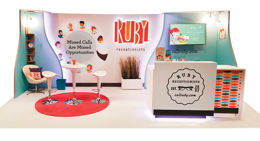
Best Island Exhibit Exhibitor: Ruby Receptionists Design/Fabrication: Skyline Exhibits, St. Paul, MN, 651-234-6000, www.skyline.com System: Skyline Exhibits Event: American Bar Association Techshow Budget: $20,000 – $39,000 Size: 10-by-20 feet Photo: Skyline Exhibits They say that good things come in small packages. And that's certainly true for this 10-by-20-foot design for Ruby Receptionists, a provider of live, remote receptionist services. The adorable little stand nabbed kudos for Best In-Line Exhibit and The Zeigler Award, the competition's top honor given to the booth with the highest overall point total regardless of category. For their booth at the American Bar Association Techshow, marketers at Ruby Receptionists wanted to represent both the smart mobile technology that forms the backbone of the service and the friendly, personal assistance of its live receptionists. They also hoped to incorporate a retro theme to conjure a connection with the gracious receptionists that were commonplace in lawyers', doctors', and other professionals' offices during the '40s and '50s. To that end, the team handed designers at Skyline Exhibits $35,000 and a mandate to blow them away. The resulting exhibit was made of modular Skyline components. While a branded reception desk anchored one side and a bistro-height table and stools adorned the other, the back wall acted as a backdrop and focal point. Eye-catching, quirky graphics included the company logo and a visual adaptation of a rotatory-dial phone, both of which were accented by integrated LED lighting. Offset fabric architecture added dimensionality to the back wall while a wall-mounted monitor presented a looping capabilities presentation. "This booth proves that you don't need to spend a fortune for an amazing design," said one Portable/Modular Awards judge. "The exhibit is bright, cheery, and somehow both modern and retro, yet it makes you want to buy whatever they're selling." Clearly, then, good things – not to mention award-winning designs – truly do come in small packages. 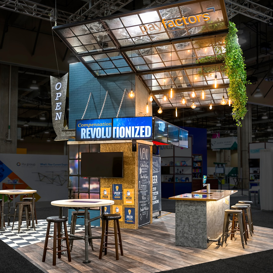
Exhibitor: Payfactors Group LLC Design/Fabrication: Hill & Partners, Weymouth, MA, 617-471-7990, www.hillpartners.com System: BeMatrix Event: WorldatWork Total Rewards Conference and Exhibition Budget: $80,000 – $149,000 Size: 20-by-20 feet Photos: Cole Group "Drawing attendees into a space for a conversation on data management is no easy feat," said one Portable/Modular Awards judge. "But with its angled ceiling element, obvious flow, and welcoming meeting areas, this stand makes it look effortless." Crafted by Hill & Partners, this remarkable structure for Payfactors Group LLC was born of the exhibitor's desire for an immersive, industrial exhibit that would not only stand out in a sea of modern, corporate booths but also encourage product demos and conversations about compensation-related issues. Debuting at the WorldatWork Total Rewards Conference and Exhibition, the 20-by-20-foot island employed a BeMatrix system and various nontraditional materials – e.g., plywood, galvanized metal, industrial pipe, and painted dimensional brick panels. To draw attention to the space and foster the industrial vibe, designers formed a series of windows in a massive overhead structure. Suspended Edison lights and faux greenery added a whimsical touch to the construction. Within the ground-floor environment, staff conducted product demos via monitors and keyboards, touchscreens integrated into tabletops, and presentations on a 60-inch screen. Near the center of the space, a 10-foot-long bar drew in visitors for casual conversations and their choice of cold-brew coffee or local craft beers. Designers also incorporated a functional dart board on the opposite side of the bar; alongside it, attendees could write their biggest compensation-related frustrations on faux dollar bills and attach them to the wall. Throughout the environ, details such as mismatched seating, neon signage, and chalkboards completed the hip bar scene and clearly distinguished the booth amid a cacophony of business-as-usual exhibitry. 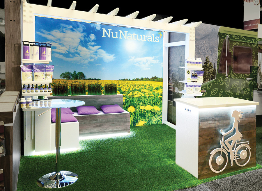
Exhibitor: NuNaturals Inc. Design/ Fabrication: Classic Exhibits Inc., Portland, OR, 503-652-2100, www.classicexhibits.com System: Classic Exhibits Inc. Event: Natural Products Expo West Budget: $10,000 – $19,000 Size: 10-by-10 feet Photo: Steve Rossman Photo and Marketing Earning a design award with your first professionally crafted trade show booth is akin to a rookie major leaguer hitting one out of the ballpark his first time at bat. Yet that's exactly what NuNaturals Inc. accomplished with its exhibit at the Natural Products Expo West show in Anaheim, CA. Going into the show, the company, which produces natural sweeteners, hoped to create an eye-catching outdoor environment befitting of the brand – and to somehow incorporate its logo, which features the profile of a woman riding a bicycle. Despite a minimal 10-by-10 footprint, marketers also wanted to include dedicated sit-down space for in-booth meetings, a reception area, and integrated storage. Designers at Portland, OR-based Classic Exhibits Inc. delivered via a compact yet powerful stand jurors called "authentic, fresh, and undeniably on brand." To evoke an outdoor theme, Classic Exhibits used a SuperNova LED lightbox with images of a field of dandelions and a brilliant-blue sky. While plush faux turf adorned the floor, a white wooden arbor protruded from the back wall. The 8-foot-tall structure supported the outdoor theme while also defining the conversation area directly beneath it. Here, an L-shaped bench and four pillows created ample space for seated chats and integrated internal storage. Both the bench as well as a reception desk positioned at the front of the space boasted a wood-grain finish to add a touch of texture. Finally, undermount lighting on the arbor, bench, and welcome desk provided visual appeal while a 3-D cutout of NuNaturals' logo appeared on the front of the check-in structure, yet another focal point for the award-winning display. 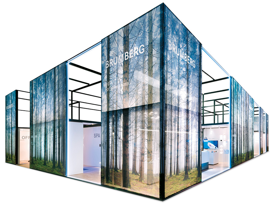
Exhibitor: Brumberg Leuchten GmbH & Co. KG Design/Fabrication: Ueberholz GmbH, Wuppertal, Germany, 49-02-02-280-96-0, www.ueberholz.de System: Ueberholz GmbH Event: Light and Building Budget: $80,000 – $149,000 Size: 16-by-26 feet Photo: Photoprop Hailed by judges as a "minimalist yet inviting space that beautifully integrated the exhibitor's lighting products," this 16-by-26-foot structure for lighting company Brumberg Leuchten GmbH & Co. KG recreated the forests of Germany's Sauerland region, where Brumberg is based. Launched at Light and Building, the stand comprised a modular mullion and transom construction to symbolize a multitude of architectural forms into which Brumberg's fixtures might be incorporated. However, designers at Ueberholz GmbH applied a gauzy, semitransparent scrim with gorgeous imagery of a Sauerland spruce forest to the frame's exterior for atmospheric appeal. Within the framework, designers crafted multiple product-display vignettes representing office, meeting, living, and sleeping environs. In each area designers embedded products in wall-mounted displays as well as within drop-ceiling structures. Furthermore, display and functional surfaces included a mixture of natural-wood tones and neutral white and black hues to perpetuate the forest theme. While the interior of the stand presented a free-flowing floor plan, the Vita LED Room housed a partially enclosed experience. Here, designers devised an LED wall featuring nature imagery and surrounded it with two walls and a ceiling covered in mirrors. The combined effect seemed to extend the projected natural content into infinity. To complete the scene, a Dolby surround-sound system emitted atmospheric nature sounds such as a rushing waterfall and an erupting volcano. Throughout the room, all elements were controlled via an Alexa-enabled device displayed atop a podium in the center of the attraction. Pairing natural imagery and diffused spruce scents with modern architectural forms, the design recreated the Sauerland region and highlighted Brumberg's product range. It also wowed the PMA judges, who called it "streamlined yet absolutely gorgeous." 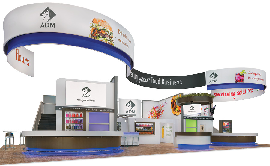
Exhibitor: Archer Daniels Midland Co. (ADM) Design/Fabrication: Downing Displays, Milford, OH, 513-965-2502, www.downingdisplays.com System: Agam Group Ltd., Downing Displays, Moss Inc. Event: Institute of Food Technologists Expo Budget: $250,000 – $499,000 Size: 40-by-70 feet Photo: Padgett and Company Inc. Going into the Institute of Food Technologists Expo, marketers at Archer Daniels Midland Co. (ADM) faced multiple challenges. They wanted a new booth with an open layout to debut the company's new branding, yet they also hoped to fit a commercial kitchen, meeting rooms, demo areas, and massive food-sampling stations into a 40-by-70-foot space. Wrangling this challenge, Downing Displays devised a stunning stand made of modular and system components from its own product line, Agam Group Ltd., and Moss Inc. At its core, the booth consisted of two double-deck structures (one on each side of the space) and a pair of sampling stations jutting out from the lower level. The double-deck elements housed two open-air meeting rooms on the upper deck and three air-conditioned conference rooms on the main floor, the latter of which featured walls with 3-D patterning accented by green and purple lighting. Directly in front of the two-story structures, ample semicircular tasting bars doled out an endless supply of savory nibbles. Designers inserted LED lighting at the base of each bar to add interest and eye-catching illumination. The exhibit's enclosed center housed a commercial kitchen from which food was quickly passed through to the tasting bars. And to cap off, delineate, and brand the 2,800-square-foot booth, a double-sided, 100-foot-long fabric banner spanned the overhead width of the footprint. According to one judge, "The skillful combination of organic forms, brand colors, effective lighting, and an overall uncomplicated design made the entire stand appear natural, healthy, and incredibly yummy." 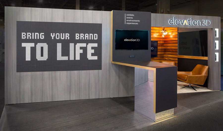
Exhibitor: Elevation Exhibits LLC (dba Elevation3D) Design/Fabrication: Elevation3D, Shrewsbury, MA, 508-842-1213, www.elevation3d.com System: Elevation3D Event: EXHIBITORLIVE Budget: $40,000 – $90,000 Size: 10-by-20 feet Photo: Exposures Ltd. Elevation Exhibits LLC (dba Elevation3D) took home this year's People's Choice Award, chosen by popular vote on www.ExhibitorOnline.com. But if there were a category for most conversation points within a 10-by-20-foot exhibit, the stand would likely have taken home that award as well. Launched at EXHIBITORLIVE and designed by Elevation3D's internal team, the exhibit was crafted to reinforce the firm's role as an industry leader in design, innovation, and customer engagement – and to announce and promote its acquisition of Exhibit Fair International Inc., a Las Vegas exhibit-marketing firm. To that end, a flip-disc wall on the left half of the space attracted attendees and helped foster initial conversations. The system was made of small plastic discs painted black on one side and white on the other. With the aid of software and a 3-D depth camera, the discs flipped over to create messages regarding the new acquisition and Elevation3D's capabilities. Meanwhile, the 3-D camera captured attendees' movements near the screen and translated them into seemingly mirrored images on the discs, much to booth visitors' delight. Designers also incorporated a counter around which visitors and staff could gather and watch a video courtesy of an LED screen embedded in the back wall. In addition, the far-right portion of the booth contained a cozy, semiprivate meeting room tucked into the back corner, complete with leather seating and another LED monitor for presentations. Finally, a concealed area behind the flip-disc wall served as storage space. Meeting marketers' objectives and promoting a multitude of in-depth discussions, the stand conveyed the high-end nature of the brand within a relaxed atmosphere. According to attendees and People's Choice Award voters alike, even seemingly small-time spaces can make a big-time impact. 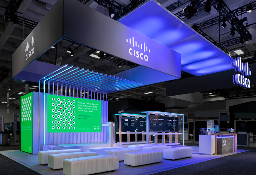
Exhibitor: Cisco Systems Inc. Design/Fabrication: Mirror Show Management Inc., Webster, NY, 585-232-4020, www.mirrorshow.com System: Mirror Show Management Inc. Event: RSA Conference Budget: $150,000 – $249,000 Size: 30-by-40 feet Photo: Padgett and Company Inc. Reconfigurable exhibitry is often all about form and function, forcing aesthetics to take a back seat. Not so for the top contender in the Best Reconfigurable Exhibit category. Designed by Mirror Show Management Inc., the exhibit for Cisco Systems Inc. scaled from a 10-by-10 to a 30-by-40-foot island and beyond. Launched at the RSA Conference, the properties included flexible demo stations and thematic elements that could be repurposed across all business units regardless of branding and size requirements. Displayed as individual units or linked to create a seemingly endless chain, the stations featured airy-looking bases and monitors embedded behind smoked acrylic panels, which created a seamless, streamlined look. Each bank of demos terminated with an edge-lit fabric scrim connected to an edge-lit canopy. The scrim could also be customized with messaging, photography, and colors to correspond to various campaigns and individual brand aesthetics. More in-booth storage could be integrated via cabinets mounted under the monitors as needed. Along with the stations, the initial design boasted a theater featuring a louvered metal canopy composed of L-shaped aluminum tubes and dramatic lighting elements. Integrated fixtures with changeable hues also appeared in the demo pods and therefore unified the two spaces. Cisco's Swiss-army-knife exhibitry was a hit with both internal marketers and judges. Since its construction, several Cisco business units have used the elements in countless configurations at shows targeting multiple audiences. And jurors not only awarded the project top honors in the category but also proclaimed it as "sophisticated" and "a smart solution with myriad applications." 
Exhibitor: Aspecta North America LLC Design/Fabrication: Nimlok Chicago, Des Plaines, IL, 847-972-5681, www.nimlok-chicago.com System: Aluvision Inc. Event: Greenbuild Budget: $40,000 – $79,000 Size: 20-by-20 feet Photos: Exposures Ltd. Going into Greenbuild, Aspecta North America LLC had more challenges than a one-armed juggler. To minimize costs, the supplier of luxury vinyl-tile flooring planned to use a rented structure to display a broad assortment of product samples. But given show regulations, the design had to consist of eco-friendly and/or sustainable materials. What's more, marketers demanded a "biophilic" concept focused on natural colors, textures, patterns, and materials, as the brand had recently begun using biophilic design as a primary differentiator. Taking home top honors in the Best Rental Exhibit category, the resulting booth was a natural masterpiece crafted by Nimlok Chicago. Employing an Aluvision Inc. system, the exhibit featured a C-shaped structure in keeping with nature's curves, and designers clad the metal lattice with bendable plywood to add a woodsy texture. Within the 20-by-20-foot environment, designers integrated various moss treatments into three different wall surfaces, all of which included a nature-inspired honeycomb design. Plus, the walls displayed flooring samples that had been cut into hexagons, each of which was underlit with green LED lighting. Designers infused another honeycomb pattern via window cutouts in the primary exhibit wall. A collection of rented flatscreen monitors offered electronic, visual messaging (a sustainable, nonprint-based tactic in itself). Other rental components included the subflooring, black carpeting around the exhibit perimeter, and most of the furniture. Judges touted the design's natural elements, and one juror proclaimed the rental "a bright, welcoming space with both an effective layout and a keen attention to detail." So hats off to this classy, custom-looking structure with a rented, undeniably sustainable backbone. 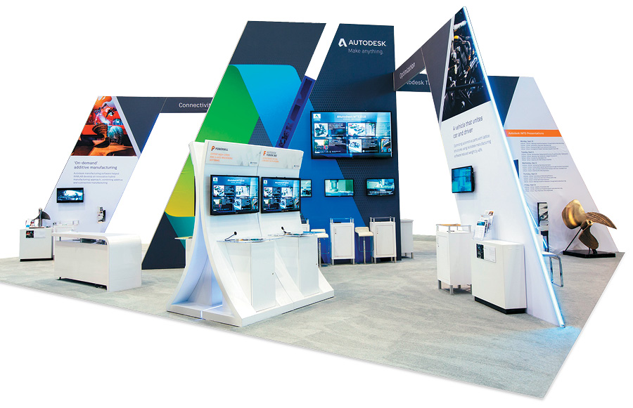
Exhibitor: Autodesk Inc. Design/Fabrication: 2020 Exhibits Inc., Houston, 713-354-0900, www.2020exhibits.com System: Aluvision Inc. Event: International Manufacturing Technology Show Budget: $150,000 – $249,000 Size: 40-by-50 feet Photo: Oscar & Associates Leading up to the International Manufacturing Technology Show, Autodesk Inc. wanted to approach its new exhibit design from a different angle – literally. The supplier of 3-D design, engineering, and entertainment software hoped to devise an eye-catching and impressive presence that would speak to the angular elements in its logo while also maintaining a light, bright, and open architecture to draw visitors into the 40-by-50-foot space. Using fabric silicone-edge graphics from Aluvision Inc., designers at 2020 Exhibits Inc. devised a space that judges called "an impressive and impactful union of strong diagonals, lightweight materials, and an open floor plan." Throughout the environment, Autodesk's rich blue, green, and gray hues branded the space and drew the eye. A central highlight was a 20-foot tower that anchored the footprint and served as an identifying beacon that was visible from aisles away. Three angular arches, which offered graphic imagery, messaging, and attached monitors, protruded from the central tower and slanted downward to make contact with the floor near three different aisles. To accommodate an in-booth presentation theater, designers placed a 16-foot-tall freestanding wall on one corner of the space. Featuring the Autodesk logo and an attached 50-inch monitor, the structure formed the theater's backdrop while ample seating came courtesy of 10 chairs and a smattering of bistro-height tables and stools. Aside from a reception desk and a freestanding kiosk for viewing product demos, designers positioned all floor-based exhibitry adjacent to the arches to ensure the interior remained open and support an effortless flow of traffic into and throughout the exhibit. 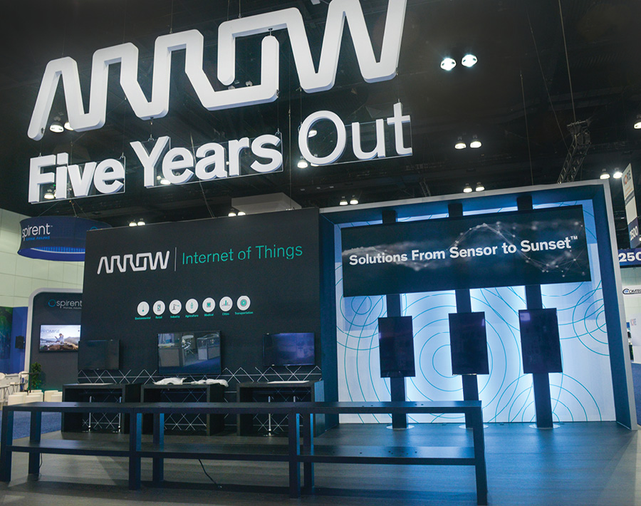
Exhibitor: Arrow Electronics Inc. Design/Fabrication: Skyline Exhibits, St. Paul, MN, 651-234-6000, www.skyline.com System: Skyline Exhibits Event: Mobile World Congress Americas Budget: $80,000 – $149,000 Size: 25-by-40 feet Photo: DeNoise Studios A peninsula-style 25-by-40-foot space is about as awkward as a newborn giraffe trying to find its footing. Nevertheless, designers at Skyline Exhibits concocted a smooth-flowing, not to mention award-winning, exhibit that made the most of this clumsy, uncooperative location. Crafted for Arrow Electronics Inc., whose products include electronic components and enterprise-computing solutions, the exhibit debuted at Mobile World Congress Americas. Skyline designers suspended a 3-D, 22-foot-wide logo over the center of the space to brand the environment and maximize visibility. Beneath the logo, a 14-foot-tall back wall comprising Skyline's own modular components was divided into two equally sized sections. The left side of the wall, which also included built-in storage, touted Arrow's offerings related to the Internet of Things. A series of lightboxes on the right side formed a backdrop for three monitors whose content enabled visitors to understand how Arrow can be a single point of contact to help create, connect, manage, and/or sustain IoT solutions. While the back wall held digital and static signage, a 21-foot-long product-display table at the front of the footprint supplied two tiers of displays that illustrated the breadth of Arrow's products and allowed attendees to get hands on with the company's wares. Hailed by judges as "simple and easy to navigate," the stand employed sleek surfaces, a neutral black palette, and an open floor plan, all of which kept Arrow's products and messaging center stage. And given the arrangement of elements and the booth's sleek vibe, designers transformed this awkward peninsula into an elegant marketing medium. 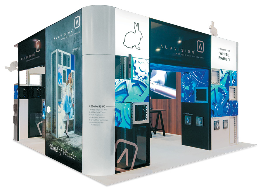
Exhibitor: Aluvision Inc. Design/Fabrication: Aluvision Inc., Duluth, GA, 470-252-3500, www.aluvision.com System: Aluvision Inc. Event: InfoComm Budget: $150,000 – $249,000 Size: 20-by-20 feet Photo: Aluvision Inc. Many exhibitors create stands that display their technology. Aluvision Inc., however, wanted its technology to be the exhibit at InfoComm. The developer of modular aluminum exhibit solutions set out to highlight its new Hi-LED 55 tile, a brilliant LED panel that seamlessly integrates into Aluvision's modular products. The display also needed to clearly demonstrate the inner workings of its tool-free and reconfigurable components. To that end, the firm's in-house designers settled on a 20-by-20-foot island space with large openings on three sides. Cheered by judges as a "stellar example of product integration and forward-thinking design," the stand showcased the Hi-LED 55 tiles, along with lightboxes, straight and curved frames, and different types of hard panel and fabric infills. Within the space, some sections showed various uses for the finished product. For example, the back wall incorporated a large LED screen, and the new LED panels were used to construct a spectacular 20-foot arch across one end of the exhibit. Meanwhile, silicone-edge graphics presented additional product-focused messaging. Other sections of the exhibit emphasized the system's functionality and gave attendees a glimpse behind the proverbial curtain. For instance, the backs of some LED tiles and traditional frames were left open, allowing visitors to understand how different component types (e.g., frames, lightboxes, and corner posts) were connected. In addition, designers devised a separate demo unit in the middle of the booth that allowed attendees to get hands on with the entire product range and gave staffers another talking point. For Aluvision, then, the stand both displayed its new tech and gave visitors a glimpse of the components that make the magic happen. 
Exhibitor: Dunkin' Brands Inc. Design/Fabrication: Hill & Partners, Weymouth, MA, 617-471-7990, www.hillpartners.com System: Moss Inc. Event: Recon Budget: $150,000 – $249,000 Size: 30-by-40 feet Photos: Cole Group It's an evolve-or-die marketplace. In fact, previous brand titans such as Sears, Payless, and Toys R Us all learned the hard way that complacency is a death sentence. Dunkin' Brands Inc., whose beginnings trace back to 1950, understands the importance of evolution. As such, the brand recently underwent a large-scale makeover to keep it relevant for generations to come. So for its exhibit at Recon, Dunkin' Donuts wanted a new booth that mimicked its redesigned stores and was on par with its recent update. Designers at Hill & Partners readily accepted that challenge and concocted a 30-by-40-foot environment that took the top slot in the Best Use of Graphics category. Enlisting the EZ Panel system from Moss Inc., designers recreated the retail-store experience, complete with a mixture of restaurant-style seating, transparent-glass and opaque walls, and an angular "rooftop" and ID logo. Within the space, designers applied a fresh material palette of rich maple wood, concrete slabs, black brick, white porcelain tile, and accents using the brand's corporate orange and pink. To meet the needs of booth staff and marketers, designers also tucked two meeting rooms into the rear of the footprint and added a small-scale model of future stores. Resting in the center of the exhibit, the model helped staff explain the brand's new drive-through experience to booth visitors. Judges applauded the clever design, calling the graphics "logical and on brand." In the words of one juror, "the exhibit graphics perfectly coexisted with traditional store graphics, creating a very cohesive design language."
2019 Judges
Entries were scored by a two-part panel of marketing and design experts, who evaluated both the aesthetic qualities of the completed portable/modular exhibits as well as their functionality, practicality, suitability, messaging, and marketing capabilities. 
|
|
|
||||||||||||||||||||||||||||
|
|
||||||||||||||||||||||||||||
|
TOPICS Measurement & Budgeting Planning & Execution Marketing & Promotion Events & Venues Personal & Career Exhibits & Experiences International Exhibiting Resources for Rookies Research & Resources |
MAGAZINE Subscribe Today! Renew Subscription Update Address Digital Downloads Newsletters Advertise |
FIND IT Exhibit & Display Producers Products & Services All Companies Get Listed |
EXHIBITORLIVE Sessions Certification Exhibit Hall Exhibit at the Show Registration |
ETRAK Sessions Certification F.A.Q. Registration |
EDUCATION WEEK Overview Sessions Hotel Registration |
CERTIFICATION The Program Steps to Certification Faculty and Staff Enroll in CTSM Submit Quiz Answers My CTSM |
AWARDS Sizzle Awards Exhibit Design Awards Portable/Modular Awards Corporate Event Awards Centers of Excellence |
NEWS Associations/Press Awards Company News International New Products People Shows & Events Venues & Destinations EXHIBITOR News |
||||||||||||||||||||
|
||||||||||||||||||||||||||||


