|
small exhibits
 Illustrations: PATRICK WELSH
Strategic Small-Booth Designs
Despite the prevailing "go big or go home" mentality, small exhibits can pack a powerful punch. To help you design your small but mighty booth, here are six layouts along with expert advice on how best to use them. By Linda Armstrong
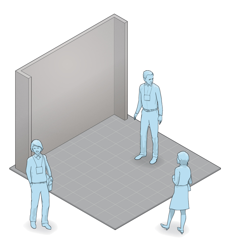
How do you make the most of a 10-by-10 space? Certainly, it's not easy to utilize every inch without creating a cacophony of clutter. But it all comes down to understanding your objectives, choosing the perfect elements to meet them, and eliminating whatever isn't absolutely needed.
So to help you optimize your space to achieve your goals, here are six layouts that accomplish some of the most popular exhibit-marketing ambitions. Plus, four industry experts – Steve Deckel, design director of Deckel & Moneypenny Exhibits; Adam Deming, exhibit design supervisor at Skyline Exhibits; Byron Thompson, exhibit designer at Access TCA Inc.; and Dana Tilghman, CTSM, CMP, senior trade show and events planner with Minitab Inc. – offer the pros and cons of each option. If you heed the experts' advice, you'll surely design a powerful, pint-sized layout that fits your needs. 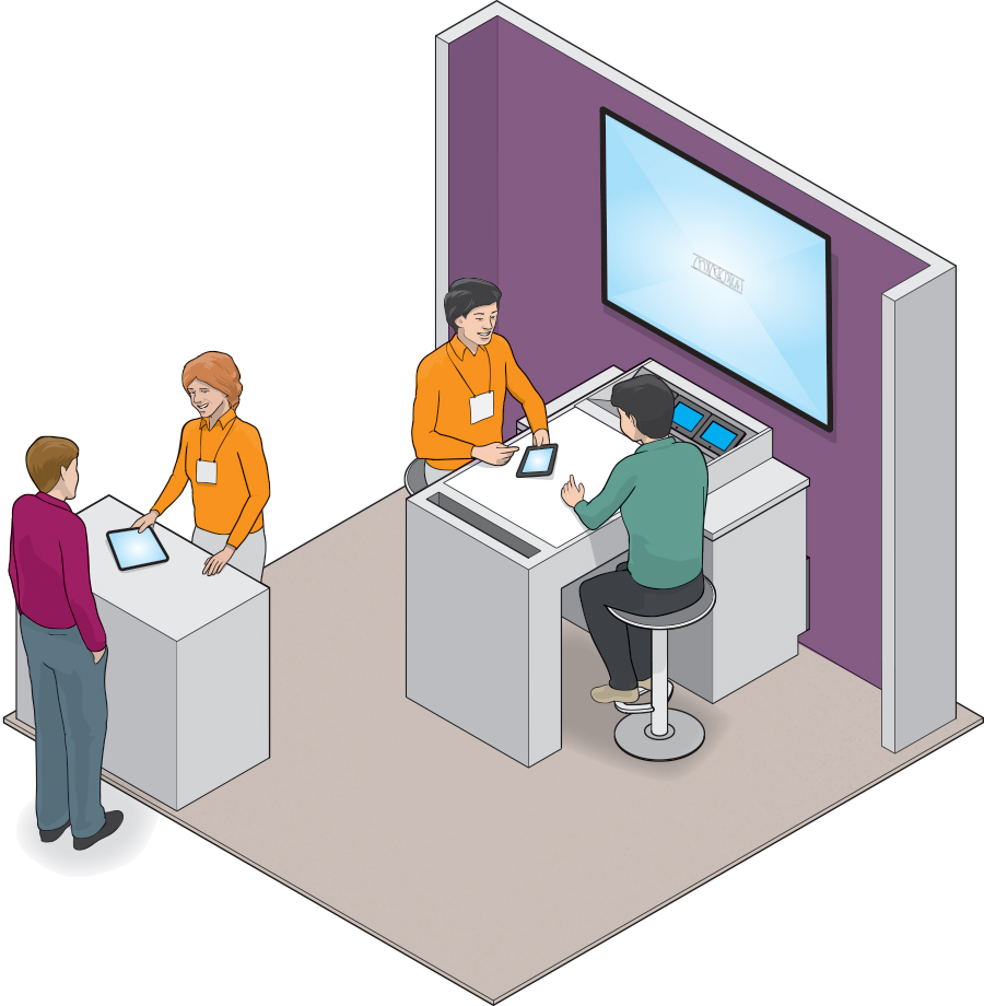 Staffers – A minimum of two staffers is required to manage both the reception desk and conversation station.
Reception Desk – Reception-desk pursuits can include everything from greeting and qualifying guests to providing shorter demonstrations or simple product information via handheld tablets. Mutimedia – The conversation station can incorporate a plethora of media options, such as product videos or interactive activities. Featuring a reception desk at the front of the booth and a sit-down conversation/demonstration station at the back, this option can accommodate semiprivate discussions in a conference-room atmosphere. It's a great choice if your objectives include both short awareness- and lead-generating conversations as well as deep-dive purchasing discussions with hot prospects. In addition, the reception desk allows for minimal lead gathering and qualifying.  • Traditionally a custom build, the layout presents a high-end feel that's typically absent from small spaces. As such, it may lend an air of permanence or sophistication to the brand. Plus, storage space can easily be built into both of the structural components. • Qualified and VIP visitors will likely appreciate the ability to sit down and engage in an in-depth, face-to-face conversation, as opposed to having to stand throughout the duration of their visit. • The design offers a dual-pronged solution with space for shorter conversations or demos with less-qualified attendees at the reception desk and in-depth discussions with highly qualified or VIP customers at the sit-down station. • The dedicated conversation station allows exhibitors to schedule meetings and rest assured there will be ample space available within the small footprint.  • Since this design plays to the needs of qualified/VIP visitors, it may not be the best option if your primary goal is marketing to the masses. • The design offers minimal opportunities for branding, as most of the back-wall space is blocked by the conversation station, and the front of the reception desk is below waist level. • The custom conversation station will likely require fairly large and heavy crates for shipping and storage, thereby creating additional fees. • The limited seating may pose a problem if you need to meet with more than one attendee at a time. 
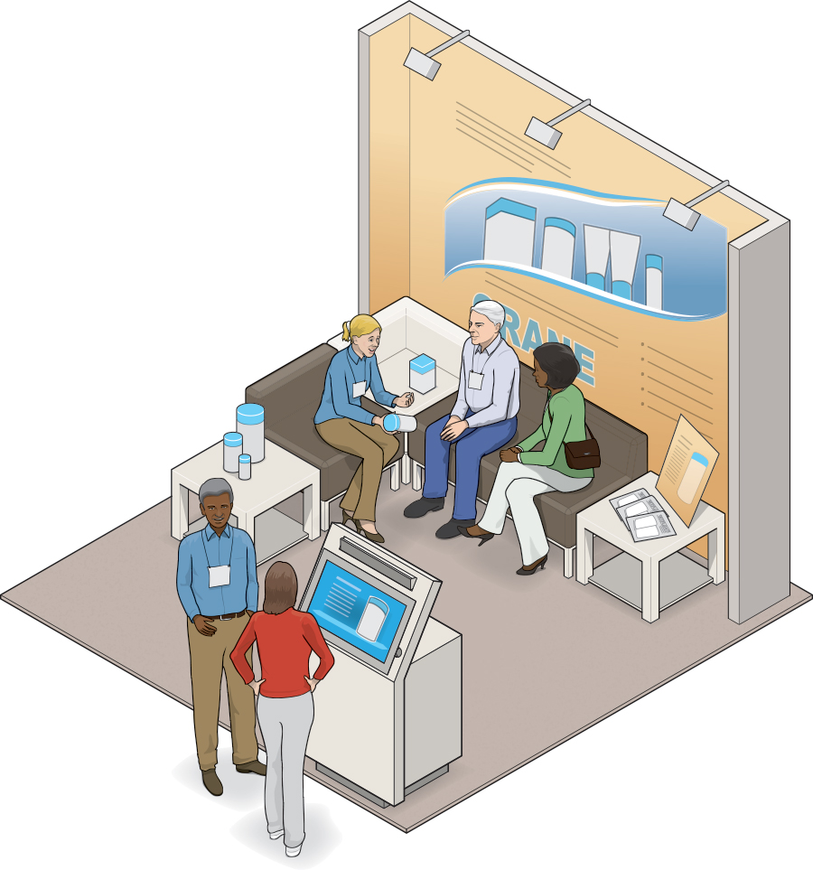 Staffers – A minimum of two staffers is necessary to handle this layout, and both should be trained to engage small, seated groups (as opposed to only solitary attendees).
 Mutimedia – With mindful use of the front-aisle kiosk, this design can also support awareness-building and lead-gathering objectives. Furniture – Make the most of every available inch by using the side tables and middle seating section to display products or product/service information. The primary purpose of this layout is to offer a casual conversation space to foster relationships with existing clients or to establish those connections with new prospects. However, the design also includes the opportunity to provide media-assisted presentations or looping videos via a kiosk at the front of the space. Thus, it meets a secondary goal of developing awareness, gathering leads, and providing product info to attendees not interested in sit-down discussions.  • This concept is ideal for casual, relationship-building conversations with existing customers or qualified attendees; plus, the ability to "take a load off" will attract weary booth visitors looking for a short respite. • Particularly when an aisle is situated on the front and side of this configuration, the design allows for easy access and offers an open feel that is rare for a small booth and can make the space feel larger than it really is. • If rental furniture is used within the space, this layout will be relatively inexpensive since you'll only be paying shipping, drayage, and storage costs for the back wall and aisle-side kiosk. • As a dual-function space, this concept allows one staffer to engage with and qualify prospects aisle side while another fosters relationships with existing clients at the back of the footprint.  • Although the lounge is ideal for existing customers, some prospects may be apprehensive and unwilling to commit to entering the space and sitting down for an in-depth conversation. • If rental furniture is used, storage space may be severely limited and potentially inconsistent from show to show. • Some clients might "camp out" in your lounge, requiring skillful and tactful staffers to "break camp" and make room for VIP guests when necessary. • Since most back-wall space is blocked by seated attendees, opportunities for branding are limited. 
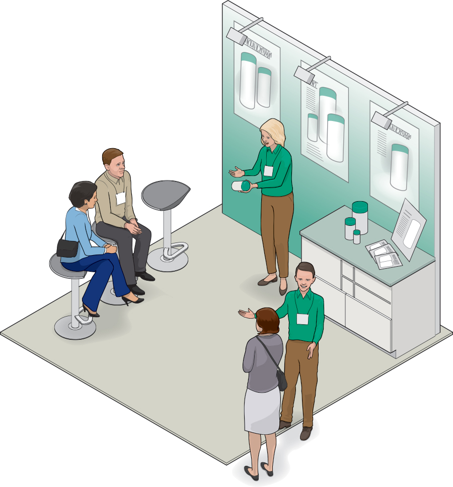 Ambient Noise – Consider the typical volume level of the show and any activities that may be happening nearby. Then ensure that your presenter can easily be heard above the surrounding ruckus.
 Furniture – High stools such as those pictured here provide comfort while also elevating their occupants to almost the same height as the standing presenter – a factor that usually gives attendees an increased sense of participation. Staffers – Two staffers are required. While both can greet attendees and invite them to sit down for a presentation, one needs to present while the other draws in passersby, answers questions, and scans badges. This layout allows you to offer fairly lengthy or in-depth small-group presentations/demonstrations – such as those required to understand complex technology or promote your products' uses and benefits. The design might be a good fit for prescheduled demonstrations with top prospects, and it can easily be accessorized with various presentation aids, such as touchscreens attached to the back wall or simple monitors positioned atop the cabinet.  • Best used in a peninsula configuration or with an aisle located on the front and side of the footprint, this option is open, inviting, and easy for attendees to access. • To accommodate storage, the size of the cabinet can be altered or an appropriately sized option can be rented. Plus, the large back-wall graphic space offers considerable branding opportunities. • Aside from a back-wall graphic, nearly all components of this design can likely be rented, thereby eliminating most shipping, drayage, and storage fees. • While seating is limited, an ongoing presentation could act as a booth draw, causing additional attendees to pause in the aisle and soak up your messages on the fly.  • Even though many attendees will be willing to stand in the aisle to watch the presentation, some will move on if there isn't an available seat within the booth. • Attendees might be apprehensive about stepping out of the aisle and into the booth, limiting the number of visitors who will sit down for your presentations. • If live presentations don't happen frequently throughout the show, attendees may perceive the booth as empty and lifeless. • As a one-function space, the design offers few opportunities for private conversations, VIP treatment, and lead qualification. 
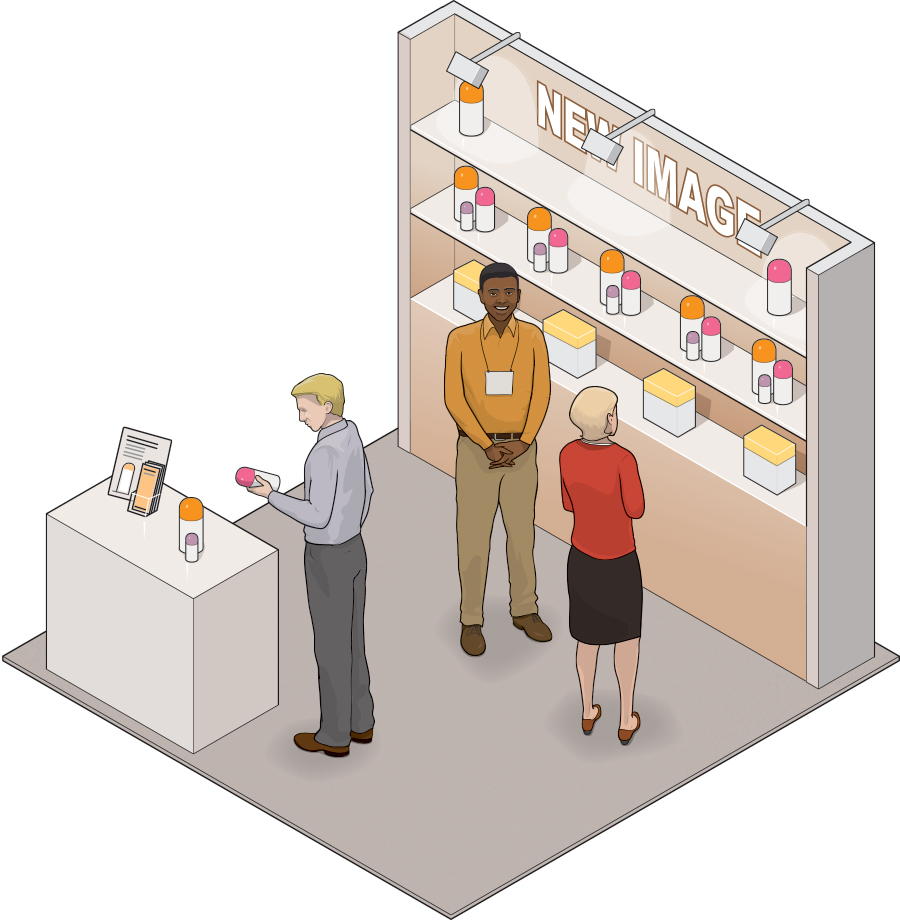 Staffers – Unlike most dual-function designs, this option may only require one staffer well-versed in your company's offerings.
 Aisle-Side Options – Since some attendees may be too wary to enter the space and handle the wares, you can meet their needs by placing a few products on the reception desk or adding a compact kiosk display on a front corner. Lighting – Consider adding a header and perhaps some light fixtures to create a branding opportunity and to further draw attention to the space. If displaying myriad products for attendees to see and touch is your goal, this design will likely best meet your needs. The concept allows you to house your wares in a back-wall display as well as atop an aisle-side reception desk. On the whole, it generates awareness of your company and products. Plus, it promotes one-on-one conversations between attendees and staffers, which can result in precise lead qualification and relationship building.  • This low-tech, low-key display keeps a tight focus on your products and offers ample opportunities for attendees to interact with them. • Multiple shelves provide plenty of room to display a large amount of products; plus, additional products or supplies can be stored in the bottom of the display case. • With the main display at the back of the booth space, attendees have sufficient room to enter the exhibit, peruse the products, and engage in conversations with staffers. • Since the primary goal of this layout is to highlight your products, it's possible that you will only need a single staffer to manage the exhibit.  • With a tight product focus throughout the footprint, the layout offers minimal opportunities for branding or graphic messaging. • While you can certainly add a monitor to the reception desk, there are few other opportunities to display digital content that might elaborate on product lines, features, benefits, warranties, etc. • Visitors will more than likely rely solely on the staffer to draw them in and answer questions. Plus, some visitors will resist walking to the far back wall of the space to handle the products. • Typically this design will comprise relatively heavy, rigid materials to support the weight of the products. As such, weight-related costs may be considerable. 
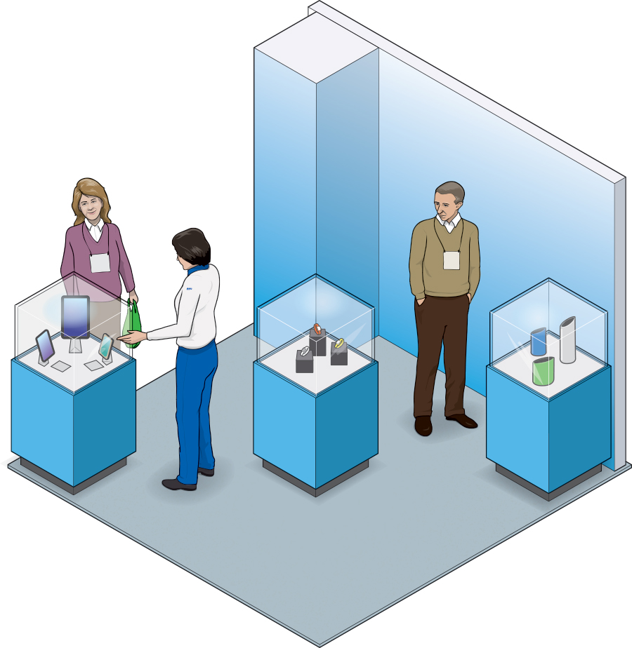 Color –Bathing all structures and the back wall in a single corporate hue can create the look and feel of a much larger space while branding
the entire environment.
 Materials – Consider using an aluminum portable/modular system for your displays to minimize shipping costs. Accessibility – Consider displaying a few products outside of the cases to allow passersby to easily touch and feel the merchandise. Featuring a "look, don't touch" vibe, this design houses products in three waist-high display cases along with a columnar display (which could also be transformed into a storage structure) near the back wall. The cases echo jewelry-store displays, which elevate the products' perceived value yet allow staff to remove and present pieces as needed. Thus, this design is the winning ticket if your products are high-end and your want to foster one-on-one conversations with attendees.  • Turning your products into artwork lends an upscale vibe to your brand and an air of sophistication to your wares. That attribute can prove helpful to companies targeting premium prospects. • The back wall and display cases provide ample surface area for branding and messaging opportunities. • The museum-like setup entices most attendees to peruse products aisle side and then eases them into and through the space. • Given its artful essence, the environment may visually pull people to the space. Plus, it promotes conversation between staff and attendees, perhaps allowing even a single staffer to qualify visitors.  • While attractive, the potentially heavy display cases could carry significant weight-related charges. Portable/modular systems may be able to lighten the load. • Although the display-case arrangements may draw people into the space, they take up considerable room. As such, the environment could easily become crowded with more than a couple of guests. • Attendees like to touch and feel merchandise, so unless at least a few of the products are displayed outside of the cases, some prospects may bypass the space. • Unless you replace the back-wall graphics with a monitor, the layout offers practically no opportunities for digital content, aside from perhaps a handheld tablet. 
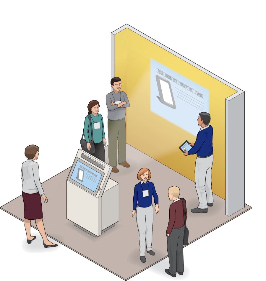 Standing Room Only –While ideal for presentations, this option offers no seating and minimal opportunity for lengthy one-on-one conversations.
Kiosk – A small reception structure or kiosk might provide a bit of storage space and a point of contact for attendees who aren't interested in a full-blown presentation. Staffers – Although the space can function with only one staffer, an additional rep is ideal, as he or she can interact with passing attendees while a formal presentation is taking place. When you don't have goods to display, offering digital content about your services may be your best bet. This layout enables you to project a looping video or customized display against the back wall and to show the same content on an aisle-side monitor. Or, you can use the back wall as a graphic display and house all digital content on the monitor. As such, the layout offers deep-dive content to qualified attendees and builds awareness via a looping broad-based display.  • Particularly effective in a peninsula configuration, the open-concept design is inviting and likely a breath of fresh air for attendees on a crowded show floor. • The back wall can serve as a giant branding and message-delivery medium, offering presentation content at times and general imagery, text, and video at others. • Since all content is digital, messaging can easily be changed for every show or even altered on the fly to suit different target markets within the same show environment. • Dynamic digital content (either looping video or a true service presentation) can draw the eye, turning the entire space into a traffic builder.  • Given the singular focus of this design (and the lack of a traditional reception desk), it's difficult for staffers to connect with passersby when a presentation is in progress. • Staff must be adequately skilled and trained in providing general information, luring in prospects, and offering in-depth presentations. • Depending on the rigidity of show management, staff may need to encourage attendees to step inside the space as opposed to watching the presentation from the aisle. This, in turn, may cause congestion. • The design offers little to no storage space and lacks seating options, the latter of which can limit the time attendees will choose to remain inside the booth space. 
Needs-based assessment
Armed with the aforementioned info, your head is likely swimming with details including everything from storage options and seating to staffing requirements and digital displays. To help you make sense of it all, here's a handy chart that summarizes how well the six designs meet nine face-to-face marketing priorities. Using both the chart and the preceding content, you should be able to select a layout and then customize it to fit your exhibiting program's particular needs. 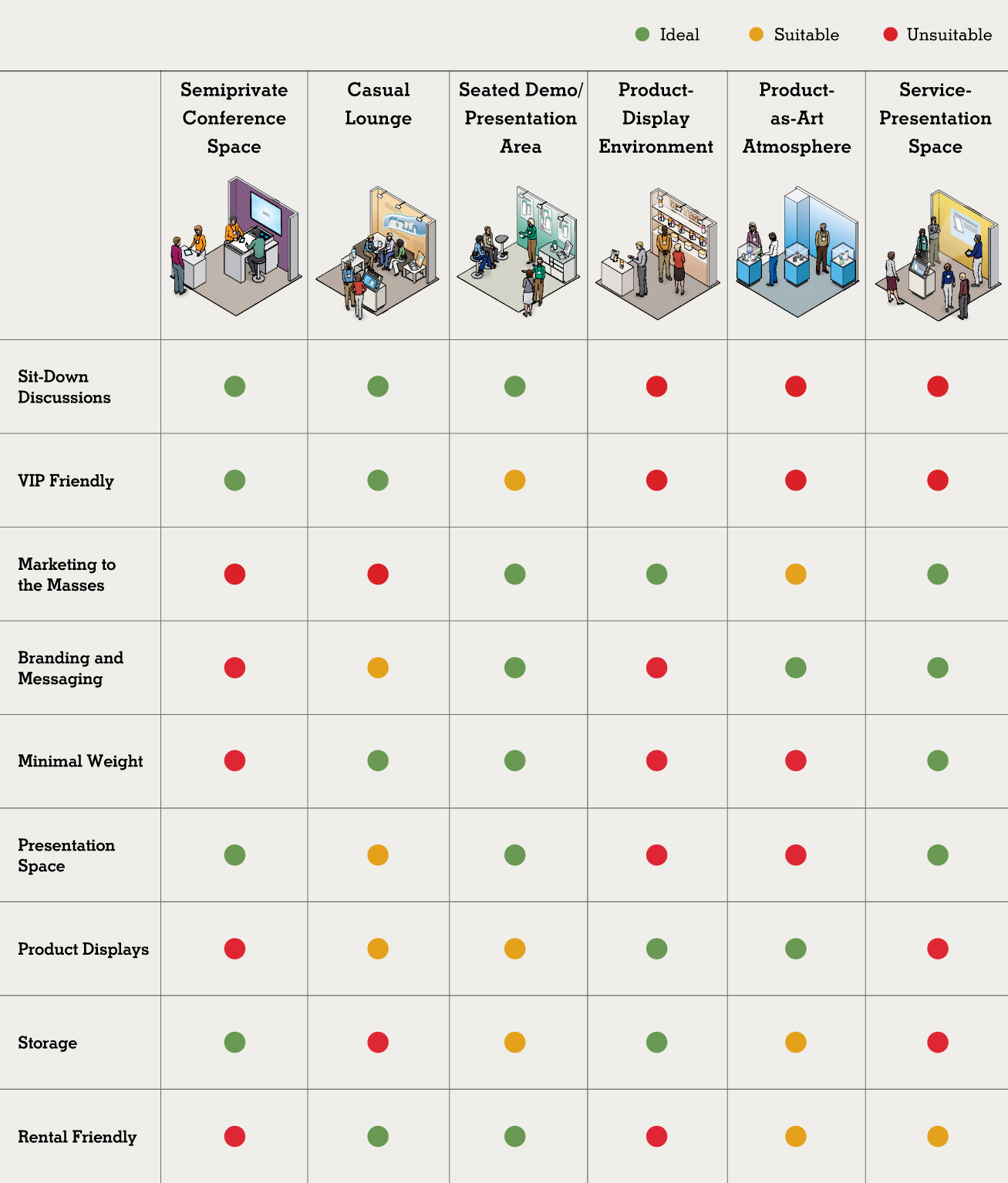
|
|
|
||||||||||||||||||||||||||||
|
|
||||||||||||||||||||||||||||
|
TOPICS Measurement & Budgeting Planning & Execution Marketing & Promotion Events & Venues Personal & Career Exhibits & Experiences International Exhibiting Resources for Rookies Research & Resources |
MAGAZINE Subscribe Today! Renew Subscription Update Address Digital Downloads Newsletters Advertise |
FIND IT Exhibit & Display Producers Products & Services All Companies Get Listed |
EXHIBITORLIVE Sessions Certification Exhibit Hall Exhibit at the Show Registration |
ETRAK Sessions Certification F.A.Q. Registration |
EDUCATION WEEK Overview Sessions Hotel Registration |
CERTIFICATION The Program Steps to Certification Faculty and Staff Enroll in CTSM Submit Quiz Answers My CTSM |
AWARDS Sizzle Awards Exhibit Design Awards Portable/Modular Awards Corporate Event Awards Centers of Excellence |
NEWS Associations/Press Awards Company News International New Products People Shows & Events Venues & Destinations EXHIBITOR News |
||||||||||||||||||||
|
||||||||||||||||||||||||||||


