sizzle awards |

|

f Derse Inc. had a marketing role model, it would be Madonna. Just as the Queen of Pop morphs effortlessly from modest lace tops and rosaries to provocative breast cones and leather whips, the Milwaukee-based company seamlessly alters its look every year at EXHIBITOR Show, the world conference and exhibition for trade show and corporate event marketers.
At the 2005 EXHIBITOR Show, for example, Derse based its booth theme on Peeps, the 55-year-old marshmallow candy, using highlighter-yellow furniture and graphics while positioning personnel outside the exhibit hall who handed out cards that read, "Admit one: Peep Show." In 2006, Derse attracted attention with an integrated program built around the concept of marketing buzz, sending out pre-show mailers stuffed with a pair of magnets that literally buzzed when connected. At the 2007 show, rather than its usual come-one, come-all approach, Derse sought to attract a smaller, more VIP crowd of attendees with an enclosed exhibit that oozed exclusivity with a hip, private-club vibe.
But for EXHIBITOR2008, Derse took a rest from the previous year's motifs and marketing by giving its exhibit and target audience some much-needed rest and relaxation.
Cool, Calm, and Collected
Making a sharp 180-degree turn from the velvet-rope exclusivity of its 2007 booth, Derse sought to draw in and sequester as many of the 2008 show's audience of exhibit and event marketers that it could. But instead of seizure-inducing colors, casino-level noise, and booth staffers touting products with all the charm of carnival barkers, Derse wanted to create a blissful retreat where visitors could contemplate their exhibit programs' needs in peace and quiet.
"Everybody is screaming and shouting on the show floor, and we thought the way to stand out and reach our goals was not to give more of that, but less," says Russ Fowler, Derse's senior director, corporate creative. "If we could help attendees slow down with all the rushing around they have to do, we felt we could get them to start conversations about their needs with us."
Fowler and the Derse staff volleyballed several concepts around: It could construct an exhibit and campaign around ideas such as spas, sanctuaries, or respites, but according to Fowler, the team felt those ideas were all "been there, marketed that." Ultimately, Derse's brainstorming turned away from concepts and themes, and instead focused on the company's primary objective: to invite prospects to linger in its booth with staff long enough to have a mutually beneficial exchange of ideas - the kind that leads to mutually beneficial partnerships. Throughout that discussion, one word kept popping up: That word was "pause."
The Comma Before the Storm
The chill-out concept seems simple enough, but how do you convey an intangible idea like "pause" in a marketing message and an exhibit structure? For Derse, the answer was disarmingly simple: It would play a serene yin to everyone else's rowdy yang, a technique pioneered in the 1930s by Smirnoff vodka.
According to "Building Strong Brands" by David A. Aaker, the legendary Russian refreshment set itself up during the Depression as the clean, simple opposite of the swarthy, complicated whiskeys and bourbons of the era with its "no taste, no smell" tagline and visuals of the crystal-clear liquid. Derse took a similar approach in its booth, using an absence of noise, light, and color to make itself paradoxically more noticeable than its competitors.
|

|
 |
 |
Pause and Effect
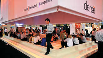
Derse Inc. built a quiet haven where
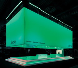
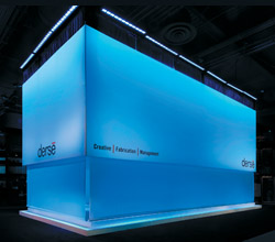
attendees could find shelter from the noisy storm of the trade show floor. The mostly monochromatic color scheme provided a visual pause from the show floor's usual riot of color. Every 20 minutes, fabric screens enveloped the booth, closing it off so visitors could watch
"Visual Pause," a short high-definition film featuring soothing, slow-motion
images and a calm-inducing soundtrack. |
Like a sauna that sweats out the toxins before a relaxing rubdown, the company began priming potential attendees with a pre-show print advertising campaign. The ad was formatted in a block of shmushed-together text with no spaces, punctuation, or pauses, which read (spaces and punctuation included here for your easy-reading pleasure) "With great respect for your long and getting longer to-do list and the pressure to do more with less - less resources, less time, less staff, and less money - in the face of great expectations from your boss and senior management, and the desire for personal and professional growth fulfillment and, call me crazy, a somewhat functional personal life, Derse begs a few moments of your time at EXHIBITOR2008 to create space for ." followed by a large comma signifying "pause."
The cease-less prose may have looked like a lost E.E. Cummings poem, but the graphical comma symbol at the end of the out-of-breath text acted like a cup of chamomile tea after a panic attack. Derse had banked on a symbol whose innate "give me a break" meaning readers would react to as automatically as they would a stop sign.
 |
 |
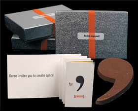
| Derse's pre-show promotion was a call to calm, with a gift-box mailer that came with a 4-ounce chocolate comma and a
message that asked recipients to "create space for pause." |
 |
A few days after the ad appeared in industry trade pubs, Derse mailed nearly 600 pre-registered attendees a silver, oblong cardboard box tied with a satin Derse-orange ribbon. In addition to an accordion-fold message that challenged recipients to "create space for pause," the box contained a 3-by-4-inch, 4-ounce chocolate comma. It wasn't just the universal recognizability of the scimitar-shaped punctuation mark that made it connect with recipients. The pre-show mailer worked because it was a temptation few recipients would resist taking a break - that is, a pause - to enjoy.
Pre-show invitations containing tchotchkes such as pens and flash drives can be highly effective as booth draws if they're useful or memorable, but chocolate is a siren song few can ignore. Where most mailings engage you on just the tactile and visual levels, the edible promotion touched the recipients on four: visual, tactile, gustatory, and, if they broke to truly savor it, conceptual, too.
Give Me a Break
With attendees primed by the manic-panic print ad and their appetite whetted by the chocolate commas, Derse started calm-unicating the rest of its message before attendees reached the booth - with one 38-by-90-inch showboard portraying a comma placed outside the exhibit hall. Now attendees were ready to enter the trade show version of Tranquility Base on the show floor: a 20-by-40-foot booth that one Sizzle Awards judge called "a destination in a sea of clutter."
Like the ancient Greek marble plazas called "agora" the philosophers held court in, the deceptively Spartan-looking 800-square-foot rectangular booth was designed to draw attendees in to talk and contemplate. Ringed by a calf-high set of stairs, the minimalist, mostly white space evoked the cozy feeling of a sunken living room, which stood out next to the other neon-colored booths, like a tuxedo in a room full of tie-dyed T-shirts.
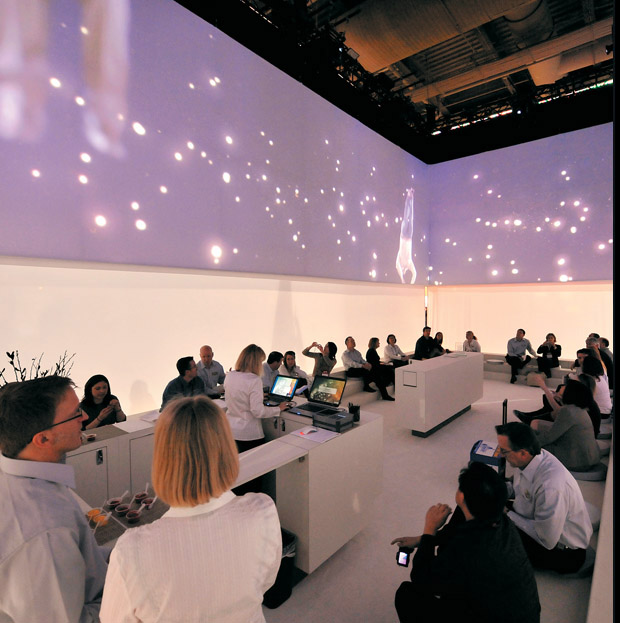
Once inside the booth (attendees entered by stepping over the white stairs that lined the exhibits perimeter - and also served as seating - or through one of two entrance points on either side of the reception desk), visitors rested on gray, circular cushions. Staffers, all outfitted in black slacks and neutral white or gray shirts that blended with the monochrome composure of the booth, served seated visitors sorbet to symbolically clear their mental palates - and allow them to mellow out for a few moments. As they enjoyed the frozen treat, Derse personnel calmly and quietly chatted with attendees in a style more appropriate to a hushed, high-end spa than the raucous happy hour of other exhibits.
 |
 |
| An oasis in a tempest of noise and light, Derse's booth invited visitors to sit and pause long enough to absorb its calming message with a serving of sorbet, light conversation, and a high-definition video. |
 |
Approximately every 20 minutes, a soft white light flickered on, and marble-white fabric screens descended from an overhead ceiling structure that defined the perimeter of the space, turning the booth into an enclosed refuge. Eight feet above the floor, a high-definition film of about two minutes' length screened on all four walls. The "Visual Pause" video showed a series of lava lamp-like colors shifting lazily, with seemingly floating people somersaulting in slow motion - all representative of the act of pausing. As staffers and comfortably captive visitors quietly absorbed the evocative images, curious attendees outside peered through the open spaces between the fabric walls' edges like kids peeking under a carnival tent to spy the treasures within. The great escape the exhibit offered from the show floor's turmoil was so profound, Fowler says, that attendees kept asking him, "Can you lower the curtains and run the 'Pause' again?"
Whether it's one moment or one hour, the inner peace you achieve while taking a break from the pandemonium of a trade show is both welcome and refreshing. So Derse staffers handed visitors round stickers with a gray comma in the center, which they could affix to anything from their cell phones to their Day-Timers to help remind them to stay in this "pause" mode throughout the show.
Derse also sent a post-show mailer to 250 booth visitors that included a comma-shaped door hanger the company hoped would encourage them to continue pausing occasionally to think about their exhibit programs' needs. The door hanger, which was branded on one side with Derse's logo, read, "Do not disturb. Pause in progress," while an enclosed postcard encouraged recipients to hang the comma on their office door and "take a moment to consider ways to increase the effectiveness" of their programs.
Rest in Peace
Lauded by judges as "a wonderful execution of a truly creative idea," the exhibit's results were as loud and bright as the booth was quiet and subdued. By the time Derse's three-day pause was over, the company had rounded up 18 percent more leads than it initially hoped for. Derse also exceeded its goals of meeting with current customers and existing prospects by 27 percent and 8 percent, respectively. But the booth's dramatic effect went way beyond lead counts and measurable results.
"Almost anyone attending this show probably already knows who Derse is, so there's no point in it doing all kinds of branding and pitching," one judge noted. "But they created a sanctuary on the show floor. Lots of exhibitors claim to do that, but this is one of the only exhibits I've ever seen that actually accomplished it." The judges' glowing tributes and the superb results that the promotion achieved prove that Derse's innovative campaign was anything but a faux pause. e |
|
|
|


 Reach 62 percent of the company's target audience during the show.
