|
ammunition
Ideas That Work
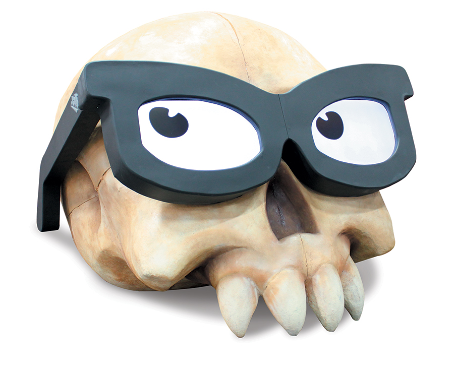 When much of your business is devoted to making licensed apparel for iconic video game franchises such as Warcraft and Halo, attendees expect to see some pretty cool elements in your exhibit. Clothing company Jinx Inc. certainly rose to the challenge at the Magic trade show in Las Vegas, where it didn't just catch the eyes of passersby – it stopped them dead in their tracks with an aisle-side 3-D depiction of the brand's spectacled skull logo. Measuring 10 feet long, 10 feet wide, and 10 feet high and crafted from an aluminum frame coated in Fiberglas, the sculptural element boasted an additional feature: Its eyes were actually video screens that alternated between blinking, scanning the crowd, and flashing psychedelic patterns. The show-stopping skull earned praise from gaming insiders and lured attendees who had never heard of Jinx into the booth to find out more. 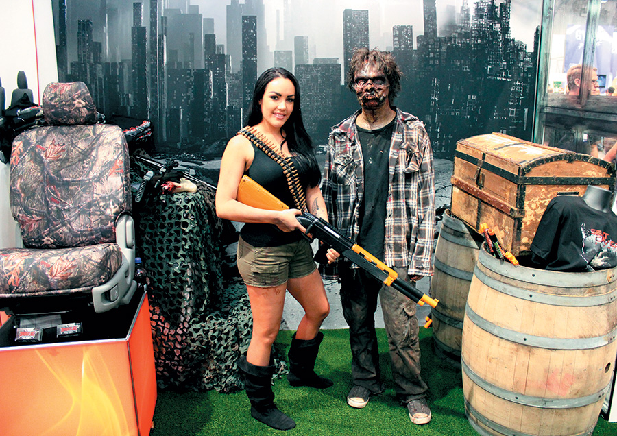 It's hard to get attendees excited about seat covers. So to create buzz around its new "Zombieflage"-patterned seat cover at the Specialty Equipment Market Association Show (SEMA) in Las Vegas, Seat Covers Unlimited devised a photo op featuring a very special guest: a member of the undead. Dressed in battle-worn clothes and covered in special-effects makeup straight out of "The Walking Dead," the "zombiefied" model stood in front of a post-apocalyptic graphic backdrop and posed with interested attendees. An accompanying graphic instructed attendees that if they shared the photos on Facebook, Instagram, or Twitter using three prescribed hashtags (#seatcoversunlimited, #Zombieflage, and #SEMAShow2015) they would receive a branded, zombie-themed T-shirt. Talk about a brave traffic-building strategy! 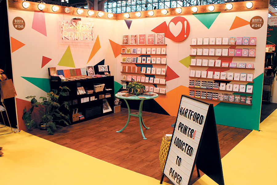 Hartford Prints wanted to make sure its 10-by-10-foot exhibit stood out at the 2016 National Stationery Show, so it used a trio of tactics, including bright colors, integrated lighting, and couldn't-miss messaging. The company started by painting its back wall with a series of bold-colored triangles. Then, a wooden header was added, bearing 17 exposed light bulbs. A neon sign provided further illumination and branded the space, while a sandwich board in the corner of the exhibit attracted attendees from both aisles with the message "Hartford Prints! Addicted to Paper." 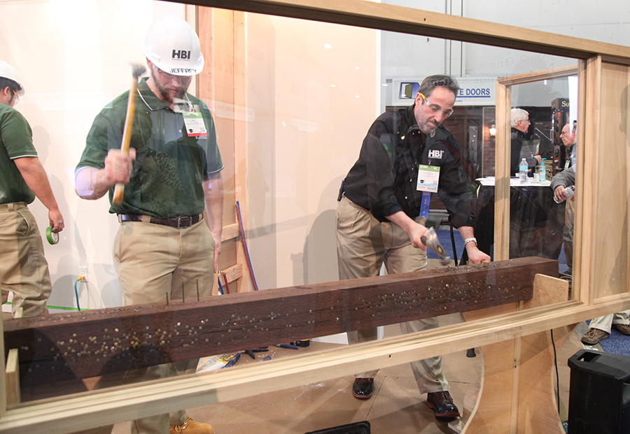 To drive home the fact that its students are able construction workers, the Home Builders Institute pit them against any who were willing to test their speed and accuracy with a hammer at the International Builders' Show. At the booth, a rotation of students waited behind a Plexiglas shield next to a 6-foot-long board, which had a row of ordinary nails just barely started into the wood. Attendee challengers, each outfitted with safety goggles and a hammer, joined the student behind the shield where each was assigned a couple of the started nails. When a moderator said "Go!" both contestants worked as expeditiously as possible to pound the nails straight into the board. Time after time, the students efficiently whacked the nails a fraction of the number of times needed by their competitors. The in-booth activity effectively hammered home the Home Builders Institute's key messages ndash; and let attendees get in on the action to boot. 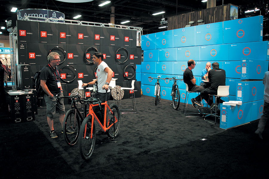 Very few trade show exhibits can be described as being both inexpensive and eye-catching. But Italian bicycle-part designers 3T Cycling Srl and Open Cycle AG pulled off this rare adjective amalgamation in their co-owned exhibit at the Interbike International Bicycle Exposition in Las Vegas. While the 20-by-20-foot space showcased a few bicycles featuring the companies' forks, stems, frames, wheels, etc., the exhibit's back and side walls took center stage. Both walls comprised little more than boxed-up bike components. However, when stacked atop one another, the packages became two solid walls peppered with the companies' product logos and corporate colors. The simple solution branded the space while keeping the companies' shipping, drayage, and installation-and-dismantle costs to the bare minimum. 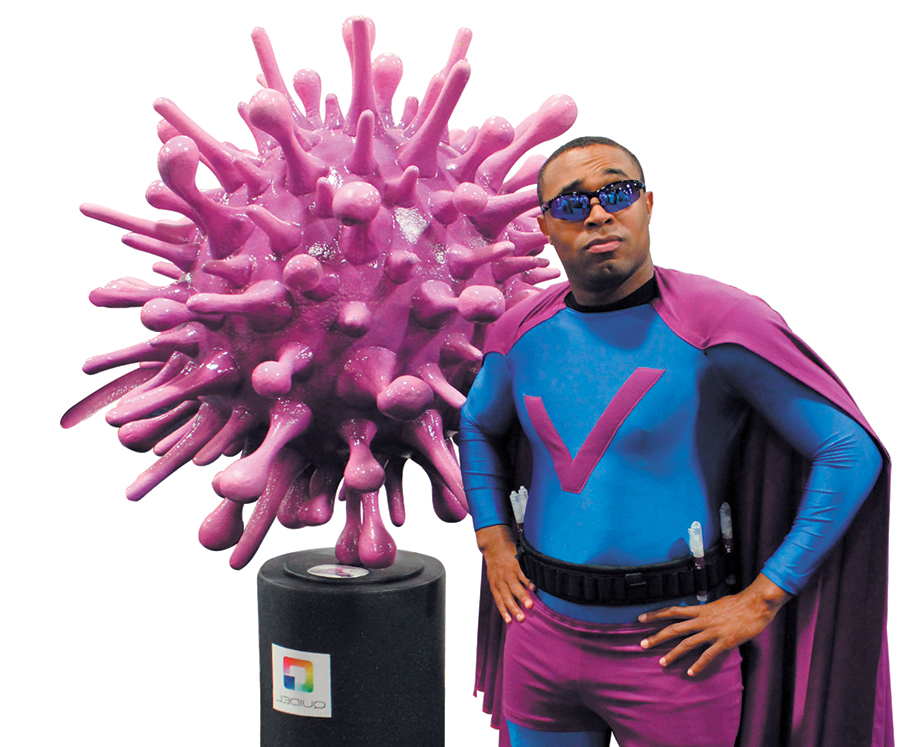 Every year, influenza infects up to 20 percent of Americans, resulting in an estimated $16.3 billion in lost earnings due to employee sick leave. That's why Quidel Corp. wanted to discuss flu prevention and the company's new rapid flu test at the 2016 Society for Human Resource Management (SHRM) Annual Conference. To attract showgoers to its booth, Quidel eschewed traditional exhibitry and employed nothing more than an unusual element and a caped crusader. A roughly 7-foot-tall sculpture of a supersized flu virus was the sole structure inside the company's 10-by-10-foot booth space, and a lone staffer ndash; dressed in a superhero costume with a utility belt bearing bottles of hand sanitizer ndash; engaged visitors. The viral avenger, dubbed Captain Quidel, encouraged basic flu-prevention practices and discussed the benefits of the company's rapid flu test. Developed by the word-of-mouth marketing agency Fizz Corp., the superhero strategy drew droves of attendees to Quidel's booth, helping the captain in his mission to vanquish the very costly viral epidemic. 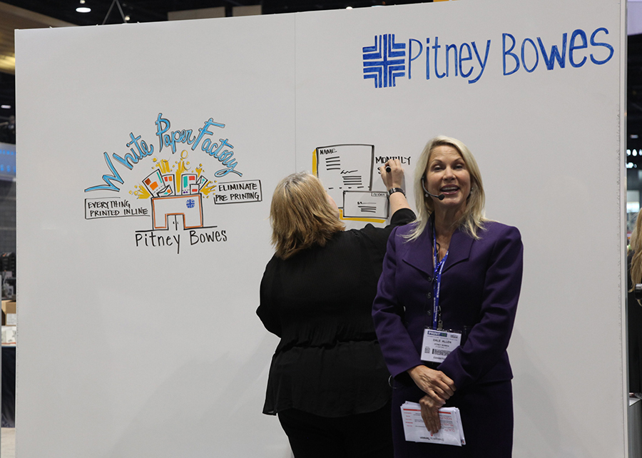 Surrounded by all manner of sophisticatedtechnology and huge pieces of machinery at the Print show, Pitney Bowes Inc. took a decidedly more human approach to sharing information in its presentations by drawing its message in colorful detail. A 6-by-8-foot whiteboard served as the back wall for the booth's presentation area, and throughout the show a staffer would stand in front of the whiteboard and explain Pitney Bowes' capabilities while an artist behind her drew a brightly colored pictograph echoing the spoken message. The information's artful design and the human touch it took to create it was an attention-grabbing tactic that was difficult to ignore.
|
|
|
||||||||||||||||||||||||||||
|
|
||||||||||||||||||||||||||||
|
TOPICS Measurement & Budgeting Planning & Execution Marketing & Promotion Events & Venues Personal & Career Exhibits & Experiences International Exhibiting Resources for Rookies Research & Resources |
MAGAZINE Subscribe Today! Renew Subscription Update Address Digital Downloads Newsletters Advertise |
FIND IT Exhibit & Display Producers Products & Services All Companies Get Listed |
EXHIBITORLIVE Sessions Certification Exhibit Hall Exhibit at the Show Registration |
ETRAK Sessions Certification F.A.Q. Registration |
EDUCATION WEEK Overview Sessions Hotel Registration |
CERTIFICATION The Program Steps to Certification Faculty and Staff Enroll in CTSM Submit Quiz Answers My CTSM |
AWARDS Sizzle Awards Exhibit Design Awards Portable/Modular Awards Corporate Event Awards Centers of Excellence |
NEWS Associations/Press Awards Company News International New Products People Shows & Events Venues & Destinations EXHIBITOR News |
||||||||||||||||||||
|
||||||||||||||||||||||||||||


