


|
exhibiting 101
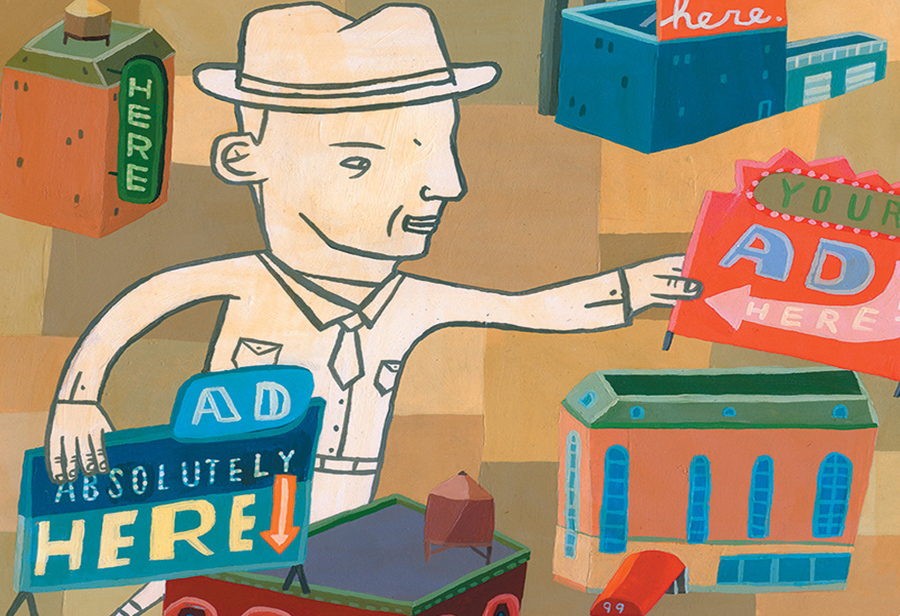 Illustration: Aaron Meshon
Sign Language
In-booth graphics can be a powerful component of your exhibit-marketing program – when they're used effectively.
Exhibit graphics should address three key pieces of information: 1) who you are, 2) what your product or service is, and 3) how your product or service benefits your target market. Yet when I walk trade show floors, I'm often amazed at the number of graphics that leave me scratching my head and pondering, "Hmmm. I wonder what that company does, and why is it here?"
While it's impossible to touch on every nuanced facet of the vast universe that exhibit graphics inhabit, here are some items to consider to make sure your graphics are effective and cost-efficient and won't leave attendees scratching their heads. Concise Messaging Some exhibitors believe they should cram as much information onto their graphics as possible, when in most cases the opposite is true. Getting your message across generally needs to happen quickly, as it takes passersby about four seconds to cross 10 feet of your booth's perimeter. Your graphic content needs to be short enough to be read almost instantaneously, so stick with the billboard design philosophy that copy should be limited to six words on one line. Powerful Words Your graphics should include words and imagery that will evoke strong personal emotions in attendees and persuade them to purchase your product ndash; or at least entice them to step into your booth. I like to say graphics should serve as the aspirin for your target audiences' headaches. As such, your messaging should be directed to your target market's specific pain points and offer solutions. Words such as "reduce," "proven," "increase," "improve," and "save" are particularly effective at describing the benefits of your products or services and will resonate more strongly with attendees than just a bulleted list of features. Also, copy that is written in an active voice ("Clients love our products") is more engaging than passive voice ("Our products are loved by our clients"), and therefore much more likely to make an impact. One note on selecting powerful imagery: When choosing between a simple product shot or a picture of a person using your product, go for the human element. In my experience, this goes a long way toward helping attendees feel an affinity for ndash; and connection with ndash; your brand. Optimal Visibility One of the age-old questions about exhibit graphics is whether or not bigger is always better. It may seem like an oversimplification, but not all graphics are created equal when it comes to where a passerby or booth visitor will be reading them. You need to plan the size and location of your graphics with this in mind. Generally speaking, graphics fall into one of three categories. Graphics that act as a magnet so attendees can find your exhibit from across the show floor, such as 3-D hanging elements, are long-range graphics. Mid-range graphics, such as those on an exhibit's walls, are meant to be noticeable from a distance of about 20 feet and are used to slow down prospects as they approach. Graphics within your booth space that will be viewed close up, including banner stands, product literature, and promotional signage, fall in the short-range category. The placement of mid- and short-range graphics is often the most critical. Someone once gave me a sage piece of advice: Any graphics below the waist are a waste. And in most cases, that's correct. Booth visitors aren't usually looking around below waist level for clues as to what your company's showing. A graphic designer I've worked with swears by the "2-foot rule" that states any short-range graphics should only be placed in the top 2 feet of an 8-foot-tall exhibit property. This makes sense, as everything from booth staffers to product displays can block attendees' view of any critical messaging that appears below shoulder level. If you have the luxury of assembling your exhibit with all the graphics in place before a show, I recommend doing a broad overview of the visibility of all your in-booth graphics and signage to determine what passersby will see when approaching your exhibit from different aisles and distances. It's usually an eye-opening experience and a chance to avoid snafus. Impactful Colors Since the eye processes color first, make sure that the most important elements on your graphics "pop" with a palette that maximizes their readability. Select text colors that provide a sharp contrast to the background color, blue and orange being a prime example. If you don't have a trained eye for graphics or contrasting colors, there's no shame in using a color wheel to aid in your selection. And it's always a good idea to check your corporate style book for guidelines regarding the Pantone Matching System (PMS) or CMYK (cyan, magenta, yellow, and black) builds. Exhibitors frequently ask me whether graphics should contrast or complement the colors of their exhibit properties. The truth is there isn't a hard and fast rule, as there are pros and cons to each strategy. For instance, graphics in a contrasting color can draw attention to a new product or special promotion, while complementing colors create a stronger brand impression. So before making the final call, bring up the matter with your exhibiting program's stakeholders and reach a consensus. Unusual Shapes Sometimes it pays to think outside the box. Since most graphics' visual lines are square or rectangular, anything that isn't one of these common forms is likely to catch your visitors' eyes. Flash back to geometry class and brainstorm what shapes might be a good fit for your graphics. One simple starting point is your company's logo. For example, if your logo is the company name over an oval background, carry that shape through to your signage, hanging banners, etc. Even a subtle typographical change, say swapping out circular bullets for oblong ones, can add a touch of the unexpected and hopefully lend your exhibit graphics more visual appeal and memorability. Eye-catching Movement Moving elements, both in the physical and digital realms, are a surefire way to draw attendees' eyes ndash; and then their feet ndash; to your exhibit. Video walls, LED displays, and touchscreens are now the norm and offer countless ways to showcase innovative graphic content. But this digital deluge has left many exhibitors sidestepping lower-tech options that can be equally effective, such as using gobos to project moving corporate logos or key words within your booth space. To get even more physical, consider having your hanging sign rotate using a turntable to attract additional attention. I've even gone so far as to mount fans to the top of an exhibit to make a series of hanging banners sway in the breeze. While digital graphics certainly have their place, a little bit of old-school movement is a welcome ndash; and unexpected ndash; element on the trade show floor that stands out amid a sea of digital signage. Consistent Aesthetics Few things can take exhibit graphics from stellar to sloppy like inconsistent design, colors, and fonts. Everything from your humble tri-fold brochure to your full back-wall graphics should relate to each other aesthetically. Also remember that your exhibit is not an island, but an extension of your company's brand. Make sure you and your graphic designer are familiar with the company's corporate style book so all graphics are consistent with other customer- and industry-facing media that portray your brand. Appropriate Substrates Nothing about trade show exhibiting is permanent, but that doesn't mean you want to toss your graphic collateral before its time. And nothing will shorten graphics' lifespan faster than printing on flimsy substrates. On the other side of the coin, you may not want to invest in top-of-the-line graphics for a single event. The key is to look at your event schedule for the entire year and determine your graphic requirements. For instance, which graphic elements should be more generic, as they will be used every time you exhibit (e.g., signage bearing your company logo or the collateral for a core item in your product line), and which should be produced with a specific message, as they'll be displayed only once? Using that logic, determine which graphics are suited for mounting on an economy substrate such as Foamcore versus a more sturdy backing like Sintra, factoring in the amount of wear and tear they'll have to endure during the length of their proposed use. I should add that this question not only applies to printed graphics, but also the ever-changing technology used with various video displays. If I'm doing signage or graphics on a video display or videowall and it's going to be a permanent fixture in my exhibit, I would consider purchasing the display since it will usually be cost effective to do so in the long run, especially if it is a touch display or new technology that may not be available yet for rental through the official show contractor. But if I need a generic flat-panel monitor for a single show to display a looped video or to use in a meeting room that my client got as part of a one-off sponsorship package, I'd probably consider renting it. While we're considering longevity, don't forget to budget for cartons, cases, tubes, or crates to protect your graphics during shipping and storage, and don't skimp on packing materials. Using sheets of foam or Bubble Wrap can prevent scratches from hook-and-loop fastener, and cardboard corners will keep your graphics from getting dog-eared. A little investment now can extend the life of your graphics down the road. A final piece of advice: With graphics, there's almost always an element of the unknown until they're actually placed in your exhibit. So many things can go wrong ndash; and often do ndash; such as low-resolution art files that produce pixilated images, poor color matching, side-by-side panels that don't line up during installation, and even spelling errors that weren't caught in the final proofing process. To avoid being stranded on the show floor with a graphic crisis, always make sure your graphic files are available, either on a thumb drive, on an accessible company server, or stored in the cloud. The need to reprint graphics arises often enough to warrant the extra work of keeping these files easily obtainable. E  Candy Adams
CTSM, CEM, CMP, CMM "The Booth Mom," is an independent exhibit project manager, trainer, speaker, consultant, and an Exhibitor Conference faculty member. CandyAdams@BoothMom.com
|
|


|
||||||||||||||||||||||||||||
|
|
||||||||||||||||||||||||||||
|
TOPICS Measurement & Budgeting Planning & Execution Marketing & Promotion Events & Venues Personal & Career Exhibits & Experiences International Exhibiting Resources for Rookies Research & Resources |
MAGAZINE Subscribe Today! Renew Subscription Update Address Digital Downloads Newsletters Advertise |
FIND IT Exhibit & Display Producers Products & Services All Companies Get Listed |
EXHIBITORLIVE Sessions Certification Exhibit Hall Exhibit at the Show Registration |
ETRAK Sessions Certification F.A.Q. Registration |
EDUCATION WEEK Overview Sessions Hotel Registration |
CERTIFICATION The Program Steps to Certification Faculty and Staff Enroll in CTSM Submit Quiz Answers My CTSM |
AWARDS Sizzle Awards Exhibit Design Awards Portable/Modular Awards Corporate Event Awards Centers of Excellence |
NEWS Associations/Press Awards Company News International New Products People Shows & Events Venues & Destinations EXHIBITOR News |
||||||||||||||||||||
|
||||||||||||||||||||||||||||