|
expo awards
Switzerland Pavilion
Client: Federal Department of Foreign Affairs, Presence Switzerland Design: Netwerch AG Fabrication: Nussli Group PHOTOS: VALENTIN LUTHIGER
Expo 2015 Awards:
Best Interpretation of Theme
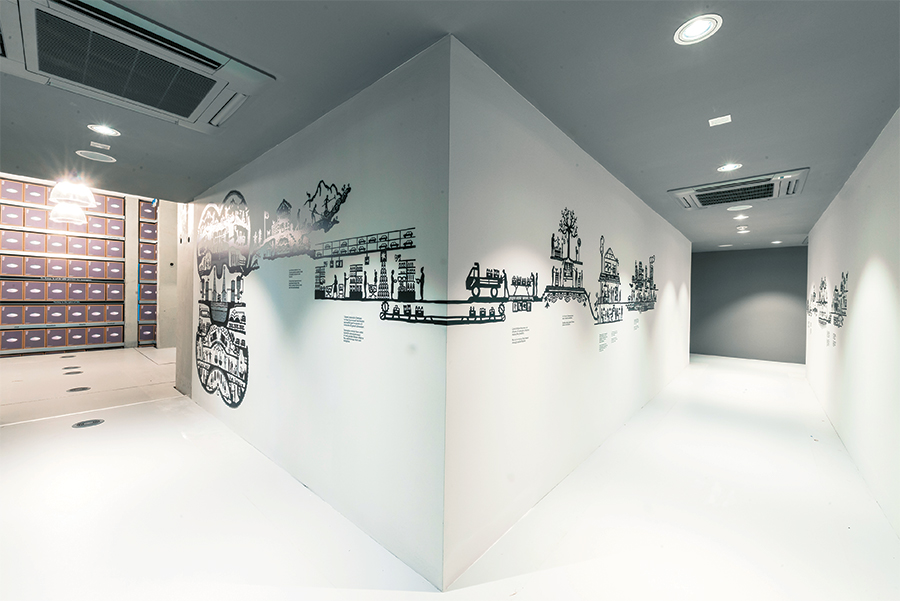
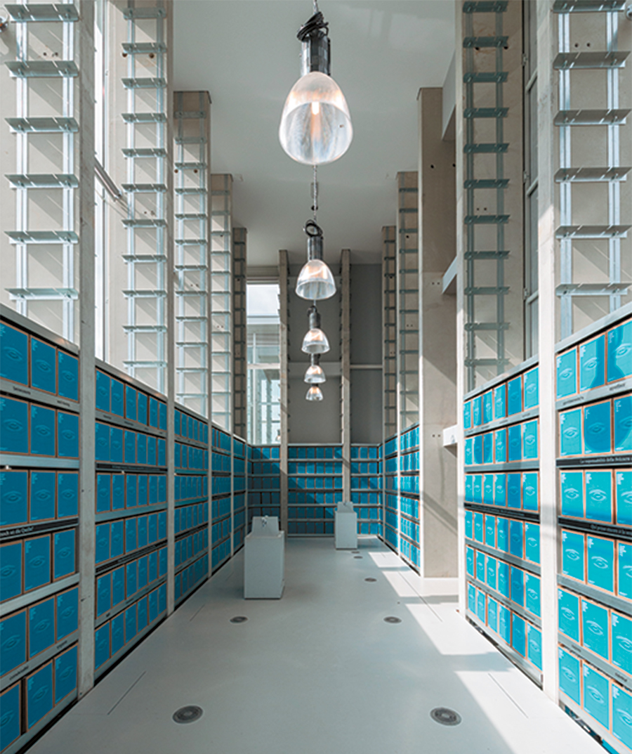
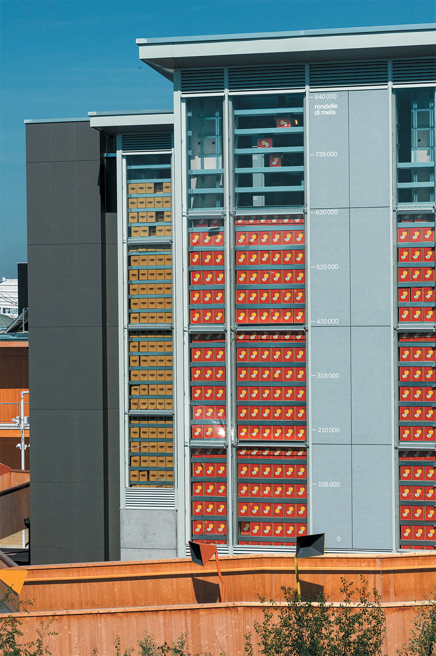
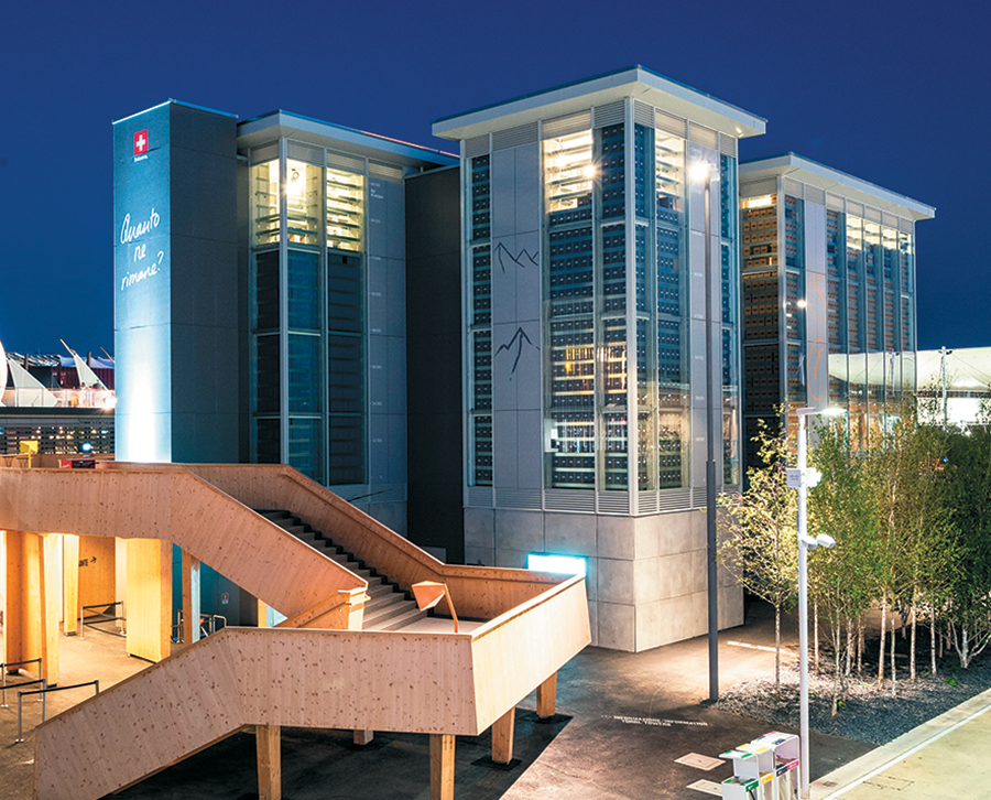
Emblazoned across the four 49-foot-high towers of the Switzerland Pavilion is the haunting question: "Is there enough for everybody?" An elevator carries visitors up into the first tower, where their journey begins. Guests are invited to take small packets of coffee from cardboard boxes lining the walls of the warehouse-like interior. In the other towers, visitors find dried apple rings, cartons of salt from the Swiss Alps, and local spring water (represented by plastic cups in boxes along the walls) to quench their thirst. Visitors can take as much as they want but are asked to consider what will be left for others if they don't conserve.
Digital displays and chalkboards in the towers are updated to show how long the supplies will last if each visitor takes, for example, one or two of the items. The inventory – the pavilion started with 2.5 million coffee bags and 2 million salt cartons, for example – is not restocked. As the shelves empty, the tower platforms lower, visually dramatizing the plight of finite resources and the direct correlation between consumption and sustainability. "Conceptually, Switzerland's interpretation of the Expo 2015 theme is spot on," said one judge. "The four towers offered visitors a moral choice: Take as much as you want and decide how much to leave for others. More an ethics lesson or uniquely engaging thought experiment than a traditional world expo experience, the Switzerland Pavilion addressed a major problem head on by asking a world used to consuming blindly to start conserving wisely." 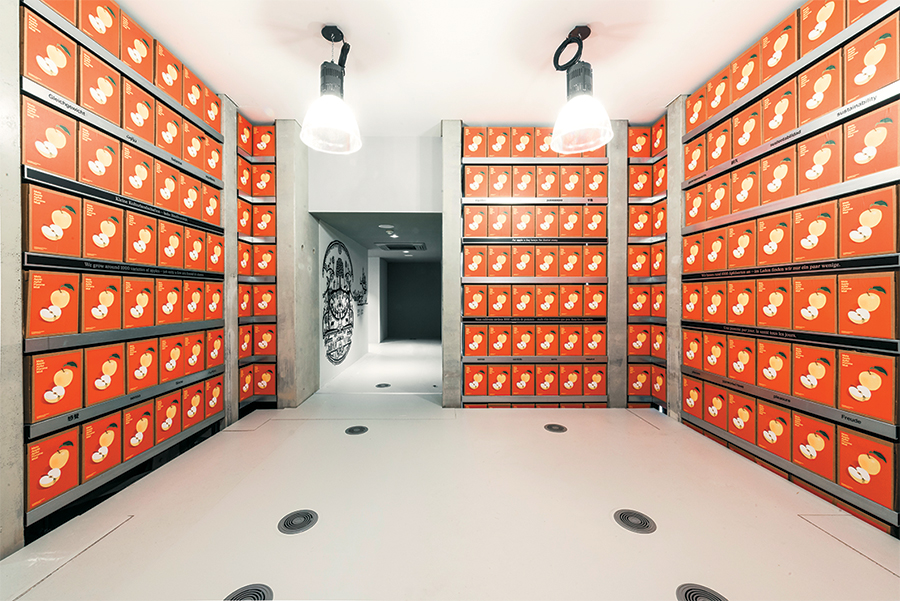

HONORABLE MENTIONS Austria Pavilion
Austria Pavilion
Client: WKO Austria Design: Team.Breathe.Austria Fabrication: Adunic AG PHOTOS: Terrain:Architects and Landscape Architects
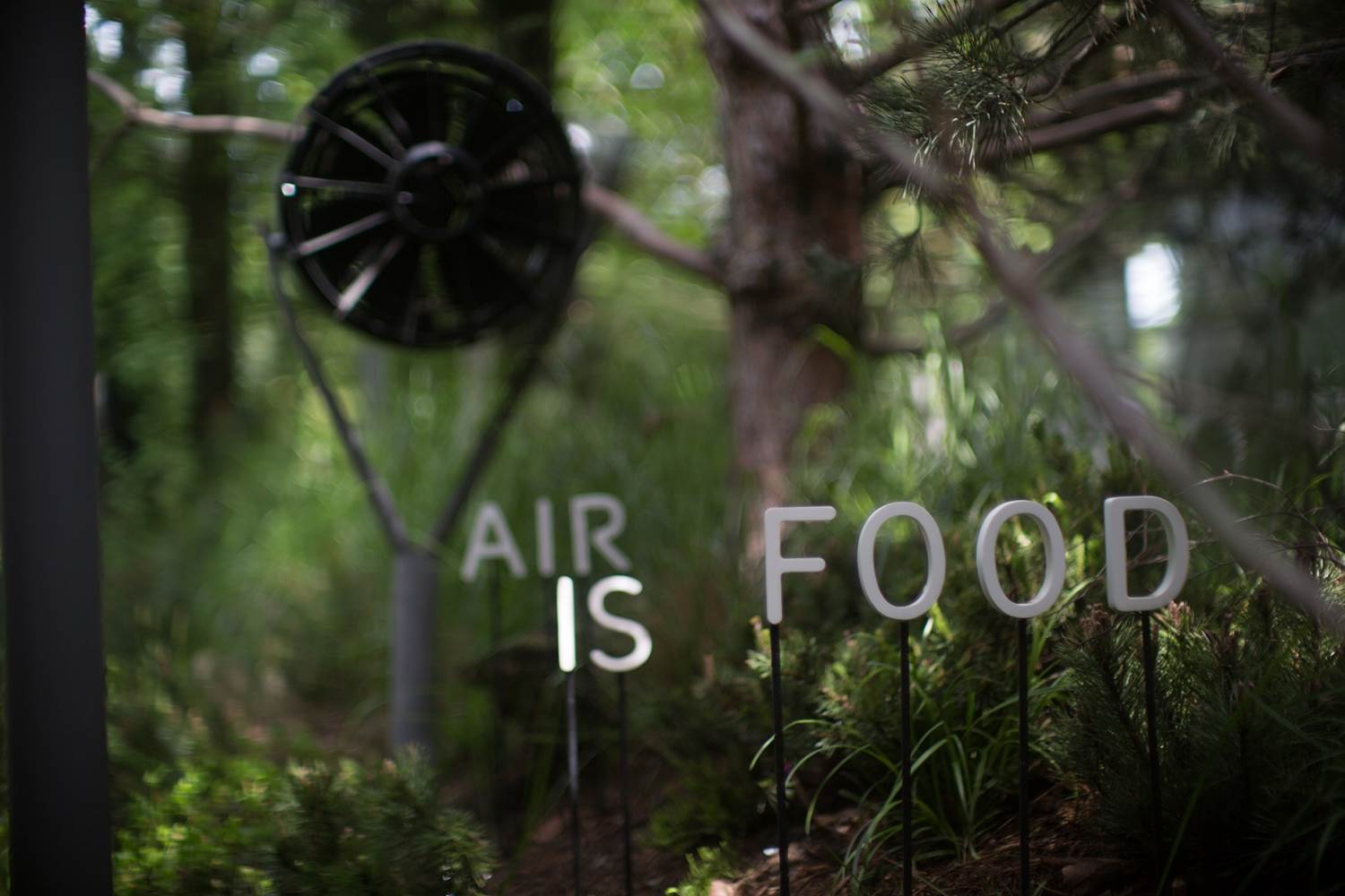
Austria zigged where others zagged in interpreting the Expo 2015 theme of "Feeding the Planet, Energy of Life." Accordingly, the European nation constructed its pavilion to convey the concept that air itself was as important a nutrient as protein or carbohydrates with the simple yet sophisticated motto "Air is food." Creating a zone of 12 ecotypes, Austria crammed the equivalent of a 7.4-acre forest in the pavilion space, including 190 different species and 1, 200 perennials, providing a lung-pleasing amount of oxygen every hour to sufficiently sustain nearly 2,000 people. Thus the entire pavilion doubled as an "air generating station," and was the only building on the entire Expo site to go without conventional air conditioning. Moreover, the pavilion was energy neutral, with the electrical energy needed to power the infrastructure supplied by a photovoltaic system on the roof and a solar-powered sculpture that fed excess energy back into the Italian power grid.

Monaco Pavilion
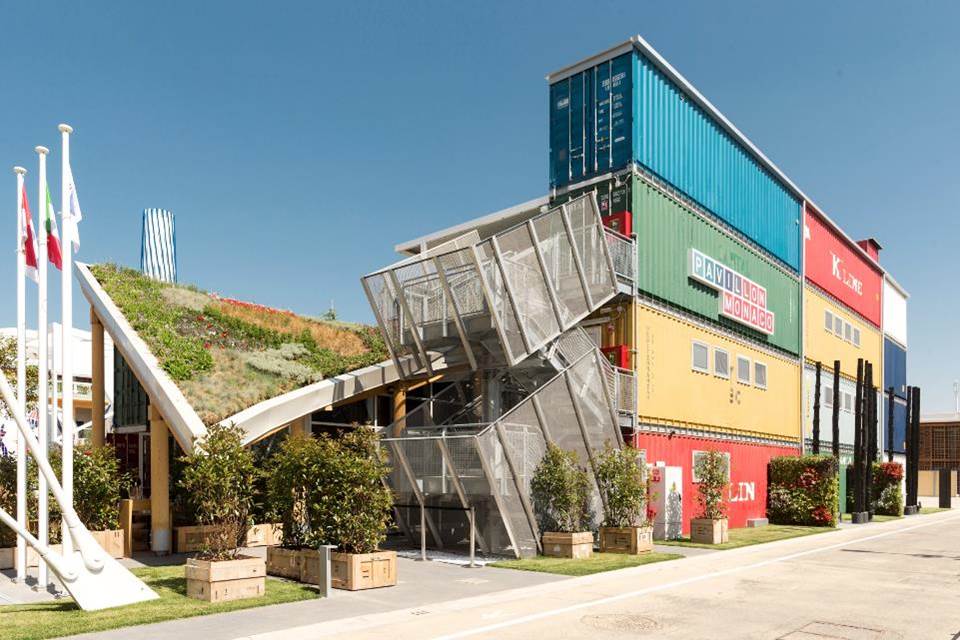
Monaco Pavilion
Client: Monaco Inter Expo Design: Facts and Fiction GmbH Fabrication: Es-Ko; Eco System photos: Martin Miseré
Constructed mostly of rugged and worn shipping containers that suggest dumpsters more than diamonds, Monaco's pavilion put forth an austere face that belied the country's affluent bearing. Encompassing 10 thematic stations, the pavilion showcases populist efforts such as the first oyster hatchery in the Mediterranean, employing an enchanting interactive game teaching guests how to balance delicate environmental conditions to produce the salty sustenance. One station promotes timber from sustainably managed forests, while another focuses on the surge of jellyfish: in a shadowy enclosure, reminiscent of a submarine, a monitor glimmers with illustrations of the marine creatures done in the sensuous style of 19th century anatomical drawings, while closeby, a tank seethes with living jellyfish. At these stations and others, visitors obtain succinct information about the projects through textual introductions, videos, and infographics that have the rough-and-ready look of a talented architect's napkin doodles.
|
|
|
||||||||||||||||||||||||||||
|
|
||||||||||||||||||||||||||||
|
TOPICS Measurement & Budgeting Planning & Execution Marketing & Promotion Events & Venues Personal & Career Exhibits & Experiences International Exhibiting Resources for Rookies Research & Resources |
MAGAZINE Subscribe Today! Renew Subscription Update Address Digital Downloads Newsletters Advertise |
FIND IT Exhibit & Display Producers Products & Services All Companies Get Listed |
EXHIBITORLIVE Sessions Certification Exhibit Hall Exhibit at the Show Registration |
ETRAK Sessions Certification F.A.Q. Registration |
EDUCATION WEEK Overview Sessions Hotel Registration |
CERTIFICATION The Program Steps to Certification Faculty and Staff Enroll in CTSM Submit Quiz Answers My CTSM |
AWARDS Sizzle Awards Exhibit Design Awards Portable/Modular Awards Corporate Event Awards Centers of Excellence |
NEWS Associations/Press Awards Company News International New Products People Shows & Events Venues & Destinations EXHIBITOR News |
||||||||||||||||||||
|
||||||||||||||||||||||||||||


