|
Functional
Furniture
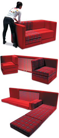
Product demonstrations are a dime a dozen at many trade shows, but they're somewhat less popular at furniture and interior-design expos, where demonstrating the goods typically entails simply sitting down atop a stylish seat or reclining in a fashionable lounger. But at the 2014 Salone del Mobile Milano (aka Milan Furniture Fair), Campeggi Srl turned to an in-booth demo to showcase its Tandem modular sofa. At first glance, the product appears to be a run-of-the-mill love seat, but its selling point is that it can be easily manipulated to create a multitude of other functional pieces of furniture. 
Eschewing static displays in favor of something with a little more movement, Campeggi simply stationed a company representative near the Tandem inside its exhibit, and tasked the staffer with continuously repositioning the modular elements to create a sofa, then perhaps a table, a pair of chairs, a bed, and so on. The constantly evolving demonstration/ display hybrid attracted attention from passersby who stopped to marvel at the versatility of the Tandem, providing Campeggi with an opportunity to engage them in discussions about the company's unique offerings.

Pedal to
the Metal
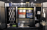
When your company name is Rigidized Metals Corp., you better believe attendees will expect to see the shiny material in your booth. Rigidized Metals took that idea one step further at Greenbuild in Philadelphia, building its entire booth out of the stuff.

Comprising various finishes and textures from dimpled to smooth and matte, the gray metal panels provided the perfect way for the company to show off its wares.
|

Got Your Goat
Amid the hustle and bustle of the show floor, it's difficult to secure dedicated face time with clients and prospects. So to incentivize attendees to schedule meetings prior to the Enterprise Connect 2014 show, Interactive Intelligence Inc., a contact center and communications-services provider, came up with a goat-centric solution: For every person who attended a meeting with the company, Interactive Intelligence would buy them a goat. But rather than offer a farm animal as a
parting gift, the firm made a monetary donation to Oxfam International, an organization that fights poverty and hunger in developing nations by providing sustainable food sources, disaster relief aid, and more. Plus, if attendees' bosses tagged along for the meeting, Interactive Intelligence pledged to upgrade its donation and buy a cow. The incentive yielded a donation of 11 goats and one cow, far exceeding Interactive Intelligence's goal of five meetings.

The Light Fantastic

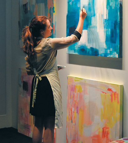
It's no secret that lighting can be tricky to demonstrate, especially on the show floor, where harsh convention-center illumination can abate the effects of a product display. So to showcase the different temperature hues of its LED lights, Lucifer Lighting Co. created an apropos environment in its exhibit at the American Institute of Architects Convention in Chicago. The company hired a painter to adorn four approximately 2-foot-square canvases mounted on one wall of its booth. Two of the abstract paintings featured the blue color family, and two featured the red family. As the artist worked on the paintings, Lucifer booth staffers used the pieces of art as a backdrop to demonstrate how the company's 80 CCI and 90 CCI LED light bulbs accentuate different hues. Talk about a bright idea.

Ice Age
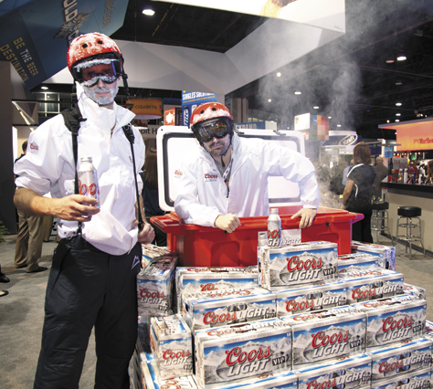
At the National Association of Convenience Stores show, MillerCoors LLC wanted to drive home the message that Coors beer is made with water from the ice-cold streams of the Rocky Mountains. So the macro brewery used props and a couple of frosty characters to create an image attendees weren't soon to forget. MillerCoors mounted a 3-by-4-foot cooler on a stand several feet high, with several dozen cases of Coors Light stacked around it to disguise the frame. With the bottom of the cooler cut out, a character donning seemingly ice-crusted goggles and a helmet stood inside, appearing to emerge from it. Dry ice stashed inside the cooler created a wintery-looking mist that rose from its depths, and passersby couldn't help but stop and gawk at the faux-frigid display. What's more, the icy strategy illustrated Coors' mountain-stream message, proving that when you want to make a statement, sometimes it's better to show than tell.

|
Vendor Bender
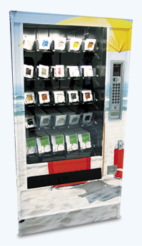
How do you make product-sample distribution fun? If you're LSI Floors, you buy a vending machine, fill every slot with samples of your vinyl flooring products, and embed that machine in the back wall of your exhibit. LSI did just that at GlobalShop, a trade show for the retail-design and marketing industries.

Covered by part of a beach-themed back-wall graphic, the vending machine was an integral part of the existing structure. But it also served as an ingenious sample-distribution medium, as visitors simply pushed the buttons corresponding to the samples they wanted to take home, and voila, their chosen samples dropped into the distribution bin.

Shark Week
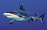
Nothing says "lurking danger" quite like the image of a great white shark swimming below the surface, which is why SpeechCheck Inc. plastered such a pic in its exhibit at the Radiological Society of North America Annual Meeting. The eery image was used to shed light on a different kind of hidden hazard — potentially life-threatening transcription errors in radiology reports. Passing health-care professionals, who were curious as to why a company would use an

image of a giant shark at a trade show packed with fancy radiology equipment, stopped to stare. As attendees admired the imagery, staffers explained how the danger-laden graphics related to its services. But SpeechCheck's shark-inspired theme stretched further than the back wall of its 20-by-20-foot booth: Staffers wore "shark patrol" T-shirts, giveaway items included bottles of hand sanitizer labeled "shark repellent," and a USB drive shaped like a shark contained company info. Together, the shark-themed promos drew in curious attendees and helped SpeechCheck take a bite out of the competition.
|


