|
Something Old,
Something New
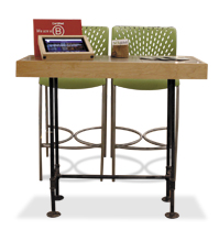
At an environmentally conscious show such as Greenbuild, image is everything. That's why Scientific Certification Systems Inc. (aka SCS Global Services) – a company that provides third-party certifications for sustainability – decided to deck out its exhibit in salvaged materials, right down to the iPad kiosks. 
Designed and built by the company's art director, the unassuming tablet holders comprised a housing made of reclaimed wood positioned at an angle atop a handmade desk. The legs of the desk, made from salvaged pipes, provided a lightweight yet eye-catching base. The DIY piece of furniture conveyed the company's Green ethos and its key messages to attendees in one aisle-side glance.

Rock On
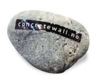
Run-of-the-mill promotional items are a dime a dozen – literally. And more often than not, those stress balls and branded pens do very little in terms of connecting with your brand and key message. But when Norway-based photographer Tom Haga set out to exhibit at EuroShop 2014, he wanted a small, portable, inexpensive item to distribute that would direct interested attendees to his website to learn more while underscoring the fact that his ConcreteWall vinyl wallpaper looks and
feels like real

concrete. He found his solution in small gray stones with labels affixed to them bearing the URL where additional product information is available. When booth visitors entered the space, staffers encouraged them to take a stone to help them remember ConcreteWall's website, and to then compare the natural texture of the stone itself to the realistic finish on the wallpaper displayed inside the booth. While stones aren't likely an applicable promotional item for most companies, the idea rocked for Tom Haga.
|

Happy Bic-Day
Not only are birthday parties fun, but they also remind people that there's an occasion worth celebrating. So Bic USA Inc. decided to host one at the National Association of Convenience Stores show to draw traffic and bring to light the fact that its ubiquitous lighters have been around for 40 years.
Cupcakes, balloons, and "Happy Birthday" signs stretched down the aisle of the roughly 40-by-60-foot booth. Behind the party spread was a display of colorful lighters in tubes. Attendees could guess how many lighters were in the tubes, and the person with the closest guess of each day won an iPad Mini. While show goers noshed on cupcakes and contemplated their guesses, staffers used the opportunity to collect lead info and explain how the product that revolutionized the industry was not just another year older, but another year better. Now that's a traffic-building idea worth celebrating.

Taking Card Stock

If you want journalists at NeoCon to pick up your press kit, you best get creative. The interior- and furniture-design show attracts an artistic set, which is why Molo Design Ltd. ditched a folder of media-kit materials in favor of an off-the-wall alternative. The company, which uses paper to make everything from walls and lamps to benches and ottomans, wanted to showcase beauty shots of its finished products along with information about assembly, dimensions, materials, and more, all in a package that appealed to the design-minded press. Held together with a small silver binder clip, 18 matte-finished, 5-inch-square cards featured full-bleed, artistic product shots on one side and detailed info on the reverse. The Softwall card, for example, had an image of a woman dressed in black and walking between two tall black walls to convey how the simple building materials looked when installed. The other side offered a list of standard heights and colors,
a scale diagram, and product uses, along with materials, contact info, and a simple red Molo logo.

A Big Idea
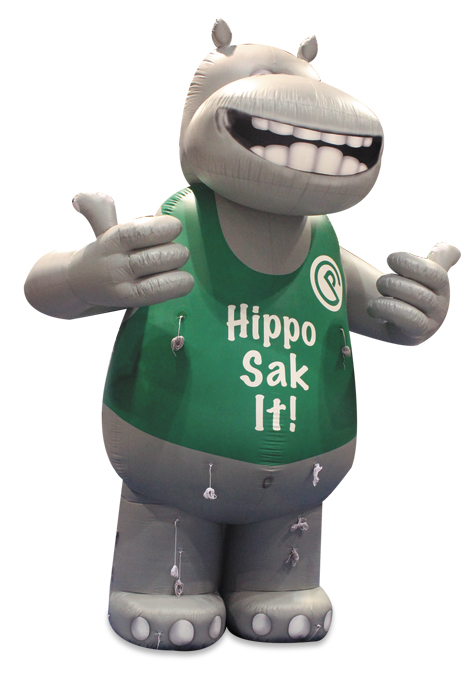
What better way to market a product called Hippo Sak at a trade show than by placing a giant, inflatable hippopotamus in your exhibit? That was Crown Poly Inc.'s thinking when it brought the behemoth balloon to FMI Connect at McCormick Place in Chicago. The Hippo Sak is a durable plastic bag that consumers and retailers can fill to the brim without having to worry about the bag ripping under pressure. To draw attention to its plastic bags, which were displayed in a nearby bin, Crown Poly set up its mammoth mascot right by the aisle. The towering inflatable hippo, which was nearly as tall as other exhibitors' banners were high, was visible across the show floor, acting as a sort of beacon that piqued the interest of attendees from all corners of the exhibit hall. Once visitors approached the inflatable animal, complete with goofy grin and sporting two thumbs up, Crown Poly booth staffers were standing by to explain its presence and hand out free samples of Hippo Sak bags.

|
Interop Arcade
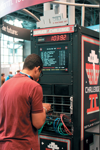
Sometimes all it takes to attract attention on the show floor is a friendly competition. SoftLayer Technologies Inc. offered up just such a competition via its Server Challenge II activity at Interop. One at a time, participants raced against the clock to install 24 drive trays into two 2U Supermicro servers and plug 18 network cables into their correct outlets.

The nearly 7-foot-tall gaming console sported graphics inspired by classic arcade games, a digital clock that kept track of participants' times, and an embedded monitor that listed the names and times of the 10 fastest competitors. At the end of the show, the attendee who recorded the fastest time won a MacBook Air. Developed in collaboration with Super Micro Computer Inc. (aka Supermicro), Server Challenge II increased booth traffic and dwell time, and provided a memorable experience for visitors – making SoftLayer Technologies the real winner.

Making its Mark
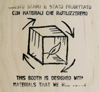
Going Green is great for the environment, but it can also be great for your brand – assuming visitors know about your eco efforts. So to communicate its plans to reuse the unfinished wood comprising its exhibit at the Salone del Mobile Milano,

Valcucine SpA used a rubber stamp featuring a leaf-like icon and the phrase "This booth is designed with materials that we will reuse" in both English and Italian. The simple stamps left an impression on the exhibit's enclosures, as well as on the hearts and minds of Valcucine's booth visitors.
|


