nyone who's ever completed a home-renovation project knows how a couple of missteps can blow your budget in a flash. That gotta-have-it travertine inlay and your just-a-tad-bit-off cabinet measurement can eat up your financial allotment faster than you can say, "Measure twice; cut once."
But what does home renovation have to do with exhibit marketing? The sad truth is that when it comes to buying new exhibits, most exhibit managers aren't all that different than hapless homeowners. While they're probably not splurging on upgraded steam showers and miscalculating tile requirements, exhibit managers often make expensive, misguided decisions – such as tacking on over-the-top technology and forgetting to factor in how the proposed design will impact everything from storage costs to shipping charges. Like rookie renovators, many exhibitors don't understand which decisions pad their bottom-line price.
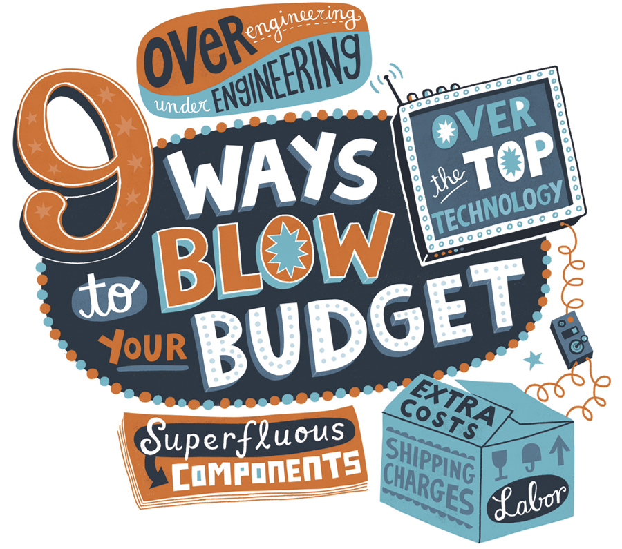
So to prevent you from inadvertently inflating the cost of your next exhibit, EXHIBITOR enlisted the help of six new-build experts. Together, they devised the following list of nine budget busters, i.e., things exhibit managers regularly do that increase prices. By simply avoiding these actions, you'll prevent most unnecessary overages, and sidestep the sticker shock in the process.
1. Starting the design before finalizing marketing directives. If your needs aren't set in stone, don't hand your designers a chisel. "Providing incomplete, sketchy input to a design team usually results in multiple redesigns," says Tony Castrigno, chief creative partner at Design Contact, a New York exhibit-design firm. "Since designers' time is your money, understand exactly what you want before you meet with your design team. You can still make changes along the way, but the fewer alterations you have, the more money you can spend on the structure instead of the design process."
Also, before you meet with designers, make sure that your internal stakeholders have had their say. "Far too often, exhibit managers think they have a handle on management's mandates only to find out weeks into the design process that they've somehow missed the mark," says Liese Tamburrino, North America managing director for Von Hagen GmbH. "Every change you make could put money in the exhibit house's pocketbook."
Lay out your directives for all of your internal stakeholders before you start the design process. Then hash out any changes they'd like to make, discuss style and color preferences, finalize functional requirements, etc. "And always ask people what they don't like," Tamburrino says. "I've seen many a great design go off the rails because of something as simple as the CEO not liking orange. So ask stakeholders if there's anything they don't want in the exhibit."
Finally, continue your internal talks until everyone signs off on the same approach. If your stakeholders are slow to commit or prone to change their minds midstream, communicate the budget ramifications for each missed deadline or change, and point out that a single hour of exhibit-design time costs $102.19 on average, according to the Exhibit Designers & Producers Association's Economic Survey. "To further protect your own budget, insist that any midcourse corrections will require additional, alternative funding outside of the money set aside for your exhibit," Tamburrino says. "Management may not go along with your mandate, but the warning alone should make everyone involved think twice before altering your plans."
2. Designing around the elements, not the experience. "Many design briefs my firm receives include a couple of superficial marketing objectives along with a laundry list of 'required' elements, such as kiosks, conference rooms, storage areas, etc." Castrigno says. "But your booth shouldn't be a collection of furniture; it should be brand experience. If you focus solely on the elements, your exhibit's effectiveness suffers, and you'll likely end up buying more 'stuff' than you need to meet your objectives."
Establish clear marketing directives first and then run each proposed exhibit component through a sort of litmus test to determine if it: a) helps meet one of your directives, and b) is the best and most cost effective of all available options to meet this directive. "If the component doesn't stand up to this scrutiny, maybe your money is better spent elsewhere," Castrigno says.
To illustrate the process, sources offered their thoughts on a hanging sign, which they claim is often unnecessary. "Since rigging costs for a standard hanging sign typically run around $1,000, always ask yourself what objective this sign is going to meet before you automatically include it in the design," says Jake Merzigian, president and CEO of Zig Zibit Inc., an exhibit house in Raleigh, NC. "Most of the time, overhead signage aims to generate visibility and lure people to your booth. So if that's one of your objectives, a hanging sign will meet it. But could you accomplish the same thing with a floor-based ID tower for half the cost?"
"Also take a step back and ask yourself if you even need an exhibit component to meet your objective," Tamburrino says. "Could you reinvest the hanging-sign budget into a promotional campaign instead? It might drive people to your booth just as effectively, and will likely be more memorable than a hanging sign." The key here is to ensure that every exhibit element has a defined purpose, and that each component is purposefully chosen.
3. Assuming material size and shape don't matter. Almost all exhibit materials come in standard shapes and sizes. Whenever your choices warrant a nonstandard shape or size, material costs increase. For example, if you want a laminate-covered wall panel to be 13 feet wide, but the product you've chosen only comes in 12-foot widths, your exhibit house will have to join two sheets together to create your panel. That means you're paying for additional production time and two sheets instead of one. A sheet here or there is nothing, but a booth full of odd sizes can bust your budget.
A similar principal applies to most curved structures (unless they comprise inherently pliable materials such as fabric). "Curves may be visually pleasing, but they generally drive up the cost of the component," says Wes Mowrer, vice president of client relations at DesignShop Inc., an exhibit house and event producer in Orlando, FL. "For example, a kidney-shaped demonstration station not only requires more production hours to cut materials and construct the element, but also creates poor material yields, as a radius creates a lot of trimmed waste. A curved counter can easily cost 50 to 100 percent more than a rectangular version with a similar footprint. If you must have curves, relegate them to the primary elements."
Certainly, experts aren't cautioning against curves and custom-length materials; instead, they're simply pointing out that exhibitors often choose them without considering their added costs. So query designers about anything you select that raises prices, and then consider whether you're making a worthwhile investment. "It's perfectly acceptable to build a custom, curved counter out of the highest quality materials available," Merzigian says. "Just make sure this one element doesn't break your bank and prevent you from achieving all of your objectives – and that you can justify your reasoning to the folks eyeing your balance sheet."
4. Selecting material finishes based solely on aesthetics. Sure, a glossy metallic finish might add a bit of bling to your booth, but it can also sting your pocketbook. "For example, a sheet of standard white laminate may be $100 per sheet, where a textured, glossy, or metallic sheet in the same size could run you $400," Merzigian says. "Plus, some of these special finishes will scratch easily, so they require special handling or frequent replacement, neither of which is free."
Randall Harju, president of 3DL Design Inc. in Kenosha, WI, suggests that you make all finish choices based on attendees' perspectives. "As an attendee, what finishes will I really even notice, and what will each finish communicate to me?" he asks. "Some finish choices can make a statement, and others will go practically unnoticed. Remember, exhibits are simple structures that support marketing communication. You're not creating the Eiffel Tower (unless your CEO has a thing for Paris)."
Again, experts aren't suggesting you ban all nonstandard finishes. Rather, they propose you do a "finishes audit" with your design team to examine all finish selections along with their price tags. Then make sure that each choice is the best option to meet your objectives and that the achieved effect is worth the additional cost.
As a side note, Tamburrino insists that the exhibit house's estimator should be part of design meetings whenever possible. "In some companies, an exhibit is laid out by a designer and approved by a client, and then, and only then, is the design submitted to estimating," she says. "In this case, you – and sometimes even your designers – have only a limited idea of how much your finishes are going to cost. So loop in the estimator early and ask questions about not only finishes, but also construction, lighting, etc. Doing so will make you a more informed buyer and help you keep a firm grasp on the budget."
5. Forgetting to factor in shipping, drayage, and labor charges. When they're buying a new exhibit, most people focus solely on design and build costs. But the size, weight, and crating and labor requirements of that structure have a significant impact on your wallet for years to come. You don't want to create a beautiful on-budget booth whose ancillary costs break your bank straight out of the gate.
"The new-build process must always include a discussion about what I call the 'lost budget' factors – that is, any cost that doesn't add value to your program such as fees for transportation, drayage, labor, and storage," Merzigian says. "To put that into perspective, let's say you're building a 20-by-20-foot booth, which will run you $65,269 on average according to the Exhibit Designers & Producers Association's Economic Survey. You will likely pay an additional $10,000 per show for lost-budget expenses related to this booth. So if you have 10 shows per year, you might have a $65,269 booth, but you've got $100,000 in additional annual expenses."
To take a bite out of these costs before they're incurred, Merzigian suggests that you ask designers the following questions at multiple stages in the process: How much does this component weigh, what type and size of crate or shipping container (if any) does it require, how many people and hours will it take to set up, and is there a more economical option that will deliver the same effect?
"Maybe rather than a heavy crate, a custom skid will do. Or perhaps you could trade out some wooden components for aluminum or fabric materials instead," Harju says. "For example, a laminated, single-sided, box-frame panel usually runs 3 inches thick, and you can only get 10 of them in a standard wooden crate. But if you trade that panel for an aluminum-extrusion system with .25-inch fill panels, you'll only need one-third of the shipping (and storage) space, and the component will weigh less than half as much as the wooden version."
When it comes to labor estimates, determine not only how long setup and dismantle will take, but also how complex this operation will be. "With a complex install, your labor hours could be drastically drawn out if you pull an inexperienced labor crew, or if your parts and pieces are difficult to connect," Merzigian says. "So the more complex the setup, the more labor costs you'll likely incur over time."
6. Going gaga for technology. Lavishing your exhibit with high-tech tools and gadgets is practically de rigueur these days. And it's probably a worthy endeavor if you're trying to project a cutting-edge, high-tech image. But many exhibitors incorporate this whiz-bang wizardry simply because everybody else is doing it. And that, sources say, is a surefire way to blow your budget.
"Technology is a big part of today's exhibit design, but unfortunately most companies don't understand the cost or the commitment it takes to safely get it to the show and consistently make it work," Merzigian says. "This relatively fragile and sometimes quirky equipment requires proper handling and installation, and at least one staffer – or perhaps a full complement of technicians – to run it at the show. So if being cutting edge isn't relevant to your brand, over-the-top technology almost becomes a gimmick rather than adding real value. Plus, if your staff doesn't understand how to operate your high-tech tools, you're creating a negative brand impression instead of a positive one."
Lisbeth Conigliaro, idea architect at Expotechnik America Ltd. in Suwanee, GA, also cautions that you shouldn't incorporate technology until you consider every associated cost and potential operational issue you could run into, as well as whether this particular technological element meets a marketing objective. "Do you really need a plasma screen in a 10-by-10-foot booth, or would a savvy staffer and an iPad work just was well?" she asks. "And is the 'wow' you're trying to deliver actually meeting a marketing objective and making the type of impact that you think it is? Will the technology enhance the attendee experience, and is it worthy of the investment?" If the answer is "yes," then go for it. But if you're even a little unsure, step away from the shiny bauble and reevaluate the costs versus the return.
7. Overlooking – and overusing – reconfigurations. When exhibitors consider the reconfigurability of their booths, they seem to make costly assumptions on both sides of the fence. While some opt for a booth that can only be used one way, others get "reconfiguration crazy" and create overengineered structures to accommodate endless variations. Both approaches can cost you.
"Building a new 40-by-40-foot exhibit with an 18-foot ID tower center stage can be a lot of fun, and it'll probably look awesome in your space," Tamburrino says. "But what if you have to downsize your footprint next year due to budget cuts, or a critical new trade show pops up but it's only offering 10-by-20-foot spaces? Your ID element is going to look ridiculous in anything but the 40-by-40-foot space for which it was originally intended. Certainly, your booth doesn't have to break down into 10 different sizes. But you need to consider the scale of your components and how they would look in a different size space. Failing to do so doesn't increase the overall cost of your current design. However, it can cost you big bucks later if you have to buy all new components or a new exhibit to accommodate a different size booth space."
On the other hand, Castrigno says that designing a "one-fits-all-sizes" exhibit could unnecessarily increase your costs. "Your exhibit probably shouldn't accommodate everything from a 10-by-10 to an enormous island space," he says. "The more flexibility you demand, the more expensive the exhibit is going to be to build. Ask designers to cost out whether it's better to build to suit many configurations or construct booths for a couple of footprints and then rent components to fill gaps for all other exhibit options."
8. Expecting exhibit designers to be omnipotent. Any good designer will have a basic understanding of each exhibit element, including everything from truss and lighting to monitors and carpet inlays. But exhibit designers are experts in, well, exhibit design, and you can't expect them to also be masters of lighting, AV, multimedia, plumbing, electrical, etc.
"If you assume your designer knows everything about everything, you could be overlooking additional requirements, necessary components, and more – ultimately creating costly delays and revisions to add additional elements and alter the design once you start the build," Tamburrino says. "For example, if you opt for a wall of touchscreens integrated with other features in the exhibit, you can't expect your designer to fully grasp every detail such as wire-routing requirements, mounting angles necessary to prevent glare, light-blocking needs, precise weights and engineering requirements of the components, and so on and so forth."
Experts assert that you can avoid some of these "duh" mistakes and design revisions, and their resulting costs, by either arming yourself with specialized knowledge of high-tech, multimedia, and lighting components, or ensuring that experts in these fields are included in the initial design-planning stages so they can point out any potential pitfalls early in the new-build process.
9. Failing to gather average costs. Nobody in their right might buys a new car without first having done some basic research to determine how much it should cost. Yet many exhibit managers sign on the dotted line without really knowing whether they're getting a good deal on each aspect of their new build. Sure, if your final price is within budget, the bean counters will likely leave you alone. But what if you paid way more than average for production time, and that overcharge could have been used to add a couple of extra kiosks instead?
While various research reports and EXHIBITOR's "Budgeting for Dummies (and Time-Strapped Smart People)" article in the November 2013 issue will give you cost averages for everything from material markups and exhibit-house labor to field-supervision and graphic-design costs, it's well worth your time to start compiling your own list of average costs, Conigliaro says. Simply keep detailed records of expenditures and average them out over time to create some benchmarks.
That way, you'll be able to compare the proposed price of your exhibit to your own historical averages to determine if anything is out of line. Often, there are good reasons for any extra costs, but you should understand when you're getting a deal, why you might be paying a bit more, and when pricing is simply out of line.
So when it's time to build your next booth, don't emulate a hapless homeowner. Instead, question your own decisions, analyze your options, and sidestep the aforementioned blunders. That way, you'll have a much greater chance of building your dream exhibit – rather than creating a money pit. 


 nyone who's ever completed a home-renovation project knows how a couple of missteps can blow your budget in a flash. That gotta-have-it travertine inlay and your just-a-tad-bit-off cabinet measurement can eat up your financial allotment faster than you can say, "Measure twice; cut once."