|
Building Blocks
Press kits in bland two-pocket folders are often stacked
a foot high in trade show pressrooms. So to ratchet up
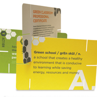
the creativity at the Greenbuild International Conference and Expo, and increase the likelihood that its press kit would get picked up by curious journalists, The Center for Green Schools decided to divvy up its data onto cards that functioned as building blocks.
The 4.5-by-7-inch cards had six 1-inch-long notches, and a plain-edged card explained how recipients could use the notched cards as building blocks, saying, "Use these cards to learn, inspire, and build something awesome." Each double-sided card also included key facts and statistics about the Green School Initiative and its professional certification. By forgoing uninspired packaging for its press kit, The Center for Green Schools was able to get journalists engaged with its key messages before they even set foot in its booth.

Wall to Wall

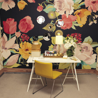
Staging a house to help it sell is nothing new. So it's not surprising that Murals Your Way, a Hopkins, MN-based firm that makes wall coverings, decided to stage its exhibit like a small office at NeoCon 2014 in Chicago. Using its murals in place of conventional graphics substrates, the company covered three plywood walls with three different custom murals. In addition to the pretty patterns, the sidewalls also displayed product samples as well as subtle key messaging seemingly housed inside picture frames. Adding to the homey feel, a gold table lamp and chic desk accessories atop a simple white wooden desk were paired with a cute yellow chair. The resulting space no doubt struck a memorable chord with designer attendees.
|

T. Rex Tactic
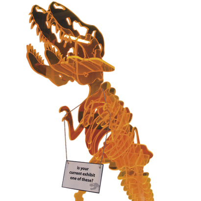
Sometimes, a little dab of whimsy is all you need to make attendees stop and stare. So at EXHIBITOR2014, The Rogers Co. gave its traditional exhibit a little brush of the fanciful by incorporating a miniature, neon-orange dinosaur. Positioned on the left edge of the exhibit house's 10-by-20-foot booth, the transparent Plexiglas tyrannosaurus stood roughly 2 feet tall. A placard suspended around its neck featured an image of a stylized T. rex head and the text "Is your current exhibit one of these?" The clever, inexpensive dino effortlessly communicated that if attendees' exhibits were indeed dinosaurs like this one, The Rogers Co. had a solution. But perhaps more importantly, it stopped attendees in their tracks, prompted a smile, and gave staffers time to swoop in and explain the company's offerings.

Print Campaign

Commercial-printing company Unicorn Graphics knows a thing or two about the power of repetition – and the devilish delight of details. At GlobalShop 2014, a retail-design and -marketing show in Las Vegas, the Garden City, NY-based firm crafted a couldn't-miss, 20-by-20-foot exhibit comprising little more than 65 prints of the same boy's face. But rather than printing the images on mere photographic paper, Unicorn Graphics covered a multitude of 3-foot-square boards with different materials, and then printed the image atop them. The long list of surfaces included Cheerios, paintbrushes, toasted bread, wine corks, screw heads, cassette tapes, and more. Loosely based on the company's Smile With Us theme, the unusual and eye-catching display demonstrated Unicorn Graphics' printing capabilities as well as its creative and marketing talents in a single,
unforgettable glance.

Getting Into Character

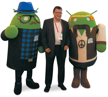
Sometimes a costume and a captive audience are all you need to attract attention and spread brand awareness beyond the confines of the convention center. To take advantage of the fact that attendees had to wait in long lines for cab rides back to their hotels after the show floor closed at the 2014 Mobile World Congress in Barcelona, Spain, Intel Corp. outfitted an army of staffers in costumes. Those staffers, resembling the Android mascot and bedecked in Intel-branded capes, nametags, and other regalia, waddled along the taxi lines engaging attendees and
posing for pictures. The simple strategy, which entertained the waiting crowd, resulted in hundreds of photos being tweeted and uploaded to Facebook and Instagram, often bearing the official Mobile World Congress hashtag (#MWC14). Furthermore, the tongue-in-check tactic spread and brand awareness at the speed of the company's core processors.
|
Tweet Treat
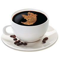
Panasonic Corp. doled out an incentive to the socially savvy attendees at the 2014 International Consumer Electronics Show. In-booth signage bearing the Panasonic Twitter handle and hashtag invited attendees to "send a tweet and get a coffee treat."

Visitors who tweeted about their experience inside the exhibit whipped out their phones, showed staffers their tweets, and ordered up a cup of java brewed with a Panasonic coffee maker. The caffeinated call to action drummed up hundreds of tweets while showcasing one of the company's home-
electronics offerings.

Selling Services
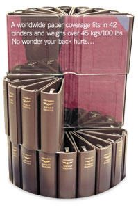
Seeing is believing. But for exhibitors selling services, a show-and-tell strategy is more difficult to execute. Jeppesen, a subsidiary of The Boeing Co., wanted to illustrate the portability of its tablet-based nautical charts and airline avionics at the National Business Aviation Association show. So it decided to show attendees just how much easier the tablet-based tools are to use and transport by creating a series of visual metaphors inside its exhibit.

In one display, Jeppesen encased two stacks of files inside acrylic cases that measured nearly 6 feet in height. Another display comprised 42 binders artfully arranged into a circular structure with messaging that read "A worldwide paper coverage fits in 42 binders and weighs over 45 kgs/100 lbs. No wonder your back hurts..." Simple, strategic, and spot on, the displays helped to show, not tell, attendees the benefits of going digital.
|


