ammunition |

|
 
When you're testing a new camera, you want to point and shoot something
other than a boring static display. So to provide attendees with a more
true-to-life demonstration of its digital cameras, Canon USA Inc. featured
several live-action vignettes inside its exhibit at the International Consumer
Electronics Show. For example, one vignette featured a harpist who
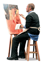
played soothing music, while another comprised an artist painting a
woman posing on a nearby loveseat, accompanied by "Titanic"-inspired
tunes. Each vignette offered visitors live-action point-and-click opportunities, while the accompanying music transformed the exhibit into a
relaxing oasis amid the high-tech hustle and bustle of the show floor.


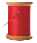
 How do you make basic, boring, black-and-white business cards stand out amid attendees' stacks? If you're Winston Salem, NC-based Bobbin Designs, you do it with a single strand of thread. The small company sells handmade greeting cards and often incorporates thread into the cards' design (hence the company's name). So along the bottom of each business card - which company staffers readily distributed to booth visitors during the 2009 National Stationery Show - is a colorful piece of thread sewn right into it. Talk about a "sew cool" strategy. How do you make basic, boring, black-and-white business cards stand out amid attendees' stacks? If you're Winston Salem, NC-based Bobbin Designs, you do it with a single strand of thread. The small company sells handmade greeting cards and often incorporates thread into the cards' design (hence the company's name). So along the bottom of each business card - which company staffers readily distributed to booth visitors during the 2009 National Stationery Show - is a colorful piece of thread sewn right into it. Talk about a "sew cool" strategy.


 When is a reception desk more than just a reception
desk? When it's a product display and three-dimensional
company logo as well. Midwest Walnut turned its easily
recognizable "MW" logo into a large walnut reception
counter in its in-line exhibit during the 2009 International
Builders' Show. The innovative, angular reception desk
not only helped to brand the company's booth space
while doing double duty as a functional exhibit element, it also served as a conversation starter and effective product display, showing off the beauty of Midwest Walnut's woods. When is a reception desk more than just a reception
desk? When it's a product display and three-dimensional
company logo as well. Midwest Walnut turned its easily
recognizable "MW" logo into a large walnut reception
counter in its in-line exhibit during the 2009 International
Builders' Show. The innovative, angular reception desk
not only helped to brand the company's booth space
while doing double duty as a functional exhibit element, it also served as a conversation starter and effective product display, showing off the beauty of Midwest Walnut's woods.


 California-based Delphi Productions recently purchased Icon Exhibits, an Indiana company. So at the 2009 Healthcare Convention & Exhibitors Association show, Delphi wanted to educate attendees about the acquisition and how it could benefit them - specifically that the company could now offer shipping-cost savings to its customers in the Midwest and Eastern United States. So Delphi gave its 10-by-20-foot booth a split personality. One half featured the Delphi name and a graphic of a surfer, along with a real beach chair and a picnic basket. Meanwhile, the text on the back wall read, "What do curls and corn have in common?" The other side of the booth featured the Icon name on the back wall with images of corn and text to answer to the question: "California meets Indiana. Delphi and Icon are one." Hay bales and stalks of corn completed the theme on that half of the booth. The unusual exhibit - with its split personality - stopped attendees in their tracks, giving booth staffers the chance to explain the acquisition and its benefits. California-based Delphi Productions recently purchased Icon Exhibits, an Indiana company. So at the 2009 Healthcare Convention & Exhibitors Association show, Delphi wanted to educate attendees about the acquisition and how it could benefit them - specifically that the company could now offer shipping-cost savings to its customers in the Midwest and Eastern United States. So Delphi gave its 10-by-20-foot booth a split personality. One half featured the Delphi name and a graphic of a surfer, along with a real beach chair and a picnic basket. Meanwhile, the text on the back wall read, "What do curls and corn have in common?" The other side of the booth featured the Icon name on the back wall with images of corn and text to answer to the question: "California meets Indiana. Delphi and Icon are one." Hay bales and stalks of corn completed the theme on that half of the booth. The unusual exhibit - with its split personality - stopped attendees in their tracks, giving booth staffers the chance to explain the acquisition and its benefits.


 Most exhibitors overlook what's underfoot, opting for blasé, run-of-the-mill rental carpet. But Martha Sturdy Studio, a maker of internally lit resin furniture, wanted to take advantage of every square inch of booth space - including those underfoot. So for the 2009 International Contemporary Furniture Fair, Martha Sturdy covered its floor in tiles made from its signature material - semi-transparent white resin. Then, the company placed black vinyl lettering on some of the aisle-side tiles, spelling out the Martha Sturdy name. The unexpected flooring gave the booth a unique aesthetic; plus, whenever anyone inquired about the durability of resin furniture, staffers could point to the resin tiles under their feet and explain that resin is such a durable material that you can, well, walk all over it. Most exhibitors overlook what's underfoot, opting for blasé, run-of-the-mill rental carpet. But Martha Sturdy Studio, a maker of internally lit resin furniture, wanted to take advantage of every square inch of booth space - including those underfoot. So for the 2009 International Contemporary Furniture Fair, Martha Sturdy covered its floor in tiles made from its signature material - semi-transparent white resin. Then, the company placed black vinyl lettering on some of the aisle-side tiles, spelling out the Martha Sturdy name. The unexpected flooring gave the booth a unique aesthetic; plus, whenever anyone inquired about the durability of resin furniture, staffers could point to the resin tiles under their feet and explain that resin is such a durable material that you can, well, walk all over it.
|
|

To debut its Bio-Luminum material, comprising 100-
percent post-consumer recycled aluminum from reclaimed aircraft parts, Coverings Etc. plopped a reclaimed airplane fuselage on one corner of its exhibit at the 2009 International Contemporary Furniture Fair. The out-of-context element stopped passersby, while text on a nearby banner told the story of the new Bio-Luminum material. Near the banner stand, Coverings Etc. positioned a handful of Bio-Luminum tiles showcasing the raw material, the story behind it, and the finished product all in an aisle-side glance.


Press kits can be a double-edged sword. While they sometimes lure media reps to your booth to learn about your products, time-starved journalists often hit the press room, gather some kits, and skip the majority of the show floor, assuming that anything worth reporting is likely found inside. So to connect face to face with editors at the 2009 National  Stationery Show, Delphine Letterpress created rather cryptic press kits for the press room. The kits comprised clear cellophane envelope containing two postcards. One postcard offered information on the company's "Tuesday Night Meetup," an off-site event during the show. The second card featured the text: "Hello there. Please visit our booth to pick up your press kit and a fun goodie bag full of paper treats." Printed with the company's logo and booth number, the provocative postcard lured journalists to the exhibit to claim their goodie bags, and provided Delphine with a little face time with those all-important members of the media. Stationery Show, Delphine Letterpress created rather cryptic press kits for the press room. The kits comprised clear cellophane envelope containing two postcards. One postcard offered information on the company's "Tuesday Night Meetup," an off-site event during the show. The second card featured the text: "Hello there. Please visit our booth to pick up your press kit and a fun goodie bag full of paper treats." Printed with the company's logo and booth number, the provocative postcard lured journalists to the exhibit to claim their goodie bags, and provided Delphine with a little face time with those all-important members of the media.


 Why explain your product's easy-to-assemble components when you can give attendees a hands-on experience with them instead? To launch its Ego exhibit system during EXHIBITOR2008, Mark Bric Display Co. gave key distributors and journalists a 4.5-by-6.5-inch case filled with segments of aluminum struts and a multiple-sided hub used in the exhibit structure. The samples allowed attendees and journalists an opportunity to explore the product's components and get a handle on the new system. Why explain your product's easy-to-assemble components when you can give attendees a hands-on experience with them instead? To launch its Ego exhibit system during EXHIBITOR2008, Mark Bric Display Co. gave key distributors and journalists a 4.5-by-6.5-inch case filled with segments of aluminum struts and a multiple-sided hub used in the exhibit structure. The samples allowed attendees and journalists an opportunity to explore the product's components and get a handle on the new system.

What's The Big Idea?
Do you have a clever exhibit-related tip? Did your last exhibit have an über-cool traffic builder?
Contact Travis Stanton at tstanton@exhibitormagazine.com.
|
you might also like |
 |
 |
 |
Ideas That Work
Ideas That Work
Table Talk, Hanging Out, Band Aid, The Pot Pit, and more. |
Ideas That Work
November 2016
Giveaway Gamble, Table of Trends, Submerged Sales, and more. |
Ideas That Work
Ideas That Work
Bottoms Up, Quid Pro Quote, Animal Magnetism, and more. |
|
|
|


