ammunition |

|

 Sometimes you have to go big or go home - especially if your product
fits in the palm of your attendees' hands. So, after years of exhibiting
in traditional, forgettable 10-by-10-foot spaces, Monkey Design USA
(which makes children's greeting cards that can be cut apart and
reassembled like a puzzle, ultimately creating small, 1.5-inch-tall, 3-D
creatures such as robots, monkeys, dinosaurs, etc.) realized it needed
something to make its greeting cards stand out amid the masses. So Monkey
Design identified its top-selling 3-D puzzle card and enlarged it by roughly 40
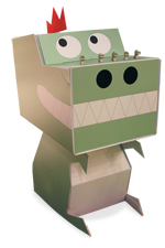
times. The resulting exhibit element is a 5-foot-tall dinosaur that attracts attention and
gives attendees a memorable visual of what the company produces. And that enlarged
dino has had an equally enlarging effect on the company's booth traffic at shows such as the 2009 National Stationery
Show, where Monkey Design saw a 40-percent uptick in leads and a 20-percent increase in show-related sales. Sometimes you have to go big or go home - especially if your product
fits in the palm of your attendees' hands. So, after years of exhibiting
in traditional, forgettable 10-by-10-foot spaces, Monkey Design USA
(which makes children's greeting cards that can be cut apart and
reassembled like a puzzle, ultimately creating small, 1.5-inch-tall, 3-D
creatures such as robots, monkeys, dinosaurs, etc.) realized it needed
something to make its greeting cards stand out amid the masses. So Monkey
Design identified its top-selling 3-D puzzle card and enlarged it by roughly 40
times. The resulting exhibit element is a 5-foot-tall dinosaur that attracts attention and
gives attendees a memorable visual of what the company produces. And that enlarged
dino has had an equally enlarging effect on the company's booth traffic at shows such as the 2009 National Stationery
Show, where Monkey Design saw a 40-percent uptick in leads and a 20-percent increase in show-related sales.


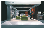
 These days, it seems light is right when it comes to exhibits. So when American Honda Motor Co. Inc. was looking to shed a few pounds - and sidestep a few weight-related expenses with its new custom exhibit at the 2009 Orange County Auto Show - the company turned to integrated event-marketing agency George P. Johnson Co. for help. GPJ began by eschewing the old auto-show paradigm of heavy wood exhibit construction and instead incorporated ultralight materials ranging from carbon fiber to honeycomb panels to dibond aluminum sheeting. Next, GPJ integrated the exhibit's light fixtures into the new booth's beam structures. The result was a strong yet lightweight exhibit that required no rigging for overhead lights and saved Honda 30 percent in drayage and labor. These days, it seems light is right when it comes to exhibits. So when American Honda Motor Co. Inc. was looking to shed a few pounds - and sidestep a few weight-related expenses with its new custom exhibit at the 2009 Orange County Auto Show - the company turned to integrated event-marketing agency George P. Johnson Co. for help. GPJ began by eschewing the old auto-show paradigm of heavy wood exhibit construction and instead incorporated ultralight materials ranging from carbon fiber to honeycomb panels to dibond aluminum sheeting. Next, GPJ integrated the exhibit's light fixtures into the new booth's beam structures. The result was a strong yet lightweight exhibit that required no rigging for overhead lights and saved Honda 30 percent in drayage and labor.


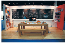
 Instead of simply telling attendees about its services, Jack Morton turned its booth at the 2009 Healthcare Convention & Exhibitors Association's Annual Meeting into a classroom aptly named the Healthcare Marketing Lab. Acting as an unmistakable focal point in the 10-by-20-foot exhibit, the back wall comprised a chalkboard covered with messages that extolled the company's offerings. The center of the board, for example, featured a flow chart of sorts indicating how planning, creative, manufacturing, and execution were followed by measurement, review, adjustment, and improvement. The right side of the chalkboard listed the marketing-firm's services along with the weather forecast for the show city and latest stock-market prices, both of which were updated by staffers daily. Resting atop a stool in the corner of the booth, a dunce hat labeled with the words "Traditional Marketing" completed the educational - not to mention memorable - scene. That's an A+ for innovation. Instead of simply telling attendees about its services, Jack Morton turned its booth at the 2009 Healthcare Convention & Exhibitors Association's Annual Meeting into a classroom aptly named the Healthcare Marketing Lab. Acting as an unmistakable focal point in the 10-by-20-foot exhibit, the back wall comprised a chalkboard covered with messages that extolled the company's offerings. The center of the board, for example, featured a flow chart of sorts indicating how planning, creative, manufacturing, and execution were followed by measurement, review, adjustment, and improvement. The right side of the chalkboard listed the marketing-firm's services along with the weather forecast for the show city and latest stock-market prices, both of which were updated by staffers daily. Resting atop a stool in the corner of the booth, a dunce hat labeled with the words "Traditional Marketing" completed the educational - not to mention memorable - scene. That's an A+ for innovation.


A product as simple as a paper bag doesn't vary a whole lot from one supplier to the next. Sure, some companies jazz up their bags with clever designs, snazzy finishes, and unusual forms. But in the end, every paper bag performs basically the same standard function. So to differentiate its bags from the competition at GlobalShop 2009, Direct Source Packaging Co. offered an  origami-folding activity along one aisle of its exhibit space. During the show, staffers folded paper cranes using Direct Source's paper,
which is used to make custom bags and packaging. Distributing the cranes to
attendees along with an origami kit
featuring the company's paper, staffers
explained that creating one of the company's eye-catching bags was just like
creating a work of art. Stopping traffic
in the aisles, the strategy elevated the
bags from a simple sack to a sophisticated
statement. And the takeaway origami kits created
above-the-fold memorability long after the show. origami-folding activity along one aisle of its exhibit space. During the show, staffers folded paper cranes using Direct Source's paper,
which is used to make custom bags and packaging. Distributing the cranes to
attendees along with an origami kit
featuring the company's paper, staffers
explained that creating one of the company's eye-catching bags was just like
creating a work of art. Stopping traffic
in the aisles, the strategy elevated the
bags from a simple sack to a sophisticated
statement. And the takeaway origami kits created
above-the-fold memorability long after the show.
|
|

 At a show like the World
of Concrete - which
is jammed to the hilt
with monster construc-
tion equipment - it's tough for a
B2B search engine to stand out. That's
why Alibaba.com opted for an on-message
traffic builder that not only made attendees
peel their eyes away from the mega earth movers; it also
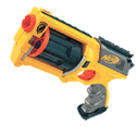
communicated that Alibaba.com can connect buyers with a world of suppliers. One corner of the company's island space offered a logo-adorned, corporate-orange desk. Behind the desk sat an orange backdrop featuring the company's logo, "Aim for a World of Suppliers" message, and an image of an orange and white globe scattered with four bull's-eye-like targets. Throughout the show, attendees lined up at the desk to try to hit all four targets with a mini dart gun, giving staffers plenty of time to tout Alibaba.com's key messages. Now that's an on-target promotion. At a show like the World
of Concrete - which
is jammed to the hilt
with monster construc-
tion equipment - it's tough for a
B2B search engine to stand out. That's
why Alibaba.com opted for an on-message
traffic builder that not only made attendees
peel their eyes away from the mega earth movers; it also
communicated that Alibaba.com can connect buyers with a world of suppliers. One corner of the company's island space offered a logo-adorned, corporate-orange desk. Behind the desk sat an orange backdrop featuring the company's logo, "Aim for a World of Suppliers" message, and an image of an orange and white globe scattered with four bull's-eye-like targets. Throughout the show, attendees lined up at the desk to try to hit all four targets with a mini dart gun, giving staffers plenty of time to tout Alibaba.com's key messages. Now that's an on-target promotion.


 Nothing says Sin City like the "Welcome to Fabulous Las Vegas Nevada" sign. So to pay homage to the home town of the 2009 International Builders' Show, while promoting its ability to create windows in custom shapes and sizes, Pella Corp. recreated the famous welcome sign using a single pane of glass and mounted it inside an 8-foot-tall wall that read, simply, "Hey, this is a window. Yeah, we do custom," along with the Pella logo. Talk about a welcoming way to get your message across to thousands of attendees. Nothing says Sin City like the "Welcome to Fabulous Las Vegas Nevada" sign. So to pay homage to the home town of the 2009 International Builders' Show, while promoting its ability to create windows in custom shapes and sizes, Pella Corp. recreated the famous welcome sign using a single pane of glass and mounted it inside an 8-foot-tall wall that read, simply, "Hey, this is a window. Yeah, we do custom," along with the Pella logo. Talk about a welcoming way to get your message across to thousands of attendees.


 Traffic-stopping entertainers are great, but if the performance doesn't tie in to your company, you'll likely score little more than applause before attendees wander off without any memory of who you are or what you do. So rather than random in-booth entertainment, 8X8 Inc. hired a pair of ballroom dancers to help promote its product, the Pocket Tango, at the International Consumer Electronics Show. Throughout the four-day show, the dancers drew crowds every 10 to 15 minutes, as they performed the tango clad in authentic Spanish regalia. The music and movement of the performances attracted attention from passersby, who stopped, watched, and took pictures, while the product/performance tie helped increase awareness of the company's new tango-titled offering. Traffic-stopping entertainers are great, but if the performance doesn't tie in to your company, you'll likely score little more than applause before attendees wander off without any memory of who you are or what you do. So rather than random in-booth entertainment, 8X8 Inc. hired a pair of ballroom dancers to help promote its product, the Pocket Tango, at the International Consumer Electronics Show. Throughout the four-day show, the dancers drew crowds every 10 to 15 minutes, as they performed the tango clad in authentic Spanish regalia. The music and movement of the performances attracted attention from passersby, who stopped, watched, and took pictures, while the product/performance tie helped increase awareness of the company's new tango-titled offering.

What's The Big Idea?
Do you have a clever exhibit-related tip? Did your last exhibit have an über-cool traffic builder?
Contact Travis Stanton at tstanton@exhibitormagazine.com.
|
you might also like |
 |
 |
 |
Ideas That Work
Ideas That Work
Table Talk, Hanging Out, Band Aid, The Pot Pit, and more. |
Ideas That Work
November 2016
Giveaway Gamble, Table of Trends, Submerged Sales, and more. |
Ideas That Work
Ideas That Work
Bottoms Up, Quid Pro Quote, Animal Magnetism, and more. |
|
|
|


