ammunition |

|
 
Even if you're playing to a mostly female
crowd of exhibit marketers, a spa-related
booth theme is about as been there and
done that as a pot of yellow mums. But at the
2009 Healthcare Convention & Exhibitors Association
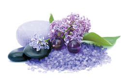
Annual Meeting, Milwaukee exhibit house Derse Inc. added its own special treatment to this tried-and-true theme. Prior
to the show, Derse sent select attendees a mailer with a "Club Pause" membership card. At the show, the card entitled
recipients to special services - courtesy of Derse - at key locations throughout the show hotel. At Starbucks, for example, a flash of the card yielded a free coffee, and in the hotel spa, the card granted bearers a free manicure. Derse even created a Club Pause retreat around the outdoor pool, featuring 15 lounge chairs, Derse-branded beach towels, and a cabana boy (actually a Derse staffer) to serve drinks and fetch clean towels. So while the company's 10-by-20-foot booth offered a spa vibe with soothing white lounge furniture and an oasis-like scene, its off-floor treatments not only made attendees feel special; they also communicated that Derse looks after clients' needs both on and off the show floor.
|
 |
 |

 A lot of U.S. trade shows attract attendees from all over the world. But unless those attendees speak and read English pretty fluently, it can be tricky for them to initiate conversations with staffers. To let international attendees at the 2009 National Association of Broadcasters Show know that it had staffers who spoke their language, Ensemble Designs Inc. dedicated one aisle-side wall in its exhibit to a world map. The wall featured text that read, "Would you like a demo in your language?" along with the names of 50 countries listed horizontally alongside wall-mounted business-card holders that contained cards for specific reps who were assigned to those countries and spoke their respective languages. The exhibit's map/wall received rave reviews from Ensemble Design's international clients and prospects who appreciated the multilingual welcome mat. A lot of U.S. trade shows attract attendees from all over the world. But unless those attendees speak and read English pretty fluently, it can be tricky for them to initiate conversations with staffers. To let international attendees at the 2009 National Association of Broadcasters Show know that it had staffers who spoke their language, Ensemble Designs Inc. dedicated one aisle-side wall in its exhibit to a world map. The wall featured text that read, "Would you like a demo in your language?" along with the names of 50 countries listed horizontally alongside wall-mounted business-card holders that contained cards for specific reps who were assigned to those countries and spoke their respective languages. The exhibit's map/wall received rave reviews from Ensemble Design's international clients and prospects who appreciated the multilingual welcome mat.
|

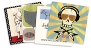
 Why settle for flat and forgettable business cards when you can choose something more functional instead? For the 2009 National Stationery Show, Woodstock, VT-based Wild Apple Graphics Ltd. printed various illustrated works on the backs of coasters made from recycled paper. On one side, recipients could see the styles of art the company (which licenses art and produces posters) has to offer, while the other side featured the company's logo, URL, and contact info. Handed out to NSS attendees, the eco-friendly coasters did triple duty as product samples, functional giveaways, and out-of-the-box business cards. Why settle for flat and forgettable business cards when you can choose something more functional instead? For the 2009 National Stationery Show, Woodstock, VT-based Wild Apple Graphics Ltd. printed various illustrated works on the backs of coasters made from recycled paper. On one side, recipients could see the styles of art the company (which licenses art and produces posters) has to offer, while the other side featured the company's logo, URL, and contact info. Handed out to NSS attendees, the eco-friendly coasters did triple duty as product samples, functional giveaways, and out-of-the-box business cards. |
 |
 |
 |


After designs had been approved for its 50-by-90-foot exhibit at the American Dental Association show, Procter and Gamble Co. (P&G) downsized its plans by 2,000 square feet. Reconfiguring the exhibit elements into a 50-by-50
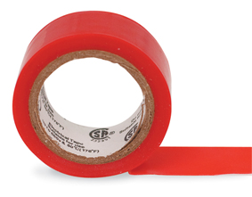
footprint became the challenge of Inter-Global Exhibitions Group. While floor plans indicated that the theater, workstations, storage spaces, etc. could fit into the downsized space, the P&G team feared that the booth might feel claustrophobic. To quell those concerns and give the revised layout a pre-show test drive, IGE Group rented banquet room in a hotel, created a to-scale floor plan by affixing tape to the floor to outline the individual exhibit elements, and invited P&G representatives to walk through the two-dimensional tape outline of the booth. The sticky solution helped P&G and IGE Group make slight modifications that they might have otherwise overlooked, decreasing the theater space slightly and increasing the sales area inside the exhibit.
|

 Given the enormous size of Print (whose show floor can exceed 740,000 square feet), it's easy for attendees to miss an exhibit or two. So to make sure attendees didn't overlook its 28,000-square-foot booth at the 2009 show, Xerox Corp. positioned a smaller booth on the opposite side of the show floor, whose main purpose was simply to drive traffic across the hall and to Xerox's main exhibit. The space held one staffer, a literature rack containing product brochures with floor plans of the main booth, and stacks of cards resembling high-end invitations. The staffer handed passing attendees one of the folded cards, which contained a gold, business-card sized "ticket" with the text: "Greetings to you the lucky owner of this Golden Ticket from Xerox. Present this ticket at Xerox booth 1100 September 11-16, 10 a.m.-5 p.m. to see the Xerox Automated Packaging Solution." By establishing a presence at the opposite end of the show floor and creating special invitations to its demonstration, Xerox helped ensure that the majority of attendees found its main exhibit space - and catapulted a product demo to an invite-only event. Given the enormous size of Print (whose show floor can exceed 740,000 square feet), it's easy for attendees to miss an exhibit or two. So to make sure attendees didn't overlook its 28,000-square-foot booth at the 2009 show, Xerox Corp. positioned a smaller booth on the opposite side of the show floor, whose main purpose was simply to drive traffic across the hall and to Xerox's main exhibit. The space held one staffer, a literature rack containing product brochures with floor plans of the main booth, and stacks of cards resembling high-end invitations. The staffer handed passing attendees one of the folded cards, which contained a gold, business-card sized "ticket" with the text: "Greetings to you the lucky owner of this Golden Ticket from Xerox. Present this ticket at Xerox booth 1100 September 11-16, 10 a.m.-5 p.m. to see the Xerox Automated Packaging Solution." By establishing a presence at the opposite end of the show floor and creating special invitations to its demonstration, Xerox helped ensure that the majority of attendees found its main exhibit space - and catapulted a product demo to an invite-only event.
|

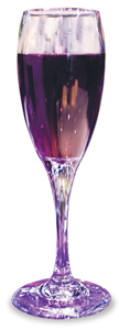
 When Photosound wanted to convey a bubbly image of the company to attendees at EXHIBITOR2009, the communications and design agency infused its corporate, royal-purple color into its 20-by-20-foot booth's walls, furniture, chandeliers, business cards - and even its bubbly.
Staffers poured booth visitors a flute of champagne or sparkling water that was shaded the same color as the exhibit's other design elements. By combining its brand and booth attributes with an offering few U.S. exhibitors serve and even fewer connect to their brand, Photosound turned its potable into a potent promotion. When Photosound wanted to convey a bubbly image of the company to attendees at EXHIBITOR2009, the communications and design agency infused its corporate, royal-purple color into its 20-by-20-foot booth's walls, furniture, chandeliers, business cards - and even its bubbly.
Staffers poured booth visitors a flute of champagne or sparkling water that was shaded the same color as the exhibit's other design elements. By combining its brand and booth attributes with an offering few U.S. exhibitors serve and even fewer connect to their brand, Photosound turned its potable into a potent promotion.
|

 To generate buzz about its exhibit at the 2009 TS2 show, Shrewsbury, MA-based Elevation Exhibits adopted a carnival theme and the tagline, "Everyone's a Winnnaaah!" Prior to the show, the company sent out postcards that encouraged recipients to visit its booth and "toss a ring for 'The Randy,'" meaning the Randy Smith Foundation, a nonprofit organization that provides support for members of the exhibit industry who experience tragedy or face insurmountable medical expenses. The back of the postcard featured information about the foundation, along with photos of some of the company's past projects and text that read, "Come test your skill and find out why our clients feel like winnnaaahs every day." At the show, staffers invited passersby to step up to the booth and try to toss a ring at an internally lit stalactite-like structure in the center of the space. Since everyone was a winnnaaah, Elevation Exhibits gave all participants branded, inflatable beach balls similar to the ones hanging from the exhibit's overhead truss and later made a donation for each attendee that visited the booth and tossed a ring. To generate buzz about its exhibit at the 2009 TS2 show, Shrewsbury, MA-based Elevation Exhibits adopted a carnival theme and the tagline, "Everyone's a Winnnaaah!" Prior to the show, the company sent out postcards that encouraged recipients to visit its booth and "toss a ring for 'The Randy,'" meaning the Randy Smith Foundation, a nonprofit organization that provides support for members of the exhibit industry who experience tragedy or face insurmountable medical expenses. The back of the postcard featured information about the foundation, along with photos of some of the company's past projects and text that read, "Come test your skill and find out why our clients feel like winnnaaahs every day." At the show, staffers invited passersby to step up to the booth and try to toss a ring at an internally lit stalactite-like structure in the center of the space. Since everyone was a winnnaaah, Elevation Exhibits gave all participants branded, inflatable beach balls similar to the ones hanging from the exhibit's overhead truss and later made a donation for each attendee that visited the booth and tossed a ring.
|
|
you might also like |
 |
 |
 |
Ideas That Work
Ideas That Work
Table Talk, Hanging Out, Band Aid, The Pot Pit, and more. |
Ideas That Work
November 2016
Giveaway Gamble, Table of Trends, Submerged Sales, and more. |
Ideas That Work
Ideas That Work
Bottoms Up, Quid Pro Quote, Animal Magnetism, and more. |
|
|
|


