ammunition |

|
 
In our forward-thinking world, some companies forget that
looking back at their history can be an effective way of positioning
themselves as trusted, time-honored suppliers. That's one reason
why Kohler Co. dedicated a small portion of its booth at the 2009
International Builders' Show to its company history, creating an in-booth corporate
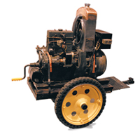
museum. Kohler displayed some of its first products in a museum-style setting
of display cases, dramatic lighting, and inspiring quotes from company founders
printed on wall-mounted graphics. Juxtaposed against the remainder of the booth,
which featured the company's contemporary, cutting-edge offerings, the museum
told the story of a company with a rich history - and a bright future.
|
 |
 |

 A water-purification company's primary selling point over bottled water is that filtered tap water is both cheaper and more eco-friendly than bottled alternatives. So at the 2010 Kitchen & Bath Industry Show in Chicago, Pentair Residential Filtration LLC focused on the negative impact plastic water bottles have on the environment, arguing that water-purifiers like its Everpure system are not only more cost effective in the long run, but are also Greener. To demonstrate the wastefulness of bottled water, Pentair filled a 3-by-8-foot Plexiglas box with empty water bottles. Black text on the clear box read "Americans used 50 billion plastic water bottles last year. 40 billion ended up in land fills." The visual aid instantly conveyed the eco-impact in black and white, and provided staffers with an intriguing conversation starter to boot. A water-purification company's primary selling point over bottled water is that filtered tap water is both cheaper and more eco-friendly than bottled alternatives. So at the 2010 Kitchen & Bath Industry Show in Chicago, Pentair Residential Filtration LLC focused on the negative impact plastic water bottles have on the environment, arguing that water-purifiers like its Everpure system are not only more cost effective in the long run, but are also Greener. To demonstrate the wastefulness of bottled water, Pentair filled a 3-by-8-foot Plexiglas box with empty water bottles. Black text on the clear box read "Americans used 50 billion plastic water bottles last year. 40 billion ended up in land fills." The visual aid instantly conveyed the eco-impact in black and white, and provided staffers with an intriguing conversation starter to boot.
|

 Plenty of companies talk about multisensory marketing, but few actually deliver. At the 2009 Healthcare Convention & Exhibitors Association Annual Meeting, Showcraft Inc. was one of the few. Hoping to demo its multisensory marketing
capabilities, Showcraft, a Burnsville, MN, exhibit house,
created a five-part sensory assault in its 10-by-20-foot booth. It began when staffers invited attendees to take an "ROI Stress Test" via an in-booth kiosk. As each attendee stepped up to the kiosk, a portion of the floor vibrated, providing the attendee with a standing foot massage. After the survey, staffers directed each attendee to a reception
desk. As the attendee moved toward the desk - which contained a scent system that piped a citrus scent into the space - a motion sensor in the floor turned on a light in a flooring panel and activated a musical tune that emanated from the ground. Staffers offered attendees orange-flavored lollipops
to complete their multisensory experience. Now that's a marketing plan that makes perfect sense. Plenty of companies talk about multisensory marketing, but few actually deliver. At the 2009 Healthcare Convention & Exhibitors Association Annual Meeting, Showcraft Inc. was one of the few. Hoping to demo its multisensory marketing
capabilities, Showcraft, a Burnsville, MN, exhibit house,
created a five-part sensory assault in its 10-by-20-foot booth. It began when staffers invited attendees to take an "ROI Stress Test" via an in-booth kiosk. As each attendee stepped up to the kiosk, a portion of the floor vibrated, providing the attendee with a standing foot massage. After the survey, staffers directed each attendee to a reception
desk. As the attendee moved toward the desk - which contained a scent system that piped a citrus scent into the space - a motion sensor in the floor turned on a light in a flooring panel and activated a musical tune that emanated from the ground. Staffers offered attendees orange-flavored lollipops
to complete their multisensory experience. Now that's a marketing plan that makes perfect sense.
|
 |
 |
 |

Frustrated by attendees who entered its promotional contests without spending any time soaking up key messages, PortaBrace Inc. decided to give booth visitors some homework. At the 2009 National Association of Broadcasters Show, the company, which manufactures cases and bags for photography and videography equipment, created a worksheet with 10 questions about its products. To register for the contests, attendees had to fill in their contact information and correctly answer the questions, which required they talk with staffers to learn about the company's key messages. The worksheets not only weeded out unqualified attendees that were just interested in winning a prize, they also ensured that all entrants heard and retained enough of the company's messages to ace the in-booth quiz.
|

When your business offers natural bumblebee pollination, it can be tricky to communicate your service in an aisle-side glance. So at the 2009 United Fresh Produce Association show, Koppert Biological Systems Inc. positioned a clear acrylic case full of buzzing bumblebees inside its 10-by-10-foot space. Intrigued by the insects, most passersby stopped in for more information, giving staffers an opportunity to deliver the complicated company message.
|

 When it came time for
the Office on Women's Health (OWH) to promote its "Best Bones Forever!" campaign for tween girls
at the American Academy
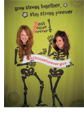
of Pediatrics National Conference & Exhibition, the government agency showed it had a sense of humor - and a humerus, too. OWH staffers, clad in T-shirts imprinted with its "Best Bones Forever!" slogan and "exskullmation point" logo of a femur and skull, encouraged visitors to pose for pics behind "Skelegirls," a 8-by-6-foot display that allowed attendees to provide the faces for two skeleton bodies. Asking them to "Say 'cheese' . because it's good for your bones!" staff snapped pics of the temporarily underweight visitors, then posted the photos on OWH's microsite where attendees could retrieve them. Hitting its pre-show goal of 700 visitors, OWH showed how tying a humorous - but related - theme to a serious campaign can deliver outstanding results. When it came time for
the Office on Women's Health (OWH) to promote its "Best Bones Forever!" campaign for tween girls
at the American Academy
of Pediatrics National Conference & Exhibition, the government agency showed it had a sense of humor - and a humerus, too. OWH staffers, clad in T-shirts imprinted with its "Best Bones Forever!" slogan and "exskullmation point" logo of a femur and skull, encouraged visitors to pose for pics behind "Skelegirls," a 8-by-6-foot display that allowed attendees to provide the faces for two skeleton bodies. Asking them to "Say 'cheese' . because it's good for your bones!" staff snapped pics of the temporarily underweight visitors, then posted the photos on OWH's microsite where attendees could retrieve them. Hitting its pre-show goal of 700 visitors, OWH showed how tying a humorous - but related - theme to a serious campaign can deliver outstanding results.
|

 When your company is an architectural-media publisher, your exhibit should be anything but flat and two dimensional. That's why Port Melbourne, Australia-based Architecture Media Pty. Ltd. adorned the front of its booth space with a When your company is an architectural-media publisher, your exhibit should be anything but flat and two dimensional. That's why Port Melbourne, Australia-based Architecture Media Pty. Ltd. adorned the front of its booth space with a
3-D fabric installation at the Interior DesignEx show. Dyed to match AM's corporate-orange hue, the dynamic organza form floated effortlessly across the front of the 26-by-13-foot exhibit space. A simple wire-and-pole system attached to an overhead truss suspended the fabric and provided enough tension to give the structure its angular shape. Mirroring the angles of the A and M in the company's logo, the dramatic ribbon clearly branded the space, offered a subtle commentary on the importance of architectural elements, and functioned as a floor-wide beacon that drew attendees to the relatively small and unobtrusive space.
|
|
you might also like |
 |
 |
 |
Ideas That Work
Ideas That Work
Table Talk, Hanging Out, Band Aid, The Pot Pit, and more. |
Ideas That Work
November 2016
Giveaway Gamble, Table of Trends, Submerged Sales, and more. |
Ideas That Work
Ideas That Work
Bottoms Up, Quid Pro Quote, Animal Magnetism, and more. |
|
|
|


