sizzle awards |
 |
 |
INTEGRATED PROGRAM |
Exhibitor: MG Design Associates Inc.
Creative/ Production: MG Design Associates Inc.,
Pleasant Prairie, WI, 262-947-8890, www.mgdesign.com
Production: Exhibitors Connection, Chicago, 773-631-9465, www.exhibitorsconnection.com; Stamm Technologies Media Division, Milwaukee, 414-263-4200, www.stammmedia.com
Show: EXHIBITOR2010
Budget: $85,000
Goals:
 Generate 25 percent more leads than at EXHIBITOR2009. Generate 25 percent more leads than at EXHIBITOR2009.
 Secure five RFPs. Secure five RFPs.
 Garner at least two press mentions in industry publications. Garner at least two press mentions in industry publications.
 Entice 35 VIP clients to visit the Fresh Ideas Marketplace. Entice 35 VIP clients to visit the Fresh Ideas Marketplace.
Results:
 Surpassed the number of leads Surpassed the number of leads  collected in 2009 by 52 percent. collected in 2009 by 52 percent.
 Secured seven RFPs to date. Secured seven RFPs to date.
 Received four press Received four press
mentions in pre-, at-, and post-show coverage.
 Lured 36 VIP clients to the exhibit. Lured 36 VIP clients to the exhibit.
|
 |
 rom Whole Foods Markets to neighborhood co-ops, natural-food retailers are the new black. While many global components of the Green movement, such as driving hybrid cars and calculating carbon footprints, may have fallen by the wayside amid the Great Recession of 2008 and 2009, paying top dollar for organic fruits and veggies has somehow claimed de rigueur status. Flashing a co-op membership card automatically grants the bearer hipster cred, and carrying a canvas tote of groceries screams, "See, I'm doing my part to save the planet because I carry radishes in my reusable bag." In other words, natural-food retailers have, in effect, become synonymous with eco-awareness. And patronizing them implies a heightened level of eco-consciousness: You shop Green; therefore, you are Green. rom Whole Foods Markets to neighborhood co-ops, natural-food retailers are the new black. While many global components of the Green movement, such as driving hybrid cars and calculating carbon footprints, may have fallen by the wayside amid the Great Recession of 2008 and 2009, paying top dollar for organic fruits and veggies has somehow claimed de rigueur status. Flashing a co-op membership card automatically grants the bearer hipster cred, and carrying a canvas tote of groceries screams, "See, I'm doing my part to save the planet because I carry radishes in my reusable bag." In other words, natural-food retailers have, in effect, become synonymous with eco-awareness. And patronizing them implies a heightened level of eco-consciousness: You shop Green; therefore, you are Green.
Given the popularity of natural-food retailers and their perceived Greenness, it makes sense that they've become a symbol of sorts for the Green movement. It also makes sense that MG Design Associates Inc., wanting to showcase its eco-friendly sentiments, used Whole Foods Market as inspiration for its integrated promotional campaign at EXHIBITOR2010, an educational conference and exhibition for exhibit and event marketers.
The Pleasant Prairie, WI-based exhibit company has long been a card-carrying member of the eco-conscious collective, and believes exhibit managers in general are also interested in tangible ways to Green their exhibit programs without going over budget. With that in mind, the company didn't want to present discerning EXHIBITOR2010 attendees with a one-off, gimmicky exhibit filled with granola, recycling symbols, and bamboo. Rather, it sought to integrate eco friendliness throughout the design while demonstrating its range of marketing and exhibit-design capabilities. So MG Design decided to make its exhibit as Green as possible and to pair that with an integrated marketing program that supported the eco concept while keeping the focus on the company's offerings. Thus, the Fresh Ideas Marketplace was conceived.
"We seized the Fresh Ideas Marketplace as our theme, which lent itself to more authentic and eco-friendly construction materials and methods," says Rob Majerowski, vice president of creative and permanent interiors at MG Design. "Basically, we sought to create a Whole Foods vibe." That vibe was invigorated by the core tenets the company wanted to convey at the show: It has offices all over the country so it is able to serve clients locally. It has grown organically - not through acquisitions - over the past 50 years. And it offers up a range of innovative marketing ideas. In short, MG Design is local, organic, and innovative. But Majerowski and his creative team didn't want to simply build a stylish structure in which EXHIBITOR2010 attendees could window-shop and kick the eco tires. So they created an integrated exhibit program that would pique the interest of attendees, attract the company's VIP clientele, and ultimately encourage sales.
|
 |
 |
 |
APPLES TO APPLES
Every component of MG Design Associates Inc.'s integrated program reinforced its Fresh Ideas Marketplace concept, from apple-themed pre- and post-show mailers to an eco-friendly exhibit.

MG Design sent the first of two e-blasts to pre-registered attendees one month before the show, and followed up with a second e-blast about three weeks later. Both e-blasts promoted the Fresh Ideas Marketplace theme and invited recipients to visit the exhibit at the show.

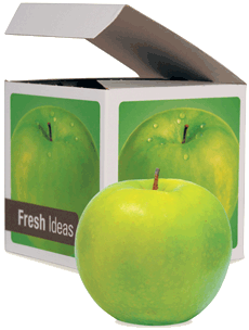
To make an impression on its VIPs, the company mailed them a branded box containing an apple about two weeks prior to the first day of the show. In addition to the apple, the box also included an invitation to visit the booth to receive a complimentary book of smoothie recipes.

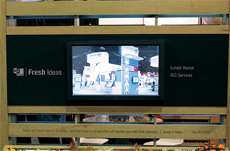
Wall-mounted touchscreens on both the interior and exterior sides of the exhibit's four wall panels allowed attendees to peruse MG Design's past projects.

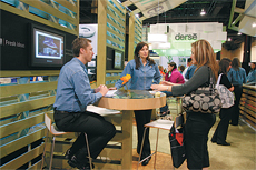
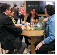
The Fresh Ideas Marketplace featured three "casual meeting zones." Comprising a round, glass-topped table and four chairs, and positioned next to a touchscreen portfolio, each zone provided an informal setting for conversation.
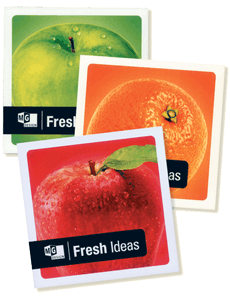
 After the interactive survey, attendees took a branded coaster from a glass jar on the counter as a thank-you gift. Each coaster featured an image of an orange, lemon, or apple, along with an exhibiting tip. After the interactive survey, attendees took a branded coaster from a glass jar on the counter as a thank-you gift. Each coaster featured an image of an orange, lemon, or apple, along with an exhibiting tip. |
Planting the Seeds
In order for the Fresh Ideas Marketplace concept to take root in the minds of attendees, Majerowski and MG Design's marketing team knew they had to hit exhibit managers - and members of the press - with the company's key messages early and often. And since MG Design hoped its exhibit program would attract three different types of audiences (attendees, VIPs, and industry media) each with their own agenda, the company designed three pre-show promotional campaigns that would appeal to each of the unique groups.
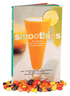
Knowing the campaign would shrivel up and die without the appropriate public-relations fertilization, the marketing team began targeting industry publications approximately six months prior to the show with a goodie-filled press kit. The kit was ripe with treats that tied to the Fresh Ideas Marketplace campaign, including a package of Jelly Belly Smoothie Blend candy, and a smoothie recipe book, as well as MG Design case studies on past projects. The company hoped that by starting the campaign early, it could bolster attendees' awareness of its exhibit program with some pre-show press coverage.
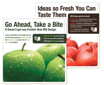
The next marketing tier, directed at pre-registered attendees, started with an e-blast sent about a month before the show opened. The e-blast, which invited attendees to visit MG Design's exhibit, featured an image of green apples on a white background. A headline ran across the top of the image and read: "Go ahead, take a bite. It doesn't get any fresher than MG Design." The e-blast also included MG Design's logo, booth number, and a link to register for the show.
The company followed up with another e-blast about three weeks later. The basic design of the e-mail matched the first effort; only this time red apples lined the bottom half of the image and the call to action read: "Let your competitors recycle old stale ideas. Fresh, inventive strategies to boost your exhibit program are on tap with MG Design at EXHIBITOR2010. Stop by #1535 to experience fresh ideas for yourself and enjoy a refreshing smoothie on us." MG Design used the body of this second e-blast to spell out the principles on which it based its Fresh Ideas Marketplace theme - that it offers innovative ideas, has grown organically for 50 years, and has offices all over the country.
MG Design account executives also sent personalized e-mails to their clients and prospects inviting them to visit the booth. Cognizant of the budget woes many exhibit managers have faced since the economy began to spoil in 2008, those e-mails also included a golden apple of sorts to further tempt them - a pass that granted free access to the show floor.
Finally, in the third and final tier of its pre-show campaign, MG Design's marketing team turned its attention to a list of 70 people it deemed VIPs, based on several factors, including industry, the scope of their exhibit program, and job title. The list represented the cream of the customer crop. While the VIPs received the same e-blasts and personalized e-mail invitations from account reps that MG Design sent to all pre-registered attendees, this very important group also received a special treat in the mail - a green 4-by-4-inch box - about two weeks before the show.
Each side of the box was printed with a side-view image of a green apple, while the top of the box featured a top view of the apple. The top and one side featured MG Design's logo and the words "Fresh Ideas," while text on the back included a "nutrition facts" label. But instead of nutritional information, this label contained tongue-in-cheek percent daily values for the company's services, such as "design," "marketing," and "logistics." Inside the box, VIPs found a real apple and an invitation to visit the company's booth at the show to receive a gift - a book full of smoothie recipes. The marketing team hoped the apple mailer and promise of a free gift was enough to draw VIPs to the exhibit like bees to honey.
Cultivating the Experience
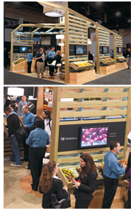
Much to the delight of the marketing team, the various pre-show marketing touchpoints - mailers, e-blasts, and personalized e-mails - proved fruitful, as hundreds of attendees flocked to the booth when the show opened. Locating the Fresh Ideas Marketplace was easy as apple pie, as it stood out like a green thumb among the various stark-white, high-tech, and sleek booths surrounding it. From its grass-green walls built using pallets made of FSC-certified lumber to the formaldehyde-free cork flooring and bins of fresh produce, the 20-by-30-foot island booth evoked the Whole Foods Market vibe for which Majerowski hoped. "As a company that is organically grown, it made sense to be eco friendly with our material choice, which tied into our Green messages and the Fresh Ideas Marketplace theme," he says. "We used natural
woods, cork flooring, real fruit, veggies, flowers, water-based finishes, and mechanical fasteners as opposed to toxic glues and plastics."
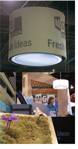
In fact, everything in the booth was literally as Green as could be: Low-energy LED lighting, naturally preserved moss, carpet made with a corn-sugar-based polymer, a natural baking soda and water-based stain dye process, and recyclable aluminum, steel, and fabric were just some of the exhibit's Green components. The result was more farmers' market than trade show exhibit. Three 6-by-10-foot panels, which looked like pallets stacked end to end, lined one side of the space. A few of the slats on the pallet walls contained quotes about sustainability and innovation such as, "Less is more," followed by an exhibit-related interpretation: "Small (done right) is the new big!"
Each of the panels housed a large chalkboard onto which two 42-inch touchscreen monitors were mounted (one on either side). The monitors displayed MG Design's interactive
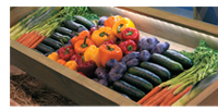
portfolio, while the chalkboard featured the company's logo and web address and the words "Fresh Ideas." Crates of fresh fruit, flowers, and vegetables littered the space, reinforcing the organic market theme. The opposite side of the exhibit featured an identical, fourth wall panel next to a smoothie bar, leaving the other two sides of the structure open to provide ample room for attendees to wander through the inviting space.
Aside from the four panels and smoothie bar, the exhibit's only other structural element was the wood-veneer clad, rectangular storage room, one side of which doubled as the backdrop for the smoothie bar. The counter-height bar featured a chalkboard across the front with MG Design's logo and the words "Fresh Ideas in Exhibit Design," while the under-counter space on another side contained crate-like shelves tightly packed with rows of fresh apples, lemons, and oranges. A cutout in the wall behind the counter echoed the rows of fruit found under the counter, and featured the MG Design logo once again.
|

MG Design mailed press kits to members of the exhibit-industry media to introduce the Fresh Ideas Marketplace. The kits contained a book of smoothie recipes, a package of Jelly Belly Smoothie Blend Candy, a collection of case studies, and photos of past projects.

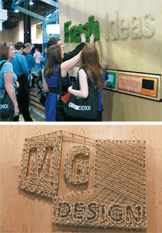
Forgoing traditional exhibit graphics, MG Design's creative team used a more eco-friendly option - jute twine and live wheat grass. Designers created the company's logo with nails and jute twine, and used the same technique for the word "Ideas," which appeared on the exhibit wall near the smoothie bar.

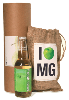
MG Design mailed a burlap sack containing a bottle of apple juice to VIPs and top prospects that visited the booth during the show. The branded bottle featured the same green label and "Company Facts" information that appeared on the pre-show apple mailer.

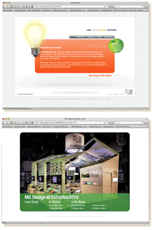
The company created a Fresh Ideas Marketplace microsite on its corporate website that contains video tours of the exhibit, press coverage it has received, booth photos, a comprehensive case study about the campaign, and more. |
 The pièce de résistance in this delightful smorgasbord of Green was summed up in two words: Fresh Ideas. But it wasn't the words so much as what they were made of that spoke to the exhibit's eco-friendliness. The word "Fresh" was made from living, growing wheat grass that sprouted through the wood-veneer panel via cutout letters, while the word "Ideas" was crafted from biodegradable jute twine wrapped around nails - a Green take on string art. The unusual artwork, interactive portfolios, and fresh produce resulted in a multisensory, tactile experience that attendees couldn't resist exploring. The pièce de résistance in this delightful smorgasbord of Green was summed up in two words: Fresh Ideas. But it wasn't the words so much as what they were made of that spoke to the exhibit's eco-friendliness. The word "Fresh" was made from living, growing wheat grass that sprouted through the wood-veneer panel via cutout letters, while the word "Ideas" was crafted from biodegradable jute twine wrapped around nails - a Green take on string art. The unusual artwork, interactive portfolios, and fresh produce resulted in a multisensory, tactile experience that attendees couldn't resist exploring.
Nurturing the Relationship
As attendees entered the Fresh Ideas Marketplace, booth staff swiped their badges at a lead-collection station and directed them to the smoothie bar. A professional hostess from Chicago-based exhibit-staffing firm Exhibitors Connection invited attendees to "feed your brain with fresh ideas and fresh smoothies, and you will have proven results." The hostess went on to ask, "What flavor smoothie can I get for you while you learn how MG Design can add flavor to your exhibit program?"
On the surface, the smoothies, with fruity, fun names such as "tange-rental," "market pomegranation," and "blueberry buzz builder," seemed like simple treats that tied to the "fresh" theme. But the smoothie component was more layered than an English trifle. After ordering the smoothie of their choice (two different flavors were offered each day), attendees received their libation in an MG Design-branded paper cup. But rather than handing the cup directly to attendees, the hostess deliberately set it down on a 3-by-3-inch white square on the counter, next to a touchscreen monitor. What seemed like a germaphobic gesture akin to the Howie Mandel fist bump was actually an ingenious way to introduce RFID technology.
 The paper smoothie cup featured a built-in RFID tag that was synched to the information gathered when staffers swiped attendees' badges. Once placed on the white square, the RFID tag in the cup activated the nearby touchscreen monitor, which prompted attendees to take a six-question survey. The strategy behind the survey was three-fold: introduce attendees to the ease of incorporating RFID technology and measurement into their exhibit programs, gauge the effectiveness of the Fresh Ideas Marketplace campaign, and determine attendees' perceptions of MG Design. After answering questions such as, "What is your largest challenge to improving your exhibit program?" and "If you had an RFP today, would you consider giving MG Design a chance to bid?", attendees helped themselves to a coaster or two from a glass bowl sitting on the countertop. The paper smoothie cup featured a built-in RFID tag that was synched to the information gathered when staffers swiped attendees' badges. Once placed on the white square, the RFID tag in the cup activated the nearby touchscreen monitor, which prompted attendees to take a six-question survey. The strategy behind the survey was three-fold: introduce attendees to the ease of incorporating RFID technology and measurement into their exhibit programs, gauge the effectiveness of the Fresh Ideas Marketplace campaign, and determine attendees' perceptions of MG Design. After answering questions such as, "What is your largest challenge to improving your exhibit program?" and "If you had an RFP today, would you consider giving MG Design a chance to bid?", attendees helped themselves to a coaster or two from a glass bowl sitting on the countertop.
 The coasters, like the smoothies, had a dual purpose. Beyond their utilitarian function, the coasters were branded takeaways that featured an exhibiting tip on one side, and an image of either a green apple, lemon, red apple, or orange on the other, along with the MG Design logo and the "Fresh Ideas" tagline. Tips included statistics to support the importance of MG Design's products and services, such as "Companies integrating measurement programs are twice as likely to receive marketing budget increases over those that don't measure," and "Eighty percent of B2B marketers generate leads through trade shows." The coasters, like the smoothies, had a dual purpose. Beyond their utilitarian function, the coasters were branded takeaways that featured an exhibiting tip on one side, and an image of either a green apple, lemon, red apple, or orange on the other, along with the MG Design logo and the "Fresh Ideas" tagline. Tips included statistics to support the importance of MG Design's products and services, such as "Companies integrating measurement programs are twice as likely to receive marketing budget increases over those that don't measure," and "Eighty percent of B2B marketers generate leads through trade shows."
After receiving the smoothie, responding to the survey questions, and grabbing a coaster, attendees could chat with an MG Design account rep, clad in a farmers-market-friendly uniform that comprised a branded, denim, button-up shirt, and khaki pants, at one of three "casual meeting zones." Each zone featured a round, counter-height, vegetable- or fruit-filled glass-top table and four chairs, and was located next to one of the three wall panels. Here, account reps led attendees through a touchscreen portfolio and filled out lead cards while attendees voiced their exhibit needs. And anyone who visited the exhibit and spoke with account reps on the first two days of the three-day show received an e-mail inviting them to return to the exhibit the next day to receive a $5 Starbucks' gift card.
As soon as the Fresh Ideas Marketplace closed up shop, MG Design turned its attention to post-show follow-up. Booth visitors received a thank-you e-blast a week after the show, and account reps sent out their own personalized e-mails to the current clients and prospects with whom they chatted during EXHIBITOR2010. In addition to the e-mail correspondence that went to everyone, 36 VIPs and those MG Design account reps categorized as top prospects received a special mailer approximately two weeks later. The mailer contained a small burlap bag and a bottle of apple juice - an homage to the apple e-blasts that kicked off the campaign. The juice featured a customized, green, branded label that included the "Fresh Ideas" tagline and the same "nutrition facts" information that adorned the boxed-apple mailer. MG Design's marketing team also created a Fresh Ideas Marketplace microsite on its corporate website that featured video tours of the booth, at-show press coverage the company received, and a case study of the Fresh Ideas integrated marketing campaign. After the show, MG Design included the URL in press releases, and the company's account representatives added it to their e-mail signatures.
 Reaping the Rewards Reaping the Rewards
Based on steady booth traffic throughout the show, everyone involved with the planning of the Fresh Ideas Marketplace knew they had executed a successful campaign long before the last marketing lead was harvested. From pre-show marketing to the premium mailers, the program's cohesiveness was not lost on Sizzle Awards judges, one of whom said, "This company covered all the bases - RFID surveys, public relations, post-show marketing, VIP targeting, etc. It's the epitome of integration." Another judge praised the theme, and said, "The reason this is so successful lies in the concept itself - and the near-perfect execution of it."
Aside from becoming the apple of the judges' eyes, MG Design enjoyed more kudos from attendees. Thanks to the Fresh Ideas Marketplace, the company exceeded 2009 lead counts by 52 percent, and surpassed its 2010 lead goal by 16 percent. Furthermore, results from the in-booth RFID survey indicated that 78 percent of respondents believed MG Design provided fresh ideas, and 90 percent would consider giving MG Design an RFP after visiting the exhibit. In fact, the company already has seven RFPs secured as a direct result of the show, and the program has received coverage in a range of industry publications, including Exhibit City News and Trade Show Expo, both of which posted tours of the exhibit, hosted by Majerowski, on YouTube.
By taking the time to carefully plant the seeds for a comprehensive, fully integrated program, MG Design not only reaped what it sowed, but it also continues to enjoy the fruits of its labor. Now that's a fresh approach. E
|
|
|
|
|


 collected in 2009 by 52 percent.
 rom Whole Foods Markets to neighborhood co-ops, natural-food retailers are the new black. While many global components of the Green movement, such as driving hybrid cars and calculating carbon footprints, may have fallen by the wayside amid the Great Recession of 2008 and 2009, paying top dollar for organic fruits and veggies has somehow claimed de rigueur status. Flashing a co-op membership card automatically grants the bearer hipster cred, and carrying a canvas tote of groceries screams, "See, I'm doing my part to save the planet because I carry radishes in my reusable bag." In other words, natural-food retailers have, in effect, become synonymous with eco-awareness. And patronizing them implies a heightened level of eco-consciousness: You shop Green; therefore, you are Green.