ammunition |

|


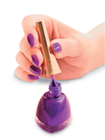
Playing to the roughly 98-percent female audience at the Healthcare Convention & Exhibitors Association Show, Catalyst Exhibits polished up its presence with an on-target nail-polish giveaway. In the days leading up to HCEA, Catalyst sent an e-vite to attendees, asking them to "Let Catalyst Color Your World" at the show. Visitors to the company's 10-by-20-foot exhibit found an aisle-side display comprising multiple bottles of purple-hued nail polish that matched the company's corporate color. Staffers offered all booth visitors a bottle and then asked them to guess the name of the purple polish, among choices ranging from Lucky Lucky Lavender to Purple with a Purpose. Attendees who guessed correctly received a set of four different nail-polish colors. The simple audience-appropriate
giveaway was the perfect conversation starter for the polish-loving crowd.


 Wallpaper displays typically fall flat in terms of creativity.
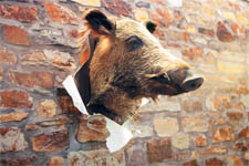
After all, how do you execute a dynamic display for a two-dimensional product? But the challenge to take its display to a new dimension at EuroShop 2011 was compounded for Architects Paper, a division of A.S. Creation Tapeten AG. Rather than showcasing traditional patterned wallpapers, the company was displaying its photo-realistic line of wallpaper that resembles slate, sandstone, and brick. So to draw attention to the fact that its seemingly 3-D brick was actually two-dimensional paper, the company hung a boar's head on the wall, but ripped the paper surrounding the head to make it look as if the boar had crashed through the parchment. The unexpected element
attracted attention while instantly and effortlessly communicating the two-dimensional nature of the product - and luring dozens of interested attendees into the company's booth. Wallpaper displays typically fall flat in terms of creativity.
After all, how do you execute a dynamic display for a two-dimensional product? But the challenge to take its display to a new dimension at EuroShop 2011 was compounded for Architects Paper, a division of A.S. Creation Tapeten AG. Rather than showcasing traditional patterned wallpapers, the company was displaying its photo-realistic line of wallpaper that resembles slate, sandstone, and brick. So to draw attention to the fact that its seemingly 3-D brick was actually two-dimensional paper, the company hung a boar's head on the wall, but ripped the paper surrounding the head to make it look as if the boar had crashed through the parchment. The unexpected element
attracted attention while instantly and effortlessly communicating the two-dimensional nature of the product - and luring dozens of interested attendees into the company's booth.


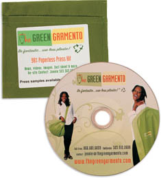
Compact, eye-catching, and literally green, the press kit from The Green Garmento LLC was not only a perfect fit for the brand; it was a couldn't-miss little gem in the press room at the International Hotel, Motel + Restaurant Show. The Green Garmento offers a Green alternative to plastic dry-cleaning bags used by myriad facilities including hotels. The fabric Garmento can be used as a clothes hamper at home, a duffel bag en route to the dry cleaner, and a hanging garment bag to protect clean clothes in lieu of individual, disposable plastic bags. Not surprisingly, then, The Green Garmento's press kit was a tribute to green both literally and figuratively. Made of the same corporate-green fabric used in the Garmento bags, the press kits were nothing more than a CD-holder with an enclosed CD, bi-fold card, and business card. The exterior of the press kit featured a self-adhesive label with the product logo and "Be fantastic . use less plastic!" tagline printed on it. Label text also explained that it was a "98% Paperless Press Kit" featuring
"News, videos, images, fact sheet & more." Simple yet unique, the press kit was totally on brand - and off the press-room shelves in no time.


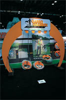
 It can be hard for your product to garner much attention when it's little more than an orange plastic ring that holds the mouths of trash bags open as users collect trash. So to give the little plastic product a big presence inside its 10-by-20-foot booth at the 2011 International Association of Amusement Parks and Attractions Expo, Garbo Grabber LLC built an 8-foot-tall entryway that resembled the orange rings. Staffers periodically littered the floor beneath the arch with garbage, then picked it up using the Garbo Grabber, creating impromptu aisle-side demos. Sporting a sign with the company's logo and tagline, the orange archway gave the product a much bigger presence than the company could have obtained with a more traditional display. It can be hard for your product to garner much attention when it's little more than an orange plastic ring that holds the mouths of trash bags open as users collect trash. So to give the little plastic product a big presence inside its 10-by-20-foot booth at the 2011 International Association of Amusement Parks and Attractions Expo, Garbo Grabber LLC built an 8-foot-tall entryway that resembled the orange rings. Staffers periodically littered the floor beneath the arch with garbage, then picked it up using the Garbo Grabber, creating impromptu aisle-side demos. Sporting a sign with the company's logo and tagline, the orange archway gave the product a much bigger presence than the company could have obtained with a more traditional display.
|
|

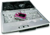
 Worth Ave. Group adopted a destructive exhibit strategy for the 2011 International Consumer Electronics Show. The insurance provider sells policies that cover cell phones, tablet PCs, and other electronic devices. So to attract passersby, staffers stood near a desk littered with laptops and other consumer electronics. Armed with hammers, they pummeled the gadgets like consumer-electronics cage fighters. Curious passersby were invited to step inside the booth, grab a hammer, and take a few swings at the device of their choosing. The unusual aisle-side activity attracted attention, and segued beautifully into conversations about how easily digital cameras, laptop screens, and cell phones can end up trashed. So while interested attendees released a little stress at the expense of the unfortunate electronics, Worth Ave. educated them on why they should insure their devices and offered them information on exactly how to do it. Worth Ave. Group adopted a destructive exhibit strategy for the 2011 International Consumer Electronics Show. The insurance provider sells policies that cover cell phones, tablet PCs, and other electronic devices. So to attract passersby, staffers stood near a desk littered with laptops and other consumer electronics. Armed with hammers, they pummeled the gadgets like consumer-electronics cage fighters. Curious passersby were invited to step inside the booth, grab a hammer, and take a few swings at the device of their choosing. The unusual aisle-side activity attracted attention, and segued beautifully into conversations about how easily digital cameras, laptop screens, and cell phones can end up trashed. So while interested attendees released a little stress at the expense of the unfortunate electronics, Worth Ave. educated them on why they should insure their devices and offered them information on exactly how to do it.


Communicating your vision for a new exhibit design can sound like all abstract adjectives and no action verbs. That's why Geneen Spence, CTSM, exhibit manager for Ossur Americas, doubled up on her communication methods. After trying to communicate her company's vision for its booth to exhibit designers, she decided to add a 3-D explanation. Using scrap paper, she drew out a scaled-down floor plan for her proposed 50-by-50-foot booth. She then cut out and labeled the various components she wanted in the booth, and taped each item onto the floor plan to indicate where it would go. Designers took one look at her creation and drew up an immediate winner.


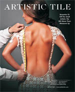
 Turns out sex can sell just about anything - even bathroom tile. Artistic Tile Inc., a stone and tile designer and manufacturer, proved this at the 2011 Kitchen and Bath Industry Show. To draw attention to its 20-by-20-foot booth, the company displayed 40-by-64-inch posters of women wearing sexy cocktail dresses and saucy gowns. But upon closer inspection, attendees discovered that the ensembles were made entirely out of the company's thumbnail-sized tiles. The images, which were originally created for an ad campaign, spoke volumes about the sophistication and allure of the company's tile. Scads of attendees stopped to admire the images, which looked as if they'd been shot for the glossy pages of a Vogue magazine. In the end, it was hard to say what appealed more to booth visitors: the toned, bronzed skin of scantily clad models or the tile that made up the ladies' garb. Whichever it was, the booth had many an ogling eyeball scoping out the goods. Turns out sex can sell just about anything - even bathroom tile. Artistic Tile Inc., a stone and tile designer and manufacturer, proved this at the 2011 Kitchen and Bath Industry Show. To draw attention to its 20-by-20-foot booth, the company displayed 40-by-64-inch posters of women wearing sexy cocktail dresses and saucy gowns. But upon closer inspection, attendees discovered that the ensembles were made entirely out of the company's thumbnail-sized tiles. The images, which were originally created for an ad campaign, spoke volumes about the sophistication and allure of the company's tile. Scads of attendees stopped to admire the images, which looked as if they'd been shot for the glossy pages of a Vogue magazine. In the end, it was hard to say what appealed more to booth visitors: the toned, bronzed skin of scantily clad models or the tile that made up the ladies' garb. Whichever it was, the booth had many an ogling eyeball scoping out the goods.
|
What's The Big Idea?
Do you have a clever exhibit-related tip? Did your last exhibit have an über-cool traffic builder?
Contact Kelli Billstein at kbillstein@exhibitormagazine.com. |
you might also like |
 |
 |
 |
Ideas That Work
Ideas That Work
Table Talk, Hanging Out, Band Aid, The Pot Pit, and more. |
Ideas That Work
November 2016
Giveaway Gamble, Table of Trends, Submerged Sales, and more. |
Ideas That Work
Ideas That Work
Bottoms Up, Quid Pro Quote, Animal Magnetism, and more. |
|
|
|


