ammunition |

|

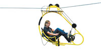
Eco-Adventure Technology faced a daunting challenge
at the 2011 International Association of Amusement Parks
and Attractions Expo: how to demonstrate its EcoFlyer
cable bicycle. Essentially a self-propelled bike attached
to a cable system, the EcoFlyer is typically suspended high
above the treetops, allowing riders to bike through the sky,
observing breathtaking aerial views. But conveying the product's
unique design in a 10-by-20-foot space isn't easy. Ultimately, the company decided to erect a steel support system
2 feet from its back wall, which held an 18-foot-long cable system and one of the EcoFlyer bicycles. A staffer pedaled
the cycle back and forth throughout the show, creating an aisle-side product demo that drew a curious crowd.


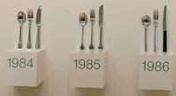 David Mellor Design wanted to display its flatware without falling flat at the 2011 International Contemporary Furniture Fair. But the company also aspired to showcase the brand's rich history of designing forks and spoons that have found their way into households around the world. The resulting display incorporated a timeline that showcased 14 of the company's designs, arranged in chronological order spanning nearly 50 years, from 1963 to 2011. The museum-like exhibit branded David Mellor Design as a fixture in the realm of eating-utensil design, while positioning the company as an undeniable force driving the future of flatware as well. David Mellor Design wanted to display its flatware without falling flat at the 2011 International Contemporary Furniture Fair. But the company also aspired to showcase the brand's rich history of designing forks and spoons that have found their way into households around the world. The resulting display incorporated a timeline that showcased 14 of the company's designs, arranged in chronological order spanning nearly 50 years, from 1963 to 2011. The museum-like exhibit branded David Mellor Design as a fixture in the realm of eating-utensil design, while positioning the company as an undeniable force driving the future of flatware as well.


 You can boast all day about the quality of your nonslip
flooring, but you've got to get your customers' attention first.
MNY Group LLC did just that at the 2011 American Institute
of Architects Minnesota Convention in Minneapolis. The
Bloomington, MN-based flooring manufacturer ordered two
of its booth staffers to shed their shoes and socks, roll up
their pant legs, and stand barefoot atop the 10-by-10-
foot exhibit's floor, which was covered with MNY
Group's Life Floor product. Passersby couldn't help
but stare at the bare toes, scanning booth signage as
they tried to figure out why, exactly, staffers were sans
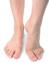
shoes and socks in the middle of a booth. That second glance was just the hook exhibit staffers needed to wrangle in lingering attendees and explain that Life Floor virtually eliminates slips and falls, even in wet areas. By doing something completely unexpected and capitalizing on attendees' curiosity, MNY Group managed to stay several feet ahead of the competition. You can boast all day about the quality of your nonslip
flooring, but you've got to get your customers' attention first.
MNY Group LLC did just that at the 2011 American Institute
of Architects Minnesota Convention in Minneapolis. The
Bloomington, MN-based flooring manufacturer ordered two
of its booth staffers to shed their shoes and socks, roll up
their pant legs, and stand barefoot atop the 10-by-10-
foot exhibit's floor, which was covered with MNY
Group's Life Floor product. Passersby couldn't help
but stare at the bare toes, scanning booth signage as
they tried to figure out why, exactly, staffers were sans
shoes and socks in the middle of a booth. That second glance was just the hook exhibit staffers needed to wrangle in lingering attendees and explain that Life Floor virtually eliminates slips and falls, even in wet areas. By doing something completely unexpected and capitalizing on attendees' curiosity, MNY Group managed to stay several feet ahead of the competition.


 Exhibit Concepts Inc. created a fresh exhibiting strategy at the 2011 Healthcare Convention & Exhibitors Association show to complement its Business Grown Here theme. The exhibit house filled its 10-by-20-foot booth with assorted gardening tools and accessories, while the back wall featured the text "Cultivators of engagement marketing" as well as a list of the company's services. As attendees approached the booth, staffers outfitted in gardening aprons asked them if they wanted to learn how to grow their business and create a great customer experience. Staffers then pulled out four seed cards, each of which contained a strip of paper with seeds imbedded in it, and a message about how Exhibit Concepts grows a great customer experience. The refreshing gardening theme and take-home seed cards helped Exhibit Concepts' fresh idea live on in attendees' gardens - and minds - long after the show. Exhibit Concepts Inc. created a fresh exhibiting strategy at the 2011 Healthcare Convention & Exhibitors Association show to complement its Business Grown Here theme. The exhibit house filled its 10-by-20-foot booth with assorted gardening tools and accessories, while the back wall featured the text "Cultivators of engagement marketing" as well as a list of the company's services. As attendees approached the booth, staffers outfitted in gardening aprons asked them if they wanted to learn how to grow their business and create a great customer experience. Staffers then pulled out four seed cards, each of which contained a strip of paper with seeds imbedded in it, and a message about how Exhibit Concepts grows a great customer experience. The refreshing gardening theme and take-home seed cards helped Exhibit Concepts' fresh idea live on in attendees' gardens - and minds - long after the show.
|
|

 Sometimes the best marketing vehicle for brand awareness is, well, a van. At the International Hotel, Motel + Restaurant Show in New York, Pure Solutions NA, which provides purification systems to help hotels create allergy-friendly rooms, positioned one of its branded service vans next to the registration area and handed out corporate-blue bags branded with the company's logo. The van's exterior featured an image of a sleeping child and the words, "Step inside for a breath of fresh air." The branded van cost little more than the gas required to drive it to the convention center and back, and served as a front-and-center messaging vehicle attendees saw before they even stepped on the show floor. Sometimes the best marketing vehicle for brand awareness is, well, a van. At the International Hotel, Motel + Restaurant Show in New York, Pure Solutions NA, which provides purification systems to help hotels create allergy-friendly rooms, positioned one of its branded service vans next to the registration area and handed out corporate-blue bags branded with the company's logo. The van's exterior featured an image of a sleeping child and the words, "Step inside for a breath of fresh air." The branded van cost little more than the gas required to drive it to the convention center and back, and served as a front-and-center messaging vehicle attendees saw before they even stepped on the show floor.


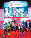
 Costumed characters are a staple of the Licensing International Expo. In fact, dozens of them walked the aisles at the 2011 show. But a random character roaming the exhibit hall does little for your brand awareness if attendees don't immediately associate that character with its respective programming. So instead of banishing its Power Rangers characters to roam the halls of the Mandalay Bay Convention Center, Saban Brands, a division of Saban Capital Group, positioned them in front of a multimedia façade welcoming passersby into its exhibit. While the Power Rangers posed for photos and interacted with attendees, the branded LED wall behind them ran video clips from the TV show that made the rangers famous. The strategy not only put the characters in context; it also allowed Saban to capitalize on the attention they attracted. Costumed characters are a staple of the Licensing International Expo. In fact, dozens of them walked the aisles at the 2011 show. But a random character roaming the exhibit hall does little for your brand awareness if attendees don't immediately associate that character with its respective programming. So instead of banishing its Power Rangers characters to roam the halls of the Mandalay Bay Convention Center, Saban Brands, a division of Saban Capital Group, positioned them in front of a multimedia façade welcoming passersby into its exhibit. While the Power Rangers posed for photos and interacted with attendees, the branded LED wall behind them ran video clips from the TV show that made the rangers famous. The strategy not only put the characters in context; it also allowed Saban to capitalize on the attention they attracted.


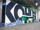
 Sometimes, if you want to be acknowledged as a big brand in your industry, you can resort to the obvious: Announce your company name with larger-than-life lettering. At the 2011 Kitchen and Bath Industry Show, Kohler Co. made a loud statement in its 100-by-140-foot space by creating a graphic featuring 12-foot-tall, block letters and wrapping it around the exhibit's stark-white exterior wall. Graphics of crystal-clear water at the base of the letters added an illusion of movement. By super-sizing its logo, Kohler made an impression too big to forget. Sometimes, if you want to be acknowledged as a big brand in your industry, you can resort to the obvious: Announce your company name with larger-than-life lettering. At the 2011 Kitchen and Bath Industry Show, Kohler Co. made a loud statement in its 100-by-140-foot space by creating a graphic featuring 12-foot-tall, block letters and wrapping it around the exhibit's stark-white exterior wall. Graphics of crystal-clear water at the base of the letters added an illusion of movement. By super-sizing its logo, Kohler made an impression too big to forget.
|
What's The Big Idea?
Do you have a clever exhibit-related tip? Did your last exhibit have an über-cool traffic builder?
Contact Kelli Billstein at kbillstein@exhibitormagazine.com. |
you might also like |
 |
 |
 |
Ideas That Work
Ideas That Work
Table Talk, Hanging Out, Band Aid, The Pot Pit, and more. |
Ideas That Work
November 2016
Giveaway Gamble, Table of Trends, Submerged Sales, and more. |
Ideas That Work
Ideas That Work
Bottoms Up, Quid Pro Quote, Animal Magnetism, and more. |
|
|
|


 You can boast all day about the quality of your nonslip
flooring, but you've got to get your customers' attention first.
MNY Group LLC did just that at the 2011 American Institute
of Architects Minnesota Convention in Minneapolis. The
Bloomington, MN-based flooring manufacturer ordered two
of its booth staffers to shed their shoes and socks, roll up
their pant legs, and stand barefoot atop the 10-by-10-
foot exhibit's floor, which was covered with MNY
Group's Life Floor product. Passersby couldn't help
but stare at the bare toes, scanning booth signage as
they tried to figure out why, exactly, staffers were sans
shoes and socks in the middle of a booth. That second glance was just the hook exhibit staffers needed to wrangle in lingering attendees and explain that Life Floor virtually eliminates slips and falls, even in wet areas. By doing something completely unexpected and capitalizing on attendees' curiosity, MNY Group managed to stay several feet ahead of the competition.
  Exhibit Concepts Inc. created a fresh exhibiting strategy at the 2011 Healthcare Convention & Exhibitors Association show to complement its Business Grown Here theme. The exhibit house filled its 10-by-20-foot booth with assorted gardening tools and accessories, while the back wall featured the text "Cultivators of engagement marketing" as well as a list of the company's services. As attendees approached the booth, staffers outfitted in gardening aprons asked them if they wanted to learn how to grow their business and create a great customer experience. Staffers then pulled out four seed cards, each of which contained a strip of paper with seeds imbedded in it, and a message about how Exhibit Concepts grows a great customer experience. The refreshing gardening theme and take-home seed cards helped Exhibit Concepts' fresh idea live on in attendees' gardens - and minds - long after the show.

