|
REGISTRATION REQUIRED
graphics
Signs of the Times
From its early beginnings in the 1990s, digital signage has transformed into a $16 billion market. Today, exhibitors are replacing traditional substrates with LCD, LED, OLED, and projection technology. To help you harness these tools, EXHIBITOR and the Digital Signage Experts Group propose seven rules to ensure your digital signs' success.
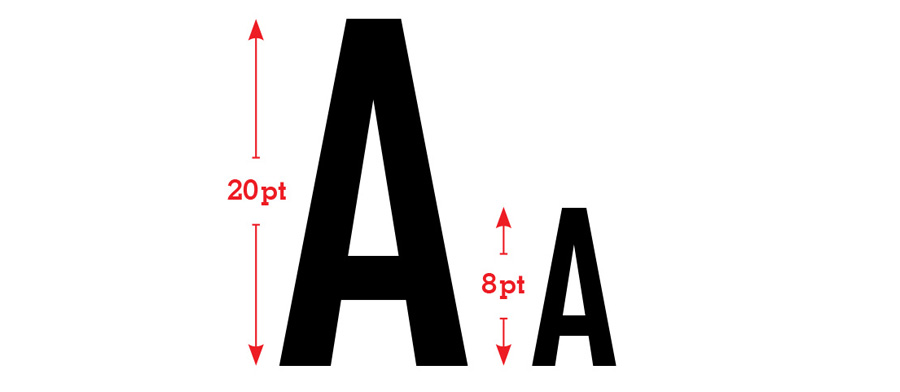 Use sans-serif typefaces such as Arial, Helvetica, or Verdana, since they're easier to read on screen than serif typefaces. And, because most people view digital signs from roughly 7 to 10 feet away, use at least a 20-point font.  Displays should almost always be positioned in portrait mode, since that orientation generates as much as 30 percent more attention and recall, according to the Digital Signage Experts Group. The aspect ratio should be 9:16, which translates to an image resolution of 1,080-by-1,920 pixels, which is the default universal aspect ratio for monitors set in portrait mode.  Make sure a call to action (CTA) – an instruction designed to elicit a specific response – is on screen at all times. The most effective CTAs tend to emphasize a time-sensitive offer with an immediate reward, such as "Get 20 percent off today only" or "Sign up for our mailing list now to receive a free consultation." 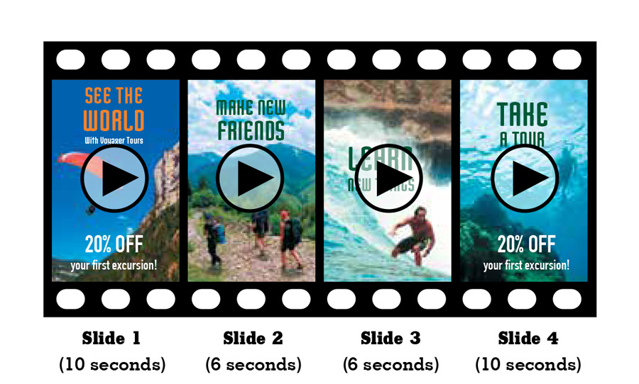 Place the most important messages at the beginning and end of the looping video on your digital sign. Moreover, introduce the first item and last item in that loop at a relatively slower speed than the others, thereby leaving them on the screen longer so that viewers have more time to digest those messages.  Individual sections of a digital sign are called zones. Typically, a screen should contain no more than three zones at a time, and those zones shouldn't compete for attention with each other. Otherwise you risk giving viewers too many areas to focus on and losing their attention altogether. If you use more than one zone per screen, the zone that contains the most pertinent information should also be the largest.  Place your digital signs as close to average head height as possible, since that is the area where most passersby focus their attention while walking the aisles. Also keep in mind what's known as the "angle of awareness," the 10-degree vertical field up or down from eye level that attendees view most as they move through an environment. Anything placed lower or higher than that will go comparably unnoticed, no matter how captivating your content.  The average dwell time in front of digital signs runs from roughly four to six seconds. To ensure your story or message can be conveyed in that very brief window, perform a dry run with staffers to see if they can read and absorb your messaging in the allotted time span. Use a maximum of either three lines of text with five words per line or five lines of text with three words each to optimize viewer retention.
|
|
|
||||||||||||||||||||||||||||
|
|
||||||||||||||||||||||||||||
|
TOPICS Measurement & Budgeting Planning & Execution Marketing & Promotion Events & Venues Personal & Career Exhibits & Experiences International Exhibiting Resources for Rookies Research & Resources |
MAGAZINE Subscribe Today! Renew Subscription Update Address Digital Downloads Newsletters Advertise |
FIND IT Exhibit Producers Products & Services All Companies Get Listed |
EXHIBITORLIVE Sessions Exhibit Hall Exhibit at the Show Registration |
ETRAK Sessions Certification F.A.Q. Registration |
EDUCATION WEEK Overview Sessions Hotel Registration |
CERTIFICATION The Program Steps to Certification Faculty and Staff Enroll in CTSM Submit Quiz Answers My CTSM |
AWARDS Exhibit Design Awards Portable/Modular Awards Corporate Event Awards Centers of Excellence |
NEWS Associations/Press Awards Company News International New Products People Shows & Events Venues & Destinations EXHIBITOR News |
||||||||||||||||||||
|
||||||||||||||||||||||||||||


