 |
TRAFFIC BUILDER |
Exhibitor: Deckel & Moneypenny Exhibits
Creative/Production: Deckel & Moneypenny Exhibits, Louisville, KY, 888-501-7469,
www.deckelmoneypenny.com
Show: TS², 2009
Budget: $10,000
Goals:
 Secure 20 leads and one invitation to participate in an RFP. Secure 20 leads and one invitation to participate in an RFP.
 Generate brand awareness during and following the show. Generate brand awareness during and following the show.
 Leverage show participation to win new business after TS². Leverage show participation to win new business after TS².
 Results: Results:
 Captured 20 leads and participated in one RFP process. Captured 20 leads and participated in one RFP process.
 Received six awards related to the competition, including Best of Show, which prompted various post-show media mentions. Received six awards related to the competition, including Best of Show, which prompted various post-show media mentions.
 Added the company's
second-largest client in
D&M's history, due in part
to the promotion. Added the company's
second-largest client in
D&M's history, due in part
to the promotion.
|
 |
 t's a big, big, big, big world. Or at least that's what we're led to believe. After all, "bigger is better," and you gotta "go big or go home." We're all supposed to look at "the big picture," try to catch our "big break," and keep an eye out for "the next big thing." Men want bigger biceps, women want bigger breasts, and we all want bigger wallets. And to top it off, Carrie Bradshaw eventually ended up with Mr. Big. (Sigh.) t's a big, big, big, big world. Or at least that's what we're led to believe. After all, "bigger is better," and you gotta "go big or go home." We're all supposed to look at "the big picture," try to catch our "big break," and keep an eye out for "the next big thing." Men want bigger biceps, women want bigger breasts, and we all want bigger wallets. And to top it off, Carrie Bradshaw eventually ended up with Mr. Big. (Sigh.)
But what if maybe, just maybe, the "big" proponents are wrong? What if smaller is better? Take your small towns, small businesses, small cars, and small dogs? Don't they hold a value all their own, as do small farms, small steps, and even some small talk? What if, dare we say it, it's really just a small world after all?
This seemingly radical question was the crux of Deckel & Moneypenny Exhibit's award-winning promotional strategy at TS² 2009, a trade show for exhibit and event marketers in Chicago. Despite the world's "biggie-size it" mentality, the Louisville, KY, exhibit house challenged TS² attendees to at least consider the idea that smaller can be better. Pairing a spot-on theme
with an ingenious in-booth traffic builder, D&M not only generated awareness and met its lead goals; it also converted many "big" proponents
into staunch "small" supporters.
David versus Goliath
Developing D&M's "small" strategy, however, was anything but a small task. That's because the company had several cards stacked against it straight out of the gate.
"We're a relatively small, unknown company in a rather odd location geographically," says Steve Deckel, D&M's design director and the not-so-small mind behind the company's strategy. "We have one office in Louisville, which isn't exactly ground zero for the trade how industry. Compared to other firms with single offices, we're average to small in size, but compared to exhibit houses with multiple offices in multiple cities, we're David and they're Goliath on steroids."
"What's more," Deckel says, "we typically don't promote ourselves at trade shows. We use e-mail, newsletters, our website, and word of mouth - and those tactics alone have brought in enough business to keep us going up until now. In fact, prior to 2009, we'd only exhibited at one show - TS², in 1984 - and that's only because it happened to be in Louisville that year."
But given the economic recession and the company's internal push to grow its business, D&M looked to trade shows as a way to generate awareness and enlarge its client base in 2009 and beyond. "During the summer of 2009, the economy
was tanking, and as a result, exhibitors - that is, our clients - were cutting back," Deckel says. "We needed to get the word out about our company, and a regional trade show of some sort, where we wouldn't get trampled by the big guys, was a good start."
 |
 |
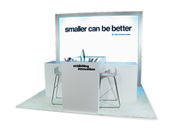
| Deckel & Moneypenny Exhibits' stark-white space featured its "Smaller can be Better" tagline and downplayed its relatively unknown name. |
 |
Deckel's show search led him to TS² 2009 in Chicago, and he soon discovered that many exhibitors were dropping out or downsizing their presence. "And when I see the majority of people zigging, I zag," he says. "For as everyone else is pulling back, they create a vacuum. So I figured we could step into the space that others had vacated and steal a little chunk of market share in the process."
Thus, D&M decided that TS² 2009 would be its second foray into exhibit marketing at least in terms of self promotion. In doing so, it hoped to set itself apart from - and perhaps above - the masses based on three company characteristics. "We would be smaller than most exhibitors there," Deckel says. "But we also thought we were more personal and creative. Plus, with our Louisville location, we can often offer clients a considerable cost break on shipping."
This mid-country location is particularly beneficial for companies on the exterior borders of the United States (i.e., those on the East and West Coasts and those bordering Canada and Mexico). With an exhibit house and thus exhibit storage in Louisville, these companies' shipments would originate in the Midwest - as opposed to one of the U.S. borders. So rather than shipping from, say, Miami, to shows in Chicago and Las Vegas, those Miami shipments would originate in Louisville, and the distance traveled would almost be cut in half.
So with a show chosen and the company's three differentiators identified, D&M only needed a clever theme to capture attendees' attention, lure them to the booth, and make a lasting impression. But no matter what size you are, that's no small order.
Wee but Wonderful
To find a solution, D&M's inspiration
came not from one source, but several. Clearly, given the situation, a "small" concept was a no brainer. Not only was D&M a small company, from a relatively small city, exhibiting at a small show, and in a small (10-by-10) booth, but given the economy, show attendees were looking for ways to downsize their budgets as well.
"Exhibit managers were being forced to scale back their programs - and to them, smaller wasn't better," Deckel says. "For most clients, any decrease, be it in marketing budget, booth size, promotional spend, theater space, etc., was typically viewed as a negative. What's more, on a personal level, exhibit mangers were worried, not only about their programs but also about their jobs, their 401Ks, their homes, their kids' college funds, and their futures. So while people were looking for ways to cut back, they weren't happy campers."
At about this same time, D&M's largest client, GE Appliances, had to significantly scale back the size of its booth at the International Builders'
Show due to budget restraints. "Prior to this show, we'd been working with them on a three-year initiative to improve program performance. Nevertheless, we were expecting a dip in IBS 2009 performance given the decrease in booth size. But when their results came in from the show, we were astounded. The company had actually increased its leads from the previous year by almost 70 percent. Clearly, at least in their case, going smaller and more strategic was much better."
 |
 |
| The Shrinky
Dinks came
out of the
oven smaller
but more vivid
in color, proving
that sometimes,
smaller is better. |
 |
Thus, considering D&M's size issues,
a bad economy, TS² attendees' desire
to downsize, and GE's "shrunken" success, Deckel hit upon an ingenious
theme: "Smaller can be Better." In conjunction with his overarching message, he developed the perfect in-booth activity to symbolize the contracting nature of the economy and attendees' marketing budgets: making Shrinky Dinks.
Not only was the activity ideal for the situation, but D&M also felt that this nostalgic activity would help win over stressed-out attendees, who no doubt fondly remembered making Shrinky Dinks while growing up. Based on the theme, the in-booth activity, and a puny $10,000 marketing budget, D&M created a small-but-mighty promotion attendees couldn't resist.
Shrinkage - It's a Good Thing
D&M's promotional campaign started roughly two weeks before the show when the company sent an e-mail blast to 1,300 clients, prospects, and TS² attendees. The black-and-white e-mail featured the TS² logo and the words "smaller can be better" along with the tagline "find out how at booth #314, July 21 - 22." The e-mail and much of the rest of the campaign put the "smaller can be better" slogan front and center, leaving the D&M name as a secondary feature.
"With little to no brand recognition, I didn't see the point in focusing on our brand name," Deckel says. "If you emphasize the brand, and people don't know what the brand means, it's nonsense. Rather, I wanted people to remember the slogan, and then learn about our brand. The campaign wasn't about who we are, and what we do. It was about what we do, and then who we are."
As attendees arrived at D&M's modest 10-by-10 space, they found a stark, similarly slogan-focused exhibit. Bathed in a brilliant white hue, the booth comprised little more than an internally lit back wall, a counter running across the center of the space, and an internally lit artist's drafting table dissecting the counter on a 90-degree angle. Bold black text across the back wall read "smaller can
be better," while D&M's name and logo appeared beneath the slogan.
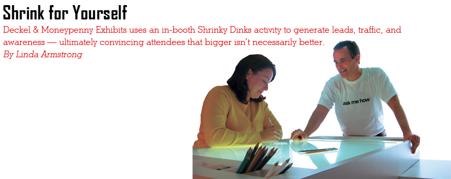
Even the staff attire - i.e., white pants and light khaki T-shirts with the words "ask me how" in black text - was part of D&M's strategy. With Deckel's staff of two (himself included) standing near the back wall, passing attendees first noticed the "smaller can be better" slogan and then glanced at staffers' shirts and their "ask me how" message.
 |
 |
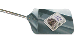
| Attendees left the
booth with a Shrinky
Dink keychain, and Deckel& Moneypenny's tongue-in-cheek reminder
that good things come in small packages. |
 |
"Passersby looked at the wall and then at my shirt and immediately gave me that 'furrowed-brow' look," Deckel says. "So I'd say, 'Wanna find out how smaller can be better?'" Deckel would generally follow up that question with something like, "I just met you, but
I'd bet that your budget isn't what it used to be. It's probably a lot smaller."
He would continue to pepper the conversation with key messages, such as, "If you think smarter and strategize effectively, smaller can be better," and, "We'll help you create a Shrinky Dink that proves that shrinking things, such as your budget and booth size, can actually be a good thing."
Staffers then offered attendees a 5-by-3.75-inch clear-plastic card, which bore the slogan, D&M's logo, and a hole in the upper-left corner. Staffers also gave attendees their choice of colored pencils and suggested that they sketch out something related to the trade show industry on the card. Of course, as people scribbled and doodled, staffers queried them about their problems and concerns, and when appropriate, they suggested ways in which D&M might help them. They were also quick to point out D&M's differentiators, stressing that while it may be small, it's personal, creative, and centrally located to help cut costs.
Once an attendee completed his or her artistry, a staffer popped the plastic into a toaster oven concealed under the counter. Next, the staffer scanned the attendee's badge while he or she waited (also making quick notes about their conversation on the
back of the lead form), and within
30 seconds, the plastic shrank to
approximately 1-by-1.5 inches. The
shrinkage caused the colors and
forms to become more vivid, while still
retaining the artist's overall message and purpose - much like the way
exhibitors can carefully downsize their programs while still retaining their exhibits' effectiveness.
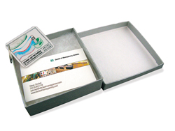
Finally, a staffer slipped a ring through the hole in the plastic - ultimately turning the Shrinky Dink into a keychain - and nestled each one into its own 3.5-by-3.5-inch box. Next, Deckel showed attendees a specialized business card. While one side of the card contained his contact information, the other side offered the words "A Good Thing." He then inserted the card into the box and affixed a label that read "a small package." As attendees prepared to depart, he made one last memorable, but tongue-in-cheek, comment saying, "You know what comes in small packages, right?" (Attendees then mentally recalled the enclosed card reading "A Good Thing.")
Attendees walked away not only with a personalized giveaway that was unlike anything else on the show floor, but also with a clear understanding of D&M's offerings. What's more, they left with the impression that D&M was an inventive little company.
Plus, according to Sizzle Awards judges, attendees couldn't help but be impressed by D&M's concepts and its near-perfect execution as well. "Most 10-by-10 exhibits don't even get their signage right," judges said. "These guys were dead on with the booth design, their clean messaging, and an inventive yet oh-so-well-done activity that was totally on target with its audience."
 |
 |
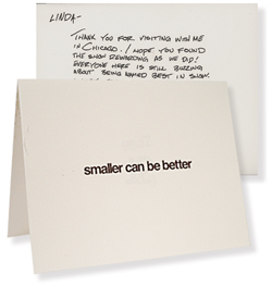
| After the show, Deckel&Moneypenny sent visitors handwritten thank-you cards that reinforced the booth's size-centric theme. |
 |
After the show, Deckel sent each Shrinky Dinks participant a white notecard bearing the "smaller can be better" slogan on the exterior. Inside, his handwritten message thanked
attendees for visiting the exhibit.
Shrunken Plastic, Enlarged Success
By the time the last Shrinky Dink was shrunk, D&M had hit its lead and RFP goals dead on. "We were hoping to get 20 leads and score one RFP out of the experience, and that's exactly what we got," Deckel says. "While 20 may not sound like a lot, for a show of this size and considering the current economy, this was a home run for us."
But perhaps more importantly, the booth took home the Best in Show Award from TS², prompting D&M to leverage the program at other events and to enter it in various competitions. In fact, D&M used the exhibit to promote itself at the Louie Awards Gala, sponsored by the Louisville Advertising
Federation, and set up the display in its office showroom as a way for clients
and prospects to experience the company's creativity firsthand.
To date, the exhibit program has won two Gold Louie Awards from the Louisville Advertising Federation, a district level Silver Addy from the American Advertising Federation, and an Eddie Award, which recognizes exhibit firms for their marketing excellence, from the Exhibit Designers and Producers Association. As a result of all those awards, D&M has received mentions in various trade and regional publications including Exhibit Design Magazine, Louisville Magazine, and Communiqué.
But according to Deckel, the "small" exhibit program's biggest accomplishment was a new contract with Chevron Products Co., which is now D&M's second-largest client. "During our bidding process with Chevron, we found out that we won the Best of Show Award," he says. "And while the folks at Chevron didn't directly come out and say it, I'm quite sure that our award heightened their interest in us. It was almost like our campaign at TS² and the show's third-party endorsement hammered home what we'd been trying to tell the prospect from the start: We're definitely smaller than most. But we're more personal. We're more creative. And well, we're better, too." E
|


 Results:
 t's a big, big, big, big world. Or at least that's what we're led to believe. After all, "bigger is better," and you gotta "go big or go home." We're all supposed to look at "the big picture," try to catch our "big break," and keep an eye out for "the next big thing." Men want bigger biceps, women want bigger breasts, and we all want bigger wallets. And to top it off, Carrie Bradshaw eventually ended up with Mr. Big. (Sigh.)