| gold awards |
Category: International Designer
Exhibitor: Blomus GmbH
Design/Fabrication: Ueberholz GmbH, Wuppertal, Germany, 49-202-280-96-0, www.ueberholz.de
Show: Ambiente, 2011
Budget: $250,000
Size: 92-by-39 feet
Cost/Square Foot: $70 |
 ow do you stuff hundreds of products into an exhibit without creating a hideous, cluttered mess? You start with a lesson from Nico Ueberholz, Andre Fusser, and Werner Laux, the product-display wizards at Wuppertal, Germany-based Ueberholz GmbH. ow do you stuff hundreds of products into an exhibit without creating a hideous, cluttered mess? You start with a lesson from Nico Ueberholz, Andre Fusser, and Werner Laux, the product-display wizards at Wuppertal, Germany-based Ueberholz GmbH.
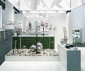
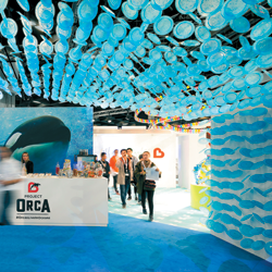
Laid out in three 92-foot sections - a hospitality bar, a row of four product-display vignettes, and a strip of product displays - the Blomus GmbH exhibit at Ambiente 2011 contained more than 700 products and product images, including everything from rain gauges to firewood bins.
Over each vignette, designers suspended a 12-foot-square cube of white scrim, which offered shadows depicting the products displayed below. To execute this effect, designers joined Plexiglas product models into a suspended mobile via nylon ropes. Each mobile was then attached to a circular disk mounted to a motor, and hung within an internally lit shadow box. During the show, the motor slowly turned the mobiles, casting shadows onto the scrim.
The effect caught the attention of Exhibit Design Awards judges. "The use of light, shadows, and scrim is a slice of brilliance in this design," one judge said.
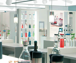
Another brilliant design element was the 92-foot-long hospitality area adjacent to the vignettes. Here, staffers
offered attendees wine via Blomus decanters and made lemonade with a Blomus lemon press. Additional products
also sat atop the bar and on white-laminate-covered counters throughout the booth, where they acted more
like modern décor than product displays.
While the uncluttered space was swimming with products, one traditional element was almost absent: text. According to Ueberholz, "Designers took inspiration from a quote, which we also placed on a scrim-covered venue column in the booth: 'Gutes design braucht wenig worte.'" Translation: Good design needs few words. e
|


 ow do you stuff hundreds of products into an exhibit without creating a hideous, cluttered mess? You start with a lesson from Nico Ueberholz, Andre Fusser, and Werner Laux, the product-display wizards at Wuppertal, Germany-based Ueberholz GmbH.
