|
REGISTRATION REQUIRED
design awards
Video Player is loading. silver award
Category: Island Exhibit
Exhibitor: Interac Corp.
Design: Zulu Alpha Kilo Inc., Toronto, 416-777-9858, www.zulualphakilo.com Fabrication: Astound Group Inc., Oakville, ON, Canada, 905-465-0474, www.astoundgroup.com
Show: Collision, 2019
Budget: $250,000 – $499,000
Size: 30-by-40 feet
PHOTOS: ZULU ALPHA KILO INC
Code Yellow
The Collision conference attracts roughly 25,000 attendees, many of which represent companies in the startup and new-technology sectors. And Interac Corp.,
a tech-forward financial-services provider, wanted to draw as many of these movers and shakers to its exhibit as possible. According to the designers at creative agency Zulu Alpha Kilo Inc., like many exhibitors at Collision, Interac's business is steeped in data. Where the company distinguishes itself is not just in managing information, but conceptualizing products and services based on its data.

Data Entry
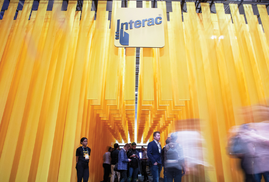
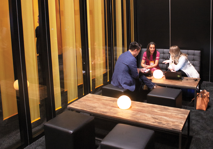
When it came to manifesting Interac's imaginative attributes, the Zulu Alpha Kilo team, working in collaboration with Astound Group Inc., found inspiration in the opening credits of "The Matrix," in which green lines of cryptic code cascade down the screen. But instead of staging a literal interpretation of this iconic cinematic sequence, designers subtly referenced it via rigging 600 strips of mesh fabric printed to match Interac's corporate yellow. By abbreviating the lengths of some of the strips arranged in a precise grid 20 feet above the floor, designers created space for an 8-foot-tall central passageway and four casual meeting spaces where attendees could engage in distraction-free demos of Interac's services. The only solid surfaces to be found were at the back of the exhibit, where wood and Plexiglas walls formed formal conference rooms. Sheltered from the show-floor din by bands of fabric rigged in a precise grid, four casual meeting spaces tucked away inside Interac Corp.'s exhibit allowed booth visitors to learn more about the company's online financial services. According to the designers, maximizing vertical space and using scale to dominate the environment created the opportunity to turn a simple brand element – color – into a show-stopping statement. Exhibit Design Awards judges agreed, calling the stand "alluring" and "deceptively simple." So hats off to Interac for proving that simplicity and award- winning design can be cut from the same cloth. E 
|
|
|
||||||||||||||||||||||||||||
|
|
||||||||||||||||||||||||||||
|
TOPICS Measurement & Budgeting Planning & Execution Marketing & Promotion Events & Venues Personal & Career Exhibits & Experiences International Exhibiting Resources for Rookies Research & Resources |
MAGAZINE Subscribe Today! Renew Subscription Update Address Digital Downloads Newsletters Advertise |
FIND IT Exhibit Producers Products & Services All Companies Get Listed |
EXHIBITORLIVE Sessions Exhibit Hall Exhibit at the Show Registration |
ETRAK Sessions Certification F.A.Q. Registration |
EDUCATION WEEK Overview Sessions Hotel Registration |
CERTIFICATION The Program Steps to Certification Faculty and Staff Enroll in CTSM Submit Quiz Answers My CTSM |
AWARDS Exhibit Design Awards Portable/Modular Awards Corporate Event Awards Centers of Excellence |
NEWS Associations/Press Awards Company News International New Products People Shows & Events Venues & Destinations EXHIBITOR News |
||||||||||||||||||||
|
||||||||||||||||||||||||||||


