Sky-High Design
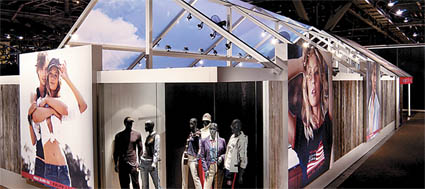
We're suckers for a stunning ceiling structure, and this is among our favorites. First discovered at the 2002 Magic Marketplace show, this exhibit designed by Freeman Co. for Polo Jeans Co. featured an open-framed roof, one half of which bore a beautiful blue-sky graphic. Not only did the surreal ceiling provide an illusion of airiness, the fabric graphic of a cloud-dotted sky lent this enclosed exhibit a great outdoors openness. TAKEAWAY: Don't forget about your overhead exhibit space. Without this faux sky, Polo's booth would have still been beautiful
but not nearly as memorable.


The Dawn of Digital
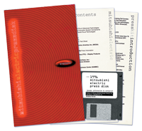
Today's press rooms are filled with pocket-sized USB drives, CDs, and small cards featuring Quick Response (QR) codes and URLs, but in the '90s, thick folders, binders, and product catalogs reigned supreme. "We were disturbed by watching how much of most press kits journalists tossed into the trash," said Colleen McKenna, Mitsubishi Electric Corp.'s director of media relations at the time. So she ditched the reams of hard-copy collateral in favor of an electronic press kit, circa 1996. Working with a company that specialized in software programming, she loaded 3.5-inch floppy disks with company info, and distributed the disks to journalists at the Comdex show in 1996. Citing cost effectiveness, adaptability, and functionality, McKenna felt the switch was an industry-appropriate solution. TAKEAWAY: McKenna surveyed targeted journalists and learned that most preferred computer disks instead of hard-copy materials. While floppy disks are now obsolete, her approach is anything but.


Trying is Believing
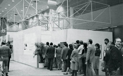
How do you exhibit a product that's expensive and exclusive? If you're Apple Inc., you make trying it out just as exclusive. That's the approach the company took at the Office Automation Conference 28 years ago. Apple built a 30-by-50-foot "classroom" where it conducted hands-on demos of its Mac computers. Attendees eager to try the new computers had to procure a ticket from Apple's main exhibit opposite the structure, then line up for the 45-minute demos. The ever-lengthening queue waiting to enter the all-white, cube-shaped building became its own traffic builder. TAKEAWAY: When your product is considered "up market," one way to increase interest in it is by putting barriers between it and customers. By restricting access to its demo station, Apple created a spectacle that made its product even more of a must-see.


King of the Road
Few exhibits do a better job of creating an experience
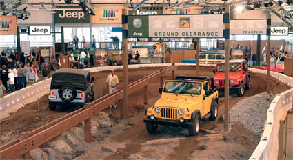
than the Chrysler Group LLC's booth at the 2004 New York Auto Show. Designed and fabricated by the George P. Johnson Co., the 51,300-square-foot booth actually comprised 250 truckloads of dirt, rocks, and logs. However, after a one-week installation, fabricators turned this giant dirt mound into a bona-fide trail-rated driving course inside the Jacob K. Javits Convention Center. Embodying the rough-and-tumble attitude of Jeep vehicles, the exhibit offered attendees the chance to test drive their very own Jeeps on the course. Meanwhile, gaming stations, a kids course, and a Jeep store kept all members of the family entertained. TAKEAWAY:
Authenticity rules. It would have been easier for Chrysler to simply plop some vehicles in its space, add a gaming station or two, and call it a day (or an exhibit). But by transforming its booth into a real driving course, Chrysler created an unforgettable and authentic attendee experience - and set a sky-high bar for product demos that exhibitors are still straining to reach.


The $866 Exhibit
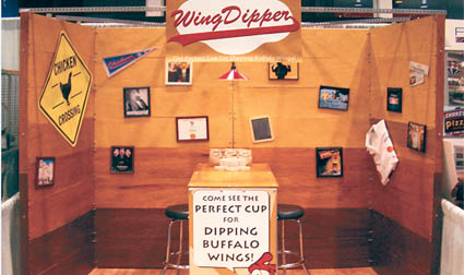
Think you don't have enough dough for an exhibit? Think again. Two DIY guys built their own 10-by-10-foot exhibit from the ground up for their newly launched company, WingDipper. To promote their new chicken-wing sauce cup to attendees at the 2006 National Restaurant Association Show in Chicago, these first-time exhibitors used little more than flooring and lighting from Ikea, stools from Sam's Club, graphics created by FedEx Kinko's, and hardware from The Home Depot to construct their $866 booth. TAKEAWAY: Sometimes, nontraditional exhibitry isn't just inexpensive; it can also be a way to differentiate your company on the trade show floor. But make sure you read and understand show-management rules and regulations regarding homemade booth structures before you go hog wild at The Home Depot.


Certified Organic
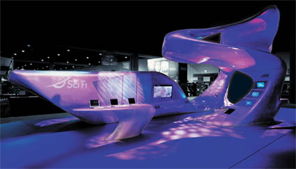
Undulating, unusual, and otherworldly are three words that come to mind when we think of this exhibit for NBC Universal Inc.'s Sci Fi Channel. Debuting at Comic-Con International in 2005, the Fiberglas structure's organic shape was made possible by a talented team of designers and fabricators from Tangram International Exhibitions Inc., Graft LLC, and Greneker. First, a 3-D model of the exhibit was generated using computer software. Using that model, a CNC mill produced a full-scale model of the exhibit made of high-density foam. Then, a dozen Fiberglas panels were molded from the foam. Once the 12 segments were bolted together, the exhibit took shape, featuring two towers, a bridge, a conference room, and a striking resemblance to the Starship Enterprise. TAKEAWAY: Organic architecture is a definite design trend, and this exhibit illustrates why. Boxy booths are boring compared to the sweeping curves and sinewy lines of this exhibit. And thanks to CNC tech and fabric architecture, it has never been easier to break the boxy mold.


Game Time
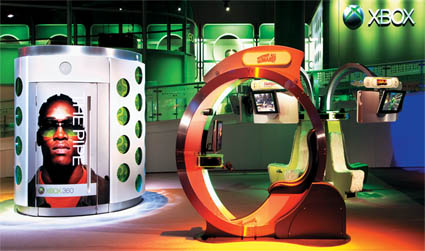
This Microsoft Corp. exhibit from the 2005 Electronic Entertainment Expo (E3) was named one of the three best booths from the past quarter century in our 25th annual Exhibit Design Awards competition. Our favorite element, in addition to the 250-foot-long second-story bridge with inlaid LEDs, is The Pipe, a cylindrical recording booth where attendees provided video testimonials about the company's Xbox gaming system. Almost immediately, each visitor's video was added to a never-ending loop and projected onto one of several screens throughout the space. TAKEAWAY: Futuristic design is a foolproof way to get mega mileage out of your next new build. Without feeling Space Age or gimmicky in the least, this innovative exhibit designed by Purepartner by Design and fabricated by Taylor Inc. was ahead of its time. Going on seven years old, this structure would still attract attention and feel cutting edge at E3 2012, and that's the mark of timeless trade show brilliance.


Bowling Ball Roller Coaster
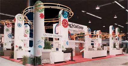
CalComp proved that computer-related exhibiting doesn't have to be boring when it unveiled a bowling-ball roller coaster booth that became a technology-show spectacle in 1990. The modular exhibit, which at its largest filled a 50-by-80-foot space, was designed and fabricated by The Exhibit Place and featured a 250-foot track that snaked overhead with rubber bowling balls kerchunking through it. Like a giant Tinker Toy, the "Imagination Machine" was outfitted with constantly turning pulleys and a lift station to keep the balls rolling, while salespeople below kept the ball rolling on leads thanks to the throngs that paused for a look. The design was a hit with CalComp's target audience - computer designers and engineers who placed a high priority on creative problem solving - and the exhibit is credited with a 15-percent rise in booth traffic during the time it was used. TAKEAWAY: Showing a playful side with a serious product can break the monotony of a conservative atmosphere and attract the attention an exhibitor needs to get its message across.


Beetle Mania
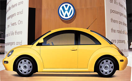
Winner of the 20/20 Award in our 20th Annual Exhibit Design Awards competition in 2006, this Volkswagen of America Inc. exhibit from the 1998 Miami Auto Show housed some of the most amazing product-centric elements we've come across in 30 years. Designed by Mauk Design and fabricated by Exhibit Works (now EWI Worldwide), the space included free-spinning 8-pound bowling balls coated in VW's various paint colors, a 10-by-30-foot mosaic of 80 automobile mirrors, and vases cleverly secured to walls via seatbelt straps. TAKEAWAY: To devise a truly product-centric space, consider ways to incorporate your products' individual elements into the more mundane exhibit accoutrements. A potted plant does little more than take up space, but VW's seatbelt vases elevated the exhibit's aesthetic and offered a subtle commentary on the brand's whimsy and style.

CEO Abuses
 Small Animals!
FireKing wins top honors for proving that effective promotions don't have to be expensive. Starting four weeks prior to the 1990 National Office Products Association show, FireKing dealers began receiving a series of mailings that accused the FireKing CEO of abusing turtles in the testing of a new fireproof file cabinet. Signed by "An animal loving friend," the cards had mock newspaper clippings with photos of picketers outside the head office and of the CEO being arrested. The final card contained a newspaper clipping saying that the CEO had been released, and it had all been a misunderstanding over the new product (called the Turtle) and no turtles were actually involved. The silly campaign, punctuated at the show with turtle-related displays and giveaways, netted 500 leads with a $20,000 investment. TAKEAWAY: A little creativity goes a long way toward turning a small budget into a buzz-building campaign. Small Animals!
FireKing wins top honors for proving that effective promotions don't have to be expensive. Starting four weeks prior to the 1990 National Office Products Association show, FireKing dealers began receiving a series of mailings that accused the FireKing CEO of abusing turtles in the testing of a new fireproof file cabinet. Signed by "An animal loving friend," the cards had mock newspaper clippings with photos of picketers outside the head office and of the CEO being arrested. The final card contained a newspaper clipping saying that the CEO had been released, and it had all been a misunderstanding over the new product (called the Turtle) and no turtles were actually involved. The silly campaign, punctuated at the show with turtle-related displays and giveaways, netted 500 leads with a $20,000 investment. TAKEAWAY: A little creativity goes a long way toward turning a small budget into a buzz-building campaign.


Blue Mood
DirecTV's exhibit for the 2005 International Consumer Electronics Show illustrates the efficacy of illumination like no other. Designed and fabricated by CenterPoint Marketing Inc. and Jeff Hall Design Inc., the white booth was bathed in DirecTV's corporate blue hues, turning it from stark and sterile to vibrant and evocative. TAKEAWAY: Lighting can help you spotlight products, create ambiance, and, thanks to today's advancements in illumination, do it without overheating your booth
or busting your budget.


The Reflect Effect
Few exhibits over the years have wowed us quite
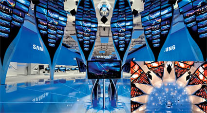
like the game-changing, budget-busting booth for Samsung Electronics Co. Ltd. at the Internationale Funk-Ausstellung 2009 trade show. Designed by Schmidhuber + Partner GbR of Munich, Germany, the $7.25 million, 321-by-128-foot booth offered a sensorial experience and optical illusion unlike anything we've ever seen before. The pulsing heart of the exhibit was a half circle of eight electronic "leaves," i.e., vertical columns that each comprised 18 LED TVs of various sizes. A mirror-covered wall and ceiling was paired with a glass floor through which lights and colors were projected. Combined, the leaves and mirrors created a 360-degree spatial experience within the semicircular room. Outside of this space, clean lines and minimal graphics created a calm product-focused oasis - and a sharp contrast to the rest of the frenetic trade show floor. TAKEAWAY: Sometimes it's OK to go a little over the top. For Samsung, the unforgettable impact of this iconic structure married its brand with adjectives such as "innovative" and "cutting edge" - and elevated the Samsung name above everything else on the show floor.

Calming Cocoon
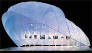
 This cocoon-like structure for American Express Co., designed by Moss Inc., debuted in 2004 and features transparent white scrim stretched across an aluminum frame and lit by a soft wash of blue and purple lighting. Enclosed yet airy, substantial yet ethereal, this fabric structure is an eye-catching contradiction of sorts. TAKEAWAY: When it comes to fabric exhibitry, the possibilities are endless. Whether you choose semitransparent or opaque, opt to hide or expose the skeletal structure, print graphics on it, or leave it clean, fabric can bring your wildest design dreams to fruition. This cocoon-like structure for American Express Co., designed by Moss Inc., debuted in 2004 and features transparent white scrim stretched across an aluminum frame and lit by a soft wash of blue and purple lighting. Enclosed yet airy, substantial yet ethereal, this fabric structure is an eye-catching contradiction of sorts. TAKEAWAY: When it comes to fabric exhibitry, the possibilities are endless. Whether you choose semitransparent or opaque, opt to hide or expose the skeletal structure, print graphics on it, or leave it clean, fabric can bring your wildest design dreams to fruition.

False Alarm
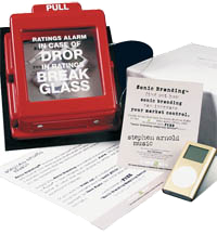
 Sent by Stephen Arnold Music to drive traffic to its booth at the 2004 Radio-Television News Directors Association show, this mailer achieved an impressive 95-percent response rate. The box contained a 7-pound fire alarm and a one-page insert explaining the importance of a strong "sonic brand" (aka musical signature) to news directors hoping to boost ratings. Inscribed on the glass panel of the 4-by-8-inch alarm was the message "Ratings Alarm - In case of drop in ratings, break glass." Recipients opened the alarm with a small lever and found a fake foam iPod and a pair of actual Apple headphones along with a card that instructed them to visit the company's booth for their free "sonic-branding sampling device" (an iPod loaded with samples of Stephen Arnold music). TAKEAWAY: Dimensional mailers are more intriguing than flat-and-forgettable envelopes. Think of your intended recipients as kids on Christmas morning. What do you think they'd rather open: a greeting card, or a mysterious package with their name on it? Sent by Stephen Arnold Music to drive traffic to its booth at the 2004 Radio-Television News Directors Association show, this mailer achieved an impressive 95-percent response rate. The box contained a 7-pound fire alarm and a one-page insert explaining the importance of a strong "sonic brand" (aka musical signature) to news directors hoping to boost ratings. Inscribed on the glass panel of the 4-by-8-inch alarm was the message "Ratings Alarm - In case of drop in ratings, break glass." Recipients opened the alarm with a small lever and found a fake foam iPod and a pair of actual Apple headphones along with a card that instructed them to visit the company's booth for their free "sonic-branding sampling device" (an iPod loaded with samples of Stephen Arnold music). TAKEAWAY: Dimensional mailers are more intriguing than flat-and-forgettable envelopes. Think of your intended recipients as kids on Christmas morning. What do you think they'd rather open: a greeting card, or a mysterious package with their name on it?


Chalk Talk
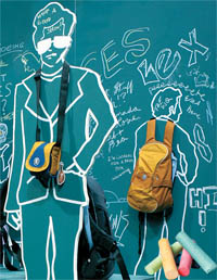
What do you get when you combine $30,000, 42 steel oil drums, and plywood walls painted with chalkboard paint? If you're Crumpler, a Melbourne, Australia-based company that creates bags for computers, cameras, and other electronic devices, those three ingredients will net you about $1.2 million in contracts. To keep costs down, Crumpler's co-founder, David Roper, hired an architecture student to design an unconventional booth for the 2005 International Consumer Electronics Show. The resulting low-tech, low-budget booth attracted hundreds of attendees who tagged its 9-foot-tall walls with chalky graffiti in different languages. TAKEAWAY: Unconventional and interactive, this booth practically begged passersby to venture inside. Sure, fully enclosed exhibits sometimes send a "keep out" vibe, but one built from oil drums and chalkboard walls says "come in and play." So before you settle for same-old structures and materials, consider other options. Design students often have some of the most cutting-edge ideas. Crumpler paid its student designer, Michael Macleod, just $500 for this unforgettable avant-garde exhibit design. |

The One-Word Exhibit
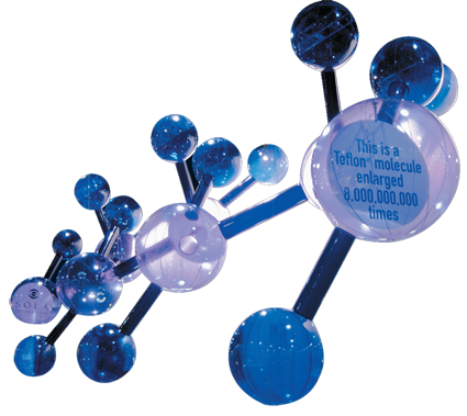
How do you make a single molecule arresting and exciting? Sola Optical USA did it by supersizing that molecule to 8 billion times its actual size and hanging it from truss inside a 20-by-60-foot booth. The 28-foot-tall, translucent-vinyl inflatable structure was unlike anything else at the 2002 Vision Expo West show. TAKEAWAY: Scale is a powerful thing, and sometimes simply enlarging an item can take it from run-of-the-mill to mind-blowingly memorable. And speaking of blowing, never underestimate the allure of inflatables: They're inexpensive to ship, easy to assemble, and eye catching when they're well executed.


Torture Test
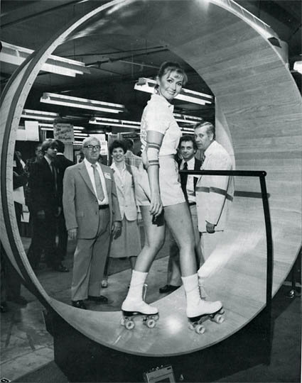
When Pierce & Stevens Chemical Co. needed to sell attendees at the National Hardware Show on Aqua Fabulon, its wood-floor finish, it opted for an off-the-wall in-booth demo. Chicago-based exhibit firm Kitzing Inc. built a 7-foot-tall hamster-wheel-like wooden roller rink out of oak coated in Aqua Fabulon. While a motor spun the wheel around, models wearing roller skates glided for eight hours a day, yet left no marks on the wood. The unusual demo helped Pierce & Stevens Chemical generate 10 percent more "A-rated" leads than expected. TAKEAWAY: Often the best way to sell a product at a trade show is to demonstrate its prowess. Moreover, using a highly visual test that requires little technical knowledge makes the product demonstration easier to understand and therefore to believe.


Plastic Ware
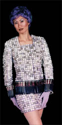
"Project Runway" contestants weren't the pioneers of plastic fashion. No, that honor goes to Impact Unlimited for a live presentation it created on behalf of BASF Corp. To increase brand awareness in the United States, the European plastic-additives manufacturer hosted its very own in-booth runway show during the 1997 National Plastics Expo. Models decked out in "clothes" comprising everything from keyboard keys and car manifolds to fishing poles and pens sashayed down the catwalk. Not only was the show a fashion feat of epic proportions, but it also increased booth traffic by 40 percent and resulted in 1,100 leads. TAKEAWAY: Faced with poor name recognition and a bad location
in the back of the exhibit hall, BASF decided it needed to do something crazy to create buzz on the show floor. But don't go crazy for crazy's sake - follow BASF's lead and have a strategy to back up the insanity.

 Peep Show Peep Show
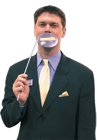
After learning from show management that attendees felt exhibitors were too aggressive and not interested in listening to their needs, Derse Inc. decided to shut up. Adopting the tagline "Not a peep," and reinforcing it with marshmallow Peep-themed graphics and pre-show mailers, Derse approached attendees at EXHIBITOR2005 without uttering a word. Instead, they held masks over their mouths. On one side, each mask carried graphics that looked like a piece of tape had been placed over the staffer's mouth. On the other, the mask read, "Ask me your pressing question." As it turns out, letting attendees initiate conversations actually increased in-booth interactions by 72 percent on the show's first day. It just goes to show, sometimes silence really is golden. TAKEAWAY: Seek out any data show management is able to provide regarding feedback about the show floor. At the very least, you can stop doing whatever it is that upsets attendees the most.


Tribute to the Obsolete
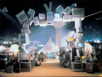
At a show like the Electronic Entertainment Expo (E3), bright lights, shiny new products, and cutting-edge gadgets take center stage. If you want to stand out, however, you either have to be louder than your neighbor, or you have to go in the opposite direction, which is exactly what Virgin Interactive did for the 1996 expo in Los Angeles. Instead of filling its exhibit with product-demo areas and cheery graphics promoting all things new and shiny, Virgin filled its dramatically lit exhibit (dubbed the "digital junkyard") with antiquated electronics, from old television screens and outdated computer monitors to typewriters. TAKEAWAY: It's tempting to try to overpower your fellow exhibitors by being louder, crazier, and bolder. But by choosing a more low-key, conceptual aesthetic and zigging where others zagged, Virgin Interactive provided a much-needed oasis for attendees.

 Deep-Rooted Design Deep-Rooted Design
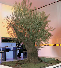
According to designer
Nico Ueberholz of Ueberholz GmbH, "If you want to create an experience people remember, you must create an atmosphere that arouses an emotion." He aroused just such an emotion at EuroShop 2005 with a 20-by-23-foot booth featuring a 250-year-old olive tree that juxtaposed the more modern elements like a 20-foot-tall color-shifting light wall that displayed different "atmospheric" images such as thunder storm, midday sun, or sunset. TAKEAWAY: If emotion-arousing atmosphere is the key to effective exhibit design, the question becomes "How does one create such an atmosphere on a trade show floor?" In Ueberholz's words, atmosphere includes "feelings, harmony, scents, music, history, sea, sand, sunrise, and sunset." While those elements may seem somewhat abstract, it's a starting point for thinking about not just how your exhibit looks, but also how it makes attendees feel.


Zen and the Art of the Anti-Booth
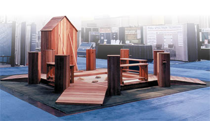
Contrary to popular belief, the "un-booth" is not a new concept. In fact, one of the most memorable un-booths we've seen debuted at the 2000 Medical Design and Manufacturing West exposition. Conceived by Fuse Integrated Marketing Inc. and fabricated by Exhibits By Design Through Imagination (EDI), the 20-by-20-foot booth - meant to provoke discussions on United Plastics Group Inc.'s "stress-free" molding technology - took the form of a tranquil Zen garden. While some attendees sat on wooden benches surrounding the perimeter, others were approached by a woman wearing an ornate, Asian dress. "Do you know about Zen?" she asked,
and quietly urged, "Come. Let us rake." TAKEAWAY:
Doing something unexpected is a surefire way to attract attention. The Zen garden stood out because it was unique. In fact, according to UPG's then vice president of engineering and technology, "People just couldn't help but stop and ask, 'What's this all about?' So rather than our staff seeking them out, attendees were seeking us out."


Pyramid Power
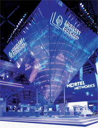
Believe it or not, there's a better way to attract show-floor attention than to take a floor-to-ceiling inverted pyramid-encased cone and plop it in the middle of your exhibit: Add neon lights to it. That's what Hewlett-Packard Development Co. did in its exhibit for the Telecom show in 1999. Designed by Firbank Kempster Integrated Communications Partnership Ltd., the enormous eye-catching "pirocone" served as the booth's focal point, luring passing attendees into the space and eventually guiding them down to a 52-seat auditorium. Featuring the HP logo, the pirocone was decorated with a handful of the computer company's key messages lit up in neon pink and blue hues, including "Ideas Accelerator," "E-services," and "Next Generation Networks." Like something straight out of Willy Wonka's Chocolate Factory, the odd structure not only dominated sight lines, but it also stopped curious attendees in their tracks. TAKEAWAY: Don't be afraid to use all of your exhibit real estate. By filling the center of its space with a large focal point and building up, HP literally funneled attendees in from the aisles and into its meeting rooms and auditorium.

 Have Fun! Have Fun!
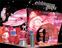
For EXHIBITOR2004, Exhibitgroup/Giltspur (which has since been acquired by Global Experience Specialists Inc.) abandoned one-on-one conversations in favor of more widespread impressions. "We wanted to show people how engaging and memorable exhibits can be," said then director of marketing strategy Murphy MacDonald. So using humor as its primary means of communication, the exhibit featured an activity in which staffers helped attendees navigate remote-controlled dirigibles through a series of hoops, and a 9-foot-tall slide down which attendees exited the exhibit. TAKEAWAY: Nobody wants to be the boring booth on the trade show floor. And while an all-out fun house might be over the top for some exhibiting companies, a little exuberance is a great way to breathe some life into your booth and attract attendees like adolescents to an amusement park.

A Walk to Remember
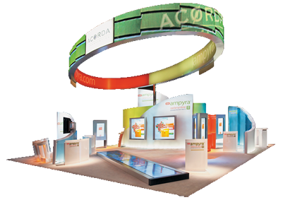
 Despite their attempts to empathize, doctors rarely walk a mile in their
patients' shoes. At the 2010 American Academy of Neurology show, how-
ever, Acorda Therapeutics Inc. not only educated patients about its
new drug, Ampyra (which improves walking speeds in patients
with multiple sclerosis), but it developed a traffic builder that
allowed attending medical professionals to walk 25 feet at
the same speed of typical MS sufferers. Along with various
educational games and activities, Acorda's 40-by-40-foot
exhibit (fabricated by Boston-based Access TCA Inc.) featured
a 25-foot-long runway-like monitor positioned horizontally
atop the exhibit floor. Attendees took turns walking on a set
of sequential video footprints that lit up on the runway at
different speeds designed to mirror average changes in
walking speed associated with mild, moderate, and severe
MS. TAKEAWAY: Sometimes, the most effective
in-exhibit education involves very little talking
and a whole lot of doing. By walking down
a 25-foot monitor at varying speeds,
physicians immediately understood their
patients' frustrations, which no doubt prompted them to learn
more about Acorda's new pharmaceutical solution. Despite their attempts to empathize, doctors rarely walk a mile in their
patients' shoes. At the 2010 American Academy of Neurology show, how-
ever, Acorda Therapeutics Inc. not only educated patients about its
new drug, Ampyra (which improves walking speeds in patients
with multiple sclerosis), but it developed a traffic builder that
allowed attending medical professionals to walk 25 feet at
the same speed of typical MS sufferers. Along with various
educational games and activities, Acorda's 40-by-40-foot
exhibit (fabricated by Boston-based Access TCA Inc.) featured
a 25-foot-long runway-like monitor positioned horizontally
atop the exhibit floor. Attendees took turns walking on a set
of sequential video footprints that lit up on the runway at
different speeds designed to mirror average changes in
walking speed associated with mild, moderate, and severe
MS. TAKEAWAY: Sometimes, the most effective
in-exhibit education involves very little talking
and a whole lot of doing. By walking down
a 25-foot monitor at varying speeds,
physicians immediately understood their
patients' frustrations, which no doubt prompted them to learn
more about Acorda's new pharmaceutical solution.

MG Design Gets Fresh
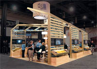
 MG Design Associates Inc.'s 20-by-30-foot island exhibit at EXHIBITOR2010 played up its eco-friendly offerings and demonstrated its marketing-related technology. Rather than building a gimmicky exhibit filled with recycling symbols and bamboo, the company used fresh produce, natural wood, cork flooring, live wheat grass, and jute twine. TAKEAWAY: By pairing effective design with a brand-appropriate theme, this exhibit goes Green without going completely off the grid. MG Design Associates Inc.'s 20-by-30-foot island exhibit at EXHIBITOR2010 played up its eco-friendly offerings and demonstrated its marketing-related technology. Rather than building a gimmicky exhibit filled with recycling symbols and bamboo, the company used fresh produce, natural wood, cork flooring, live wheat grass, and jute twine. TAKEAWAY: By pairing effective design with a brand-appropriate theme, this exhibit goes Green without going completely off the grid.


Fresh Squeezed
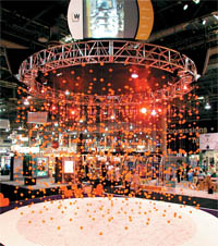
Often, standing out on the trade show floor is as simple as finding a fresh way to appeal to attendees. Kansas City, MO-based Winntech did both at GlobalShop 2004 with an exhibit whose focal point was a chandelier-like structure comprising 1,174 oranges hanging from a 20-foot truss. The innovative, aromatic, 30-by-40-foot booth cost a mere $35 per square foot. After the show, Winntech sent targeted prospects a 4.5-inch-square box containing a fresh orange and an accordion-fold card with pictures of the design firm's past projects. Winntech won both a Gold Exhibit Design Award and a 2005 Sizzle Award for the undeniably appealing strategy. TAKEAWAY: Think outside the box, then put an orange in one and send it to your clients. Doing something different is a definite step toward attracting attention and burning your brand into attendees' memories. And linking your post-show communications to your at-show marketing efforts is a great way to make sure recipients recall who you are and what you did at the show.


Molding Metaphors
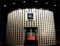
Product displays can get dicey when your company is a service provider. But Duncan Aviation, a provider of airplane-maintenance services, conjured a conceptual solution to that conundrum at the 1996 National Business Aviation Association show. To emphasize Duncan's quality employees and effective time management, the booth featured 668 employee headshots mounted on a tower with the words "The Talent of Duncan Aviation" printed in gold letters, while 60 12-inch-round clocks were hung on a curved, fuselage-like glass wall. TAKEAWAY: If you lack a product to demo or display, consider how you can communicate your services and brand attributes in more creative, conceptual ways.


Movie Magic
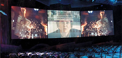
Delivering consistent key messages can be difficult. But working with Chicago-based marketing agency, Live Marketing, Intel Corp. managed the task at the 1994 Comdex show by creating a film that showed "slices of life" detailing how technology was changing the way people lived. One segment, for example, featured doctors on opposite corners of the country sharing patient medical charts electronically. Running five times an hour, the film reached 75,000 attendees. TAKEAWAY: If one picture is worth a thousand words, then Intel's miniature motion picture was worth a few million. Plus, each attendee who experienced the film left with a similar impression because they had been exposed to identical content presented in a consistent manner.


An Egg-celent Exhibit
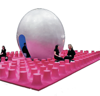
Designed by Karim Rashid, the famed New York-based industrial designer, this exhibit for Fort Mill, SC-based Muzak LLC debuted at GlobalShop in 2003. The 30-by-40-foot space was dotted with a grillwork of pink plastic stools. An 18-foot-tall pearl-gray Sensorium, or as Rashid called it, "the womb," was positioned in the center of the space. Inside the Sensorium, attendees sat atop a bench and leaned back against foam-padded walls while a hostess explained that they were about to experience "a movie for your ear." Then, LED lights bathed the womb in a sequence of ever-changing hues while a built-in sound system roared and purred with an eight-minute loop of blues, rock, jazz, and history. TAKEAWAY: Muzak made its mostly unremarkable elevator music memorable by creating an experience for attendees that illustrated the power of sound and the emotional reactions sound can create. The exhibit might look like Mork and Mindy's psychedelic landing pad, but it enveloped attendees in the exhibiting company's key messages and turned those memories into ever-lasting brand impressions. And that was music to Muzak's ears.
|


