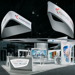
 xhibit design, like any other design discipline, is about creating something that serves a purpose, evokes a reaction, and satisfies the needs of not only the client,
but also the attendee. Those
objectives carry the weight of additional conditions, mostly because there is no one-size-fits-all approach. What works xhibit design, like any other design discipline, is about creating something that serves a purpose, evokes a reaction, and satisfies the needs of not only the client,
but also the attendee. Those
objectives carry the weight of additional conditions, mostly because there is no one-size-fits-all approach. What works
for a health-care company's 50-by-100-foot booth and $1 million budget won't necessarily translate to the needs of a drill-bit manufacturer's 10-by-10 and $2,000 coffers.
Though the specific needs of exhibitors are as varied as the brush strokes in a Van Gogh painting, there are several overarching principles that guide designers on the path to creating a successful exhibit, from behavioral sciences to color theory. In addition to these principles, the 12 designers we talked to honed in on a handful of things that guide the way they approach exhibit design, including new technologies, alternative construction materials, attendee experiences, and brand identities.
So if you've ever wanted to peer inside the minds of designers and find out what, in their opinion, are the hallmarks of divine exhibit design, read on for the traits they say turn an oh-so-average booth into a marketing masterpiece.
Seeing Green
In the years just before the Great Recession, Green design seemed to top many exhibitors' wish lists, and sourcing sustainable materials became a priority. In fact, if it wasn't recyclable, recycled, reusable, or sustainable, exhibitors balked. With the recession, however, came talk of another green material: Benjamins. As the economy struggles to reach financial viability, it seems Green is still making its mark - with one caveat.
"Building materials made from recycled products tend to be more costly than standard building materials, and exhibitors don't always want to pay that premium," says Rob Majerowski, vice president of creative at MG Design Associates Corp. "But you don't have to buy a product labeled 'Green' in order to be Greener. For example, renting is Green because it cuts down on production waste. And fabric can be Green because it can reduce shipping volume, which in turn reduces fuel consumption."
Furthermore, as we move into 2012, Green is becoming less about physical products and materials, and more about processes. "Since sustainability also means reduce, reuse, recycle, and rethink, reusing structures and any materials you already have is always a good place to start," says
Eli B'sheart, vice president of creative and innovations at EWI Worldwide, a live communications company with headquarters in Livonia, MI.
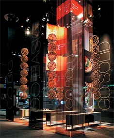
While a material's "Greenness" remains a hot topic for designers and clients alike, two new attributes are making waves: flexibility and durability. "There is a trend to create lighter and more modular architecture," B'sheart says. "Decreasing drayage and increasing flexibility are important objectives for exhibitors." And there's nothing more flexible than fabric. "We have been using fabric as our primary material for more than a decade," says Deanna Kuhlmann-Leavitt, principal and lead designer of Kuhlmann Leavitt Inc., a design firm based in St. Louis. "It's sustainable, lightweight, and versatile. As people start catching on to its potential, you will see fabric used in more innovative ways for a variety of purposes."
In addition to fabric, designers are exploring more
"honest" construction materials (such as wood) to replace "hidden" construction materials (such as laminate applied to a wooden backing). "Every time we permanently adhere
a decorative material to a construction material, we weaken the recycling and reuse chain," says Mark Pearlman, design director at Group Delphi, a design firm based in Alameda, CA. "Designing with the construction material as the decorative material often reduces labor costs and increases the potential for recycling, reuse, and sustainability. Prime examples include aluminum-extrusion systems, paper products, bamboo, glass, and recyclable plastics."
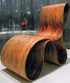
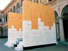
Steve Cook, senior designer at Pinnacle Exhibits in Hillsboro, OR, calls these types of products "low-grade" construction materials, and he noticed them in abundance at the 2011 Milan Furniture Fair. "I saw many exhibits using low-grade construction materials with amazing effect. Not only do these materials look great, they can also be less expensive since you're basically using the product as is."
Plastics in general, and copolymers in particular, are also surprisingly eco-friendly and increasing in popularity,
according to Jerry Firbank, chief creative officer at Pico Concept Ltd. in London. "Of all the alternatives to wood-based, custom-built exhibits, there is one avenue that has been generally overlooked or misunderstood: molded copolymers. Copolymers such as acrylonitrile butadiene styrene (ABS) plastic are molded into a shape and are available in a variety of thicknesses, colors, surface finishes, and textures," he says. "They're also available in compliance with the varying fire-retardant regulations the world over. And the cost of the product is comparable with traditional laminated board." What's more, copolymers are more durable than laminates, and require little maintenance compared to wood-based structures.
Signs of the Times
Sustainability is influencing another exhibit-design component: graphics. "The increase in petroleum costs is starting to have an impact on many standard graphic supplies that are created from petroleum by-products," Pearlman says. "For 2012, I see a shift to more sustainable graphics solutions, such as printing on recyclable or recycled materials." However, Pearlman notes that these so-called sustainable graphics solutions might not offer the same print quality as their not-so-Green counterparts. "In some cases, there is a small loss in saturation and vibrancy, but for a three-day show, I think the change in visual impact is negligible."
In addition to using recyclable materials on which to print graphics, exhibit designers are also turning to digital technologies as a communication medium. "There is a shift from static graphics to dynamic graphics, and that changes how the architecture of the booth supports the story," Pearlman says. So instead of, say, a vinyl sign or banner stand, exhibitors are using flatscreen monitors and video, signage comprising light-emitting diodes (LEDs), and even 3-D technology. The result is a more engaging means of communication, and, ultimately, a dramatic change in what constitutes an exhibit. "LED screens are becoming both content provider and architectural statement," says Jeff Bartle, chief creative officer of 3D Exhibits Inc., based in Chicago. "We can use these screens, which come in all shapes and sizes and can be mounted in a variety of ways, to deliver a more unique exhibit environment."
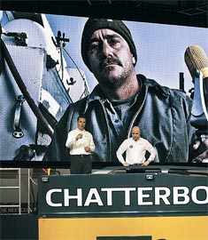
Take the Deere & Co. exhibit at the 2011 ConExpo-Con/Agg show in Las Vegas, for example. "This is one of my favorite exhibits from the last year," says Saul Stokes, senior designer at the San Francisco office of exhibit house MC². "The company created this thing called the 'Chatterbox,' which was basically a mobile recording studio, and set it in the middle of its exhibit space. Staffers invited attendees to step inside and share their feedback about John Deere equipment and services. Instead of a typical hanging sign a huge 12-by-33-foot LED display floated above the Chatter-box, and displayed graphics and customer testimonials. It looked like nothing else on the show floor and attendees were mesmerized."
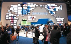
Awe-inspiring, large-scale digital signage was also seen in full effect at the International Consumer Electronics Show. The exhibit for Samsung Electronics Co. Ltd., for example, boasted an oversized world map comprised of nearly 100 flatscreen televisions of varying sizes. The screens were synched and displayed a video loop that featured the company's marketing messages and not-so-subtly branded Samsung as a world leader.
But the benefits of using digital signage go beyond simply wowing the crowd. Not only is such signage more dynamic than its predecessor, but you can also customize your messaging for each individual show without having to reprint or repair your booth graphics. Exhibitors can also use flatscreen monitors as touchscreen interfaces, gaming stations, lead-capture kiosks, and more, all of which facilitate interaction, ultimately leading to a more memorable experience than simply reading a vinyl sign.
Technically Speaking
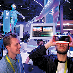
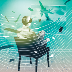
"We have to accept that our society is becoming desensitized to the many forms of corporate marketing, including conventional exhibitions and even exhibits," Firbank says. "Attendees are bored with the same old, same old, and there is now an immensely accelerating technical capability to show them things that they haven't seen before. As a result, I think the use of new technologies, such as augmented reality, will become even more prevalent in the coming year."
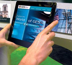
Finding ways to incorporate that technology into the exhibit experience is a challenge faced by nearly every designer, many of whom project a drastic change in the fundamentals of exhibit design. "Interactive media and its supporting hardware are changing the way exhibits work," says Errol Ahearn, executive creative director for Las Vegas-headquartered Global Experience Specialists (GES) Inc. "For example, tablets have unchained reps from their counters and desks, allowing them to freely cover an exhibit space with confidence. The possibilities for tablets are limitless - we've built them into educational lounges and even used them as customized digital guides for larger exhibits."
Beyond changing the way in which companies exhibit, technology is also changing the way in which attendees interact with information and their environment. "Rapidly growing innovation through technological development presents us with seemingly endless opportunities," says Nico Ueberholz, principal of Wuppertal, Germany-based temporary-architecture firm, Ueberholz GmbH. "Each visitor or viewer is now becoming a part of the presentation, empowered to actively direct or change it. The visitor is no longer merely a spectator, but a participant. That creates emotional experiences that leave impactful, long-lasting memories in people's minds."
B'sheart agrees, adding, "User interfaces are getting
better and easier to use, and information is coming to
attendees with little or no effort. As a result, we are seeing the merging of RFID and QR codes into spaces to further enhance and personalize the attendee experience."
Spark a Conversation
It's not enough to have a sexy exhibit space if you can't back it up with some meat, because today's attendees are looking for substance, according to B'sheart. "An exhibit design should set the stage for conversation in order to create an authentic experience," she says. "Exhibits need to have an inviting, comfortable space staffed by knowledgeable people in order to facilitate a dialogue about the attendees' needs and reasons for attending the show. This gives the exhibitor the opportunity to think about a solutions-based strategy that focuses on the attendee's needs, rather than focusing on the services the exhibitor has to sell."
That seems like common sense, but it's not unusual for exhibitors to first focus on incorporating key messages into in-booth dialogue, plastering logos on as many exhibit surfaces as possible, and bedecking back walls with every type of product in their companies' arsenals. All of those elements are driven solely by what products and services the exhibitor is selling, and are not necessarily about learning what attendees need. It's the difference between shopping at Walmart and shopping at a high-end department store with a personal shopper to assist you. At Walmart, everything is at your fingertips - but rarely do you need everything. A personal shopper, on the other hand, will ask you what you're looking for, a conversation will ensue, and you'll be presented with items that meet your needs.
The latter is a much more intimate, personalized experience, which is where exhibit design is heading. "For years, exhibit design was kind of viewed as perfunctory," says Gino Pellegrini, president and exhibit designer at InterGlobal Exhibits in Englewood, CO. "Pick an exhibit size, add a meeting room or two, drop in a reception desk and lounge area, and then add the company colors and logo. Voila! An exhibit has been designed. Today, however, you need to consider the brand message, the promise behind it, what your customers want, and then use your exhibit to communicate with them, not at them."
There are several ways to find out what clients and prospect want, from surveys sent via e-mail to face-to-face discussions during sales calls. But, Bartle explains, you can also use your exhibit. "Think about how your company perceives itself versus how attendees perceive you," he says. "We have a client, Dell, that thinks of itself as a 'lifestyle betterment provider,' with the tagline, 'The power to do more.' Well, we found that most of its customers think of Dell as a service and/or data-storage-box provider. That's a commodity-based market position in which it's difficult to compete. So we decided to use its exhibit at the 2011 SAP Sapphire event to change that perception."
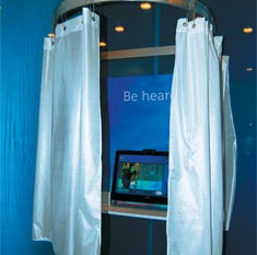
To marry attendees' perception with the company's own, Dell introduced a new tagline for the exhibit program, "Be Heard." 3D Exhibits then replaced product images with lifestyle images, eliminated almost all of the product displays, and added more communal discussion areas so staffers could have one-on-one conversations with attendees, identify their needs, and offer specific solutions. The exhibit also featured video booths where attendees could voice their opinions and perceptions of the company. "The final result was an exhibit designed to discover what attendees wanted," Bartle says. "And Dell can use the information it gathered in the booth to guide future marketing campaigns."
A Light Touch
Every element of exhibit design must serve a real, tangible purpose in order to be relevant, and lighting is no exception, according to Tom Yurkin, experience designer at Freeman, a Dallas-based exhibit-services company. In its most basic form, lighting illuminates objects. However, exhibit designers the world over are using lighting as a means to evoke emotion, guide the attendee experience, and establish a hierarchy of information within booth spaces. "Instead of illuminating an entire exhibit or individual objects in a static way as was done in the past, we now enable light, almost unnoticeably, to pulsate, to live," Ueberholz says.
Selecting the correct lighting for an exhibit is much more complex than putting a gobo here and adding a spotlight there. "Lighting done well makes a space come to life," B'sheart says. "We can create drama and emotion simply by adjusting the color and intensity of light. Keep in mind that balance is important - if there's too much lighting in an exhibit, it will detract from the product on display and make the space seem unapproachable. On the other hand, if there's not enough lighting, the space will be dark and uninviting, and, ultimately, overlooked."
From new lighting techniques and sustainable processes to experiential elements, booth design is an ever-changing discipline that can be difficult to pin down. Considering the variables, designing and executing a successful exhibit that meets your needs is not an easy task. Fortunately, there's an entire industry of exhibit designers ready, willing, and able to take on that challenge. E
|

Designers are continually finding new uses for fabric, which is beginning to all but replace conventional construction materials such as laminates, wood, and substrates. In this exhibit for Formica Corp., Deanna Kuhlmann-Leavitt, of Kuhlmann Leavitt Inc., used fabric panels in place of hard-surface walls.


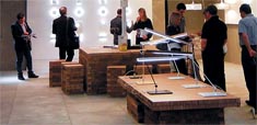
The use of low-grade construction materials, such as the cardboard, untreated and/or salvaged wood, and found objects pictured in these exhibit photos from the 2011 Milan Furniture Fair, is increasing in popularity.
The materials are readily available, recyclable, and generally less expensive - and less hazardous to the environment - than using decorative veneers.


As iPads and other tablet PCs become more readily available, exhibit designers are finding different ways of incorporating them into booths, such as tethering them to display stands or housing them within countertops. Here, built-in tablets took the place of conventional hard-copy portfolios and catalogs.


Flatscreen monitors and LED screens - including the ones featured in these exhibits for Samsung Electronics Co. Ltd. at the 2011 International Consumer Electronics Show and for Deere & Co. at ConExpo-Con/Agg - are replacing static means of displaying graphics, such as on banner stands or vinyl signs.


3D Exhibits Inc. used Dell's exhibit at SAP Sapphire to change attendee perception of the computer company's brand from a data-storage provider to a lifestyle enhancer. Reinforcing the company's new "Be Heard"
marketing campaign, the exhibit was light on product imagery and displays, instead featuring intimate conversation areas and video-testimonial booths.
|


 xhibit design, like any other design discipline, is about creating something that serves a purpose, evokes a reaction, and satisfies the needs of not only the client,
but also the attendee. Those
objectives carry the weight of additional conditions, mostly because there is no one-size-fits-all approach. What works