expo awards |

|
 For nearly 25 years, EXHIBITOR has brought you the world's most prestigious exhibit-design competition, honoring the crème de la crème of trade show exhibits. Expanding on the success of that program, EXHIBITOR launched its Expo 2010 Awards competition five months ago. The purpose of the competition was to honor the most impressive work from the 2010 World's Expo in Shanghai, China, and to spotlight some of the incredible pavilions there, all brimming with inspiration for exhibit and event professionals. For nearly 25 years, EXHIBITOR has brought you the world's most prestigious exhibit-design competition, honoring the crème de la crème of trade show exhibits. Expanding on the success of that program, EXHIBITOR launched its Expo 2010 Awards competition five months ago. The purpose of the competition was to honor the most impressive work from the 2010 World's Expo in Shanghai, China, and to spotlight some of the incredible pavilions there, all brimming with inspiration for exhibit and event professionals.
The competition netted entries from dozens of country and theme pavilions, ranging from Austria and Spain to Russia and Belarus. Reflecting the Expo's theme of "Better City, Better Life," many of the pavilions focused on the future of urban development, sustainable architecture, and the dangers of neglecting the environment. While a star-studded panel of multidisciplinary design, marketing, and communications experts judged seven categories, the People's Choice Award winner was determined by popular vote on EXHIBITOR's Expo 2010 microsite, and the editor of EXHIBITOR magazine determined the winner of our Editor's Choice Award.
Featured on the following pages, the Expo 2010 Award winners represent some of the most amazing examples of how design, technology, presentation, and storytelling come together to effectively communicate compelling messages. Those examples will hopefully inform and inspire today's exhibit and event professionals - along with the next generation of face-to-face marketers. Because whether you're creating an immense international pavilion or a small 10-by-10-foot exhibit, it's often about making an impression, and the work on display in Shanghai does that in truly monumental and memorable ways.
So join us in congratulating EXHIBITOR Magazine's Expo 2010 Award winners. After all, according to our judges, our readers, and, well, ourselves, they are among the best the world (well, the World's Expo, at least) has to offer.
|
 |
Winner: Germany Pavilion
Theme: "Balancity: A City in Balance"
Design: Schmidhuber + Partner GbR/Milla & Partner GmbH
Fabrication: Nussli (Deutschland) GmbH, EWI Worldwide
Client: German Federal Ministry of Economics and Technology, Organisation and Operation: Koelnmesse International GmbH
Size: 64,584 square feet |
 |

Called "Balancity" (a combination of the words "balance" and "city"), Germany's pavilion represents its designers' belief that successful cities of the future will be abstract works of art balancing nature and technology, where opposing forces must work in unison. Consisting of four polygon-shaped structures connected together, each individual building is deliberately designed to look as if it might topple over if not for its neighboring edifice, thus literally embodying the idea of balance.
Guests first step onto a moving walkway and emerge, moments later, in a deep-blue "underwater" room, surrounded by the sounds of the ocean. They have entered the Harbor, a stylized recreation of Hamburg, Germany's, revitalized waterfront, with seagulls soaring in a cloud-dotted sky. Following the Harbor, attendees move into the Planning Office, where oversized sketches and models jutting from the floor depict urban-infrastructure projects, such as converting old prefab homes into solar-powered buildings.
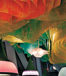
In the Garden, nine wave-like sails imprinted with images
of German greenery are suspended from the ceiling over visitors' heads, while the comforting scents of flowers and barbecue tickle their noses. Refreshed, guests then explore the Factory. Here, in a stylized industrial setting, a conveyor-belt-like system whizzes by overhead, transporting obscured
objects which intrigued visitors can later "X-ray" to find out what they actually are, and access informational videos
about them. The Factory's commotion gives way to the Park's
calm, where, under a canopy evocative of Dale Chihuly's floral sculptures, guests bask in a cool breeze perfumed with aromatic flowers.
Attendees' last stop is a 40-foot-tall exhibition hall containing the "source" of Balancity's power: a 10-foot-wide, 1.2-ton orb, known as the "Sphere of Balancity."
Judges called the German pavilion "the most theoretically
creative" of the entries, applauding its "bold" exterior design and its "innovative and adventurous" interior. In the words of one judge, "This pavilion has been meticulously designed throughout. It is crisp and clean, with a solid storyline and message. Sehr gut!"
for more information, images and videos on this pavilion, click here.
for more information on the honorable mention, click here.
|
  
 |
Honorable Mention
A giant velodrome, complete with more than 100 bicycles for Expo visitors to pedal, the Denmark pavilion received Honorable Mention in the Best Pavilion category. Judges called it "the most refined and elegant" of the entries, and appreciated its "clear, humble concept that cuts through the jumble." |
|
 |
Winner: Denmark Pavilion
Theme: "Welfairytales"
Design: BIG - Bjarke Ingels Group
Client: Danish Enterprise & Construction Authority, Expo 2010
Size: 9,842 square feet |
 |

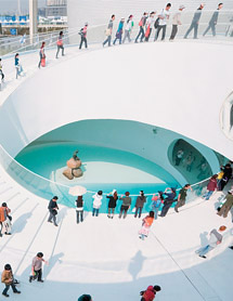
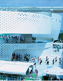
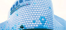
Conceived as a self-supporting truss and constructed of white-painted steel sourced from dilapidated ships, Denmark's pavilion resembles a giant white Slinky. Along the metal skin, thousands of perforations of varying size help ventilate and light the interior, while LEDs placed in each of the 3,500 openings transform the face from austere metal coils by day into a colorful work of abstract art by night. Form follows function, however, as the pavilion's elliptical shape houses a giant velodrome, where more than 100 bikes are available for attendees to glide from the pavilion's base to its cloud-white roof.
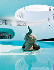
Based on the concept of "welfairytales" - a blending of "welfare" and "fairy tales" - Hans Christian Andersen's native country authors a new fairytale for an ecology-minded era. The centerpiece of the pavilion is the statue of the Little Mermaid, which was brought to Shanghai from its home in the Copenhagen Harbor where it has sat since it was unveiled in 1913. She rests in a pool of water treated using the same Danish technology that transformed the harbor's polluted waters into safe, clean water in which Danes can now swim. The statue and water form the pavilion's Harbor Pool, whose soft aqua lighting illuminates the ground floor as well as the VIP area below it.
Visitors can take in three presentations: "Tales of how we live," "Tales of what we love," and "Tales of where we're going." In "Live," Danish director Martin de Thurah shows how the Danish lifestyle is centered on sustainability, while in "Love," photographer Peter Funch's images spin stories of Danish people's lives. "Going" illustrates how Danish-Chinese cooperation can improve city life.
"The Denmark Pavilion is powerful and memorable in its simplicity and authenticity," one judge said. "Everything is cleverly, poetically executed, and the framed views and vistas are brilliantly done."
for more information, images and videos on this pavilion, click here.
for more information on the honorable mention, click here.
|
  
 |
Honorable Mention
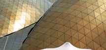
Constructed of glimmering gold-colored steel, the United Arab Emirates Pavilion is rounded and curved to imitate the way scorching desert winds sculpt sand dunes in its seven states. Like the dunes that inspired its design, the pavilion's northern side appears rough and textured while the southern side is soft and smooth.
|
|
 |
Winner: World Wide Fund for Nature (formerly World Wildlife Fund)
Theme: "For a Living Planet"
Design/Fabrication: EWI Worldwide
Client: World Wide Fund for Nature (World Wildlife Fund)
Size: 3,500 square feet |
 |

Touted by judges as "good, information-rich design work," the exhibit for the World Wide Fund for Nature (formerly
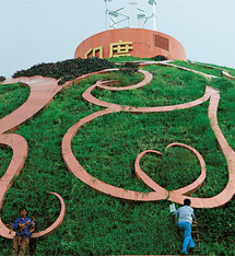
the World Wildlife Fund) enlists the ancient notions of yin and yang. In fact, when viewed from above, the round exhibit mirrors the iconic I-Ching symbol. Aimed at educating visitors about worldwide conservation, the exhibit represents the yin as human society and the yang as nature. In this manner, the project illustrates the inner correlation, dependence, and contradiction between human beings and their environment.
Featuring WWF's panda logo, the curved exterior walls display a whimsical, childlike graphic - making it appropriate and eye catching for children, while at the same time reminding adults of their responsibility to future generations. While one side is clad in illustrated images of wildlife, the opposing side bears an urban scene complete with an overhead blimp trailing a banner that reads, "The future of our planet is up to me!"
Inside the 3,500-square-foot, semi-enclosed exhibit (which is housed within the International Organizations Pavilion), a floor graphic resembling a winding river snakes through the various displays. Throughout the booth, curved walls feature images of plants and animals along with text and simple touchscreen activities explaining the impact humans have on their environment, what WWF is doing to help, and what each person can do to help lessen their own impact (such as recycling and minimizing energy use).
At the heart of the exhibit, visitors encounter what is touted as the world's largest orb-shaped aquarium. Weighing in at 15 tons, the aquarium holds species native to the Yangtze River, all of which will be returned to the Yangtze after the Expo. Nearing the end of their journey, visitors discover a customized carbon-footprint calculator to help them estimate the impact they have on the planet.
According to judges, "This exhibit offers a fresh approach compared to the other exhibits. It is filled with light and warm materials, and does not rely on digital technologies to enhance visitors' experiences." But most impressive is how the exhibit is able to communicate so much information with such little tech and even less text - and in a manner that resonates with both children and adults.
for more information, images and videos on this pavilion, click here.
|
 |
Honorable Mention
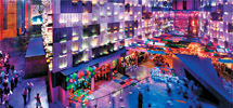
Receiving the Honorable Mention, Guangdong's Green Life Exhibit in the Chinese Provinces Pavilion features an interactive video wall and theater presentation, an imme-rsive express-train experience, trad-itional Qilou architecture, and an overhead LED-grid canopy, which, according to judges, is "captivating."
More images and video: click here.
|
   |
 |
Winner: Window of the City
Producer: Taipei Arts International Association/Shanghai Media Group
Design: The Observer Design Group/
J.M. Lin Architect
Fabrication: Wonders of Art International Ltd.
Client: Expo 2010, Shanghai, China
Size: 63,000 square feet |
 |

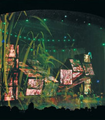
Combining the choreography of a Broadway musical with the multimedia technology of the 21st century, Window of the City moved judges to hail it as "a heroic achievement of big thinking and execution." Set in a 63,000-square-foot, eye-shaped pavilion with a Tiffany-blue roof, Window of the City is Expo 2010's official presentation, artistically interpreting the fair's theme of "Better City, Better Life." As many as 2,000 visitors seated around a 360-degree stage watch a fairytale-like story of a young girl who, eking out a lonesome existence alongside jet-setting parents traveling to London; Paris; New York; Sydney, Australia; and Osaka, Japan (all former expo sites), finally settles in Shanghai, China. There she encounters an angel who whisks her through time to see how cities help people build lives and find love.
A transparent 66-foot-tall screen surrounds the stage's periphery, giving the presentation a look and feel that is half Imax, half snow globe. Positioned on the stage inside the diaphanous curtain is a one-of-a-kind 30-by-33-foot LED-covered structure. Resembling a massive Rubik's Cube divided into seven columns and four rows of smaller, individual cubes, the LED structure's separate sections spin horizontally and vertically, running film footage, animations, and still pictures as the performers morph from shambling cavemen to hiphopping New Yorkers. Meanwhile, 36 "angels" flit and whirl 33 feet above the stage on a lattice of complex computer-controlled cables.
"The combination of live actors with the truly unprecedented rotating structure has to be saluted," one judge said. Not surprisingly, Window of the City has left more than 1 million attendees - and our judges - stage struck.
for more information, images and videos on this pavilion, click here.
|
 |

 |
 |
 |
Honorable Mention
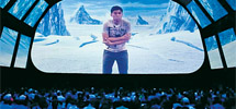
The Information and Communi-cations Pavilion features a 4-D theater comprising 37 screens. During an Arctic scene, snow falls from the ceiling, while an on-screen fireworks finale is augmented by bubbles that fill the air and reflect the images. More info: click here. |
|
|
 |
Winner: Germany Pavilion
Theme: "Balancity: A City in Balance"
Design: Schmidhuber + Partner GbR/Milla & Partner GmbH
Fabrication: Nussli (Deutschland) GmbH, EWI Worldwide
Client: German Federal Ministry of Economics and Technology, Organisation and Operation: Koelnmesse International GmbH
Size: 64,584 square feet |
 |

The winner in our Best Activity/Interactive category is housed within Germany's Balancity-themed pavilion.
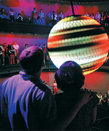
A combination of the words "balance" and "city," the pavilion is meant to represent an actual city of the future. Inside a three-story, 40-foot-tall presentation space known as the "Energy Source," visitors encounter the source of Balancity's power: a 10-foot-wide, 1.2-ton, motion-activated metal sphere flecked with 400,000 LED lights known as the "Sphere of Balancity." The globe-like ball is the focal point of an interactive presentation inside the Energy Source's circular theater, which also serves as the final stop on attendees' trek through Balancity.
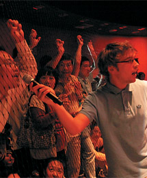
Reinforcing the concept that "together we can really make a difference," the 600 guests inside the theater bring the sphere to life by shouting. With their movements and voices, they activate the ball, which swings back and forth like a pendulum as it "absorbs" the audience's energy. The sphere's speed accelerates, its colors intensify, and it flies higher and higher until it begins to move in circles. The ever-changing images on the sphere depict various elements that make cities attractive places to live before those scenes gradually morph into an image of the Earth.
The interaction is encouraged and facilitated by two characters - Xanyan, a Chinese student, and Jens, a German student - played by live presenters. The ultimate embodiment of the pavilion's concept, the audience puts Balancity into balance by working not only as individuals, but also as a collective whole. The visual presentation, set to a moving theatrical score, sends the message that just as audience members put the fictional Balancity in balance, they can also create a balanced Earth by working together.
"Now that's interactive," said one judge of the German
pavilion's group-activated sphere. "The technology supporting this crowd interaction is amazing and compelling. It's not easy to get a theater full of 600 people to willingly and cohesively interact, but this successful presentation-activity hybrid not only accomplishes that feat, but beautifully underscores the pavilion's 'Together, we can get things moving' moral."
for more information, images and videos on this pavilion, click here.
for more information on the honorable mention, click here.
|
  
 |
Honorable Mention
Visitors to the Switzerland Pavilion are in for a truly memorable ride, as a chair lift transports them away from their urban pressures to an oasis of calm. The four-minute ride takes them through the pavilion and over a rooftop expanse of fragrant grasses from which attendees can view the Expo grounds. |
|
 |
Winner: Australia Pavilion
Theme: "ImagiNation"
Design/Fabrication: think!OTS
Client: Department of Foreign Affairs and Trade, Australia
Size: 20,500 square feet |
 |

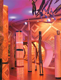
Divided into three acts, the Australian pavilion depicts the country's indigenous and colonial cultures though multimedia art installations that run from gruff to ghostly. The first of those acts - "Act One" - comprises several vignettes, three of which caught our judges' attention, earning Australia our Expo 2010 Award in the Elements and Details category.
The first of those vignettes, called Bedrock, features totems and artwork representative of indigenous Australia.
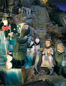
The largest of the totems house hidden speakers that play traditional music. In Nation, attendees get a sense of Australia's 222 years of colonial history, but not as a dry history lesson. Instead, the 28-scene vignette tells the country's story through a whimsical 3-D installation based on a work by illustrator Matt Hatton. The timeline-like piece shifts in color palette and style from that of famous Australian political cartoonist Norman Lindsey to Hatton's own more contemporary style.
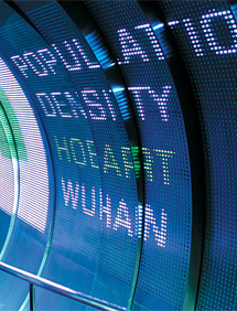
The third component of "Act One" that captured judges' attention is Land, a 51-foot-long exhibit designed to change the stereotype of Australia from that of a rugged outback to that of a heavily urbanized country. The three-part structure begins with a section inspired by Wave Rock, a popular
tourist attraction in West Australia. There, info-based graphics illustrate the population of China compared to that of Australia, relative to each country's land mass. The rock then morphs into a tsunami-like acrylic wave, which breaks over the heads of attendees. Graphics in this section communicate that while only 7 percent of Chinese citizens reside on the coast, 63 percent of Australians live along the ocean. Finally, the acrylic wave gives way to a stainless-steel structure meant to represent Australia's cities. An LED screen embedded in the steel communicates various bits of data, including the fact that more than 76 percent of the country's citizens live in one of eight major cities.
According to judges, Australia's "Act One" successfully distilled a tremendous amount of content with dramatic success. In the words of one judge, "Australia created a wonderful space with smart ideas, surprises, and a storyline throughout the 'Act One' experience that few other pavilions were able to pull off."
for more information, images and videos on this pavilion, click here.
for more information on the honorable mention, click here.
|
  
 |
Honorable Mention
The Urbanian Pavilion received an Honorable-Mention nod for its innovative use of materials. The pavilion's so-called "City of
Diversity" is a megalopolis, with towering monoliths made of
paint cans, housing developments assembled from plastic crates, and residential neighborhoods constructed of milk cartons. |
|
 |
Winner: Urban Planet Pavilion
Theme: "Humanity in Symbiosis with City and Planet"
Design: Triad Berlin
Projektgesellschaft mbH
Fabrication: Shanghai Foremost Multimedia Co. Ltd.
Client: Bureau of Shanghai World Expo Coordination
Size: 129,166 square feet |
 |

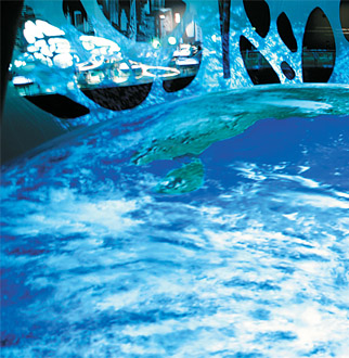
The Urban Planet Pavilion earned judges' top scores in the Best Use of Technology category with a pair of immersive presentations, the first of which attendees reach at the pavilion's summit. There, visitors stand above a 105-foot-diameter globe. A massive media installation, the globe is actually an image projected onto the surface of a hemispherical screen.
Called Blue Earth, the immense sphere seems to liquefy and reform into grids signifying the growth of transportation
and energy and how those networks sap our resources. The
stunning visual transformations are accentuated by sounds with an almost mystical power. This unique merging of seemingly surreal projections with breathtaking audio does
not merely captivate visitors on an emotional level, but also raises their awareness of the Earth's beauty.
The second presentation - a 360-degree video entitled
"The Only Earth We Have" - takes place inside "the Earth," i.e., beneath the domed surface upon which the first presentation is projected. The presentation depicts a planet that goes from unsullied oasis to industrialized blight to a post-carbon Eden. It concludes as thousands of faces combine to create a constellation-like collage on the screen, eventually fading into the phrase, "we have just one world," underscoring the message that "The future of our cities lies in the hands of all of us."
"In an Expo where a lot of theatrical technology is used for impact, with little thought about content, the Urban Planet theaters were a refreshing departure, with simple but huge immersive videos," one judge said. "This isn't tech for the sake of tech. The message wouldn't have been nearly as memorable had it been presented in a more traditional way, meaning the use of projection technology and unique projection surfaces enhanced both the experience and the impactfullness of the content."
for more information, images and videos on this pavilion, click here.
for more information on the honorable mention, click here.
|
 
 |
Honorable Mention
"This pavilion has the most amazing 'gadget factor,'" said one judge of the Information and Communications Pavilion's use of handheld devices, radio-frequency identification (RFID), interactive presentations, and web pages that extended attendees' visits. According to another judge, the combined effect was a "brilliant use of various media technologies, creating an amazingly participatory attendee experience." |
|
 |
Winner: Israel Pavilion
Theme: "Innovation for Better Life"
Design: Haim Dotan (architect) and Prosper Amir (designer)
Fabrication: Shanghai Century 3 Construction Co. Ltd.
Client: State of Israel: Israel Ministry of Foreign Affairs
Size: 4,265 square feet |
 |

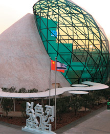
Architecturally acknowledging the Chinese philosophy of yin and yang, Israel constructed its pavilion with two curvilinear forms - one of stone and one of glass - that symbolize the dualities confronting modern Israeli life, such as man versus nature, and ancient versus modern.
A strand of 54 citrus trees known as The Whispering Garden represents the way Israelis terraformed their country from a sere wasteland to one of lush groves. Speakers hidden among the trees softly voice greetings in English and Mandarin as visitors walk past.
Inside the glass-covered Hall of Light, an expanse illuminated by natural daylight, attendees follow a curved wall with a 49-foot-high screen picturing Israel's storied history and rich Semitic heritage, as well as a historical
depiction of Israel's major tourist attractions. Situated inside the stone sphere, the Hall of Innovations is a 52-foot-tall room where visitors learn of Israel's innovations in Green energy, science, music, literature, and even security through large-scale projections and hundreds of "light spheres." Overhead, a 360-degree screen envelops the room with sights and sounds extolling Israeli technical achievements. The glowing, color-changing spheres positioned throughout the space display images and subtitles to support the presentation, which recounts the country's innovations, from extracting diesel oil from plants to inventing the computer memory stick.
"More than any other pavilion, the Israeli pavilion transports me to an otherworldly place," said EXHIBITOR editor Travis Stanton, who selected Israel as the recipient of the Editor's Choice Award. "It depicts myriad dichotomies with such elegance and sophistication. I felt like I was walking on ancient sacred grounds that had been developed by forward-thinking futurists. From the Whispering Garden all the way through to the Hall of Innovations, this pavilion was an absolute joy to experience."
But perhaps the most impressive part of the Israeli Pavilion is its ability to make a big impression despite its diminutive size (4,265 square feet) and budget ($2.5 million) - compared to pavilions costing hundreds of millions of dollars and occupying 10 to 30 times the square footage.
for more information, images and videos on this pavilion, click here.
for more information on the honorable mention, click here.
|
  
 |
Honorable Mention
The Macau Pavilion represents rabbit-shaped lanterns used in Chinese festivals. It is 19.99 meters (approximately 66 feet) tall, referencing the year Macau became a special region of China. Its 120 projectors create an immersive environment, & transport visitors to the streets of Macau. |
|
 |
Winner: India Pavilion
Theme: Cities of Harmony
Design: Design C -
unit of HTA Pvt. Ltd.
Fabrication: China Jingye
Client: India Trade Promotion Organization Ministry of Commerce and Industry, Government of India
Size: 34,980 square feet |
 |

The People's Choice category of our Expo 2010 Awards competition allowed visitors to EXHIBITOR magazine's Expo 2010 microsite to vote for their favorite pavilion based on virtual tours. Thousands of votes were cast during the weeklong voting window, and when we tallied final totals, the India Pavilion came out on top, claiming the People's Choice Award.
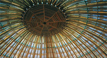
Modeled after Sanchi Stupa, an ancient Buddhist temple built about 24 centuries ago, India's pavilion may look like a monument from its illustrious past, but its reality is eminently 21st century: The dome's ferrocement roof is covered by a grid of ropes and wires that allow herb trays and solar cells to be mounted on it. In a nod to sustainable
architecture - and Expo 2010's "Better City, Better Life" theme - the solar cells and a wind turbine generate enough energy to support the structure's emergency lighting system, while the herbs act as a carbon sink, purifying the surrounding air. Built with tens of thousands of thick bamboo poles, the 115-foot-diameter structure is now considered the world's largest bamboo dome.
A vault-like entrance engraved with a replica of the "Tree of Life" carving from India's 16th-century Siddi Saiyyed mosque welcomes visitors to India's pavilion. Streaming inside, guests move through a plaza showcasing artisans and their works, cultural displays, and shops offering various crafts. A nearby amphitheater hosts cultural shows from India's different regions, while a 360-degree holographic display beneath the pavilion's massive dome runs an ongoing program charting India's history from ancient times to the medieval era to the modern India of Bollywood and telecommunications. The pavilion's upper level offers guests a panoramic view of the pavilion and an up-close look at its world-record-breaking dome.
for more information, images and videos on this pavilion, click here.
for more information on the honorable mention, click here.
|
 |
Honorable Mention
The Information and Communi-cations Pavilion claimed its third Honorable Mention in our People's Choice voting. One of the most technologically advanced pavilions at Expo, it is no wonder why it appeals to visitors. |
|
|
|


 For nearly 25 years, EXHIBITOR has brought you the world's most prestigious exhibit-design competition, honoring the crème de la crème of trade show exhibits. Expanding on the success of that program, EXHIBITOR launched its Expo 2010 Awards competition five months ago. The purpose of the competition was to honor the most impressive work from the 2010 World's Expo in Shanghai, China, and to spotlight some of the incredible pavilions there, all brimming with inspiration for exhibit and event professionals.
