exhibit design |
 n nature, size matters. Whether you're a wolf in the wild or a whale in the water, bigger is better. But what if your claws or jaws aren't the most massive? Then, you find a way to make friend or foe think they are. That's why members of the animal world expand like Kirstie Alley on a Cinnabon diet to appear larger than they really are, making themselves more attractive to potential mates and more formidable to potential adversaries. The puffer fish, for example, swallows water until it swells up to four times its normal size to ward off predators, while the male peacock spreads its plumage like Lady Gaga to impress the feathered females. n nature, size matters. Whether you're a wolf in the wild or a whale in the water, bigger is better. But what if your claws or jaws aren't the most massive? Then, you find a way to make friend or foe think they are. That's why members of the animal world expand like Kirstie Alley on a Cinnabon diet to appear larger than they really are, making themselves more attractive to potential mates and more formidable to potential adversaries. The puffer fish, for example, swallows water until it swells up to four times its normal size to ward off predators, while the male peacock spreads its plumage like Lady Gaga to impress the feathered females.
Darwin rules on the trade show floor every bit as much as he does in the wild kingdom: You may not have to stave off predators, but you do have to attract customers who often equate size with authority and bulk with credibility.
According to Red Bank, NJ-based Exhibit Surveys Inc., there is a direct correlation between the size of an exhibit and the likelihood it will be remembered. While this truism comes from Exhibit Surveys with a caveat - it mainly applies to the major "anchor" exhibitors in a given show - it's still desirable for your booth to be as large as it can be - or at least perceived as such.
But in an economy where exhibiting budgets have been struck by what George Costanza from "Seinfeld" might delicately refer to as "shrinkage," many exhibitors have been forced to scale back on booth space at shows. Even many of these "anchor" exhibitors with large spaces are now having to make do with 10 to 30 percent less square footage than in previous years.
So how can you maintain a powerful presence despite a reduction in space? And how can you avoid being swallowed up by the 80-by-100-foot exhibit next door if your 20-by-20
|
 |
downsizes to a meager 10-by-10? Unlike the puffer fish, sucking water isn't likely to help, but you can manufacture the mirage of a bigger booth.
To help show you how, we canvassed exhibit houses, leading designers, and other experts to discover their favorite tips and tricks for wielding color, light, mirrors, and more so you, too, can make your exhibit space appear impossibly larger than it really is, leaving booth visitors crying, "It's so big!" . even when it's so small.
To view an online photo gallery of trade show exhibits that employed the following six tips and tricks to embiggen their perceived presence at their respective shows, visit www.ExhibitorWebLinks.com.
|

From the time of their invention in 16th century Venice, Italy, modern mirrors have been used to create deception of depth and space. Whether it was the Hall of Mirrors at Louis the XIV's over-the-top palace of Versailles, or the fun houses at traveling carnivals, these reflective surfaces conjured grand illusion of spaciousness where none existed.
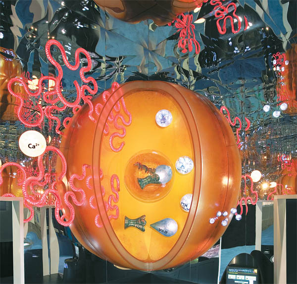
That was the illusory history designer Mitchell Mauk, of San Francisco-based Mauk Design, reflected on for Amgen Inc. at the American Society of Nephrology convention. The Thousand Oaks, CA-based makers of blockbuster drugs for kidney, cancer, and metabolic ailments, Amgen wanted Mauk and fellow designer Larry Raines to fashion an exhibit that reflected its advances in drugs that combat chronic kidney disease (CKD). The only problem was, the space Mauk had to work with was as miniscule as the company's success was massive. Measuring just 400 square feet, the exhibit would be as cozy as a studio apartment that, with the hoped-for crush of visitors, would also be as cramped as a subway car at rush hour.
 To create an impact as massive as the exhibit was minuscule, Mauk devised an interior jam packed with 3-D models of cells and receptors related to CKD that were as much as several thousand times the size of a real cell. Made of Fiberglas and iridescent plastics, and hung from the exhibit's ceiling and walls like ornaments from The Blob's Christmas tree, the structures were eerily beautiful. Attendees might have felt crowded by them if Mauk hadn't turned to an interior-design trick Louis the XIV would have recognized. He arrayed 1,300 square feet of Plexiglas
mirrors around the top of the Amgen booth. To create an impact as massive as the exhibit was minuscule, Mauk devised an interior jam packed with 3-D models of cells and receptors related to CKD that were as much as several thousand times the size of a real cell. Made of Fiberglas and iridescent plastics, and hung from the exhibit's ceiling and walls like ornaments from The Blob's Christmas tree, the structures were eerily beautiful. Attendees might have felt crowded by them if Mauk hadn't turned to an interior-design trick Louis the XIV would have recognized. He arrayed 1,300 square feet of Plexiglas
mirrors around the top of the Amgen booth.
When visitors entered, they witnessed the impossible: The inside space appeared to be perhaps twice as big as it was from the outside. Once their eyes went up, attendees experienced a booth whose topmost points seemed to stretch on and on, over and above the other exhibits on the trade show floor into a seemingly unreal space.
But you don't actually need mirrors, per se, to employ the same reflective technique. At the 2008 International Consumer Electronics Show, Pluto - a provider of products that link in-home technologies such as media, security, telecom, and computing - made a big reflective statement sans mirrors in its meager 10-by-20-foot space. It created a false sense of perspective in its booth by hanging an image of a cheery living room on the exhibit's back wall. Then, the company filled the space in front it with chairs, tables, a carpet, and other décor that matched the hyper-realistic back-wall graphic perfectly. What resulted was a booth that looked impossibly larger than the physical footprint it occupied.
La Verne, CA-based Permeco adopted a similar strategy to conjure a little extra space in its 10-by-10-foot booth at the 2009 International Cemetery Cremation and Funeral Association show in Las Vegas. Permeco, a wholesale supplier of funeral monuments and memorials, used an artificial grass floor in its exhibit, then enhanced the faux turf effect by covering the back wall with a nature graphic that, like Pluto's equally convincing photograph, extended the booth visually from here to, well, the great beyond.
The short explanation for why mirror and mural magic works is as old as the first human being who ever stared into a reflective surface. "Mirrors and murals increase your visual perception of depth within an environment," says Bill Smith, senior creative director at the San Francisco office of event and exhibit agency Impact Unlimited Inc. "Mirrors do this by reflecting the ambient light and images back to the viewer, effectively doubling the perceived size of any room. Photorealistic murals create the illusion of depth that fool the eye into believing that there's a 'there' there, when none actually exists."
|

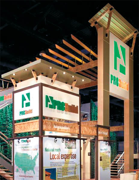
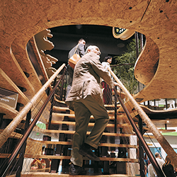
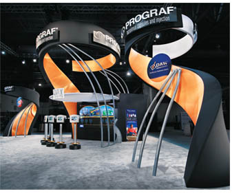
 History is full of soaring towers, from ancient Babel in the book of Genesis to the ultra-new Burj Khalifa in the United Arab Emirates. Their popularity is as old as mankind because they symbolize the DNA-deep need to build "axis mundi," a pillar that connects earth to heaven. But whether they were constructed amid the sands of ancient Egypt or the sidewalks of modern New York, these Jack-and-the-beanstalk spires seem to inflate the size - and importance - of the space and objects surrounding them. It's also a trick of the eye you can easily transfer from the architectural world to the exhibiting one. "Go as high as you can," says Rob Majerowski, a designer with MG Design Associates in Pleasant Prairie, WI, "because even one object taller than the others in your exhibit can make the entire exhibit feel larger." History is full of soaring towers, from ancient Babel in the book of Genesis to the ultra-new Burj Khalifa in the United Arab Emirates. Their popularity is as old as mankind because they symbolize the DNA-deep need to build "axis mundi," a pillar that connects earth to heaven. But whether they were constructed amid the sands of ancient Egypt or the sidewalks of modern New York, these Jack-and-the-beanstalk spires seem to inflate the size - and importance - of the space and objects surrounding them. It's also a trick of the eye you can easily transfer from the architectural world to the exhibiting one. "Go as high as you can," says Rob Majerowski, a designer with MG Design Associates in Pleasant Prairie, WI, "because even one object taller than the others in your exhibit can make the entire exhibit feel larger."
Majerowski wanted MG Design's client, ProBuild Holdings Inc., a supplier of building materials to professional contractors, to seem bigger for the 2009 International Builders' Show (IBS). ProBuild's exhibit measured a voluminous 50-by-50 feet. But what would be a booth of Pentagon proportions to many exhibitors was almost closet-sized compared to the 66 exhibits at IBS that had larger footprints. Thankfully for ProBuild, MG Design had a way of making the company's booth appear bigger than it really was, using some towering trickery.
Boasting an entryway that soared nearly 30 feet above the show floor - as high as show management would allow - the exhibit seemed built for creatures whose vocabulary includes the catchphrase "Fee-fi-fo-fum." Visitors looking straight on at the doorway from the exterior saw it framed on both sides by a back wall covered in 10-by-16-foot photographs of evergreens towering under a blueberry sky.
The doorway, as well as the interior stairway walls, was angled up toward two 30-foot branded towers. The upward trajectory of these elements gave the booth the appearance of thrusting off into the wild blue yonder. Additionally, MG Design used compression and expansion, an ages-old architectural technique that can amplify the perceived size of a space. By building the entrance just 8 feet wide (27 percent of its height, as opposed to a regular doorway, whose width is 40 percent to 45 percent of its height), visitors entering ProBuild's supermodel-thin entrance felt vised between its narrow sides. "The open space attendees 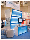 encountered after crossing through made the booth feel as if it had dramatically expanded in size, making it seem so much bigger than it actually was," Majerowski says. encountered after crossing through made the booth feel as if it had dramatically expanded in size, making it seem so much bigger than it actually was," Majerowski says.
"Vertical objects make space appear larger by keeping the viewer's eye moving through the environment upward," says Jeff Foulk, the design director of Matrex Exhibits in Addison, IL. "The viewer then links that additional expanse of space around and above the structure with the rest of the booth, making it look and feel like much more than it is." In fact, according to Dr. Duje Tadin, a psychology professor specializing in brain and cognitive science with the Center for Visual Science at the University of Rochester in Rochester, NY, "The contrast of small objects with a taller structure can make the bigger item seem about 10 percent larger."
|

 Not everybody can - or wants to - build the equivalent of the Washington Monument in their booth. If tight budgets or refined aesthetics make constructing a tower difficult, you can simply place various items - from headers to signage to light fixtures - as high up in the booth as possible to help spur the perception that the exhibit is larger than it actually is. Not everybody can - or wants to - build the equivalent of the Washington Monument in their booth. If tight budgets or refined aesthetics make constructing a tower difficult, you can simply place various items - from headers to signage to light fixtures - as high up in the booth as possible to help spur the perception that the exhibit is larger than it actually is.
It's a time-honored trick that harkens back to the Middle Ages when craftsmen placed narrow, stained-glass windows well above eye level on the stone walls of churches. Worshippers were compelled to lift their eyes and follow the dagger-thin vertical lines of the saintly windows heavenward, expanding not only their souls but their perceptions of the space around them. "By concentrating vertical items in one area, you can shift attendees' attention away from its small scale, and leave them instead with a feeling of something bigger and grander," says Ross Weitzberg, president of exhibit-design firm Space Potential.
If you were strolling along at a trade show and a blue whale swam over your head, would you lift your eyes skyward or keep them front and center? The answer is obvious, which may explain why Toronto, ON, Canada-based
VisualSonics Inc. ran a header over its 20-by-20-foot booth at the American Heart Association show in Orlando, FL. Drawing attendees' gaze upward to the large pool of empty air surrounding it and away from the cozy confines of the ground-floor space, the header easily drowned out any possible perception that the booth, designed by Mount Laurel, NJ-based Kubik Inc., was guppy-sized.
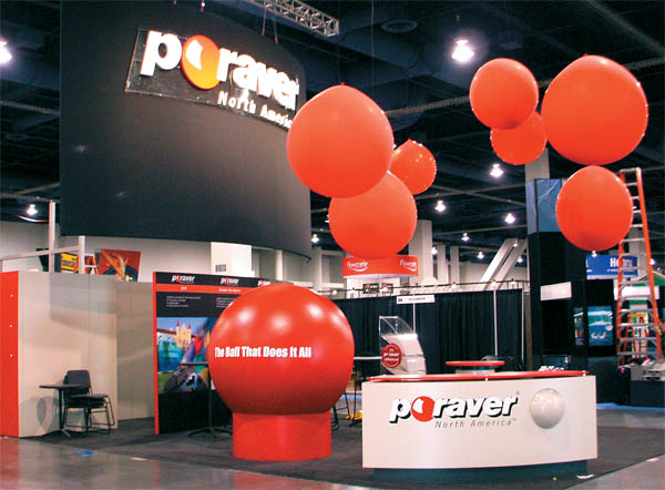
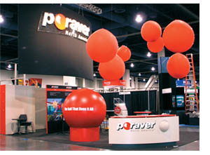
Poraver North America Ltd., a Barrie, ON, Canada, manufacturer of a Green construction material, also adopted a sky-high strategy. Assisted by its exhibit design house, The Taylor Group Inc. of Brampton, ON, Canada, Poraver floated seven red balloons that were two to four feet in diameter over its 20-by-20-foot space. The height and bobbing movement of the inflated orbs steered attention above the exhibit, and tied back to the company's red ball-like logo.
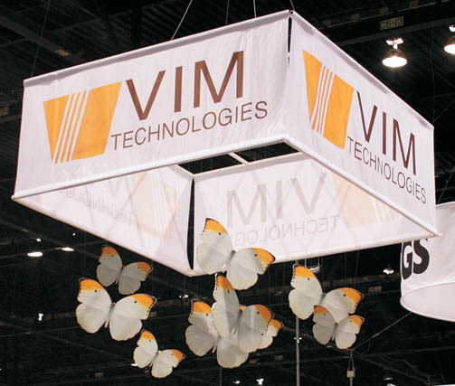
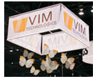 VIM Technologies Ltd. soared with the same "Look, Up in the Sky!" tactic at Print 09 in Chicago. Stuck in a flock of similarly sized 20-by-20-foot booths, the Hanita, Israel, manufacturer of digital print products stretched its artistic wings with a mobile of 2-by-3-foot fabric butterflies that hung from a ceiling structure almost 20 feet over the exhibit. The eight insects fluttered above the booth drawing attention away from the other 650 companies exhibiting their products at the show. VIM Technologies Ltd. soared with the same "Look, Up in the Sky!" tactic at Print 09 in Chicago. Stuck in a flock of similarly sized 20-by-20-foot booths, the Hanita, Israel, manufacturer of digital print products stretched its artistic wings with a mobile of 2-by-3-foot fabric butterflies that hung from a ceiling structure almost 20 feet over the exhibit. The eight insects fluttered above the booth drawing attention away from the other 650 companies exhibiting their products at the show.
Aiming high paid off for these companies because they were able to claim vertical space for themselves. "Without visual clutter to disrupt the sightlines on a message posted high up," says Smith, "you create a clear, open space that by contrast seems much larger than the product-, furniture-, and people-filled area below."
|

When it came to their living or working spaces, nobody liked a mess more than the Victorians, whose chaotic clutter stands in stark contrast to today's cleaner, comparably empty, mod aesthetics. In fact, clutter was king until 20th century designers such as Mies van der Rohe and his philosophy of "Less is more" showed that a sparsely decorated space could appear more spacious than one jammed with stuff. And, not surprisingly, that same directive can be effectively applied to your company's exhibit. "Keep your booth clean and empty," says Impact Unlimited's Smith, "and it's going to feel larger and more open than if all your available space is occupied with product displays and exhibit elements."
 Terrazzo and Marble Supply Cos. practiced this principle of mind over clutter at the 2009 Greenbuild International Conference and Expo. A supplier and distributor of stone and faux-marble terrazzo flooring products, the Wheeling, IL-headquartered company built a 10-by-10-foot booth that consisted of little more than a couple of banner stands, a pair of folding chairs, an oval table that served as a reception desk and display space, and flooring that cleanly and simply branded the small space. Yet the "Less is more" stratagem turned a booth as plain as a bare linoleum floor into one that felt far more open and inviting than the other 100-square-foot exhibits around it. Terrazzo and Marble Supply Cos. practiced this principle of mind over clutter at the 2009 Greenbuild International Conference and Expo. A supplier and distributor of stone and faux-marble terrazzo flooring products, the Wheeling, IL-headquartered company built a 10-by-10-foot booth that consisted of little more than a couple of banner stands, a pair of folding chairs, an oval table that served as a reception desk and display space, and flooring that cleanly and simply branded the small space. Yet the "Less is more" stratagem turned a booth as plain as a bare linoleum floor into one that felt far more open and inviting than the other 100-square-foot exhibits around it.
The less-is-more motif isn't only effective in tight little 10-by-10s. For the American Society of Nephrology show in Philadelphia, Astellas Pharma U.S. Inc. teamed up with Matrex Exhibits to create a 40-by-40-foot exhibit filled with . empty space. While the company's 1,600-square-foot booth was much smaller than many of the competing exhibits, Astellas' space looked as uncluttered as an artist's blank canvas. Six interactive kiosks no taller than parking meters and three 14-foot-tall towers made of fabric and aluminum tubing stood like abandoned relics on a desolate moon. Paired with a predominately black and white color scheme with some gold-colored accents, the restrained design made visitors feel as if they were strolling on a blunt lunar surface that would take hours to traverse rather than a bustling, cramped, and crowded booth space.
Even today, scientists can only speculate why clutter makes a space feel smaller. "It may be that the disorderliness fills up more space and impedes the clean sight lines that would give people the sense of a larger space," says Dr. Frank McAndrew, the Cornelia H. Dudley professor of psychology at Knox College in Galesburg, IL. "Or it may give an impression of crowdedness that could be automatically associated in our minds with smaller, more confined areas."
|

 "I've been 40 years discovering that the queen of all colors was black," the great impressionist painter Auguste Renoir said. But the empress of hues is a mere peon when it comes to increasing your booth's perceived dimensions. "Word-association studies suggest that we generally link dark colors with small, compressed areas, while light colors evoke wide-open, natural spaces," says Leatrice Eiseman, executive director of the Pantone Color Institute in Carlstadt, NJ, which provides color specifications for products made in the United States. Atmospheric blues and jungle greens are often connected to the sky and the outdoors, thereby creating the impression of a larger expanse. "I've been 40 years discovering that the queen of all colors was black," the great impressionist painter Auguste Renoir said. But the empress of hues is a mere peon when it comes to increasing your booth's perceived dimensions. "Word-association studies suggest that we generally link dark colors with small, compressed areas, while light colors evoke wide-open, natural spaces," says Leatrice Eiseman, executive director of the Pantone Color Institute in Carlstadt, NJ, which provides color specifications for products made in the United States. Atmospheric blues and jungle greens are often connected to the sky and the outdoors, thereby creating the impression of a larger expanse.
"The color yellow can also create this impression, since it's so strongly associated with sunlight and the outdoors," says Eiseman, who also runs www.Colorexpert.com, which provides consulting services to businesses on how to integrate color into their products. "White, of course, also increases the feeling of more space - think snow-capped mountains."
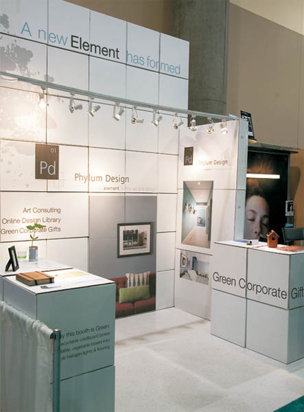
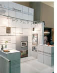
White made right for Phylum Design Inc. at the 2009 Greenbuild expo in Phoenix. With a 10-by-10-foot exhibit, the Logan, UT-based company wasn't going to dominate the show floor based on measurements alone. Instead, it created a larger-than-life look with a booth that was as white as the North Pole. Constructed mostly of eggshell-colored, eco-friendly cardboard boxes assembled with hook-and-loop fastener, the company's ivory-complected exhibit appeared larger than the identically sized, multicolored exhibits nearby.
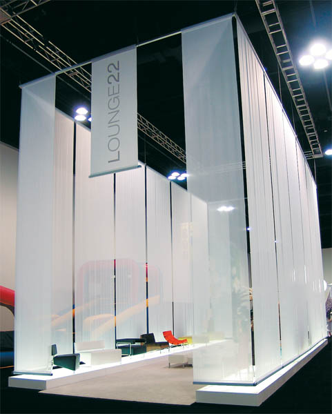
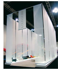
Compared to Phylum Design's booth, Lounge 22 LLC's 20-by-50-foot exhibit at the Event Solutions show couldn't be accused of being tiny. But the Glendale, CA-based company that provides handcrafted furniture for retail stores, trade shows, and events still wanted to bulk up in the eyes of Event Solutions' attendees. To accomplish that, Lounge 22 turned the space as bright as a spotlight and as white as a Hostess Sno Ball. The company ran raised lighted flooring the length of the booth on both sides, creating two boulevards that glowed like airport runways at night.
 Hugged between the runways was a plush carpet the shade of a polar bear, while overhead hung 16 26-foot-tall cloth panels that enclosed the space in what looked like frozen white smoke. The effect transformed a 1,000-square-foot environment into something that seemed as immense as Superman's silver-white Fortress of Solitude. Hugged between the runways was a plush carpet the shade of a polar bear, while overhead hung 16 26-foot-tall cloth panels that enclosed the space in what looked like frozen white smoke. The effect transformed a 1,000-square-foot environment into something that seemed as immense as Superman's silver-white Fortress of Solitude.
The reason behind these booths' inflated appearance is explained by how the brain processes colors, according to Dr. Steve Bitgood, environmental psychologist from Jacksonville State University in Jacksonville, AL. Dizzying geometric patterns, such as checks, circles, and polygons, fool the eye and brain into breaking up a space into smaller units, instead of seeing it as an intact and thus larger whole. "Light colors tend to make spaces look and feel larger," Bitgood says, "mostly because they reflect more light back to the eye, which the brain interprets as a larger, more voluminous space."
|

Ever since a hosiery maker in 1932 found that women preferred nylon stockings steeped with the scent of narcissus over those saturated with "fruit, sachet, or natural" aromas, fragrance has been used to seductively, even subliminally, maneuver customers' perception of products. But one often-overlooked aspect of scent is its effect on how we perceive space. "Studies show that the right scent can increase people's perceptions of room size," says Dr. Alan Hirsch, the head of the Smell & Taste Treatment and Research Foundation in Chicago.
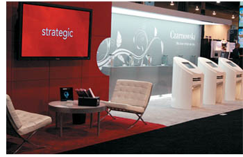 Going into the 2009 EXHIBITOR Show, Czarnowski Inc. needed that olfactory wisdom. Concerned that a "Hey look at me!" exhibit during an economic slump would be as tasteless as selling yachts to homeless people, the Chicago-based exhibit house constructed a 10-by-20-foot exhibit instead of its standard 20-by-20-foot presence at the show. While a booth with half its usual square footage offered visual proof to attendees that the company could be as thrifty as a dollar store, it still managed to leave visitors with a big, lasting impression. Going into the 2009 EXHIBITOR Show, Czarnowski Inc. needed that olfactory wisdom. Concerned that a "Hey look at me!" exhibit during an economic slump would be as tasteless as selling yachts to homeless people, the Chicago-based exhibit house constructed a 10-by-20-foot exhibit instead of its standard 20-by-20-foot presence at the show. While a booth with half its usual square footage offered visual proof to attendees that the company could be as thrifty as a dollar store, it still managed to leave visitors with a big, lasting impression.
Czarnowski used a scent-delivery system from the Orlando, FL office of ScentAir Technologies Inc. that misted the air with the fragrance of the fresh outdoors - specifically, the scent of a green meadow with honeysuckle that made the booth seem as large as the great outdoors.
Natural scents like the meadow-inspired fragrance used by Czarnowski do indeed call to mind wide open expanses. But so do sea-inspired aromas. That's what H. B. Stubbs Co. LLC found for its booth at the Healthcare Convention & Exhibitors Association (HCEA) Annual Meeting. The Warren, MI, exhibit house lured visitors to its 10-by-20-foot booth with a sea-salt giveaway. The salt was in such abundance that its briny scent of the "vasty deep" deluged the booth until its "Gilligan's Island"-like 200 square feet seemed as wide as the nearby Atlantic itself.
Using light, natural scents that appeal to a wide demographic is the best bet for enlarging your space via olfactory allures. According to research by Harald H.Vogt, founder of the Scent Marketing Institute in Scarsdale, NY, the best scent to stretch your sense of a room's size is green apple. "But many pleasant, widely liked aromas will do, from chocolate-chip cookies to pine trees," Vogt says.
From color to scent, and mirrors to towers, there are plenty of options for making even the smallest exhibit seem much more expansive. But whichever of these approaches from leading exhibit houses, designers, and experts in perception you decide to use, one thing is sure: Thanks to a little trickery,
these techniques will have your small-booth space ready to compete against the big-boy exhibits at your next show.
From color to scent, and mirrors to towers, there are plenty of options for making even the smallest exhibit seem much more expansive. But whichever of these approaches from leading exhibit houses, designers, and experts in perception you decide to use, one thing is sure: Thanks to a little trickery,
these techniques will have your small-booth space ready to compete against the big-boy exhibits at your next show. E
|
|
|
|