booth themes |
 |
 |
 n 2005, Crypton Inc. already had a super-powered 80-percent brand awareness in the competitive hospitality market. But the West Bloomfield, MI-based originator and licenser of stain-resistant, antimicrobial, and durable fabrics wanted more than fantastic name recognition. It wanted to expose what it thought to be its true identity: market leader. n 2005, Crypton Inc. already had a super-powered 80-percent brand awareness in the competitive hospitality market. But the West Bloomfield, MI-based originator and licenser of stain-resistant, antimicrobial, and durable fabrics wanted more than fantastic name recognition. It wanted to expose what it thought to be its true identity: market leader.
 According to Crypton's co-founder Randy Rubin, trade shows have been an essential part of the company's marketing mix because they allow the fabric to speak for itself. "I can tell you it's stain resistant, it's microbial resistant, it's strong, it's durable, all day long, but it doesn't matter until you see it," Rubin says. According to Crypton's co-founder Randy Rubin, trade shows have been an essential part of the company's marketing mix because they allow the fabric to speak for itself. "I can tell you it's stain resistant, it's microbial resistant, it's strong, it's durable, all day long, but it doesn't matter until you see it," Rubin says.
While Crypton currently exhibits at more than 60 shows per year, before 2005, it opted out of a booth at the Hospitality Design Exposition (HD Expo) and, instead, sponsored the show's coffee bistro. But the branded tablecloths and black coffee were more ordinary than extraordinary.
So to go from great to greater, Crypton began a trendy new exhibit strategy: It started creating must-see booths with smart, relevant themes that highlighted the latest trends in the hospitality industry and branded Crypton as more than a well-known name but also as an industry leader.
"Every year we research to find the next big thing in the hospitality market, what we should concentrate on, and what designers are talking about," Rubin says. After isolating the year's "emerging trend," the company stitches together a themed booth to match.
Uncovering hotels' expanding offerings of spa services, Crypton asked attendees to chill out in its spa-themed booth in 2005. Relaxing music and a waterfall washed away guests' stress as they tried out massage chairs upholstered in Crypton fabric and previewed the company's products in use throughout the spa décor.
The following year, Crypton responded to designers' demand for fabric usable in indoor and outdoor environments. The company had just introduced In & Out, a new color-fast and bleach-cleanable fabric designed for use inside and outside.So Rubin and her team designed a corresponding In & Out-themed booth that was entirely black and white and played on the oppositional product name. A lounge area illustrated indoor use of the In & Out fabric on black and white sofas, while an outdoor vignette featured Adirondack chairs upholstered with In & Out fabric sitting on a backyard of faux grass.
In 2007, Crypton noticed that kids were taking over the hospitality industry, and the company wanted to play along. It located research that revealed a 300-percent increase in families - including kids - tagging along on business trips. So Crypton sought to capitalize on this trend by positioning its line of versatile and resilient fabrics as a solution for this industry development.
 Before the show, the company sent out a press release to registered attendees that not only invited them to stop by and embrace their inner child, but provided a sampling of research and statistics supporting the influence of kids on the hospitality industry. A message from Rubin also claimed, "As a major force in the hospitality industry, it is our job to pay attention to emerging trends," emphasizing Crypton's use of trend-based booth themes.
Once attendees arrived at the 30-by-40-foot exhibit, they found four "rooms" featuring different scenarios in which Crypton could be used - and abused - by kids. A hospitality room featured headboards, mattress covers, and other furniture upholstered in Crypton fabric. A nursery room displayed a crib with a headboard and footboard, mattress cover, changing table, and rocking chair fully Crypton-ized. Another bedroom contained similar furniture designed for older kids, and the final area was a rec room with Crypton-covered beanbags.
In addition to its products and fabrics, Crypton used a couple of characters to bring its kid theme to life. The company created a children's storybook starring Messie Jessie and her dog Molly B. The sturdy board book with colorful cartoon illustrations was entitled "Messie Jessie and the White Sofa." The book's cover featured a white sofa made of Crypton fabric along with the caption: "A Girl and her Super Dog take their Crypton Sofa through an adventure of mud and milkshakes and still come out clean."
Sight, touch, and even sound made Crypton's book memorable as, turning to the last page, readers heard a surprise recorded message saying, "Don't worry. It's Crypton!" "I think the book told the complete story," Rubin says. "It was something designers loved to take home, and it just worked for our theme."
 The company also created 9-inch-wide circular pillows that looked like the characters' heads and were, of course, made using Crypton Super Fabric. It piled the stuffed toys into a "goodie trough," a transparent fabric holder and dispenser that housed hundreds of copies of the board book on shelves built into its base. The company also created 9-inch-wide circular pillows that looked like the characters' heads and were, of course, made using Crypton Super Fabric. It piled the stuffed toys into a "goodie trough," a transparent fabric holder and dispenser that housed hundreds of copies of the board book on shelves built into its base.
Blake Moore, founder of Mo Design, and designer of Crypton's themed booths since 2005, compares the 15-foot-high holder to "a giant gum-ball machine." Suspended above the booth and digitally printed with graphics of Jessie, Molly, and other kids jumping, the centrally lit dispenser attracted attention from across the show floor and added "a little sizzle and sparkle" to the exhibit, Moore says.
To generate additional buzz, Crypton wrapped a fabric bellyband on every show guide encouraging attendees to visit its booth to see if they had a winning code to receive a free stuffed animal and book. The fabric company also offered the book and the stuffed toys to booth visitors in exchange for a $10 donation benefiting Hollywood Heart's Camp Pacific Heartland, a nonprofit organization offering opportunities to at-risk kids.
"Our thematic booths reinforce to our distributors that we are a well-tuned marketing machine," Rubin says. What's more, Crypton's 2007 booth generated 18 percent more leads than in 2006. In addition, brand surveys indicated a 90-percent brand awareness in the hospitality industry,
a 10-percent increase
over 2005 that Crypton
attributes, at least in part,
to its themed booths.
"Shifting to themes was an amazing change. Today, people come to our booth at every show to see what's new," Rubin says. "It's totally repositioned the way that people perceive Crypton, and has helped establish us as an insightful market leader."
|
 |
 or the last 11 years, Bodek and Rhodes Inc., a Philadelphia-based wholesaler of imprintable active wear, has taken attendees on a magic carpet ride of sorts with an array of innovative booth themes. or the last 11 years, Bodek and Rhodes Inc., a Philadelphia-based wholesaler of imprintable active wear, has taken attendees on a magic carpet ride of sorts with an array of innovative booth themes.
It all started when Mary Ellen Pahlka-Hudicka came on board as director of marketing in 1997. When planning her first show with the company in March of 1998, she met with the owner of Bodek and Rhodes and asked him, "What's the one message you want people to know about the company?" At the time, Bodek and Rhodes had just lowered prices, and he wanted people to know about that policy. But, other than printing a new price list, Bodek and Rhodes hadn't done much to get the word out.
"So we designed a postcard with the saying 'Dirtcheap: That's our new pricing policy,' and an explanation of our new, lower prices. Then we spooned potting soil into tiny Ziploc bags and stapled one to the front of each postcard," Pahlka-Hudicka says.
 Bodek and Rhodes also designed a gardening-themed exhibit to match its mailer. It filled the booth space with hoes, rakes, hoses, piles of dirt, and flowerpots, and it dug up a themed giveaway to match: a canister of dirt with seeds that grew into a "money tree," which staffers encouraged attendees to take home and grow on their office desks.
"We had 10 to 20 people standing in line for cans of dirt," Pahlka-Hudicka says. "It was new, fun, and different, and it was tied in with the theme." The week after the show, business grew faster than the money trees themselves, as call volume went up 27 percent.
A couple of years later, when its two biggest competitors were bought by conglomerates, Bodek and Rhodes capitalized on its family-owned status by turning its booth into a family picnic with a chain-link fence and games of horseshoes. It put staff in tie-dyed shirts and invited clients to stop by and have a picture taken with the Bodek and Rhodes family.
In 2006, the company wanted to reinforce the premium quality of its products, so it channeled the popular television series "CSI," by turning its booth into a crime lab. A staffer dressed as a cop "arrested" attendees as they arrived and directed them to four stations where they collected evidence about the products' quality, including one station that was a faux ballistics lab where attendees shot garments with water pistols to test stain resistance. After visiting all of the stations, attendees were "released" from custody and given a pair of plastic handcuffs as a souvenir.
While the booth's look, feel, and key message change every year according to what the sales team wants to communicate to attendees, Pahlka-Hudicka's strategy stays the same. "It comes down to infotainment - informing and entertaining so that attendees will remember you long after the show," she says.
When Pahlka-Hudicka searched for Bodek and Rhodes' main message in 2007, it seemed the company wanted to promote its high level of customer service and its wide range of products. Already carrying more brands than its competitors, the company also wanted to let the genie out of the bottle regarding its five new providers and more than 100 styles. So to showcase its superior spread of brands and products, Bodek and Rhodes drew on its reputation for customer service and built an Arabian Nights-themed Brands Bazaar.
Bodek and Rhodes started off by sending magic-carpet themed invitations to registered attendees. The promotion's windowed envelopes revealed an Arabian woman peering over a veil with a tassel dangling over her nose. The invitation read, "Is your magic tassel the one that wins?"
At the booth, attendees discovered a 20-by-40-foot Arabian tent made of pink and orange satin cloth. The bright colors and engaging architecture attracted visitors from across the show floor. Hired actors in Arabian costumes greeted attendees by bowing and saying "Welcome, oh Royal One. We've been waiting for you. Welcome to the Brands Bazaar. We have more brands than anyone else." The actors' extravagant greeting communicated the breadth of the company's product offerings, reminded them of Bodek and Rhodes' excellent customer service, and reinforced the theme.
 After scanning attendees' badges, the actors escorted them into the tent where they could browse the company's products displayed on market carts. Moroccan accessories, furniture, tea tables, lanterns, and bamboo stools all gave a Middle-Eastern feel to the space, while a beautiful Arabian actress displayed one of the company's new soft fabrics by asking customers if they'd like to pet a snake puppet constructed out of the material.
Attendees who brought in the tassels from the magic-carpet mailer received their own magic carpets: fringed mouse pads emblazoned with the company's name, logo, Web address, and the message "A magic carpet to the most brands in the industry 24-7." Two to three lucky winners were sent tassels that matched ones found on a Middle Eastern rug in the booth. If they returned the winning tassels to the company's staffers, they won a free product of their choice.
Thirty-one percent of attendees brought the tassel to the booth, and 6 percent more remembered receiving the tassel but had forgotten to bring it - a total response rate of 37 percent, almost twice the company's goal. Even better, Bodek and Rhodes gathered 1,745 new leads - 75 percent above its goal.
The company infotained attendees again in 2008 with a rainforest-themed booth that promoted its line of organic products. A die-cut leaf-shaped mailer in a clear envelope invited attendees to visit the booth for a chance to win products from the organics collection. Not surprisingly, the theme cleaned up with a record-breaking 70-percent response rate.
"There's no question that our themes are profitable," Pahlka-Hudicka says. "We know that if we can identify the right message for the market and incorporate that into an exhibit, we can produce tangible results."
|
 |
 elfer Lighting Inc. wants to help its current and potential customers see the light - its various product lines of lighting and light fixtures, that is. So to shed a little light on its products every year at its biggest trade show, Lightfair International (LFI), Belfer developed a new strategy in 2005: American exhibit themes. elfer Lighting Inc. wants to help its current and potential customers see the light - its various product lines of lighting and light fixtures, that is. So to shed a little light on its products every year at its biggest trade show, Lightfair International (LFI), Belfer developed a new strategy in 2005: American exhibit themes.
As one of the few American-based lighting companies left in the industry, Belfer has established a tradition of spotlighting its identity with American exhibit themes that highlight those "Made in America" roots. "The bulk of lighting is made in China," says Bruce Belfer, president and CEO of Belfer Lighting. "We value our American roots, and we want to talk about that, so we stick with themes typical of America and Americana to remind people of that American manufacturing."
Prior to using American-themed booths, the lighting company exhibited inside more conventional booths. But according to Belfer, traditional booths tend to get boring. And no one remembers boring.
"When you're at a trade show, you might see 700 to 1,000 booths, and you don't really retain a lot of that. You go back to the office, put the literature on your desk, and eventually throw it out. Unless your head is turned, the impact is minimal. That's why we wanted to break the mold and do something completely different," Belfer says.
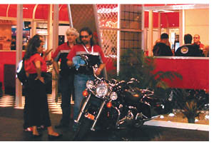
The company kicked off its new American-themed booth strategy by raising a "skull-and-crosstools" flag above an in-booth biker bar in 2005. The "crosstools" (a pair of crossed wrenches) represented Belfer's position in the manufacturing sector. According to Belfer, the booth bar brought the spirit of a "kegger to the Javits Center floor," complete with a keg and Belfer's own Harley-Davidson along with four other American-made bikes on proud display. Inside the booth, staffers gave away stick-on tattoos and T-shirts with Belfer's skull-and-crosstools image.
In 2006, flower power took over the company's 1970s booth and brought the feel of a "nonstop party" to the show floor, Belfer says. Staffers donned tie-dyed shirts and bell-bottoms and offered attendees beer, wine, soft drinks, and various candies and sweets. Images of smiley faces and peace signs decorated the booth and conveyed the era's feel of peace, love, and happiness. Belfer shared the love, giving away smiley-face T-shirts and '70s-style sunglasses.
While Belfer knew he wanted to bring a '60s-era diner to the show floor in 2007, he turned over the details to Eatontown, NJ-based exhibit house Klose Associates. "Bruce's enthusiasm was contagious," says Raymond Klose, president and creative director at Klose Associates. "The diner concept was his. We were able to help him execute it within a budget and to make the experience a real one by using an economical custom rental that cost $75,000 - about three times less than the average cost of a custom booth of the same size."
 When attendees streamed onto the floor at LFI 2007, Belfer opened its 1,500-square-foot custom-rental - Mr. B's diner - for business. The diner's glossy red acrylic outer walls contained open windows so attendees could catch a glimpse of the old-fashioned fun going on inside. When attendees streamed onto the floor at LFI 2007, Belfer opened its 1,500-square-foot custom-rental - Mr. B's diner - for business. The diner's glossy red acrylic outer walls contained open windows so attendees could catch a glimpse of the old-fashioned fun going on inside.
Upon entering the diner, attendees stepped across black-and-white checkerboard flooring and headed to the counter. There "Belfer Girls" (bedecked in pink poodle skirts with satin jackets) and "Belfer Guys" (outfitted in racing shirts and blue jeans) took their lead information and also took their orders for hot dogs and root-beer floats.
Sounds of the 1960s - including the Drifters, the Coasters, and the Beach Boys - filled the diner, and a plasma screen played scenes from the movie "Grease" as attendees slid into one of Mr. B's red banquette booths to enjoy their treats. At the tables, visitors scanned Belfer's menus, which contained not burgers and fries, but Belfer's light fare, including new lighting products from all divisions of the Belfer Group in categories such as "American Favorites" for Belfer's products, "Going Dutch" for products from Atomis, "LED Specials" for products from Radiant, and
"A Taste of Italy" with items from TreCi Luce and Martini.
On top of reading about products, attendees could see them in action throughout the diner. Overhead panel and pendant fixtures, under-counter lighting, and outdoor lighting in a garden outside the diner all helped display Belfer's lights and fixtures in the best possible light.
Staffers circulated throughout the diner, which was packed to its 40-person capacity throughout the show. For more serious conversations, Belfer invited attendees to an eight-person meeting room, which they entered through swinging doors labeled as if they were men's and women's restrooms.
At the end of the three-day show, Belfer's booth dished up results as bright as its lights. The company gathered 875 new leads - more than twice as many as LFI 2006. And the themed booth attracted attention from show judges who honored it with an award for branding, product presentation, and creativity.
Belfer followed its successful diner booth by throwing a "white party" at LFI 2008. Taking a note from the American music industry and rappers like P. Diddy's upscale soirées with all-white décor, Belfer played house, or dance, music as attendees mingled in the all-white exhibit alongside the company's white-clad booth staffers. Wiping its color slate clean brought in more leads the first day than during the entire 2007 show.
"Part of the fun of doing this is that it's an elbow in the ribs of the industry," Belfer says. "A lot of booths are just people in suits. That's not exciting. Rather than succumb to boring and stodgy booths, we decided to be less stuffy. Stuffy doesn't sell."
There's certainly nothing stuffy about Belfer's themed booths, and the increased traffic proves their effectiveness. "I can tell you our themed booths have really paid off for us. It's gotten to the point where I can't even leave the booth during the show because it's so busy," Belfer says. "And what's more, everyone receives our American-made message loud and clear." e
|
 |
|
|
|


 n 2005, Crypton Inc. already had a super-powered 80-percent brand awareness in the competitive hospitality market. But the West Bloomfield, MI-based originator and licenser of stain-resistant, antimicrobial, and durable fabrics wanted more than fantastic name recognition. It wanted to expose what it thought to be its true identity: market leader.


 or the last 11 years, Bodek and Rhodes Inc., a Philadelphia-based wholesaler of imprintable active wear, has taken attendees on a magic carpet ride of sorts with an array of innovative booth themes.


 elfer Lighting Inc. wants to help its current and potential customers see the light - its various product lines of lighting and light fixtures, that is. So to shed a little light on its products every year at its biggest trade show, Lightfair International (LFI), Belfer developed a new strategy in 2005: American exhibit themes.