|
REGISTRATION REQUIRED
cost cutting

Downsizing is de rigueur these days, as exhibitors reassess their footprints and reconsider exhibit components to make room for more social distancing. So EXHIBITOR recruited a panel of experts to help you reduce real estate and exhibitry without ruining effectiveness. By Linda Armstrong
As in-person trade shows dust off the cobwebs and sputter to life, chances are that many exhibitors will downsize their exhibitry to one degree or another. While some will reduce their footprints due to decreased marketing budgets and fewer attendees and staff traveling to shows, others will maintain their square footage but scale back on the amount of exhibitry employed within it. The latter provides more space for social distancing and COVID-related adaptations, plus it can cut costs, as less exhibitry typically translates to lower transportation, drayage, and labor fees. What's more, if a show assigns priority points to exhibitors with larger footprints, maintaining a sizable slab of concrete may pay off
in the long run.
The point is, when most exhibitors hit the road, they'll likely need to leave something or someone at home that would have previously made the trip. But having never been down this precarious path before, most marketers aren't quite sure what to bring nor what to eliminate. After all, they don't want to overpack, but they can't leave crucial components at home either. That's why EXHIBITOR tapped a host of exhibit-design and -marketing experts for their downsizing advice. Along with tips to help you scale back components and afford more social-distancing space, they've provided several queries to aid the process along with specific "ditch that" directives. Their guidance should help you tighten your belt without decreasing effectiveness. 
Investigative Questioning
The following queries can help determine whether specific exhibit elements make the trip or stay at home.  ➤ What's our No. 1 goal? "Identifying your one big thing helps you understand what must be included and what might be unnecessary," says Jay Menashe, CTSM, vice president of sales and marketing at EDE Corp. For example, if your primary aim is to launch a new gizmo, you'd prioritize demo stations, and if push came to shove, you'd eliminate conference spaces, awareness-related elements, etc. ➤ What do we want visitors to remember? Another way to isolate your core reason for exhibiting – and therefore ascertain the essential exhibitry that supports it – is to identity the sole thing you want visitors to remember about their experiences in your stand, says Katina Rigall Zipay, creative director at Classic Exhibits Inc. "Often, the memory you want to instill is the name of a new product, a key message, or a positive impression of your staff or the brand," she says. "But by pinpointing this aim, you can also make sound decisions about your exhibitry."
FAST FACT
➤ How many staff and attendees do we expect? If you're taking fewer staff to the show, you'll need less storage space for their gear. In June 2020, the International Association of Exhibitions and Events (IAEE) recommended an optimum floor density (based on a 6-foot radius around individuals) of 28 square feet per person. Based on this suggestion, those with a 20-by-20-foot booth, for example, would limit occupancy to 14 people. While recommendations are changing rapidly, each show also may have its own guidelines regarding this metric. The point is, it's important to determine how many attendees will occupy your space at once and how many staff you intend to bring to the show. "This data can help you determine the amount and type of exhibitry you need," Menashe says. "For example, if only three people will occupy your exhibit due to density recommendations, do you really need a reception counter? And if you're bringing only four staffers, do they need a sizable storage or break area?" ➤ What do attendees need? In all likelihood, attendees' pain points and expectations have changed in the last year or two. "That means you can probably forget some of what you knew about your audience," says Melissa Park, founder of Melissa Park Events. "Therefore, it's time to ask some hard questions to reassess each show's unique attendance. Who's going to this show today, not two years ago? What do they need, and how have these needs changed since 2019? How can your offerings and your booth best meet their expectations?" Stephen Ross, vice president and executive creative director at Access TCA Inc., further stresses the importance of an attendee-centric experience. "To create such an encounter, determine how you want visitors to feel and what you want them to think and know about your brand or product," he says. "Also consider how you want them to act after engaging with you. If you understand your audience in these terms, you can choose components that will facilitate face-to-face conversations."
FAST FACT
➤ How will staff engage with attendees?Align your exhibit to attendees' current needs, not those of two or more years ago. The whole point of trade shows is to allow your personnel to talk with attendees face to face. "Always keep visitor engagement and interaction top of mind as you prioritize exhibit planning," says Bill Lanisek, event strategist from Novak Birch Inc. Obviously, pandemic protocols mean this engagement will look a little different than it did in 2019. "But to effectively downsize exhibitry," he says, "you need to understand and prioritize elements that best support face-to-face engagement results." Along these same lines, Todd Dailey, vice present of creative at Visual Communications, reminds us that attendee "returns" are also critical. "The new normal for exhibiting is all about focusing your message to attendees' pain points," he says. "Gone are the days when an errant salesperson can shoehorn in one extra workstation for a specific product or service that has a small effect on your business. Today it's about what is important to your audience and what gives them the best return on experience."
Going Big in a small space
How do you ensure that your petite environment still looks spacious and inviting as opposed to cluttered and cramped? Our experts weigh in. ➤ Declutter. Clutter kills any booth and can deter attendees from entering your space, says Bill Lanisek, event strategist at Novak Birch Inc. So whenever possible, maintain a tight focus on your main messages, goals, and products, and eliminate everything else. ➤ Avoid dark colors and patterns. Designers often use patterns and dark colors to elicit emotions and intimacy, says Jay Menashe, CTSM, vice president of sales and marketing at EDE Corp. But if you want to maintain a sense of openness within a small space, bypass the patterns and aim for lighter colors. ➤ Incorporate some white space. Dense graphics perceptually diminish the size of your stand. "It's important to maintain some white space and not overfill your graphics with messages or text," says Katina Rigall Zipay, creative director at Classic Exhibits Inc. ➤ Maintain you sightlines. "Attendees want to be able to see through and into your space, so designing clear, uninterrupted sightlines to key points of interest is paramount," says Sean Combs, CEO of Steelhead Productions. See-through walls, slatted dividers, and more are a few ways make a smaller space appear larger.
Unnecessary Accoutrements
Take a close look at these frequently used exhibit elements, which are probably due for a decrease.  ➤ Enclosed meeting rooms. Face-to-face meetings are almost always essential, so you'll need to set aside pandemic-friendly environs for these endeavors. However, Sean Combs, CEO of Steelhead Productions, says it may be time to skip enclosed conference rooms for the near future. "Many attendees won't be eager to enter such an environment – or any close quarters for that matter. A simple solution is to eliminate traditional closed-door conference rooms from your floorplan." ➤ Paper and digitizable assets. Eschew paper collateral (e.g., brochures, product one-sheets, etc.) along with any video assets that don't clearly support your main directives. "If people can scan a Quick Response (QR) code and gain access to the content immediately – and/or retrieve it from the comfort of their homes or offices – then you can eliminate the need for literature stands, collateral storage, and even a few monitors and perhaps the walls or cabinetry that support them," says Kevin Carty, executive vice president of Classic Exhibits. ➤ Hospitality and gift items. Dailey expects that some attendees may not feel 100-percent comfortable with food service, so prepackaged items may be the best way to go. Lanisek concurs. "You may want to reconsider – or at least redefine – hospitality and giveaway offerings," he says. "Assess the need for self-serve coffee stations, candy bowls, and any kind of food or tchotchke distribution." Granted, you could switch to single-serve, individually wrapped items, but first ascertain whether a particular offering truly supports your objectives. ➤ Lounge furniture. While you may want to sit down for socially distanced discussions, presentations, and demos, Lanisek recommends that you eliminate most lounge furniture that might entice visitors to loiter in your space. You'll likely need to curtail the number of people in the exhibit at any given time, and you don't want unqualified and unengaged attendees simply lolling about.
FAST FACT
➤ Nonessential or underqualified staff. No, people certainly aren't exhibitry. But they – and their stuff – still take up space. "When selecting booth staff, consider who will best serve the needs of both the company and the attendees," Menashe says. "Now's the time to bring your starting five (or two or 10) and to leave the benchwarmers at home." Also consider setting up a sort of hybrid staffing team. That is, you could bring a few of your top-notch salespeople but then have several product specialists and executives on standby for impromptu or scheduled booth meetings via Zoom.Enclosed conference rooms can be problematic in a pandemic. Open them up or eliminate them. ➤ Heavy, cumbersome components. Scrutinize all your burdensome elements, Zipay suggests. "These pieces often cost a pretty penny in terms of shipping, drayage, and installation, and if they don't pack down well, they may take up more room in your crates," she says. "So carefully look over such components to determine if they're truly critical to your objectives or if you can leave them at home and kill two birds with one stone – by freeing up space and decreasing costs." 
Reduction Instructions
Further enhance your downsizing efforts by fully leveraging the components you do bring to the show.  ➤ Employ dual-function elements. You've likely seen reception desks that act like Swiss army knives with built-in demo screens, and storage space, but myriad other elements can multitask. "The same wall or kiosk could have an interactive screen on the front and a product display on the side while its back side defines a meeting space," Zipay says. Even something as simple as a strategically placed bench can delineate a space and direct traffic. ➤ Replace on-site swag with an online store. "A great alternative to in-booth giveaways is a virtual swag store filled with branded items or gift-card codes attendees redeem online," Park says. "Qualified visitors can view the store via a tablet (which you can sanitize after each use), input their contact info, and pick what they want. After the event, you simply email or mail them their selections." ➤ Reduce, don't remove. Rather than completely doing away with a piece or type of exhibitry, consider how you might edit it. "Does your storage closet need to be as big as in years past, particularly since you're likely bringing fewer employees and handing out less swag?" Menashe says.
FAST FACT
➤ Consider traffic flow. To make the most of your selected exhibitry, ask show management about any COVID-induced traffic flow changes or show-floor tweaks that could affect how you orient your booth, Carty says. For example, you don't want to position your massive LED display in the
opposite direction from which attendees will be approaching your space.Think like a tiny-home builder and try to incorporate elements with dual purposes. ➤ Keep effectiveness top of mind. Whether your downsizing endeavors are driven by the pandemic or something else entirely, Park cautions that effectiveness trumps everything. "If you can downsize your space and deliver a great experience that meets your goals and objectives, then you absolutely should," she says. "But if you can't deliver an experience that represents your brand or showcases your products in the best light, then that event could be more detrimental than beneficial."
The No-go list
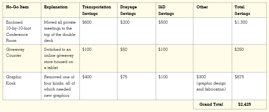
Steve Deckel, CEO of Deckel and Moneypenny Inc., recommends tracking elements you've eliminated along with the cost savings associated with each. By doing so, you can employ the data for future shows and demonstrate the value of your efforts to management. Here's an example of a no-go list that includes estimates for each item's transportation, drayage, and labor fees. To download a PDF of this worksheet and start tabulating your own reductions, click here. 
|
|
|
||||||||||||||||||||||||||||
|
|
||||||||||||||||||||||||||||
|
TOPICS Measurement & Budgeting Planning & Execution Marketing & Promotion Events & Venues Personal & Career Exhibits & Experiences International Exhibiting Resources for Rookies Research & Resources |
MAGAZINE Subscribe Today! Renew Subscription Update Address Digital Downloads Newsletters Advertise |
FIND IT Exhibit Producers Products & Services All Companies Get Listed |
EXHIBITORLIVE Sessions Exhibit Hall Exhibit at the Show Registration |
ETRAK Sessions Certification F.A.Q. Registration |
EDUCATION WEEK Overview Sessions Hotel Registration |
CERTIFICATION The Program Steps to Certification Faculty and Staff Enroll in CTSM Submit Quiz Answers My CTSM |
AWARDS Exhibit Design Awards Portable/Modular Awards Corporate Event Awards Centers of Excellence |
NEWS Associations/Press Awards Company News International New Products People Shows & Events Venues & Destinations EXHIBITOR News |
||||||||||||||||||||
|
||||||||||||||||||||||||||||


