|
REGISTRATION REQUIRED
awards
EXHIBITOR Magazine's Eighth Annual
Portable/Modular Awards
Last year, humans learned the importance of flexibility. And today, exhibitors must flex their configurations and their components to fit not only different footprints but also new COVID-centric concerns. To celebrate the increasing role portable/modular exhibits play in the world of face to face, EXHIBITOR magazine hosts the annual Portable/Modular Awards. While the program continues to recognize innovative designers and forward-thinking system suppliers, it flexed a bit this year as well, providing slightly altered categories and a four-year eligibility period. This year's 10 standard-category winners were selected by a jury of marketing and design experts, who evaluated entrants' functional and aesthetic merits. Meanwhile, one winner, which took home the People's Choice Award, was selected by popular vote on www.ExhibitorOnline.com. And one project, which earned the highest score regardless of category, received the program's top honor, The Zeigler Award. By Linda Armstrong
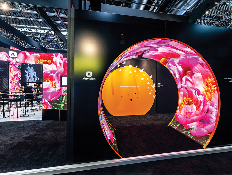
Best Island Exhibit (1,000 Square Feet or More) Exhibitor: Aluvision Design/Fabrication: Aluvision Inc., Duluth, GA, 470-252-3500, www.aluvision.com System: Aluvision Event: EuroShop, 2020 Budget: $250,000 – $499,000 Size: 49-by-80 feet Photo: Ellen Goegebuer In order to sell products, buyers must be able to envision themselves using them. Marketers at Aluvision, a modular-framing system provider, have this trick down pat. In fact, their mastery is evidenced in their EuroShop exhibit, which won over hordes of attendees and wooed the competition's jurors. The latter crowned the 49-by-80-foot booth with The Zeigler Award, the program's top honor. Aluvision's design is even more impressive considering the firm's challenges. In addition to releasing its new corporate identity and 15 new products, Aluvision wanted to demonstrate the endless ways its modular framing system can coordinate with its compatible LED tiles. Towering up to almost 20 feet tall and divided into three sections spanning two show-hall aisles, the resulting stand comprised Aluvision frames and profiles with integrated Hi-LED 55 tiles – all assembled without a single rigging point. Designers included new products throughout to show integration possibilities along with designated "product corners" where visitors could discover each offering's novelties. Furthermore, designers devised mesmerizing and colorful content for multiple LED installations, including an immersive cube, interactive floor, and engaging tunnel, all of which proved to be Instagram-worthy creations. Meanwhile, a hospitality zone offered both cozy conversation corners and open areas for discussions. As a whole, the multifaceted experience no doubt helped attendees envision Aluvision's system in use in their own designs. Plus, in the words of one juror, "the stand provided a seemingly endless amount of surprise and delight, along with beautiful moments of discovery throughout."  
Exhibitor: Verity Global Solutions LLC Design: Exhibits NW Inc., Portland, OR, 877-246-3709, www.exhibitsnw.com Fabrication: Classic Exhibits Inc., Portland, OR, 503-652-2100, www.classicexhibits.com System: Classic Exhibits Inc. Event: American Society of Health-System Pharmacists Midyear Conference, 2017 Budget: $20,000 – $39,000 Size: 10-by-10 feet Photo: F-Stop Photography If you opt to make something simple, it has to be good." While these wise words come from Norman Calder of "The Great British Bake Off," they're also apropos for booth design. This stunning 10-by-10 for Verity Global Solutions LLC is the perfect example. Designed by Exhibits NW Inc. and constructed by Classic Exhibits Inc., the booth was born out of Verity Solution's straightforward demands: Create a space that is clinically clean, highly technical, and representative of the health-care field. Hailed by judges as "visually and technologically effective," the booth debuted at the American Society of Health-System Pharmacists Midyear Conference. Here, attendees discovered a back wall comprising a SuperNova LED lightbox that featured interchangeable backlit graphics, allowing messaging to be tailored to individual audiences. While originating from modest and minimal ingredients, this simple design is delightfully delicious – or what Mary Berry might call "a scrumptious good bake."  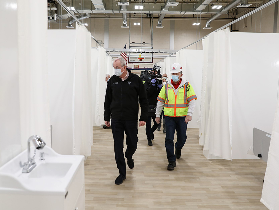
Exhibitor: EverBlock, a division of Versare Solutions LLC Design: EverBlock, a division of Versare Solutions LLC, Minneapolis, 844-422-5625, www.everblocksystems.com System: EverBlock, a division of Versare Solutions LLC Event: COVID-19 Temp Hospitals, Acute-Care Facilities, and Medical Testing Sites, 2020 Budget: $5 million or more Photo: EverBlock, a division of Versare Solutions LLC For industry suppliers, 2020 offered the opportunity to evolve in ways that helped the greater good while keeping their workers employed. So in an effort to recognize portable and modular suppliers that found a way to change course and/or to aid the pandemic effort, EXHIBITOR added the Best Pivot category to this year's competition. EverBlock, a division of Versare Solutions LLC, took home top honors in this unique (and hopefully one-time) category. The firm typically provides modular building blocks (think giant Legos), flooring systems, and interlocking wall panels for myriad uses. At the height of the pandemic, the company stepped up when New Jersey governor Phil Murphy put out a call for help. Together with the United States Corps of Engineers, EverBlock rapidly installed roughly 130 patient "pods" in a gymnasium turned temporary hospital. The U.S. Army Corps of Engineers then used the same EverBlock and EverPanel components to create an acute-care facility with more than 100 beds. Following these initial installations, EverBlock components have been used in the construction of nursing stations, medical-testing sites, and more. In addition, they were installed at surge hospitals across the city of New York and in New Orleans.  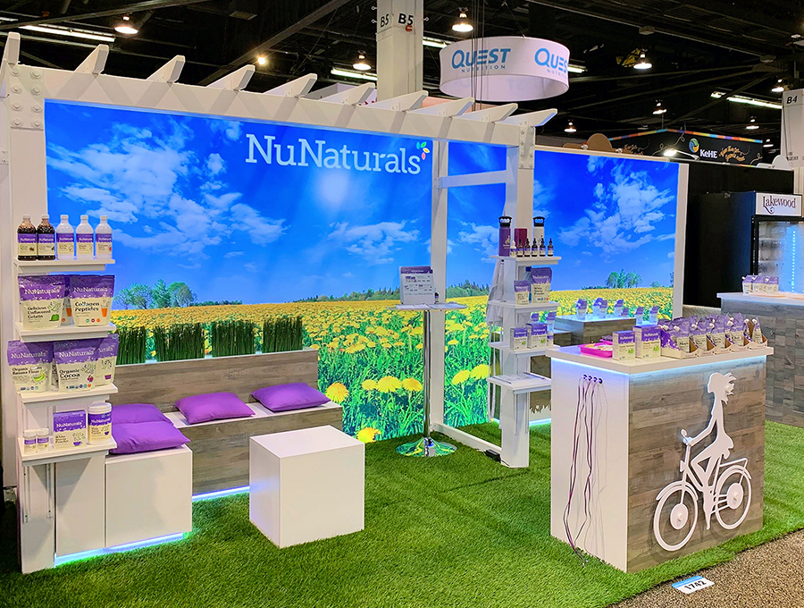
Exhibitor: NuNaturals Inc. Design/Fabrication: Classic Exhibits Inc., Portland, OR, 503-652-2100, www.classicexhibits.com System: Classic Exhibits Inc. Event: Natural Products Expo West, 2019 Budget: $20,000 – $39,000 Size: 10-by-20 feet Photo: NuNaturals Inc. Crafting a believable outdoor environment in the middle of a trade show floor is no small feat. But NuNaturals Inc. made it look effortless at Natural Products Expo West. The provider of plant-based sweeteners and baking ingredients wanted to grow its existing 10-by-10 stand into a 10-by-20-foot booth with a reception zone, a casual meeting space, and ample product displays and storage. The resulting booth from Classic Exhibits Inc. married the previous 10-foot structure with a new, equally sized lightbox comprising the same materials and similar graphics. Together, the two structures presented a dynamic backdrop depicting a brilliant field of dandelions beneath an azure-blue sky. In front of the back wall, designers positioned staggered-height product counters on the right of the footprint and an L-shaped seating area on the left, the latter of which included storage space accessible via hinged seat-top panels. Designers added a reception desk comprising Euro Lt Modular Panels front and center in the booth. Here, a 3-D logo and edge-lit countertop garnered additional attendee interest. Throughout the exhibit, natural features such as wood finishes, floral silhouettes on the display cabinets, and multiple planters enhanced the outdoor vibe. "Brilliant!" one juror remarked. "Designers managed to create a functional yet aesthetically pleasing environment that became a breath of fresh air on the show floor."  
(1,000 Square Feet or More) Exhibitor: World Fuel Services Corp. Design/Fabrication: Elgin International Ltd., Farnham, United Kingdom, 44-758-277-0682, www.elginint.com; Exhibit Concepts Inc., Vandalia, OH, 800-324-5063, www.exhibitconcepts.com System: BeMatrix USA, Dex Exhibit Systems Inc., NTension Corp. Event: National Business Aviation Association (NBAA) Business Aviation Convention and Exhibition, 2018 Budget: $500,000 – $749,000 Size: 50-by-150 feet Photo: Cole Group Inc. In 2017, World Fuel Services Corp. was looking for an upgrade. The provider of energy, logistics, and technology solutions was burdened by a booth whose cumbersome and weighty components were showing their age. So when marketers tapped Exhibit Concepts Inc. for a new rental structure for the National Business Aviation Association's 2018 conference, they hoped to secure an expansive stand that was heavy on presence but light on the scales. Marketers also needed individual spaces for 24 partner firms that would schedule their own meetings within the booth. Touted by jurors as "a well-designed environment that married spaciousness with function," the 50-by-150-foot booth comprised components from BeMatrix USA and an upper-deck expanse from Dex Exhibit Systems Inc. In addition, designers nixed all rigid graphics in favor of fabric panels from NTension Corp. Video Player is loading. The ground floor had a sense of movement courtesy of curving carpet inlays that swept the length of the footprint. Throughout the exhibit's center, attendees discovered 24 individual cubicles of sorts where World Fuel partners could meet with clients and prospects. Designers positioned a roughly 10-foot reception desk at the front corner of the space and situated entertainment, hospitality, and additional meeting environs around the exterior. Thanks to the fabric components, weight-related charges were manageable. So in the end, you might say that World Fuel secured a first-class upgrade for the price of coach.  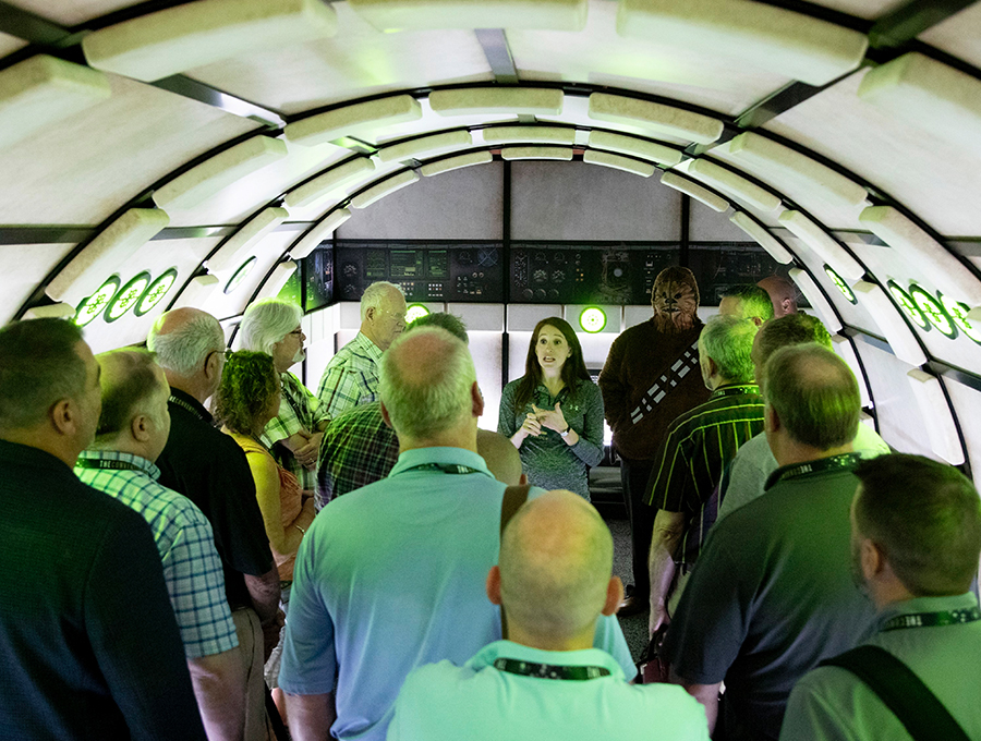
Exhibitor: GE Appliances, a Haier company Design/Fabrication: Classic Exhibits Inc., Portland, OR, 503-652-2100, www.classicexhibits.com Design: Deckel and Moneypenny Inc., Louisville, KY, 888-501-7469, www.deckelmoneypenny.com System: Classic Exhibits Inc. Event: Nationwide Marketing Group PrimeTime, 2019 Budget: $150,000 – $249,000 Size: 80-by-110 feet (16-by-30-foot experience) Photo: Kertis Creative To accomplish its goals at the 2019 Nationwide Marketing Group PrimeTime show, GE Appliances, a Haier company, needed nothing short of a Jedi mind trick. GE needed a way to draw attention to an out-of-this-world sponsorship. Its Profile Series line of appliances would be an official sponsor for the then soon-to-be-released "Star Wars: The Rise of Skywalker." In fact, it had set aside a 16-by-30-foot space within its 80-by-110-foot booth to promote this endeavor. However, The Walt Disney Co., which owns the franchise, forbid GE from referencing past characters and key parts of the upcoming film. Thus, designers at Classic Exhibits Inc. and Deckel and Moneypenny Inc. needed to craft an experience that attendees would immediately connect to the Star Wars franchise but didn't cross lightsabers with Disney's demands. To quote Master Yoda, it was a "Do or do not" situation. After rejecting a host of options, the team finally identified an element that was a constant throughout the movies but that Disney also deemed safe for public consumption: the Millennium Falcon. Thus, the team devised a unique show-floor experience devoted entirely to this upcoming Star Wars sponsorship that wowed not only attendees but also visitors to www.ExhibitorOnline.com, the latter of which ultimately identified this project as the People's Choice Award winner via popular vote. GE's spacey encounter comprised a tunnel-like structure that mirrored the interior of Han Solo's beloved Corellian cruiser. Designers used curved, black powder-coated ClassicModul Aluminum Extrusions and meticulously crafted graphic infills that replicated the spaceship's walls. To simulate its panels, fabricators employed high-density foam, which was cut via computer numeric control (CNC), sanded, shaped, and painted. Custom SuperNova LED lightboxes along the floor and in the walls highlighted the custom graphics. Within the larger exhibit, staff distributed tickets to attendees and explained that they provided access to a fall promotion reveal of some sort. Costumed ushers collected these tickets at the entrance and distributed bags of fresh popcorn. As staff pulled back a curtain, attendees found themselves transported to the magical world of Star Wars, much to their surprise and kids-at-heart delight. After attendees meandered within this alien yet familiar world, a GE Profile brand manager explained the new sponsorship. Once attendees exited the structure, they watched a trailer for "The Rise of Skywalker" and discovered a display of GE Profile appliances wrapped in Star Wars-themed graphics. Despite a battery of challenges on par with a Death Star assault, designers organized a fierce resistance. And according to scores of People's Choice voters, the Force was strong with this solution.  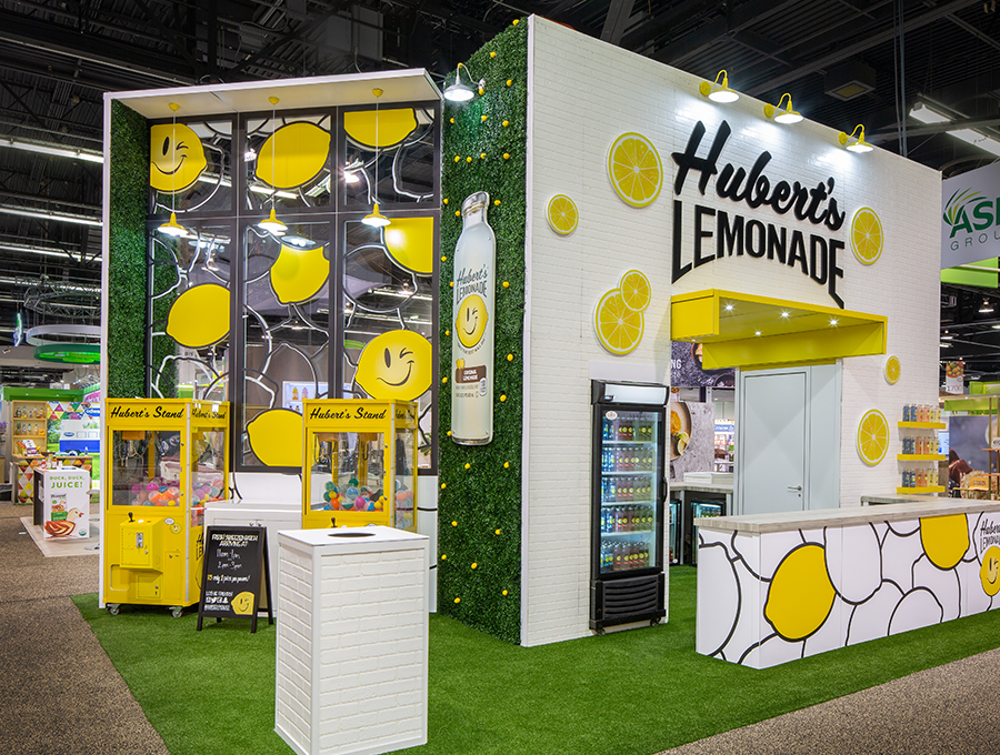
(1,000 Square Feet or More) Exhibitor: The Coca-Cola Co. (Hubert's Lemonade) Design/Fabrication: ExpoMarketing Group LLC, Tustin, CA, 949-861-7344, www.expomarketing.com System: Aluvision Inc. Event: Natural Products Expo West, 2019 Budget: $40,000 – $79,000 Size: 20-by-30 feet Photo: Exposures Ltd. If Pharrell Williams' "Happy" song were an exhibit, it'd be this cheerful creation for Hubert's Lemonade, a brand of The Coca-Cola Co. Incorporating faux fruit, artificial turf, and the company's logo featuring a lemon with a "winky" face, the 20-by-30-foot stand certainly brought a smile to judges' faces. However, it no doubt made the firm's marketers cheery too, as the booth was a rental structure with a price tag in the range of $40,000 to $79,000. Debuting at Natural Products Expo West and featuring an Aluvision Inc. system, the booth served as a sizeable sampling station, allowing visitors to taste test lemonade flavors such as blood orange, watermelon, and mango. To foster an open environment and clearly brand the locale as Hubert's hub, designers at ExpoMarketing Group LLC positioned a towering pass-through structure in the center of the footprint. While its height fostered visibility, the construction's whimsical graphics and industrial lighting made sure the brand name didn't go unnoticed. To further amplify the sense of prominence â?" and to offer seating areas for those who preferred to sit and sip â?" designers incorporated a Plexiglas wall that protruded from the main configuration. While the wall was peppered with vinyl graphics of colorful lemons, it still retained enough transparency to maintain sight lines. The stand's 3-D logos, bright-yellow shelving, faux moss, and artificial turf flooring complemented the brand and wowed the judges. "This booth really stands out from the rest," said one juror. "The colors, graphics, and textures pair perfectly with the brand's fun, happy feel."  
(1,000 Square Feet or More) Exhibitor: The Coca-Cola Co. (Hubert's Lemonade) Design/Fabrication: ExpoMarketing Group LLC, Tustin, CA, 949-861-7344, www.expomarketing.com System: Aluvision Inc. Event: Natural Products Expo West, 2019 Budget: $40,000 – $79,000 Size: 20-by-30 feet Photo: Exposures Ltd. If Pharrell Williams' "Happy" song were an exhibit, it'd be this cheerful creation for Hubert's Lemonade, a brand of The Coca-Cola Co. Incorporating faux fruit, artificial turf, and the company's logo featuring a lemon with a "winky" face, the 20-by-30-foot stand certainly brought a smile to judges' faces. However, it no doubt made the firm's marketers cheery too, as the booth was a rental structure with a price tag in the range of $40,000 to $79,000. Debuting at Natural Products Expo West and featuring an Aluvision Inc. system, the booth served as a sizeable sampling station, allowing visitors to taste test lemonade flavors such as blood orange, watermelon, and mango. To foster an open environment and clearly brand the locale as Hubert's hub, designers at ExpoMarketing Group LLC positioned a towering pass-through structure in the center of the footprint. While its height fostered visibility, the construction's whimsical graphics and industrial lighting made sure the brand name didn't go unnoticed. To further amplify the sense of prominence – and to offer seating areas for those who preferred to sit and sip â?" designers incorporated a Plexiglas wall that protruded from the main configuration. While the wall was peppered with vinyl graphics of colorful lemons, it still retained enough transparency to maintain sight lines. The stand's 3-D logos, bright-yellow shelving, faux moss, and artificial turf flooring complemented the brand and wowed the judges. "This booth really stands out from the rest," said one juror. "The colors, graphics, and textures pair perfectly with the brand's fun, happy feel."  
(1,000 Square Feet or More) Exhibitor: Dermira Inc., a subsidiary of Eli Lilly and Company Design/Fabrication: Access TCA Inc., Whitinsville, MA, 508-234-9791, www.accesstca.com System: BeMatrix USA Event: American Academy of Dermatology Annual Meeting, 2019 Budget: $250,000 – $499,000 Size: 20-by-40 feet Photo: Padgett and Company Inc. Few exhibitors have harnessed the power of an overhead space better than Dermira Inc., a subsidiary of Eli Lilly and Company. At the American Academy of Dermatology Annual Meeting, the biopharmaceutical firm flipped the script, delivering a "party on top, business down below" environment that prompted judges to employ adjectives such as "dynamic," "exciting," and "memorable." Designed by Access TCA Inc. using components from BeMatrix USA, the booth had a mission to educate attendees about Dermira's new medication, Qbrexza. To that end, designers concocted several floor-based kiosks made of BeMatrix components and branded exclusively with the Qbrexza name. The central focus of the stand, however, was the dynamic overhead element comprising three heavily branded fabric rings surrounding a kinetic lighting installation. Here, roughly 100 internally lit orbs dangled via motorized wires, allowing the spheres (which alternated between varying hues of white and blue) to form shapes, undulating patterns, and random yet artistic arrangements. While a traffic builder all its own, this structure used practically every square inch of the footprint's overhead space.  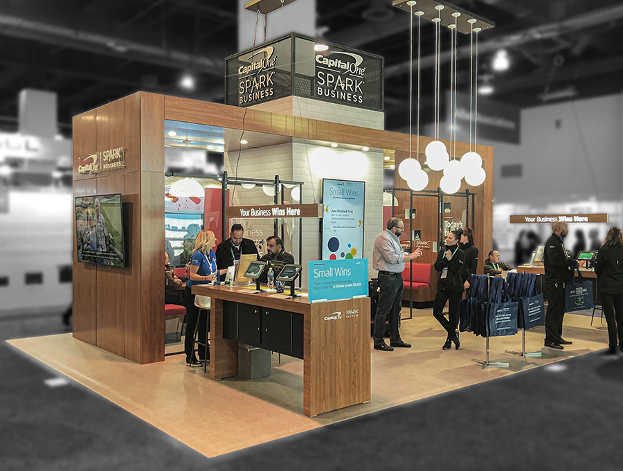
Exhibitor: Capital One Financial Corp. (Spark Business) Design/Fabrication: Cardinal Expo Inc. (dba CX Exhibits), New Orleans, 504-723-1359, www.cxexhibits.com System: BeMatrix USA Event: SuperZoo, 2019 Budget: $250,000 – $499,000 Size: 20-by-30 feet Photo: Cardinal Expo Inc. (dba CX Exhibits) The Spark Business division of Capital One Financial Corp. needed a new exhibit that could accommodate configurations ranging from a 10-by-20-foot in-line to a 20-by-30-foot island. In addition, it hoped to create an inviting and visually captivating exhibit similar to what is found in Capital One Cafe locations across the country. To that end, the firm tasked Cardinal Expo Inc. (dba CX Exhibits) with designing a welcoming and contemporary reconfigurable exhibit. The resulting stand employed a BeMatrix USA system and contained a unique "story pod" element. Enclosed by transparent Plexiglas, each pod resembled a recording studio where attendees could sit down with staff and record their personal business journeys and success stories. Complete with "Recording" signs and retro microphones, the pods were private enough to capture audio but visually open so passing visitors were intrigued by the happenings inside. Staff then collected these recordings for possible use in marketing campaigns related to small-business owners. Depending on its size, each exhibit contained one to two story pods and an adjoining L- or U-shaped wall – the combination of which offered a pair of weight-conscious decor elements: a white subway-tile fabric and a warm wood-laminate facade. Judges lauded the design as "a beautifully consistent branded experience regardless of booth size." However, attendees likely cared less about the concept and more about how telling their stories â?" and having them heard â?" made them feel.  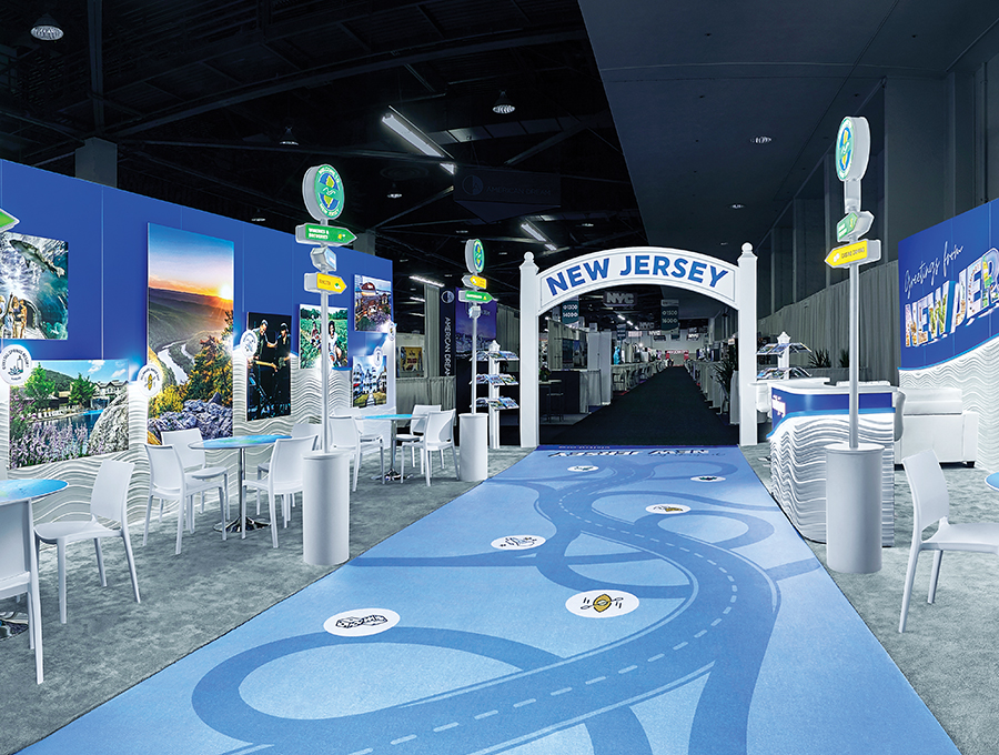
Exhibitor: State of New Jersey, Division of Travel and Tourism Design/Fabrication: Novak Birch Inc., Baltimore, 609-313-1428, www.novakbirch.com System: Agam Group Ltd. Event: International Pow Wow, 2019 Budget: $250,000 – $499,000 Size: 30-by-30 feet Photo: Proto Image When it came time to purchase a new stand, the State of New Jersey's travel and tourism division had a list of objectives almost as long as the Jersey shoreline. First and foremost, it hoped to highlight the state's diverse vacation and entertainment options. However, the design also needed to incorporate separate meeting locales for multiple destination-management organizations (DMOs). Plus, marketers wanted a modular construct that could morph from a 10-by-10 in-line to a 30-by-30-foot island. Working with designers at Novak Birch Inc., the team settled on a captivating design whose road-trip theme drove visitors to the Garden State and rose to the top of the Best Use of Graphics category. In its 900-square-foot iteration at the travel industry's International Pow Wow, the design featured a literal and thematic pathway down the center. Comprising printed vinyl flooring, the trail included imagery of winding thoroughfares and iconography referencing New Jersey's roadside destinations. Along both sides, designers positioned freestanding wayfinding signposts whose directional arrows called out additional attractions, such as casinos, outdoor recreation, and farm-to-table dining options. Walls made from Agam Group Ltd. components enclosed the floor plan on two sides and provided space for ample messaging, including 3-D backlit letters and eye-catching photographs highlighting more popular destinations. While these thematic graphic elements likely wooed attendees, they definitely pleased judges, who lauded them as "intriguing," "relevant to the objectives," and "consistent and well-executed across different mediums."  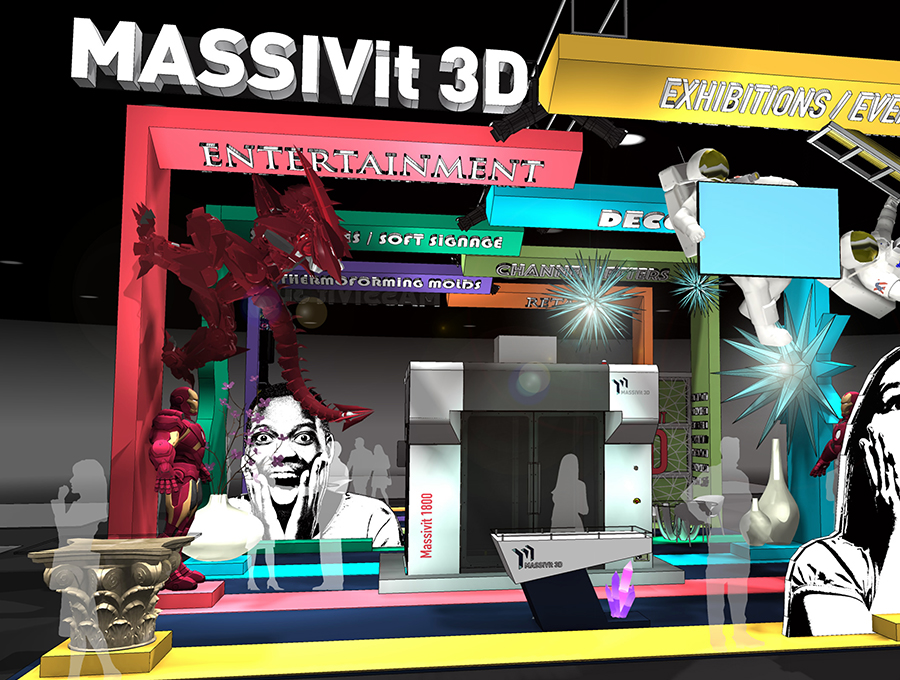
Exhibitor: Massivit 3D Printing Technologies Ltd. Design: CenterPoint Marketing Inc., Woodbury, MN, 651-578-3606, www.centpoint.com; Exhibitre LLC, Minneapolis, 952-201-3172, www.exhibitre.com System: BeMatrix USA, Moss Inc. Event: Printing United, 2019 Budget: $150,000 – $249,000 Size: 30-by-50 feet Hailed by jurors as "a superb example of exhibit storytelling" and "a wonderful use of scale and whimsy within a fun and disruptive space," this rendering is the inaugural winner of the Best Conceptual Design category. Come entry time, many entrants had few newly realized stands to share due to the harsh economic realities of COVID-19. As such, EXHIBITOR devised a category open to design concepts. That is, if you could dream it with portable or modular components, you could enter it – so long as the design obeyed the laws of physics. This stellar concept came from CenterPoint Marketing Inc. and Exhibitre LLC. The unbuilt design was intended for large-format 3-D printing firm Massivit 3D Printing Technologies Ltd. The exhibitor wanted to showcase its market applications and leverage the scale and wow factor afforded via this type of printing. It didn't take a quantum leap of logic to realize the best way to tout Massivit's offerings was to walk the walk by employing the resulting work and perhaps even the printing tools within the stand itself. Based on these parameters, designers conceived a 30-by-50-foot booth featuring BeMatrix USA components paired with silicone-edge graphics from Moss Inc. Using these elements, they concocted a series of nontraditional overhead constructs in L-shaped forms, which provided both identification and market-related messaging, and attached large-format thematic elements (such as dragons and astronauts) that could be seen from across the show hall. Designers also employed a different hue for each L-shaped element as well as the flooring beneath it, which helped to delineate the markets and potential 3-D-printed components within them. Finally, they positioned a working 3-D printer in the center of the footprint, allowing visitors to better understand the practical machinations behind the magic in this enchanted space.  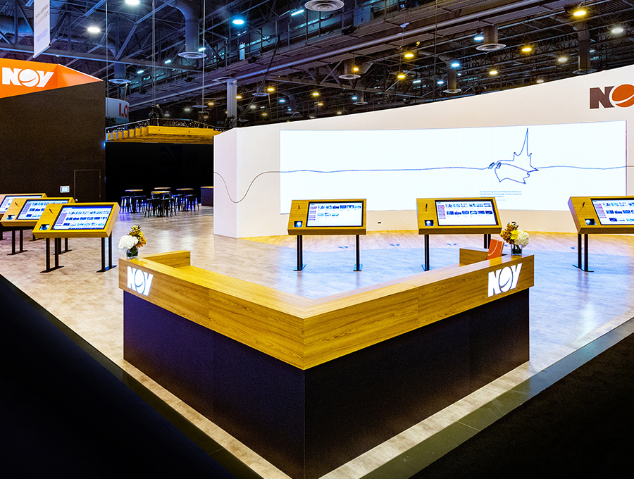
(1,000 Square Feet or More) Exhibitor: National Oilwell Varco Inc. Design/Fabrication: 2020 Exhibits Inc., Houston, 713-354-0900, www.2020exhibits.com System: Octanorm North America Inc. Event: Offshore Technology Conference, 2019 Budget: $500,000 – $749,000 Size: 50-by-80 feet Photo: 713 Photography Oil- and gas-drilling equipment is about as personable as a porcupine. But at the Offshore Technology Conference, National Oilwell Varco Inc. hoped to set itself apart by trading a booth full of titanic drilling equipment for one built around personal connections and interactive experiences. Crafted by 2020 Exhibits Inc. using components from Octanorm North America Inc., the 50-by-80-foot booth comprised an eye-catching environment filled with sharp, angular structures and sloping walls. Within the layout, designers created five key areas for attendees to interact with NOV content and staff. Front and center was a curved, 6-by-20-foot wall that contained 120 LED tiles. Here, attendees could stand atop five sets of footprints in front of the structure, which were accompanied by text such as "sustainable future" and "quality wellbores." Once their tootsies were in place, the wall's motion sensors activated and played a short video about the respective topic. Visitors could also learn more about NOV's offerings via six learning stations, each of which held a 49-inch touchscreen and a Bose-brand headset that helped attendees shut out the show-floor din and soak in NOV's messaging. On the far back corner of the booth, designers incorporated an open and inviting hospitality area whose wooden-beam ceiling added an air of coziness and intimacy. Meanwhile, a fully enclosed conference room afforded a cozy corner for in-depth conversations, and a walled lounge complete with sofas and comfy chairs gave VIPs a quiet retreat. Attendees flocked to these environs, and jurors delighted in designers' efforts as well. "I especially appreciated the thought put into the design and the ambiance of the conference and lounge spaces, which are so often neglected," one juror remarked. Indeed, NOV delivered a thoughtful design that traded pumps and pipelines for personal interactions.
2021 Judges
Entries were scored by a two-part panel of marketing and design experts who evaluated both the aesthetic qualities of the entries as well as their functionality, practicality, suitability, messaging, and marketing capabilities. Design Panel Jeff Bartel, executive art director, co-founder, Nemo Design, Portland, OR Matthias Braun, creative director, Studio Atelier Damböck Messebau GmbH, Munich Chris Fredericksen, global head of creative, Pinnacle Exhibits, Hillsboro, OR Suzanne Morsch, founder, Su, Design Us, Woerden, Netherlands Kimberly Tyner, partner and chief creative officer, Spire Agency, Dallas Marketing Panel Diana Barnes, chief brand officer and creative director, Munchkin Inc., Van Nuys, CA Glenda Brungardt, CTSM, global events manager, HP Inc., Fort Collins, CO Chris LaRoy, director, industry events and trade shows, Cox Automotive Inc., Atlanta Annette McClure, CTSM, CSEP, account manager, trade shows and events, Nationwide Childrenâ?Ts Hospital, Columbus, OH Victor Torregroza, brand experiences program manager, global event marketing, Intel Corp., Santa Clara, CA
|
|
|
||||||||||||||||||||||||||||
|
|
||||||||||||||||||||||||||||
|
TOPICS Measurement & Budgeting Planning & Execution Marketing & Promotion Events & Venues Personal & Career Exhibits & Experiences International Exhibiting Resources for Rookies Research & Resources |
MAGAZINE Subscribe Today! Renew Subscription Update Address Digital Downloads Newsletters Advertise |
FIND IT Exhibit Producers Products & Services All Companies Get Listed |
EXHIBITORLIVE Sessions Exhibit Hall Exhibit at the Show Registration |
ETRAK Sessions Certification F.A.Q. Registration |
EDUCATION WEEK Overview Sessions Hotel Registration |
CERTIFICATION The Program Steps to Certification Faculty and Staff Enroll in CTSM Submit Quiz Answers My CTSM |
AWARDS Exhibit Design Awards Portable/Modular Awards Corporate Event Awards Centers of Excellence |
NEWS Associations/Press Awards Company News International New Products People Shows & Events Venues & Destinations EXHIBITOR News |
||||||||||||||||||||
|
||||||||||||||||||||||||||||


