


|
REGISTRATION REQUIRED
small booths
Smalls of Fame
It's no surprise that small booths typically carry a negative connotation, considering most 10-by-10- and 10-by-20-foot exhibits underwhelm with uninspired designs, lackluster displays, and cluttered graphics. So to ensure you don't end up with a Birkenstock-boring booth, here are 10 examples whose aesthetic appeal and multifunctionality made EXHIBITOR staff take note – and take pictures. By Linda Armstrong
Images: beauty industry group inc., Katherine Frank Creative Inc., Intervine inc., Intervine Inc. StormTrap, Padgett and Company Inc.
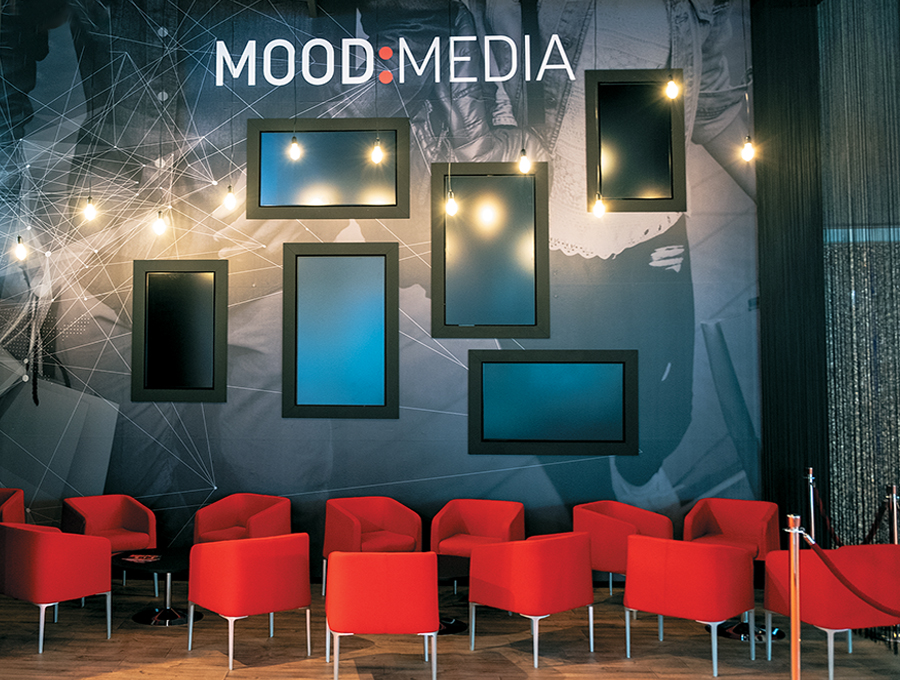 In-store media solutions, including everything from scent marketing to sound masking, are designed to set the tone and exude a specific atmosphere. So Mood Media Corp., which provides these offerings and more, wanted to create a similarly experiential space at Integrated Systems Europe in Amsterdam. Thus, the firm turned its exhibit into a veritable media lounge that maintained a product and conversational focus yet made the most of every inch of its minimal in-line space. Using a dark color palette throughout, designers crafted a roughly 12-foot-tall back wall featuring inset monitors in landscape and portrait orientations that offered capabilities videos, product presentations, and attract loops. But the majority of the environment was meant for lounging via the 14 Mood Media-red chairs arranged in casual conversational groupings and placed under a smattering of Edison bulbs. While a functional hospitality-staging area occupied the left part of the space, the right corner was delineated by classic theater-style stanchions and a semitransparent drape made of string – both of which furthered the luxe lounge experience. 
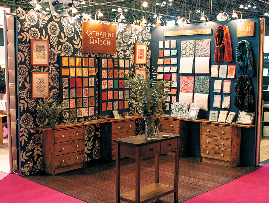 When creativity is your main differentiator, your booth had better scream "one of a kind." This little gem for Katharine Watson delivered. As the creative mastermind of the business bearing her name, designer Katharine Watson creates block-printed paper goods and textiles, including everything from calendars and foil-stamped cards to coasters and gift tags. So in addition to demonstrating her creative capabilities at the National Stationery Show, she also needed to cram oodles of product into her 10-by-10-foot space and somehow stand out from the sea of small stands surrounding hers. While the booth featured more than 100 different product samples without feeling even a tad bit congested, it also managed to exude the essence of an authentic crafter's studio. Mixing printed wallpaper, scarves, wooden dressers, and a table (which held countless other product samples), the design successfully combined colors, textures, forms, and finishes. By grouping displays into organized grids, Watson crafted a space that, while brimming with myriad products, was admirably organized. Ultimately, the booth bypassed kitsch and epitomized adjectives such as "urbane" and "sophisticated."
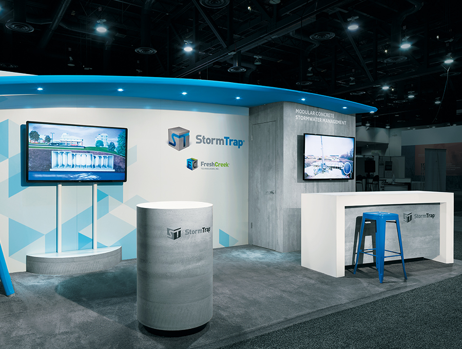 When one thinks about stormwater management, the words "polished" and "contemporary" don't usually come to mind. But somehow, designers at 3D Exhibits Inc. managed to conjure an in-line exhibit that embodied those two adjectives and more. Going into the International Council of Shopping Centers RECon show, StormTrap, a provider of stormwater management solutions including detention, infiltration, treatment, and rainwater-harvesting systems, wanted its stand to not only offer an industrial vibe but also give off a somewhat chic and sophisticated feel. This simple but sublime design delivered via a bare-bones back wall (highlighted by two flatscreens), a reception counter, and an aisle-side podium, all of which comprised wood constructions with faux-concrete finishes. However, an angular back-wall fabric canopy with inset lighting along with industrial stools – both of which featured the company's corporate blue hue – added a splash of color and style to the functional yet refined booth.
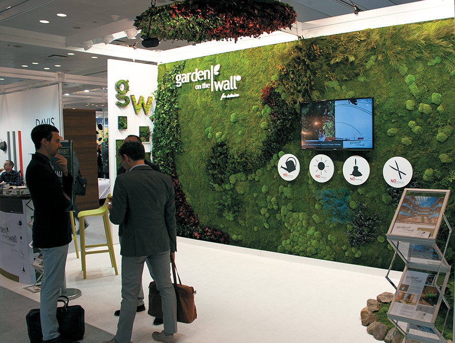 Greenhouse Effect Ninety-nine percent of the time, covering your entire back wall with your product is a surefire way to create a cluttered mess – and to turn away the majority of the show's visitors. But at Boutique Design New York, Garden on the Wall was in the 1 percent, as slathering its product across a 10-by-20-foot canvas created a near-perfect display. Garden on the Wall provides what it calls maintenance-free vertical garden installations. In effect, it uses preserved plants to create structures that can last an average of seven to 10 years and require no watering, light, or soil. At BDNY, then, the company created a gorgeous display that bordered on artwork and adorned it with minimal accoutrements, including a cutout of the firm's logo, a monitor offering an ongoing capabilities presentation, and four circular icons communicating the garden's minimal upkeep. Granted, not every exhibitor's product is appropriate for a full-wall display, but this example shows when and how a 1-percent application can work.
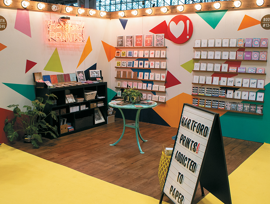 Hartford Prints, a provider of letterpress greeting cards, urban streetwear, and more, wanted to make sure its 10-by-10-foot exhibit stood out at the National Stationery Show. So it employed a trio of tactics, including bright colors, integrated lighting, and couldn't-miss messaging. A series of boldly colored triangles adorned the space's two walls and quickly caught the eyes of passersby while a wooden header equipped with 17 exposed lightbulbs drew further attention. A neon sign fashioned into the company's logo gave off additional illumination and branded the space.
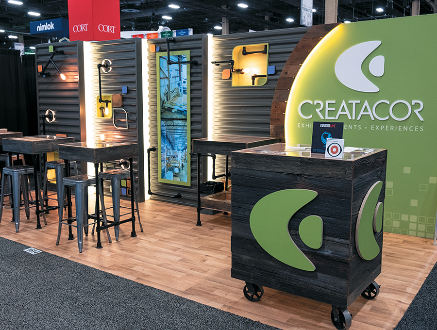 An industrial aesthetic is certainly on trend, but it also happened to be the perfect vibe for Creatacor Exhibits & Displays Inc., which was hoping to demo its custom, modular, and rental capabilities at EXHIBITORLIVE. The firm's 10-by-20-foot exhibit featured an eye-catching back wall with various embedded lighting elements. Comprising a core of six b62 wall frames from BeMatrix USA, the structure included powder-coated, corrugated-metal panels; reclaimed-wood framing; two vertically stacked monitors; and black-pipe light fixtures with Edison bulbs. On the right end, a corporate-green fabric panel intermixed with the industrial components, and white cut-out letters formed the Creatacor name. However, comfy conversation areas made up the bulk of the footprint. After chatting up staff at a reception desk comprising reclaimed wood and metal castors, visitors could relax and further talk shop at various bistro-height tables and retro stools.
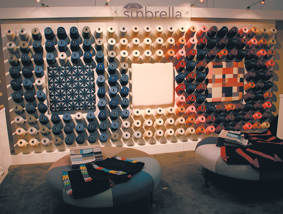 When you want to highlight the depth and breadth of your upholstery fabrics, nothing gets the job done like a wall full of colorful spools of yarn. At the Boutique Design New York show, Glen Raven Custom Fabrics LLC devised this alluring display to promote its Sunbrella brand. The company's 10-by-20-foot exhibit featured 192 different spools of yarn and three fabric-covered squares that designers crafted into an artistic arrangement. Adorned by a few overhead lights and ottomans, the simple design communicated the core of Sunbrella's offerings.
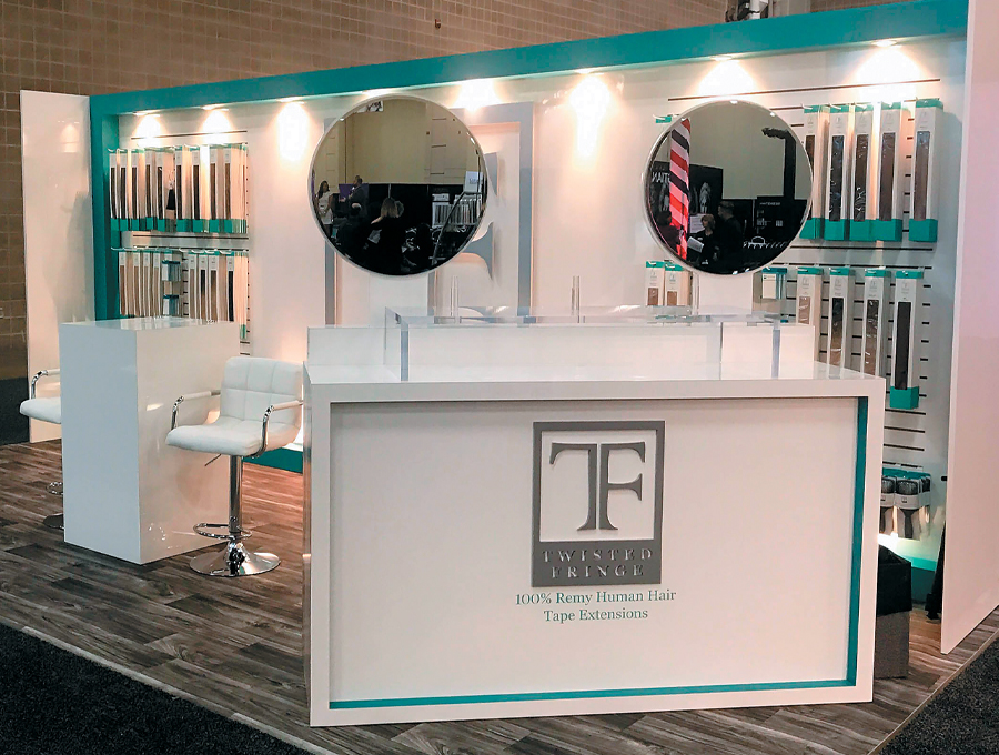 When Beauty Industry Group Inc. launched its Twisted Fringe brand of hair extensions, it crafted a series of point-of-purchase displays to market the line in retail locations. So when it came time to exhibit at the Armstrong McCall World's Fair, Twisted Fringe marketers wanted a look and feel similar to the POP displays and an environment that exuded "high-end simplicity." Designers at Katherine Frank Creative Inc. delivered with this 10-by-20-foot modular stand that maintained a sophisticated style while giving a nod to a traditional salon environment. Combining a white palette with straight lines and sleek surfaces throughout, designers focused visitors' attention on the back wall. Here, the logo took center stage while rows of product offerings appeared on both sides courtesy of a slat-wall system. Designers also paired bright-white lighting and salon-style chairs with dark faux-wood flooring, creating a look that mirrored the POP displays.
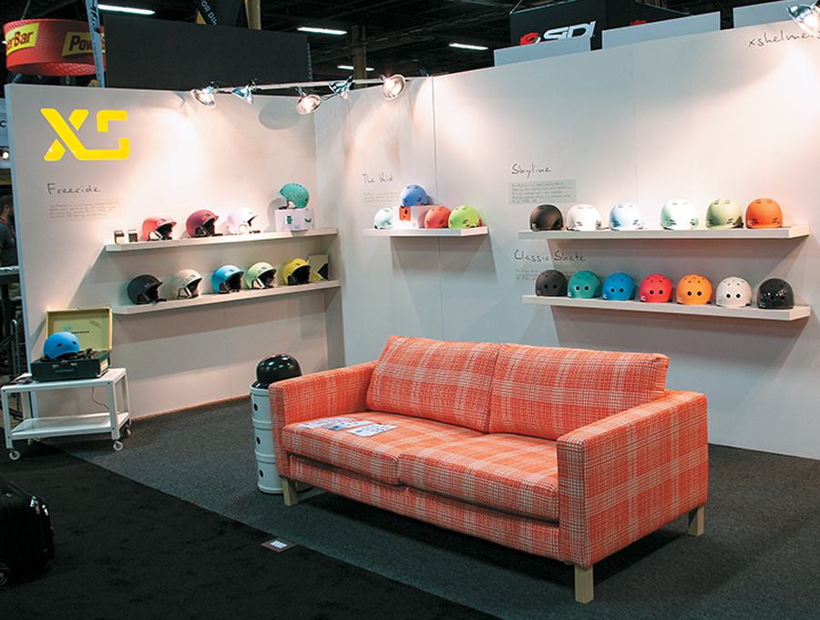 Lighting – or a lack thereof – plays a powerful role in exhibiting, as evidenced by this stand at Interbike. Wishing to draw attention to its various brands of biking helmets and socks, XS Unified devised an uber-simplistic space that kept attendees' eyes trained on its products. In-house designers fastened colorful socks to stark-white walls and perched helmets upon simple wall-attached shelving. Aside from a bright orange couch that beckoned attendees to drop in and take a load off, the exhibit's only accoutrements were minimalist black graphics that designers positioned on the wall next to each set of product displays. However, in what was a relatively dark venue, almost every one of the company's products would have practically disappeared had it not been for the handful of spotlights, which were suspended via framing across the two corners of the booth, along with an internally lit logo that added a pop of color. Pairing a plethora of light with colorful displays and pristine product placement, this little booth had a outsized presence that belied its humble footprint.
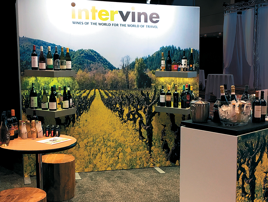 A picture says a thousand words – especially if it's a stunning booth graphic that's perfectly in tune with your company's wares. That was certainly the case with this charming 10-by-10 for Intervine Inc. Hoping to lure in airline- and travel-industry wine buyers at the International Flight Services Association Expo, the international wine-management firm handed Skyline Exhibits $10,000 (to cover everything from the booth and flooring to installation and shipping) and asked for an eye-popping display that would immediately communicate its offerings, draw visitors to the stand, and tempt them to try the wine or even sit down and talk shop. Actually affixed to the front of a storage closet, the back-wall graphics featured vibrant vineyard imagery, which was further accentuated by attached lighting and customized shelving that inconspicuously displayed the various wine offerings. A simple desk at the front of the space bore a similar vineyard image and acted as an informal tasting station. Meanwhile, two stools of rough-hewn wood and a circular table provided ample space for wine buyers to relax and sample the goods.
|
|


|
||||||||||||||||||||||||||||
|
|
||||||||||||||||||||||||||||
|
TOPICS Measurement & Budgeting Planning & Execution Marketing & Promotion Events & Venues Personal & Career Exhibits & Experiences International Exhibiting Resources for Rookies Research & Resources |
MAGAZINE Subscribe Today! Renew Subscription Update Address Digital Downloads Newsletters Advertise |
FIND IT Exhibit Producers Products & Services All Companies Get Listed |
EXHIBITORLIVE Sessions Exhibit Hall Exhibit at the Show Registration |
ETRAK Sessions Certification F.A.Q. Registration |
EDUCATION WEEK Overview Sessions Hotel Registration |
CERTIFICATION The Program Steps to Certification Faculty and Staff Enroll in CTSM Submit Quiz Answers My CTSM |
AWARDS Exhibit Design Awards Portable/Modular Awards Corporate Event Awards Centers of Excellence |
NEWS Associations/Press Awards Company News International New Products People Shows & Events Venues & Destinations EXHIBITOR News |
||||||||||||||||||||
|
||||||||||||||||||||||||||||