|
REGISTRATION REQUIRED
design awards
Video Player is loading. silver award
Category: Double-Deck Exhibit
Exhibitor: Marmite Sp. Zo. o.
Design/Fabrication: Smart Design Expo Sp. Zo. o., Przezmierowo, Poland, 48-61-642-714, www.smartdesign-expo.com Show: ISH, 2019
Budget: $150,000 – $249,000
Size: 62-by-32 feet (3,049 square feet, including second-story space)
PHOTOS: PATRYK LEWINSKI
Subterranean Style
By Ben Barclay
At ISH, a German trade fair well-known for setting bathroom-
design trends, Marmite Sp. Zo. o. rolled out a
double-deck exhibit crafted almost entirely of white
marbled laminate to showcase its lines of washbasins,
shower trays, and bathtubs. "The monochromatic color
palette was probably a risk at a show where there were
no doubt tons of white fixtures," said one Exhibit Design
Awards juror. "But here it's highly successful."

On the Rocks
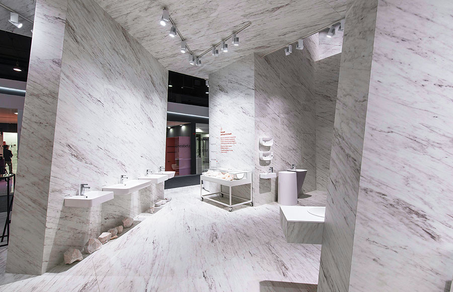
To implicitly reflect its use of natural composites, Marmite
charged Smart Design Expo Sp. Zo. o. with designing a
stand inspired by white dolomite caves. "Marmite asked
us to create an innovative concept that presented its
brand in an inspiring and
intriguing way," said
Marzena Michalska, designer
and art director at
Smart Design Expo. Massive
23-foot-tall sloping
walls arranged at surprising
angles interrupted sight
lines to create a dynamic
atmosphere. Walking
around each turn felt like
entering an unexplored
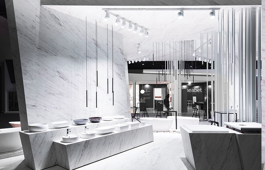
grotto where black lamps hung low over product displays
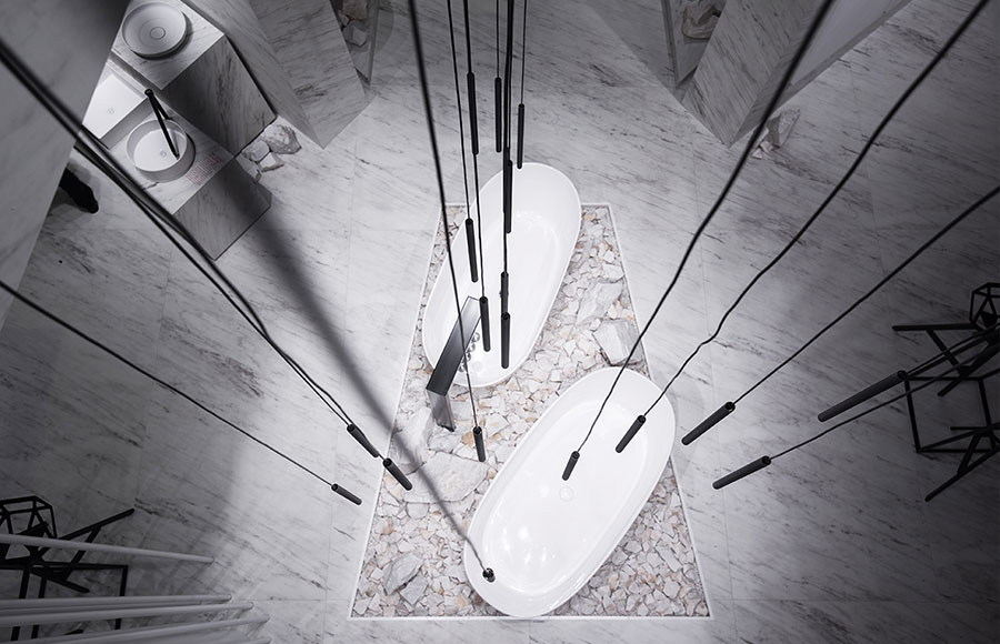
like stalactites. At the heart of the exhibit, a pair of white
tubs sat atop a bed of dolomite rocks, as if resting on a
cavern floor. Above the tubs, suspended lights emerged
from a hole in the ceiling, giving visitors the impression of
standing below yet another cavernous room. Robust white
support pillars were surrounded by thin Plexiglas poles to
resemble clusters of natural cave columns. Taking its inspiration from white dolomite caves, Smart Design Expo Sp. Zo. o. showcased Marmite Sp. Zo. o.'s sleek bathroom fixtures by displaying them amid unpolished rock. Climbing the steps to the second level felt like ascending a subterranean corridor as the marbled walls loomed on each side. The minimalist setting helped draw attention to the sparse bursts of color resulting from the few graphics in the company's corporate red hue and a smattering of pewter, bronze, and black basins that stood in stark contrast among the white elements and fixtures. Marmite reaped plenty of attention from judges with its caverninspired strategy, proving that some design risks, like caves, are well worth exploring. E 


|
|
|
||||||||||||||||||||||||||||
|
|
||||||||||||||||||||||||||||
|
TOPICS Measurement & Budgeting Planning & Execution Marketing & Promotion Events & Venues Personal & Career Exhibits & Experiences International Exhibiting Resources for Rookies Research & Resources |
MAGAZINE Subscribe Today! Renew Subscription Update Address Digital Downloads Newsletters Advertise |
FIND IT Exhibit Producers Products & Services All Companies Get Listed |
EXHIBITORLIVE Sessions Exhibit Hall Exhibit at the Show Registration |
ETRAK Sessions Certification F.A.Q. Registration |
EDUCATION WEEK Overview Sessions Hotel Registration |
CERTIFICATION The Program Steps to Certification Faculty and Staff Enroll in CTSM Submit Quiz Answers My CTSM |
AWARDS Exhibit Design Awards Portable/Modular Awards Corporate Event Awards Centers of Excellence |
NEWS Associations/Press Awards Company News International New Products People Shows & Events Venues & Destinations EXHIBITOR News |
||||||||||||||||||||
|
||||||||||||||||||||||||||||


