


|
REGISTRATION REQUIRED
graphics
10 Small-Booth Graphic Gaffes
Small-exhibit graphics are a lot like boutique storefronts. In the three- to five-second glimpse typically afforded you by passersby, they must capture attention, communicate what you offer, and entice visitors to enter your space. If your graphics are successful, attendees will stop to learn more. If they flop, folks will likely waltz into the open arms of your competitors. So how do you ensure your small-booth graphics are a hit? Often, it helps to reverse engineer the issue by examining what not to do. Here are 10 of the most common 10-by-10 graphic mistakes along with rules to help you understand what you should do instead. By Linda Armstrong
 Pixelated images – often the result of using photos with low resolution – can ruin the exhibit's impact and tarnish perceptions of your brand.
Poor Image Quality"Images usually perform double duty as both the main attraction element and the focal point of your graphics," says Robert Duffany, graphic designer at Hill & Partners Inc. "But pixelated images, where the resolution is too low for the size of the panels, can ruin not only the graphics but also the impact of the entire exhibit." What's more, pixelated images can make you look unprofessional, says Martha Barnard, marketing manager at E4 Design, a Freeman company. "Poor-quality images can make attendees question whether your lack of attention to detail will carry through to your product or service." Rule: Always consult an experienced designer to determine the necessary resolution for your size parameters. But as a general rule, back-wall images should be a minimum of 200 dpi, and something closer to 300 dpi is preferred.
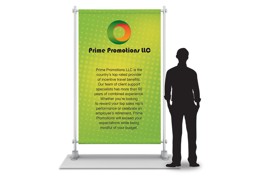
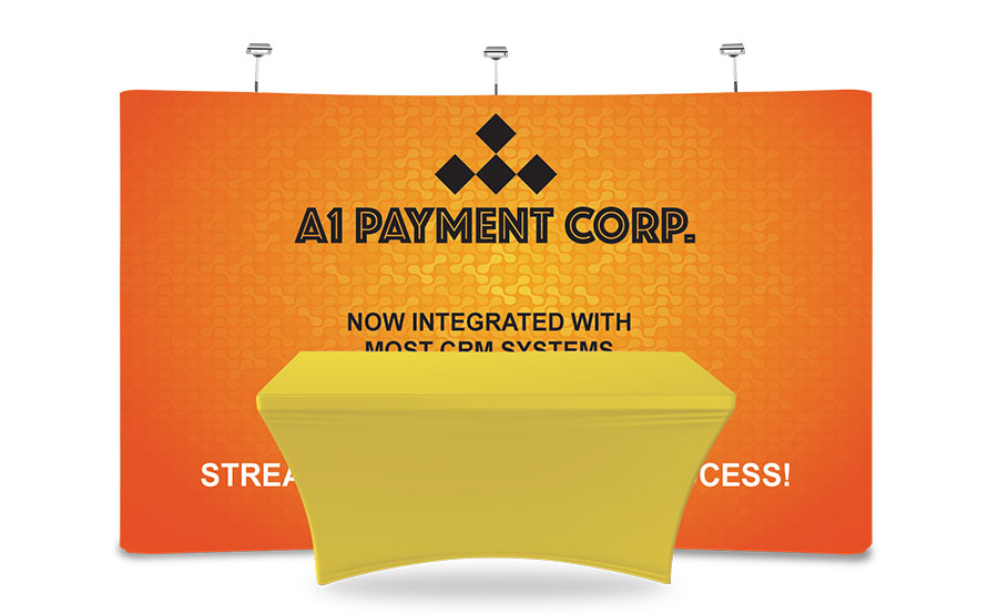 Text placed on the bottom two-thirds of your graphics will likely be obscured by staffers
and exhibitry.
Haphazard Image and Text PlacementMost exhibitors understand that the eye-level zone across the top of the back wall is the most effective location for text, says Kevin Fett, president of Ion Exhibits. But they often fail to account for other exhibitry, e.g., tablet stands, desks, etc., that can block attendees' view of their messages. Text and image placement are even more important if you're using silicone-edge graphics. According to Mackenzie Skipper, graphic designer at SEG Systems LLC, text on these surfaces should be located a few inches in from the edge of the panel so it doesn't get lost or distorted when the fabric's silicone bead is inserted into the side of the frame. Rule: Situate text within the top one-third of the panel and consider how the placement of other exhibitry and framing structures will impact viewing.
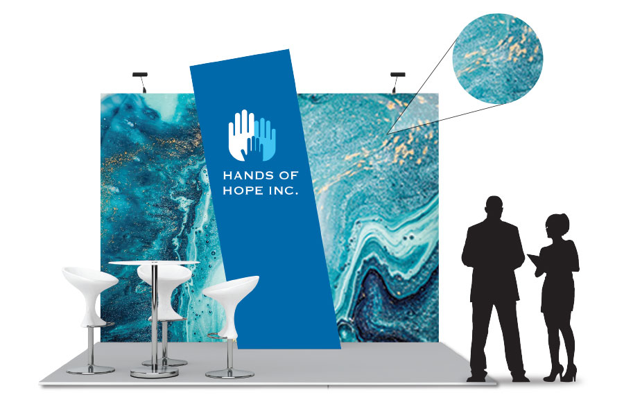
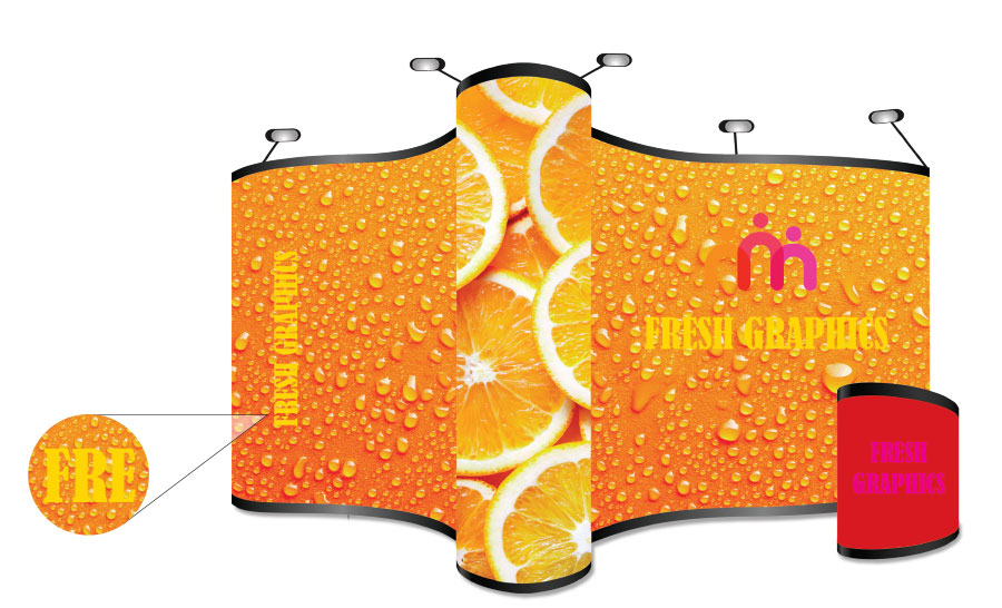
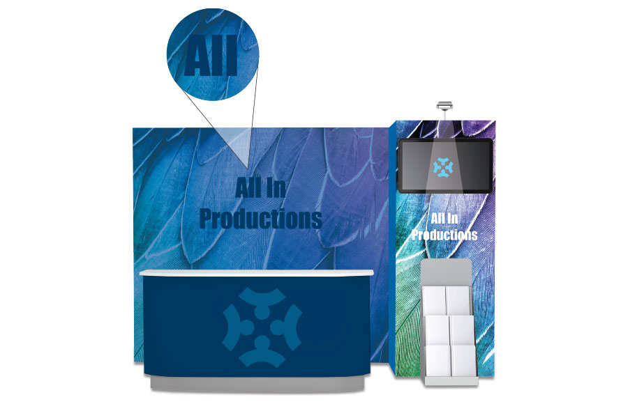
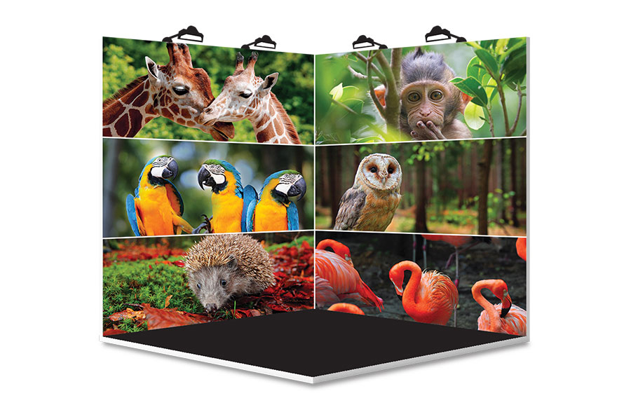 Multiple back-wall images force attendees' eyes to bounce across your graphic and detract from your messaging objectives.
Inferior Image SelectionWhen you have such a limited amount of time to capture attendees' interest, you don't want their eyes bouncing from pic to pic on your graphics, Skipper says. Rather, one big, beautiful image must grab the eye and create some type of connection with attendees – perhaps generating humor, empathy, or curiosity. Once this engagement is established, attendees' eyes will logically fall on your text. Keep in mind that this main image can be independent of text (e.g., a brilliant sunflower on the left side of your panel with text on the right), or you can place an image across the entire panel and layer text on top of it. Either option can be effective as long as you carefully consider readability. Rule: Allow ample time to select a single, strong image that says something about your product or brand and elicits an emotional response in attendees.
 Minus a visual hierarchy, graphics have no focal point, and attendees can't determine which messages are the most important to read.
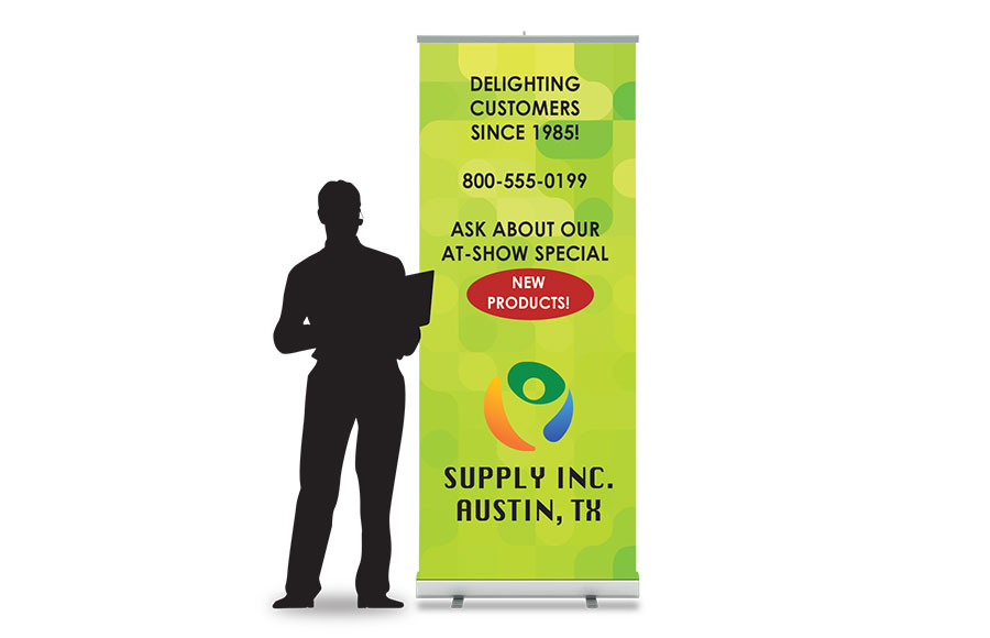
Lack of Visual HierarchyAll graphics meant to communicate messages should have a visual hierarchy that instructs attendees as to what they should examine first, second, third, and so on. Without one, readers search for a focal point – often landing on less-important messaging – or they give up altogether. "Your most critical messages, such as your company logo, product names, or key marketing phrases, should comprise your largest size of text and be located in the most prominent and visible part of your graphics," Duffany says. Text size should diminish in relation to messages' levels of importance, and placement on each panel should be arranged similarly. Rule: Prioritize text and images and then plan a messaging hierarchy so that your most important content receives prominent sizing and positioning.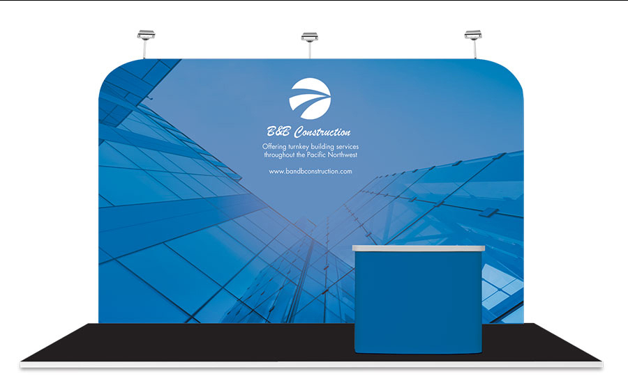 Text that is too small for attendees to read from the aisle is incapable of conveying your key messages.
Teeny TypePassing attendees should never have to squint to read your back-wall text. While type size should vary to ensure a proper messaging hierarchy, words should always be large enough for passersby to easily read them from the aisle. "At almost every show, attendees are at least 12 feet from your back wall," Barnard says. "And as a general rule, text should be 1 inch tall for every 3 feet of distance between attendees and the text. Therefore, all text in your booth should be a minimum of 4 inches tall." Rule: Vary text size according to importance, but ensure all text is at least 4 inches in height.
 Colors that clash with one another, as well as images and text with the same intensity and/or brightness, diminish effectiveness and readability.
Ineffective Color CombinationsClashing colors and imagery can diminish the effectiveness of otherwise well-designed graphics, Duffany says. Limit the colors employed throughout your space and consider using varying shades of the same hue rather than entirely different palettes. Also opt for dark text atop light backgrounds or the reverse (light over dark) to ensure your text remains readable. "Remember that colors may look different on various mediums and finishes," Barnard says. "The same CMYK on a glossy reception-desk laminate may not visually match fabric back-wall graphics." Rule: Employ variations of the same hue to avoid clashing and use light over dark (or dark over light) text/visual combinations to promote readability.
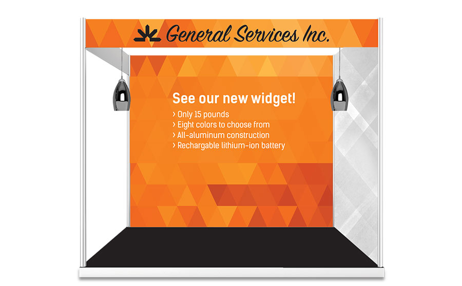 Using your back-wall graphics to convey dry product specs is unlikely to elicit much interest from passing attendees.
Poor Word SelectionMany exhibitors have a tendency to select the wrong verbiage to generate intrigue with showgoers. That is, they often focus on detailed product specs as opposed to what attendees really what to know: what's in it for them. Short benefit statements can quickly illustrate how your products help users, Fett says. Phrase such as "Cut production costs by 30 percent" and "Eliminate data-breach disasters" will both immediately capture attendees' interest and communicate your products' benefits. Rule: Use benefit statements rather than product specs to explain how your offerings can meet attendees' needs.
 Artsy typefaces and text featuring a mishmash of fonts lessen readability and can often fight for attention with your images.
Decorative Fonts"Images are meant to be viewed and appreciated. Text is meant to be read and digested," Skipper says. So apply your creative license to your images and make readability the top priority for your text. Avoid artsy fonts, which in addition to being difficult to read can also fight for attention with images, thereby diminishing the impact of any established messaging hierarchy. Choose clean serif or sans serif text styles and stick to one or maybe two fonts per panel. Rule: Bypass decorative text in favor of serif or sans serif fonts, and use two or fewer fonts per graphic panel.
 Too much text repels attendees who want to talk – as opposed to read – about your offerings.
Too Much TextA back wall is a billboard, not a brochure. After all, this is face-to-face – not face-to-graphic – marketing. So brevity and careful text selection are critical to effectiveness. "A back wall cluttered with text can visually discourage the reader from consuming your message," Fett says. "Embrace the less-is-more approach. Simple, easy-to-read messages are more likely to be absorbed by passersby." Concise, compelling messages are really all you need to prompt staff/attendee interactions. Rule: Limit text to six to 10 words, employing short phrases or bullet points instead of lengthy sentences.
 Without effective lighting, your booth – and critical elements within your graphics – can disappear.
Lack of Lighting"The human eye contains energy sensors that are activated by light," Fett says. "As such, we're naturally attracted to brighter areas in our field of vision. So without proper lighting, your booth virtually disappears on the trade show floor." Plus, according to Duffany, lighting can emphasize various elements, such as a dramatic image or key phrase. You don't need a ton of fixtures or money to incorporate some lighting. Sources suggest you can employ everything from simple arm lights and a bit of uplighting to internally lit logos that pop off your back wall. Rule: Wash your graphics with light by positioning fixtures 2 to 3 feet apart, or choose a couple of areas on your panels to serve as illuminated focal points.
|
|


|
||||||||||||||||||||||||||||
|
|
||||||||||||||||||||||||||||
|
TOPICS Measurement & Budgeting Planning & Execution Marketing & Promotion Events & Venues Personal & Career Exhibits & Experiences International Exhibiting Resources for Rookies Research & Resources |
MAGAZINE Subscribe Today! Renew Subscription Update Address Digital Downloads Newsletters Advertise |
FIND IT Exhibit Producers Products & Services All Companies Get Listed |
EXHIBITORLIVE Sessions Exhibit Hall Exhibit at the Show Registration |
ETRAK Sessions Certification F.A.Q. Registration |
EDUCATION WEEK Overview Sessions Hotel Registration |
CERTIFICATION The Program Steps to Certification Faculty and Staff Enroll in CTSM Submit Quiz Answers My CTSM |
AWARDS Exhibit Design Awards Portable/Modular Awards Corporate Event Awards Centers of Excellence |
NEWS Associations/Press Awards Company News International New Products People Shows & Events Venues & Destinations EXHIBITOR News |
||||||||||||||||||||
|
||||||||||||||||||||||||||||