|
REGISTRATION REQUIRED
double decks
Double Vision
Building up instead of out is a great way to increase your stand's visibility, sense of prominence, and functionality. So to help you envision how you might elevate your exhibiting efforts, here are six double decks to spark your imagination. While some comprise custom exhibitry and others are made of modular, system, or rental components, they all helped their respective companies double down on effectiveness. By Linda Armstrong
1. Up in the Clouds
For its presence at Mobile World Congress in Barcelona, Cisco Systems Inc. opted for a double-deck structure with a double-faceted form. Designed by Mirror Show Management, the 65-by-131-foot booth featured a couldn't-miss public space on the front corner. Here, designers created a cloud-like element by pairing fabric louvers with high-intensity lighting. Beyond the public space, a cavernous two-story atrium offered more private product displays. In addition to demo stations, the lower-level included a nicely appointed hospitality space, charging stations, and meeting areas. Meanwhile, the upper deck, which featured a balcony overlooking the lower level, contained a number of conference rooms.  From the spacious balcony wrapping around the perimeter of the second floor, guests could gaze down on Cisco Systems Inc.'s first-level atrium with its curved wall and sculpted carpet.

Some double-deck structures are exhibit accoutrements, perhaps placed in a corner of the space as a secondary meeting or hospitality zone. However, for its booth at the Business Aviation Convention and Exhibition (hosted by the National Business Aviation Association), Aloft AeroArchitects' two-story environment was the footprint's main focal point. Crafted by Hamilton Exhibits LLC, the 20-by-23-foot double-deck element was made of Highmark TechSystems architecture. While this structure offered a functional meeting area on the top level, it also added visibility and prominence to the entire stand. Horizontally positioned white louvers formed the exterior walls and created a cohesive and ample canvas to house the exhibitor's logos. Below the deck, designers positioned several orange chairs around a branded charging station, providing a comfy locale for casual conversations. 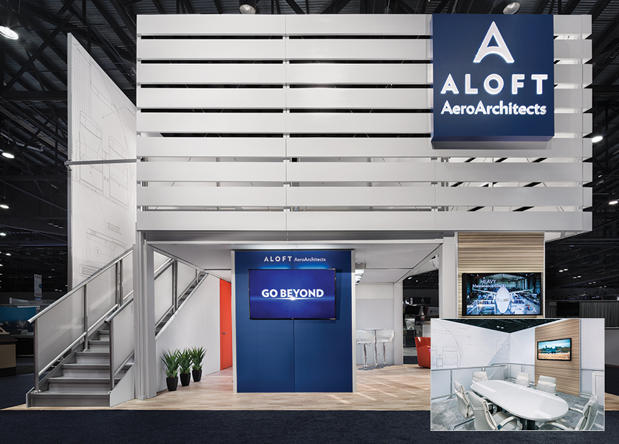 To maintain an airy, open feel while still fostering a conspicuous presence, Aloft AeroArchitects used white louvers to form the walls of its upper-level meeting room.

For its 50-by-50-foot space at the National Plastics Expo, Teknor Apex Co. Inc. wanted to go big in every sense of the word. Marketers at the material-science company hoped to establish a sizable presence with big graphics and big structures, all in an effort to generate massive awareness for the firm and its offerings. Designers at Access TCA Inc. delivered with a towering double-deck structure positioned diagonally across the center of the footprint. The rented deck configuration housed a hospitality area, a key expectation for attendees at this global show. Designers then capped the space with more big elements, specifically an identification header and a Tectonics-brand aluminum and fabric ceiling canopy. 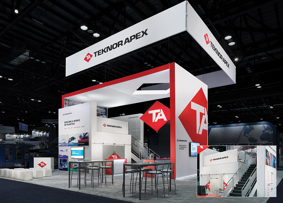 Hospitality and meeting space abounded in this towering stand for Teknor Apex Co. Inc. While some visitors imbibed and nibbled on the upper deck, others talked shop in a lower-level conference zone.

Launched at the RSA Conference, this two-story structure for security-software firm Rapid7 Inc. showcased the perfect pairing of both open and secure environments along with inventive and eye-catching materials. Designed by Hill & Partners Inc., the construction comprised a system from Searle Exhibit Technologies Inc. featuring brushed aluminum surfaces and, for a dose of industrial-grade cool, railings made of unfinished wood and orange cordage. The upper assembly boasted two private meetings rooms: one fully enclosed option for six participants and another open-air version for up to 10 people. Finally, a massive, quirky moose mount made from plywood kept watch over the ground-floor proceedings. 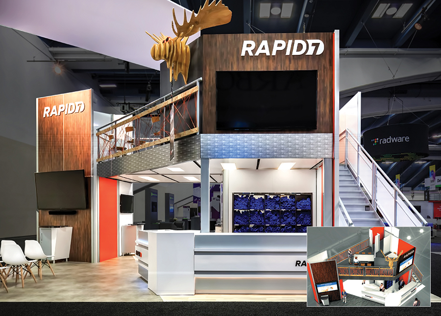 Rapid7 Inc.'s second-level space offered an open-air meeting area for up to 10 visitors and a fully enclosed room for top-secret convos.

To debut its new polymer business at the National Plastics Expo, Royal Dutch Shell plc hoped to create a double-story structure with show-stopping allure. Designed by The Imagination Group Ltd. (dba Imagination), the resulting 50-by-80-foot exhibit no doubt forced attendees to do a double take. Towering over the space was a one-off ceiling comprising silicone-edge graphics in Shell's corporate hues. Immediately beneath these fins, designers added a considerable double-deck structure that also demanded attention. Running diagonally across the footprint and visually dissecting the overhead fins, the deck acted as a quiet oasis far above the ground-floor hubbub. 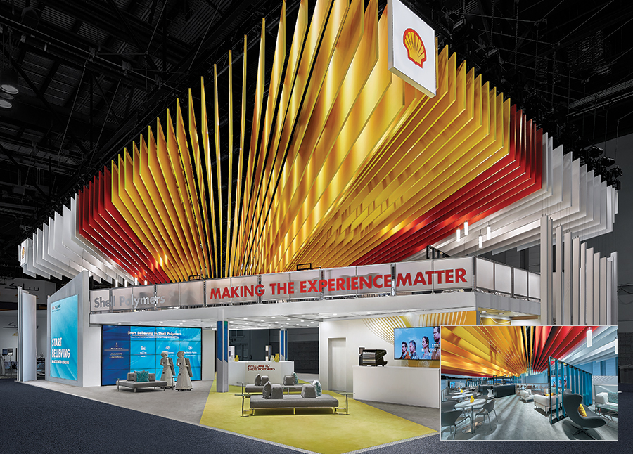 Capped by a dramatic fabric structure, the upper deck of Royal Dutch Shell plc's stand was a quiet retreat for casual conversations complete with a central bar and multiple seating options.

The security industry is booming – as are security-related shows such as the International Security Conference and Exposition (ISC) West. Here, exhibitors are doing everything short of standing on their heads to ensure attendees stop to peruse their security technology. To stand out in this frenetic landscape, Milestone Systems A/S took a much simpler and likely more effective approach. The provider of internet-protocol-based video-management solutions enlisted designers at Czarnowski Display Service Inc. to craft an ever-so-cool blue-hued booth that prompted feelings of security and comfort while also looking sleek and sophisticated. The 40-by-60-foot stand offered various ground-level demos, but a two-story structure on one corner anchored the space. The lower level's blue hues gave way to neutral whites and grays on the top floor, where conference and hospitality spaces cocooned attendees in a serene but secure environment. 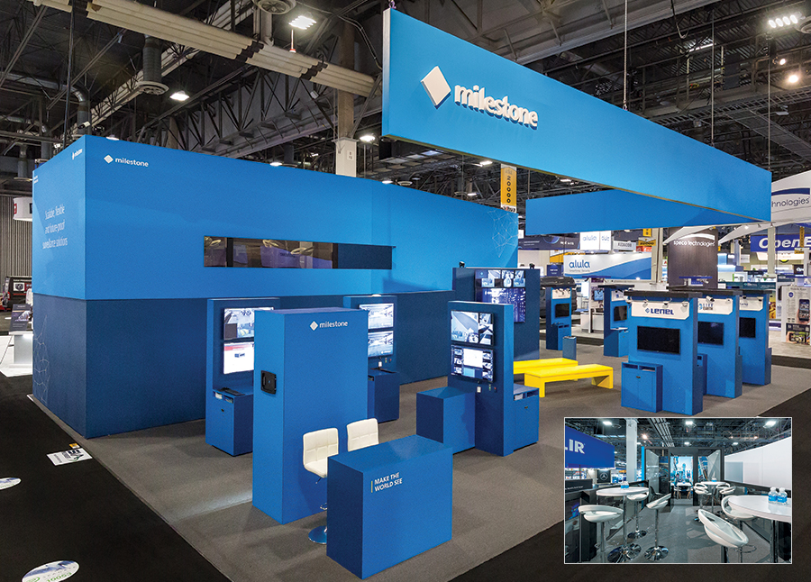 The clean lines of the lower level of Milestone Systems A/S' exhibit continued in the upper-deck area, which contained minimalist conference spaces and ample room for hospitality.
|
|
|
||||||||||||||||||||||||||||
|
|
||||||||||||||||||||||||||||
|
TOPICS Measurement & Budgeting Planning & Execution Marketing & Promotion Events & Venues Personal & Career Exhibits & Experiences International Exhibiting Resources for Rookies Research & Resources |
MAGAZINE Subscribe Today! Renew Subscription Update Address Digital Downloads Newsletters Advertise |
FIND IT Exhibit Producers Products & Services All Companies Get Listed |
EXHIBITORLIVE Sessions Exhibit Hall Exhibit at the Show Registration |
ETRAK Sessions Certification F.A.Q. Registration |
EDUCATION WEEK Overview Sessions Hotel Registration |
CERTIFICATION The Program Steps to Certification Faculty and Staff Enroll in CTSM Submit Quiz Answers My CTSM |
AWARDS Exhibit Design Awards Portable/Modular Awards Corporate Event Awards Centers of Excellence |
NEWS Associations/Press Awards Company News International New Products People Shows & Events Venues & Destinations EXHIBITOR News |
||||||||||||||||||||
|
||||||||||||||||||||||||||||


