|
REGISTRATION REQUIRED
small booths
Small Wonders
Small booths typically carry a negative connotation. And that's no surprise, considering most 10-by-10- and 10-by-20-foot exhibits clearly miss the mark by
employing uninspired back walls and cluttered graphics. So to ensure you don't end up with a Birkenstock-boring booth, here are 15 examples that not only hit the mark in terms of aesthetic appeal and multifunctionality but also made EXHIBITOR staff stop, take note, and take pictures. By Linda Armstrong
IMAGE CREDITS: PLAN-J GMBH PHOTO: PLAN-J GMBH, KUBIK INC. PHOTO: PADGETT AND COMPANY INC. Zentek gmbh & co. kg Photo: Nieswand & Pletschke Fotografie, PlantFusion photo: Cole Group Inc. Jazz Pharmaceuticals plc photo: Padgett and Company Inc., Designtechnica Corp. photo: Marketing Genome Project LLC, SUXESS Inc. photo: Suxess Inc. (dba Lux Dynamics), Volume Network ltd. photo: Volume Network Ltd., Lexis Nexis risk solutions inc. photo: Cole Group
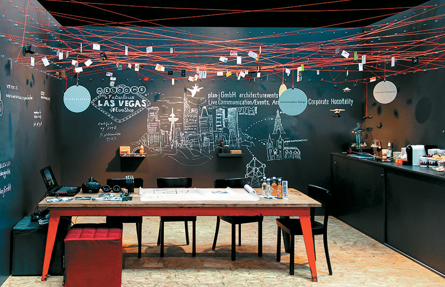 What do you get when you combine roughly 100 yards of red string, 250 wall-embedded hooks, and a gallon of black chalkboard paint? If you're the inventive wunderkinds at Plan-J GmbH, a German creative agency, you end up with an inexpensive, stop-'em-dead-in-their-tracks experience. Crafted for an in-line space at EuroShop in Düsseldorf, Germany, the stand featured a web of wall-attached red threads that acted as an overhead canopy and symbolized the manner in which Plan-J connects its departments, partners, and customers. Designers then set up a sort of workshop beneath the string art by bringing in actual tables and chairs from their Frankfurt-based design studio. The walls of the space, which had been coated with chalkboard paint, also served as an ever-changing canvas on which in-house designers offered chalk-art drawings of everything from well-known trade show locales such as Las Vegas and Paris to potential design solutions. Including an unfinished chipboard floor, the artful design drew in visitors like moths to a flame. And in a sustainability-minded stroke of ego-friendly genius, Plan-J reused many of the exhibit elements, including the chalkboard-like walls, in its agency offices after the close of the show. 
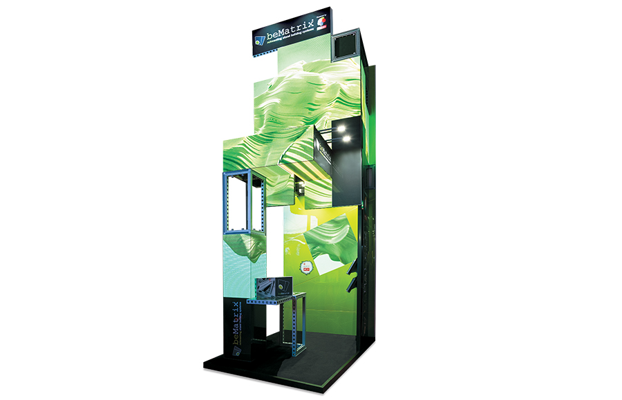 What do you do with a space that doesn't even measure 10-by-10 feet? In the case of BeMatrix, a provider of aluminum stand-building systems, you build up, not out. That's exactly what the Belgium-headquartered firm did at Integrated Systems Europe, where designers employed BeMatrix's own B62 framing and LEDskin product to build a roughly 15-foot-tall edifice attendees couldn't help but notice. While the structure looked like a series of random rectangular elements, when the LEDskin activated, the whole stand sprang to vibrant, colorful life, displaying geometric designs, vivid colors, the BeMatrix logo, and more. While designers included a tiny reception desk and built-in literature rack, the elements went practically unnoticed, taken over by the presence of the small but mighty structure. 
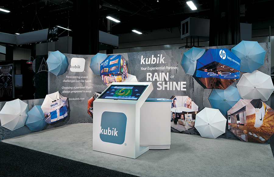 How an exhibit house deals with adversity is often far more important than how it handles moments of triumph. So at EXHIBITORLIVE, marketers at Kubik Inc., which designs and produces exhibits, events, and environments, decided to focus on its ability to manage the unexpected using a "rain or shine" theme. As such, its simple in-line space was made of interlocking panels with a graphic overlay featuring images of rain puddles. In addition, a touchscreen experience positioned front and center showed what appeared to be a Doppler radar image; however, it featured case studies of calamites Kubik had conquered. But perhaps the design's simplest yet most innovative and eye-catching elements were the umbrellas attached to the back and side walls. While some offered blank canvases in Kubik's corporate colors, others were printed with images of the firm's work. 
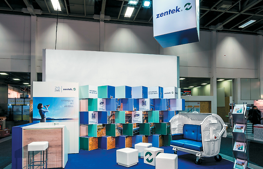 At the Bautec show in Berlin, German waste-management firm Zentec GmbH & Co. KG wanted to target a specific group of the show's building- and construction-industry attendees. But it also hoped to reach a different segment of its target audience at the company's next exhibition, SHK in Essen, Germany, which attracts visitors in the sanitation, heating, and air-conditioning fields. The creative team at Atelier Damböck Messebau GmbH crafted a solution centered on an ingenious back wall comprising 30 stacked cardboard boxes, which were angled in different directions. Along with the firm's colors and logos, the boxes featured imagery related to various target markets. Thus, at Bautec, staff set the boxes so that construction-industry images faced outward, and at SHK, they rotated the cubes so HVAC images were visible and construction photos were hidden. And as a final on-brand touch, designers converted a mobile waste container into an aisle-side piece of furniture that caught the attention of passersby and provided them the perfect place to cop a squat and talk shop. 
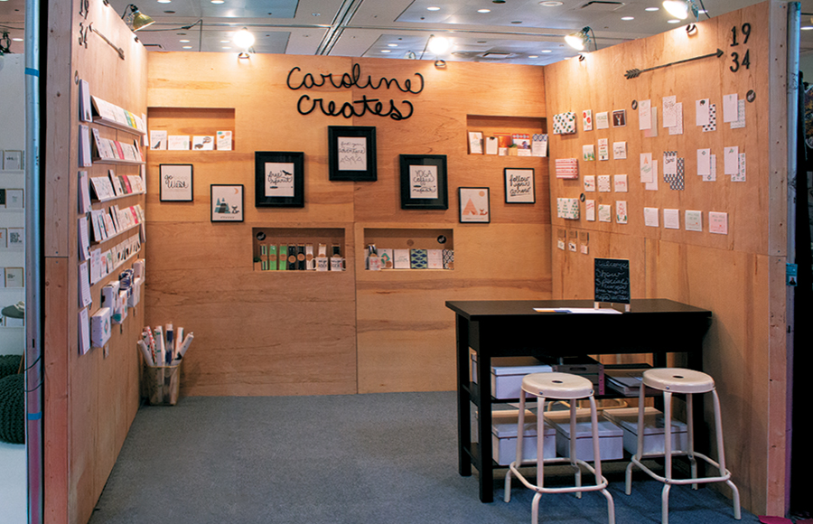 Nothing says earthy and authentic quite as well, or as succinctly, as a minimalist design comprising little more than wood and metal elements. At the National Stationery Show, Caroline Creates offered this quaint space to showcase the company's stationery and artwork. Unfinished wood walls featured recessed and attached shelving and served as a blank slate for displaying artist Caroline Hull's work. Topped with understated spotlights, the walls also had wrought-iron embellishments as well as the company's logo front and center; however, their simplicity kept visitors' attention tightly focused on the firm's offerings. A small table turned reception desk and a pair of metal stools completed the scene and gave visitors a well-needed respite amid the company's heavenly haven. 
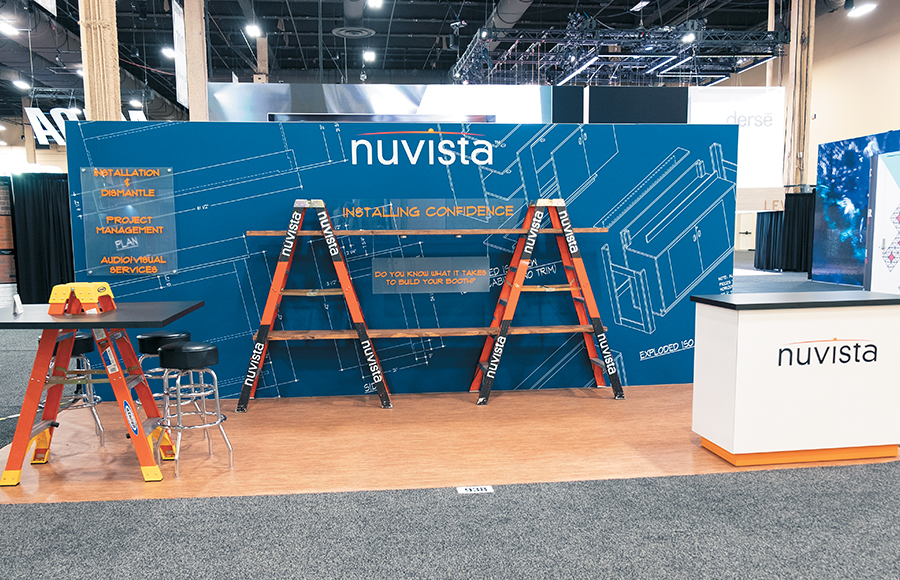 When it comes to trade show stands, it's usually a heck of a lot easier to display products than it is to effectively show off a service. But at EXHIBITORLIVE, the folks at Nuvista made this task look easy. The provider of trade show services, including everything from installation-and-dismantle assistance to shipment preparation, wanted to communicate its offerings under a central theme: Installing Confidence. Thus, marketers brought their initial creative concepts to designers at Access TCA Inc., and together the teams constructed this simple yet clever structure that was spot on with Nuvista's skill set. Comprising BeMatrix panels and fabric graphics, the back wall featured the company's logo and what appeared to be exhibit-setup schematics. Two branded ladders and a couple of planks augmented the back-wall display, and a one-off table made from a ladder and a simple wood-and-laminate top further communicated the company's capabilities. In addition, a traditional reception desk drew visitors to the front corner of the space, and flooring from The Inside Track Inc. completed the crafty scene. 
 At Natural Products Expo West, it's all about product sampling. Not surprisingly, then, PlantFusion, which offers a variety of plant-based protein supplements, wanted its exhibit to feel like a hip sampling bar. The resulting 10-by-20-foot stand, designed by 3D Exhibits Inc., provided a waist-level bar featuring the brand's logo atop a chocolate-hued laminate. The back wall displayed product samples along with two end-cap-like graphic wraps that matched the products' packaging. And to infuse a little bit of a juice-bar vibe, designers incorporated suspended pendant lights as well as a few sets of bistro-height tables and stools. 
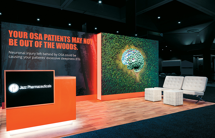 Going into the American Thoracic Society's (ATS) annual meeting, Jazz Pharmaceuticals plc faced a fairly common industry pitfall: The drug it hoped to market to this audience was not yet approved. Thus, Jazz Pharmaceuticals worked with designers at Access TCA Inc. to craft this high-tech 10-by-20-foot booth to educate physicians about disease states and current research related to its promising solution. While one half of the space featured traditional wood-and-laminate exhibitry, the right half comprised an 80-inch interactive monitor. Here, visitors discovered an image of a forest with a brain smack dab in the middle. When they touched various parts of the brain, data popped up that explained how that portion of the organ is affected by obstructive sleep apnea, a key factor involved with the up-and-coming drug. 
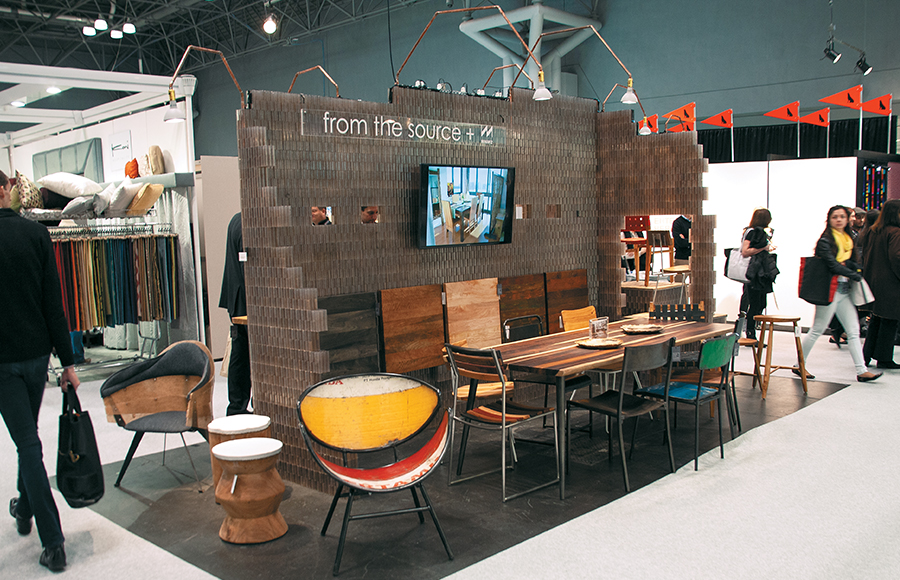 Who says you can't display a profusion of products and still provide a pristine, not to mention pretty, environment? At the Boutique Design New York show, two innovative design and development firms – From the Source, a manufacturer of premium designer furniture and functional objects, and Miniwiz Co. Ltd., which turns post-consumer waste into high-performance materials and products – paired up, ultimately creating a 10-by-20-foot island space that was 90-percent product and 100-percent sophisticated. All the furniture, including everything from tables and stools to a Pele chair, a colorful and curvaceous beauty made from recycled oil barrels from Indonesia, came courtesy of From the Source. However, the main exhibitry running down the middle of the space comprised Polli-ber brick, a structural building system made of recycled plastic waste and developed by Miniwiz. Requiring no mortar, the brick system is connected via pins or its grooved engineering, as a patented interlocking mechanism gives the brick unique construction capabilities in vertical, horizontal, and curved formations. Despite being far outside their natural habitats, the products cohesively came together to create a space that was much more than the sum of its parts. 
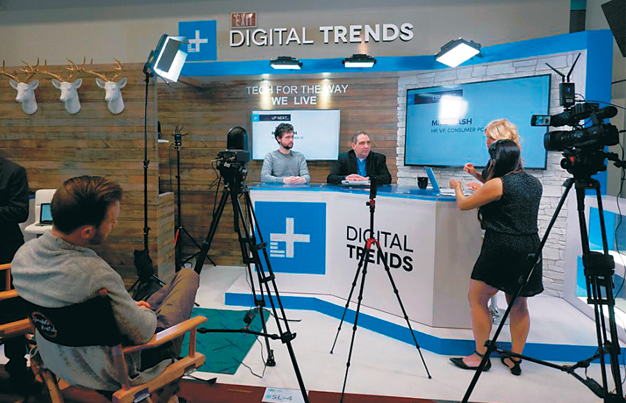 This multitasking 10-by-20-foot stand for Designtechnica Corp. (dba Digital Trends) debuted at the International Consumer Electronics Show. Designed by the Marketing Genome Project LLC, the booth included everything from a storage room and multiple custom display cases to a live broadcast center – complete with an elevated stage, presentation monitors, and a plethora of lighting, internet, and audiovisual equipment. During the show, Digital Trends, a news, technology, and lifestyle website, offered live show coverage and interviews with the industry's movers and shakers. Comprising mostly modular aluminum extrusions and panels, the stand featured various textured finishes, such as the faux-wood paneling and white-rock accents on the back wall, along with 40- and 60-inch monitors, a clear-acrylic sign bearing the company's logo, and decorative foam deer heads. What's more, the exhibit was oriented so a small camera crew could operate from the front of the space without breaking any confines of booth regulations. Talk about camera readiness! 
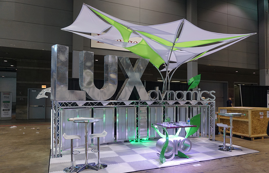 More often than not, booth design falls to the professionals – or at least to a company's marketing team. Not so at Suxess Inc. (dba Lux Dynamics), a provider of LED luminaries. The company's president and CEO, John McCarty, has been designing and building the firm's Lightfair International stands for the last 10 years. And these aren't your average DIY ditties; they're stunners like this 10-by-20-foot beauty, which was eye-catching in more ways than one. First, there were the 800,000 lumens showcased throughout, courtesy of the firm's products comprising the lower back panel of the structure. While still bright enough for attendees to consider pulling out their shades, the fixtures were actually dimmed to 10 percent of their capabilities. Second, McCarty added a couldn't-miss canopy that incorporated a touch of dimensionality and color, capped the minimalist space, and provided an enormous amount of vertical cache. Finally, the firm's logo appeared via in-your-face 3-D letters positioned at and above eye level for maximum impact. 
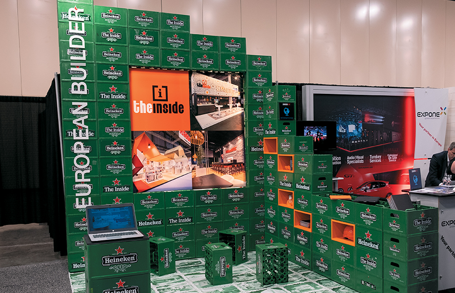 How do you stand out from the crowd while also sending a message about your company's location and heritage? If you're The Inside BV, a Dutch exhibit house, you utilize one of your country's most notable icons: Heineken beer. Designers constructed roughly 90 percent of the company's 10-by-10 at EXHIBITORLIVE out of reusable (and returnable) Heineken beer crates, including the exhibit's walls as well as a laptop stand of sorts on the front corner of the space. The containers even served as causal seating. However, to ensure attendees didn't think The Inside was a beer distributor, designers inset the back wall with graphics featuring the company's logo and images of some of its recent exhibit-design projects. In addition, they adapted the Heineken logo to incorporate The Inside name and taped this new creation over some of the crates. Boxes painted the company's corporate orange hue were inserted into the side wall to add a pop of color and serve as cubbyholes for various exhibit materials. 
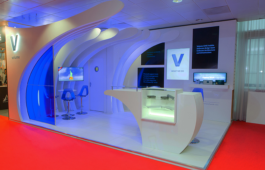 Big brands, such as NEC, Panasonic, Epson, and more, come out to play at Integrated Systems Europe, and they bring their big-boy budgets to boot. Despite its minimal in-line space and $32,000 budget, Volume Network Ltd. crafted an organic, cool-hued display that gave the big guys a run for their money. The provider of content-delivery solutions for electrical retailers traded in angular elements for sensual curves, as seen in the central reception desk and a series of "fins" that arched over the conference area on the left of the space. Meanwhile, the back wall offered a storage area and several monitors showing capabilities presentations. While the space comprised mostly smooth, white surfaces, designers added a corporate-blue pop of color courtesy of Plexiglas chairs, an aisle-side panel, and accent lighting. Given its 10-foot height, curvaceous elements, and effective use of space, this itty-bitty booth exuded a prodigious presence. 
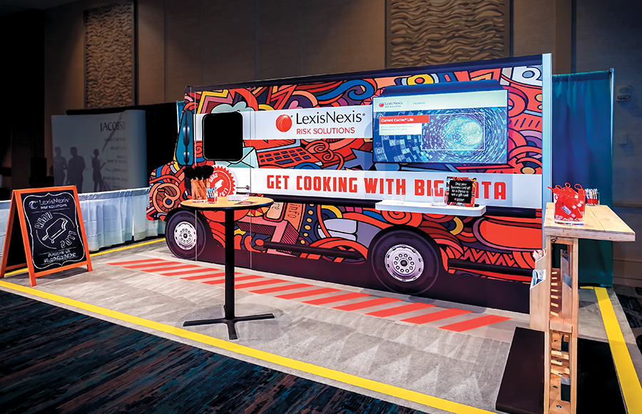 Some products simply have a higher fun factor than others. And as a general rule, most products far "out-fun" legal- and public-records-related offerings. So going into the Association of Home Office Underwriters Conference, LexisNexis Risk Solutions Inc., which provides computer-assisted legal research as well as business and risk-management services, wanted to ratchet up the whimsy and play off the show's theme: Appetite for Disruption. Thus, designers at Exhibit Concepts Inc. stirred up a one-off concept, i.e., Cooking with Big Data, and incorporated a food truck as its central imagery. Or more specifically, designers used modular BeMatrix panels to construct the body of a food truck, complete with front and rear ends and a service table. Near the back of the "vehicle," a monitor offered live demos, and at the front, designers inserted a door (providing access to interior storage) with what appeared to be a driver's window. Meanwhile, graphics affixed to the carpet suggested a roadway, and a wooden pallet doubled as a reception desk and literature holder. 
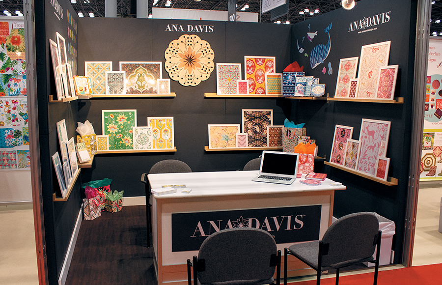 DIY exhibitry doesn't have to look unprofessional, as illustrated by this beauty of a 10-by-10 from Ana Davis Design that launched at the National Stationery Show. Artist Ana Davis paired matte-black walls with simple shelving that displayed her handcrafted designs, adaptable to everything from mugs to tote bags, as framed prints. A laser-cut wooden mandala of sorts along with simple branding were the space's primary adornments, which allowed the artwork to take center stage. Passersby could easily ogle the offerings, and if they wanted to talk shop, they could step inside the exhibit for a sit-down discussion.
|
|
|
||||||||||||||||||||||||||||
|
|
||||||||||||||||||||||||||||
|
TOPICS Measurement & Budgeting Planning & Execution Marketing & Promotion Events & Venues Personal & Career Exhibits & Experiences International Exhibiting Resources for Rookies Research & Resources |
MAGAZINE Subscribe Today! Renew Subscription Update Address Digital Downloads Newsletters Advertise |
FIND IT Exhibit Producers Products & Services All Companies Get Listed |
EXHIBITORLIVE Sessions Exhibit Hall Exhibit at the Show Registration |
ETRAK Sessions Certification F.A.Q. Registration |
EDUCATION WEEK Overview Sessions Hotel Registration |
CERTIFICATION The Program Steps to Certification Faculty and Staff Enroll in CTSM Submit Quiz Answers My CTSM |
AWARDS Exhibit Design Awards Portable/Modular Awards Corporate Event Awards Centers of Excellence |
NEWS Associations/Press Awards Company News International New Products People Shows & Events Venues & Destinations EXHIBITOR News |
||||||||||||||||||||
|
||||||||||||||||||||||||||||


