


|
REGISTRATION REQUIRED
exhibit Design
ILLUSTRATIONS: PETER AND MARIA HOEY
Top Seven Design Tenets From the Museum World
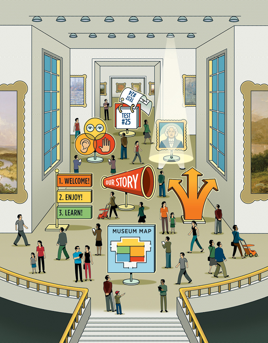
Given the crossover between museum exhibits and trade show stands, designers from the other side of the fence can offer novel yet applicable principles and fresh perspectives. So EXHIBITOR consulted a multitude of museum-industry masters and developed the following seven tenets for successful exhibit design. By Linda Armstrong
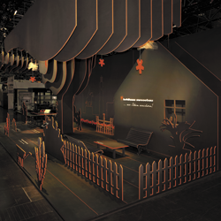
On the surface, trade show booths and museum exhibits are two different animals with varied venues, audiences, challenges, and objectives. But at their core, these disparate beasts are members of the same herd, especially when it comes to design principles. "Museum and trade show exhibits must attract visitors into a physical environment, engage them in an activity or conversation, and communicate a message," says Shawn McCoy, vice president at Jack Rouse Associates. "So the mediums are fundamentally similar in terms of design objectives and solutions." Plus, designers from both industries face some of the same challenges, says Beverly Serrell, founder of Serrell & Associates, a museum-exhibit consulting firm. "Trade shows and museums present comparable obstacles," she says. "Both environments are often overwhelming, with more things to look at than visitors have time for." To help offer a fresh vantage point to marketers, EXHIBITOR spoke with eight museum-industry professionals (see page 47 for their photos and bios) and identified seven best practices. Given the trade show industry's wide scope, not all of the fundamentals mentioned here will apply to every exhibit-marketing program. But this compilation, which includes both 10,000-foot tips and minute-detail maxims, can help solve some of your biggest structural challenges – and perhaps highlight a few hiccups you didn't even know you had. 
"While museum exhibits relay a tale about people, places, and things, trade show exhibits tell a story about a company or product," says Bobbie Bonebrake, senior exhibit designer at Taylor Studios Inc. "Yet no matter what it is, the story is the heart of any design. It drives it. And without a clear story, you have nothing. Sure, you can craft a trade show booth that is over the top and creates a ton of buzz, but if visitors don't take in the story you're trying to tell, it's not effective." Serrell concurs on the importance of storytelling, but she prefers the term "big idea." "In effect, every exhibit should have one big idea that answers the question 'What's this exhibit about?' This clear, compelling concept must weave its way through every element of your design," she says. "If booth visitors exit your space without having grasped your one big idea, the design has failed." In trade show exhibits, then, your story could be your brand's values, mission, purpose, etc. It could also be as simple as two benefit-related words such as "Technology Simplified." But according to sources, you need to get crystal clear about your story and then massage it into every nook and cranny of your exhibiting program. Identifying this one big idea and remaining steadfast throughout the design process, however, can be an exhibit manager's sticky wicket. "Our job as design professionals is to turn an idea into a reality," McCoy says. "But if a client does not have a firm grasp on his or her own idea or waffles on objectives – or the client comprises a team of people with slightly different perceptions of this single, big idea – it's difficult to realize a successful project. The bottom line is that you should never start a design project before you fully understand and truly believe in your story." 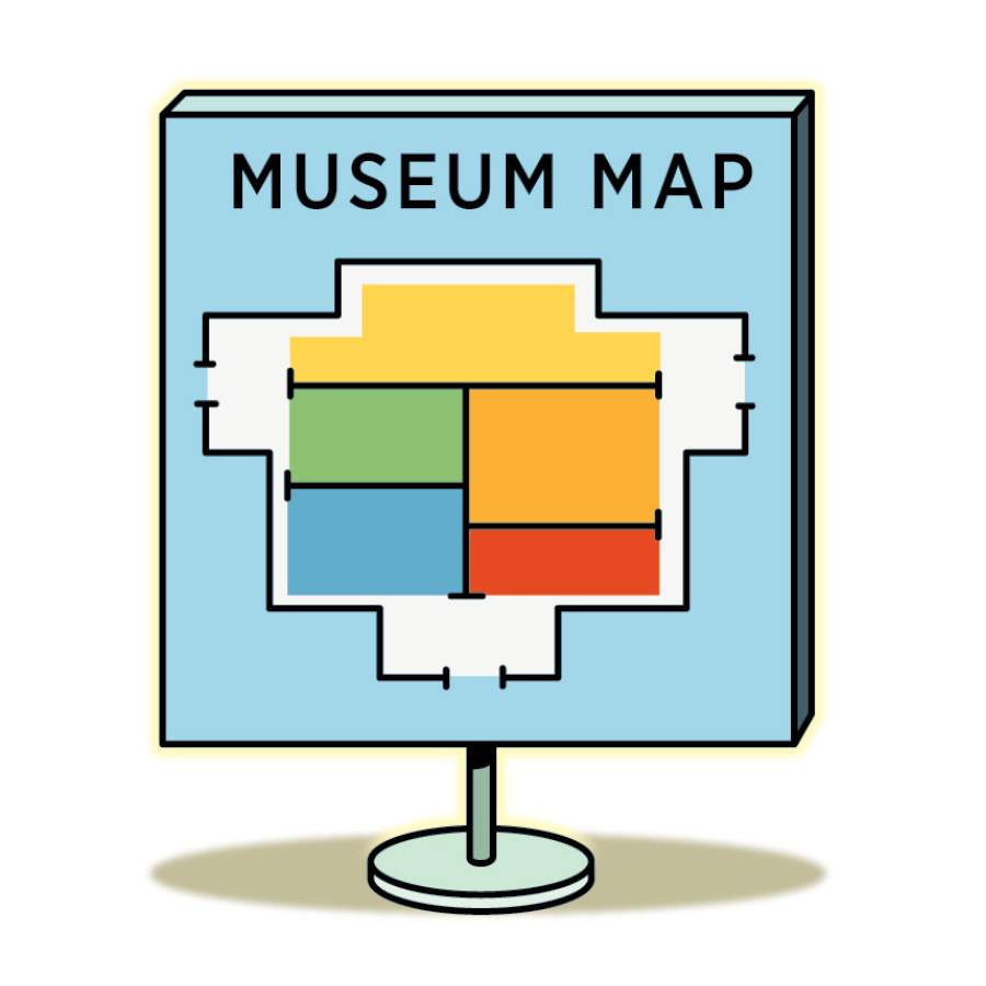
"Whether you're talking trade show booths or museum exhibits, there must be some clear differentiation between being in the exhibit and not being in the exhibit," says Cynthia Sharpe, principal of cultural attractions and research at Thinkwell Group Inc. "To help people mentally transition from the distractions of a crowded trade show floor to your experience and to ready themselves to take in your messages, you need an environment that somehow presents a contrast to the world they've left behind in the aisle." In effect, your space must send a signal to the brain that suggests people switch gears, leave their concerns at the door, and prepare for new input. "Color choice, lighting, sound design, and more all help to create an environment," Sharpe says. "But no matter your methods, you need clear space differentiation to help shift visitors' mindsets and prepare them for what comes next." Along these same lines, Serrell suggests that your design also must help visitors immediately orient themselves within the booth. "Orientating the visitor often garners little attention in the design-planning process," she says. "After all, designers generally assume the design is self-explanatory. Some people are OK with just wandering, but most are better off when they understand the context of the environment they are in." Time is another considerable factor, according to Serrell. If your design or interactives leave visitors confused or seem to require considerable time to comprehend, attendees will bail. Each person perusing the show floor has a window of time that he or she is willing to spend in an exhibit or on a specific activity. Visitors may not have consciously decided to spend 15 minutes at each booth, for instance, but there's an unconscious threshold that guides their actions. "So when visitors walk into your space – or up to demo kiosks, interactives, etc. – they're unconsciously gauging whether the time required to understand and participate in your experience is worth the effort," Serrell says. "If your offering doesn't easily and immediately orient them to the booth's layout or task at hand, you've already lost them." With regard to the stand as a whole, visitors need to know where to begin, whether there's a prescribed route or check-in spot, and how to locate various product sections or areas of interest. Even if you have an in-line space, people need to know at a glance whether they should walk up to a reception desk, wait to talk to a staffer, or simply step inside your booth and start handling your goods. If this isn't clear, many visitors will walk on by instead of enduring an awkward interaction or wasting time trying to figure out the next steps.
10 Sources of Design Inspiration
Just as you can't often see the forest for the trees, you can't always rely on the show floor for inspiration. Rather, you need to set the tone and offer something that visitors haven't seen before. "If you want to create something fresh, then you have to expand your points of reference beyond exhibitions," says Shawn McCoy, vice president at Jack Rouse Associates. "You can find design inspiration in countless locales, but you can also locate fresh ideas for operational techniques, interactives, sensory inclusions, customer service, and more." So here's a list of 10 environments where inspiration is likely lurking. ➤ Trade shows outside your industry can give you an idea of what's happening in the broader exhibit-marketing world. ➤ Museums, traveling exhibits, and road shows are close relatives of trade show exhibits. As such, they can spark ideas that are applicable to exhibit marketing. ➤ Pinterest, Instagram, Twitter, and Facebook are practically bottomless sources of inspiration, as exhibit houses, trade shows, and industry publications and associations often post images spotlighting unique stand designs. ➤ Design-centric trade shows and events such as EuroShop, EXHIBITORLIVE, GlobalShop, and the International Contemporary Furniture Fair are full of inspirational examples of lighting design, furniture, flooring, etc. ➤ Theme parks, zoos, water parks, and other public attractions are designed to draw eyes to various elements and pull people through vast areas. As such, exhibitors with large spaces can discover unique attention-directing techniques. ➤ Pop-up shops, retail malls, and consignment-boutique malls (e.g., Painted Tree Marketplace) are meccas of consumer-marketing best practices, many of which have direct application to the trade show world as well. ➤ Design and architectural magazines, e-zines, and blogs can keep you up to date on trends yet to make their way to the trade show floor. ➤ Mass-gathering locales where wayfinding is employed (e.g., subways, stadiums, etc.) can provide a plethora of different approaches to directing visitors through large spaces, many of which may apply to exhibitors erecting massive booths. ➤ Highly visual books and websites covering a range of topics such as photography, artwork, digital design/interactives, graphics, typography, infographics, illustration, architecture, advertising, animation, comics, album covers, nature/travel, etc. can be chock-full of creative concepts to consider. ➤ Exhibit- and museum-design competitions and awards programs spotlight the most exceptional and interactive examples from their respective fields, making them treasure troves of inspirational fodder. 
"The importance of traffic flow is sorely underestimated," McCoy says. "The way guests move through an exhibit of any size will have a significant impact on how well they respond to and retain your messaging." "So as you plan your design," Bonebrake adds, "you must fully understand your audience and what will best engage its members, and then you need to plan key engagements to lead them throughout your space." The progression of these engagements could be chronological or random. But unless you're talking about an in-line exhibit with limited movement within it, you must always consider how people will flow into and through the booth in order to best deliver your message and craft an effective visitor experience. This flow is often established by visually linking experiences together. So you should have something near the aisle or perhaps in the center of the booth that attracts passersby. And assuming you want guests to experience multiple parts of your exhibit, as an attendee completes one engagement or finishes viewing a specific product grouping, another element nearby should lure him or her to that locale. For this tactic to work, however, you need to maintain proximity from one experience to the next, and then somehow visually link the experiences. "One designer I work with always places a dramatic sightline from one gallery to the next – either a powerful graphic mural or splashy digital screen," says Adam Kohn, project director of museums and special projects at Kubik Inc. "Walt Disney called these sightline elements 'wienies,'" says Mel McGowan, chief creative officer at Storyland Studios and a former attraction designer at The Walt Disney Co. "Mr. Disney used hot dogs to motivate his dog to act in specific ways. So he always said designers should use wienies – that is kinetic, visual, or sensory triggers – to keep visitors moving forward into the next experience." In the end, you want to use curiosity and attraction to motivate attendees to explore your space rather than forcing them to navigate a maze with a proverbial cattle prod. McGowan also suggests you carefully consider potential bottlenecks, which could involve as few as three attendees in a small space or as many as hundreds of visitors in a behemoth booth. "In the themed-attraction industry, one of the very first things we establish during the design phase is the maximum throughput of a spatial experience," he says. In a theme park, this can range from a few hundred to several thousand people an hour, based on the desired length of stay, space allotted, and technology involved – all factors that are carefully considered during the design. "However, we also account for potential bottlenecks, which can not only make visitors uncomfortable and effectively push them out of the experience, but also create safety issues," he says. And in the exhibiting world, pinch points that force attendees into the aisles can also violate confines-of-booth regulations and get you in hot water with show management. Kate McConnell, senior creative director at Thinkwell Group Inc., also suggests that every exhibit must have some type of respite, figuratively or literally, built into the flow. "We all get fatigued from too much input," she says. "So if you want your guests to stick around, it's important to offer them chances to think, absorb, and reenergize for the next moment." Designing for respite is about giving visitors a chance to breathe among and within experiences. "We analyze the spacing and pacing of interactive or high-retention moments, and we intersperse them with less intellectually taxing encounters," Sharpe says. "There needs to be an ebb and flow physically and mentally between focal points throughout the space." "Finally, remember that based on your activities, all booth space is not created equally in terms of its ability to handle throughput," McGowan adds. "We often differentiate between river space versus ponding areas. Consider where your attendees will quickly flow through your content and where they'll slow down and pond together, perhaps to read text or engage in conversation." As a rule, an effective booth should include ample wienies positioned and spaced in a manner that keeps your rivers flowing and your ponds from breaching their banks. 
When it comes to graphics, sources offered a plethora of advice. However, all of their recommendations fell under two key directives: Make sure graphics feature a messaging hierarchy, and remember that less is always more. McConnell breaks down this hierarchy technique via a common analogy. "At any show, you have waders, swimmers, and divers, and your exhibit messaging needs to address the needs of all of them," she says. "Waders wander into your space, have a quick look around, note your company name and URL, and vamoose. Swimmers paddle around to various stations to soak up comparably more info, but they don't spend a ton of time treading water. Finally, divers pinpoint a particular product area and plunge deep into your content, rarely coming up for air." The best way to deal with these water dwellers is to layer your information via a messaging hierarchy. "Waders need broad info about who you are, what you offer, and where they can learn more," says Diane Perlov, senior vice president for exhibits at the California Science Center. "You want clear, large, inviting text that identifies you and your offerings." For the swimmers, booth signage should be slightly smaller but still allow folks to splash around in the space and soak up key product messages via bite-size takeaways. "But you also need a few sentences of deep-plunge text for your divers," Perlov says. "This can be effectively relayed via digital media or tablet-based interactives as opposed to paragraphs of printed text. Digital technology also allows you to customize text for different segments of your target audience." Selecting the specific messages and text for this hierarchy is paramount. "Determine exactly what you're trying to convey with each graphic and ask yourself whether every proposed element relays your message," McConnell says. For example, do the messages, words, fonts, images, colors, sizes, positioning, and location you've chosen all aid in delivering your story? And have you selected the proper graphic medium – digital, interactive, static, etc. – for maximum effectiveness? "Every answer should be in the affirmative," she says. "After all, each graphic-design choice must be purposeful because consciously or not, guests will consume everything you put in front of them. Every element either supports or detracts from your story and message, so choose wisely." While determining what to include in your graphics is important, figuring out what to exclude may be even more critical. "This may come as a shock to people, but your booth doesn't need to answer every question an attendee has," Sharpe says. "Rather, it should tell your story and provide opportunities for attendees to learn more – perhaps via deep-dive digital PDF product catalogs, well-versed staffers, or even post-show follow-up. Remember that the booth is a step in a long-term relationship, not a one-stop shop. If you try to shove too much detail into your space, your message will become muddied, and your guests will be overwhelmed." The most common manner in which exhibitors muddy their messages is via too much text. "Less is always more in this regard," Bonebrake says. "Visitors simply will not stop to read long blocks of text. So keep the copy simple but make it impactful. Often, a single photo can evoke a much bigger emotional response than a bunch of text. And consider whether static or even digital graphics are the best mediums. Might a mechanical, multisensory, or interactive display be more effective in telling your story than passive words and images?" "Also remember that blank space is just as important as text," Perlov says. "It's almost as if visitors need to be able to take a visual and mental breath between bits of data in order to properly consume it. My rule of thumb is that you want people to view one text block and visual image in its entirety without being visually disturbed by seeing adjacent words or pictures." For Bonebrake, blank space – in graphics, interactives, and even conversations – offers a sort of mental respite. "Content needs room to breathe," she says. "Negative space, and even a void of sound and light, creates a place to mentally absorb. Sensory overload creates fatigue and uneasiness in visitors. An empty space can actually do more to recharge the visitor experience by creating a moment of calm before the next big 'wow.'" This respite can be in the form of an open stretch of exhibit space, using only lighting to create mood and allow the eyes to rest. A predominately blank wall or graphic with widely spaced and carefully chosen text blocks can also give visitors the opportunity to pause and reflect. "An appropriate use of negative versus positive space can do more for a productive visitor experience than drowning out the story with extraneous content and mere eye candy," Bonebrake says. 
As anyone in the field of education will tell you, people have different learning styles, and what works best for one person utterly fails with the next. Thus, when you're trying to tell your story, the more delivery methods you offer, the more people your message will reach. "If at all possible, offer a variety of experiences," Perlov says. "In a museum we'd include real artifacts, hands-on experiments, reading, listening, and full-body experiences. Not all of these are perfectly adapted to trade show booths, but you need to think beyond the static graphic." According to sources, these types of experiences should certainly include interactives. In fact, there's a formal designation for the interactive model: learning by doing. (A Google search for the term brings up more than 870,000 results.) Multiple studies purport the effectiveness of interaction in terms of increased engagement, but the research also seems to indicate that people are more likely to remember the learned content. McCoy values interactives, but offers a caveat. "Interactives are very important to effective design," McCoy says. "Yet interactivity doesn't have to be physical or media-driven. In some cases, it can be a purposeful, story-centric conversation. The key is to create whatever interactive experiences that best deliver your content to your target audience." Just as your exhibit shouldn't support only one learning style, your interactive shouldn't involve just one or two senses. "The most engaging experiences employ multiple senses," McCoy says. "So well-designed exhibits should feature strong visual icons, colorful graphics, and simple text to convey base content. But you also need to look for nonvisual ways to engage the visitor." For example, ambient sound, listening stations, and audiovisual presentations engage guests' hearing. Tactile exhibits and interactives make strong connections, as guests literally have their hands on your content. "And in some instances," McCoy says, "a guest's sense of smell and taste can be incorporated to truly immerse them within your story." 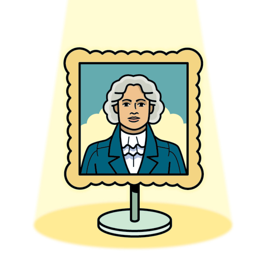
According to Sharpe, "Lighting is critical to any effective exhibit design. It not only illuminates products, messages, graphics, and more but also cues visitors on where to go, supports the drama of an experience, and provides emotional signals." Bonebrake agrees. "Designers should use it to create movement within the space, generate suspense, and affect mood and perception," she says. "No matter its size, every exhibit should have some form of lighting, as it's an essential element of the design. Without proper lighting, your exhibit can practically disappear from the attendee perspective altogether." Making something vanish, however, can be a worthwhile endeavor. In fact, sources purport that the dark voids created by a lack of lighting can be used to hide various elements, direct visitors, and tell your story. Kohn explains that while lighting certainly showcases important exhibit elements, it can also help hide structural components, which can include modular-exhibit framing, audiovisual equipment, and cabling, along with venue necessities such as columns, sprinklers, and electrical boxes. "Most successful lighting designs eliminate the floors and ceilings from the visitor's gaze altogether, instead highlighting the graphic content and providing drama for the big exhibit elements," he says. Bottom line: Although exhibit flooring and ceiling elements are often valuable components of the trade show experience, lighting should be employed to eliminate all features that don't actively drive the story. If lighting is the salt that properly seasons almost every dish, technology is the cayenne pepper that should be sprinkled lightly. According to Sharpe, "Technology is a tool in the designer's kit. Period. If the technology itself is more compelling than the content, you've got a problem. A beautifully produced 60-second video with a highly emotional and impactful story can make a much bigger impact than a whiz-bang interactive. As always, the story comes first. And high-tech wizardry is not a story unless you're selling technology." Similarly, Kohn sees technology as a valuable tool in some situations and a high-priced gimmick in others. "Good design utilizes technology to maximize the delivery of content within spatial and budgetary constraints," he says. "Bad design places technology into an exhibit for the sake of using new toys rather than to serve the exhibit's objectives. For example, virtual reality is currently touted as a great way to immerse visitors in your content. When it's successful, the subject matter lends itself to placing the visitor inside the story. When it fails, VR becomes an expensive way to view content that could have been consumed more effectively through simpler delivery streams." Clearly, your story is king whether you're talking lights and technology or graphics and wayfinding, and at its core, storytelling is an analog, around-the-campfire endeavor. In fact, according to Bonebrake, low-tech may be the most effective communication method, even in a high-tech world. "Some of our visitor studies have concluded that a low-tech approach is the most appropriate choice for telling a story," she says. "Children especially are often more engaged by low-tech approaches – a spinning wheel, sliding magnifiers, flip-door scent stations, puzzles, etc. Even as adults, these simple tactics are still effective and might even foster a sense of nostalgia. While some might argue that in the world of tablets and smartphones visitors are more at home in a tech-heavy exhibit, I personally think that nothing beats hands-on engagement." 
"When it comes to any type of interactive, from simple mechanical contraptions to complicated digital engagements, prototyping is essential to effectiveness," Serrell says. Effective prototyping simply means building and testing your design – even if it's a scaled-down version or one made with cheaper or temporary materials. And it's best carried out on various people who don't have a stake in the game. But testing is even more important when applied to the stand as a whole and when carried out over the life of the booth. "By 'prototyping' your space, you will immediately discover insights that never occurred to you and your designers," Serrell says. Perlov is also a big proponent of testing across the board, including the structure, its components, and your content. "We test design and content," she says. "For example, we evaluate whether guests can quickly and easily understand the visitor interface and how effectively they interact with all aspects of the exhibit." Ideally, you should test prior to a design launch, but it's never too late. In fact, sources recommend that you test your booth every once in a while, especially if it's been in use for years, as your target audience, industry trends, and levels of technological innovation may have changed significantly. This testing can involve everything from focus groups and exhibit exit surveys to simple interviews and on-floor observations. "During the design phase, after the initial launch, and over time, observe how people interact with your exhibit," Perlov says. "If we notice an area in a museum exhibit is being ignored, we may interview guests about it. We would want to determine if the problem lies with the exhibit itself or with the gallery design. In either case, we would likely first install test graphics – exhibit instructions in the first case, wayfinding in the second – and explore if there are simple ways to make the exhibit more effective. But no matter when or how we test, we always learn something from the process. It ensures that we deliver the content as clearly as possible, and it helps identify unintended assumptions we may have made about the user experience." E
Source Spotlight
While they're not traditional experts from the trade show industry, the sources for this article have broad experience, varied backgrounds, and famous employers and clientele. So to help you get to know these museum-industry masters, here's a bit more insight into their diverse skills, notable work, and recent awards.
 Bobbie Bonebrake serves as a senior exhibit designer at Taylor Studios Inc., whose projects include the National World War I Museum, USS Midway Museum, Lewis and Clark Interpretive Center, and more. She received the Mordecai Gorelik Award for Excellence in Scene Design, and two of her designs were chosen for the 2011 Prague Quadrennial Exhibition.
 Adam Kohn is project director of museums and special projects at Kubik Inc. The firm's recent museum work includes the award-winning traveling exhibit of The Dead Sea Scrolls along with the Museum of the American Revolution and the Museum of the Bible. Projects also include the William J. Clinton Presidential Center, the upcoming Royal Alberta Museum, and the famed Newseum in Washington, DC.
 Kate McConnell, a senior creative director at experience-design and production company Thinkwell Group Inc., creates and guides the guest experience for a broad variety of projects with a particular focus on museums and cultural attractions. In addition to her award-winning experience-design work, she collaborates with the world-renowned Oregon Shakespeare Festival.
 Shawn McCoy is the vice president at Jack Rouse Associates, an award-winning attraction-design company whose clients include the Crayola Experience, Science Centre Singapore, Universal Studios Florida, Ferrari World Abu Dhabi, Space Center Houston, and the Children's Museum of Atlanta.
 Mel McGowan, the author of "Design Intervention," is the chief creative officer at Storyland Studios, whose clients include Universal Studios, Sea World, the Lego Store, Seoul Grand Park, and more. The firm also has completed projects for exhibitors at the Electronic Entertainment Expo (E3), Comic-Con, and Anime Expo. Prior to joining Storyland, he spent 10 years at The Walt Disney Co. and co-founded Visioneering and PlainJoe Studios.
 Diane Perlov is the senior vice president for exhibits at the California Science Center, where she supervises all exhibit programs and the permanent exhibit pavilions of World of Life, Creative World, Ecosystems, and the Sketch Foundation Gallery Air and Space Exhibits. She has been a Research Fellow at the National Science Foundation and has served as a judge
for EXHIBITOR Magazine's Exhibit Design Awards.
Diane Perlov is the senior vice president for exhibits at the California Science Center, where she supervises all exhibit programs and the permanent exhibit pavilions of World of Life, Creative World, Ecosystems, and the Sketch Foundation Gallery Air and Space Exhibits. She has been a Research Fellow at the National Science Foundation and has served as a judge
for EXHIBITOR Magazine's Exhibit Design Awards. Beverly Serrell, the author of eight books including "Exhibit Labels: An Interpretive Approach," is the founder of museum-exhibition consulting firm Serrell & Associates. She is on the Centennial Honor Roll of Museum Champions as selected by the American Alliance of Museums, and her clients include designers for the J. Paul Getty Museum, the National Archives, and more.
 Cynthia Sharpe serves as the principal of cultural attractions and research at Thinkwell Group Inc. With 20 years of exhibit-design experience, she has also worked for the Museum of Science and Industry and completed projects for the Smithsonian, Expo 2020, and the Nixon Presidential Library and Museum. Plus, she's won the Thea Award for Outstanding Attraction for her work on Warner Bros. Studio Tour London: The Making of Harry Potter.
|
|

|
||||||||||||||||||||||||||||
|
|
||||||||||||||||||||||||||||
|
TOPICS Measurement & Budgeting Planning & Execution Marketing & Promotion Events & Venues Personal & Career Exhibits & Experiences International Exhibiting Resources for Rookies Research & Resources |
MAGAZINE Subscribe Today! Renew Subscription Update Address Digital Downloads Newsletters Advertise |
FIND IT Exhibit Producers Products & Services All Companies Get Listed |
EXHIBITORLIVE Sessions Exhibit Hall Exhibit at the Show Registration |
ETRAK Sessions Certification F.A.Q. Registration |
EDUCATION WEEK Overview Sessions Hotel Registration |
CERTIFICATION The Program Steps to Certification Faculty and Staff Enroll in CTSM Submit Quiz Answers My CTSM |
AWARDS Exhibit Design Awards Portable/Modular Awards Corporate Event Awards Centers of Excellence |
NEWS Associations/Press Awards Company News International New Products People Shows & Events Venues & Destinations EXHIBITOR News |
||||||||||||||||||||
|
||||||||||||||||||||||||||||